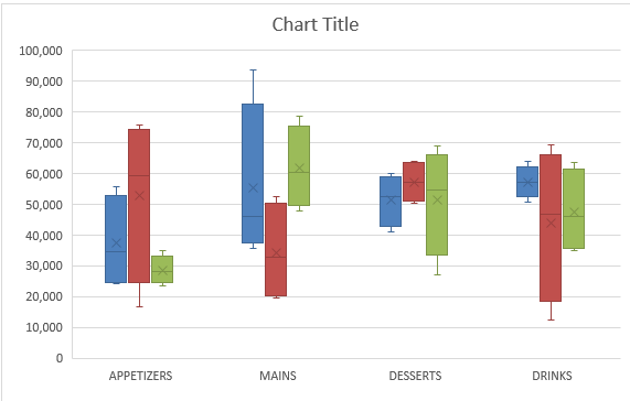
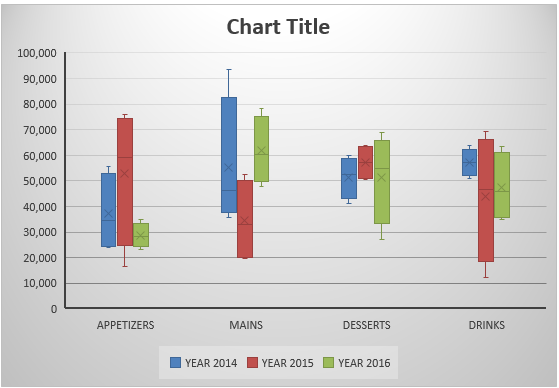
Box and Whisker Excel is one of the many new Charts available only in Excel 2016 and was originally invented by John Tukey in 1977. They show you the distribution of a data set, showing the median, quartiles, range, and outliers. The X in the box represents the Mean. The Median divides the box into the interquartile range. The box represents 50% of the data set, distributed between the 1st and 3rd quartiles.
Key Takeaways
-
Visualize Data Distribution – A Box and Whisker chart helps identify medians, quartiles, and potential outliers quickly.
-
Requires Excel 2016 or Later – The Box and Whisker chart is a built-in chart type available from Excel 2016 onward.
-
Insert from the Chart Menu – Go to the Insert tab, click Insert Statistic Chart, and select Box and Whisker.
-
Customizable Chart Elements – You can adjust the box style, whisker length, and show/hide outliers through Format options.
-
Great for Comparative Analysis – Ideal for comparing multiple data sets side-by-side, especially in performance or quality analysis.
Table of Contents
Quick Overview
For example, 25% of the data lie between the values of the 2nd Quartile box and the other 25% lie between the values of the 3rd Quartile box.
The lines extending vertically outside of the box (whiskers) show the outlier range outside of the upper and lower quartiles. So this is the lowest and highest data points within the data set.
Below is a Box and Whisker diagram explaining this:
Here is how the Box and Whisker plot Excel 2016 version looks like:
In this example, I show you how easy it is to insert a Box and Whisker Excel 2016.
To upgrade to Excel 2016 you can use this link here: Microsoft Office 2016
Read this tutorial to create a box and whisker diagram (box plot) using Excel 2013 or below.
How to Create a Box and Whisker in Excel 2016
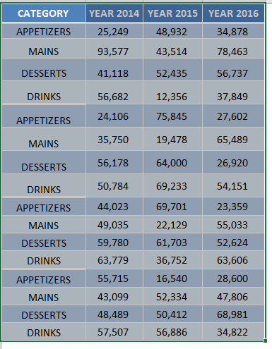
STEP 1: Highlight your table and go to Insert > Recommended Charts
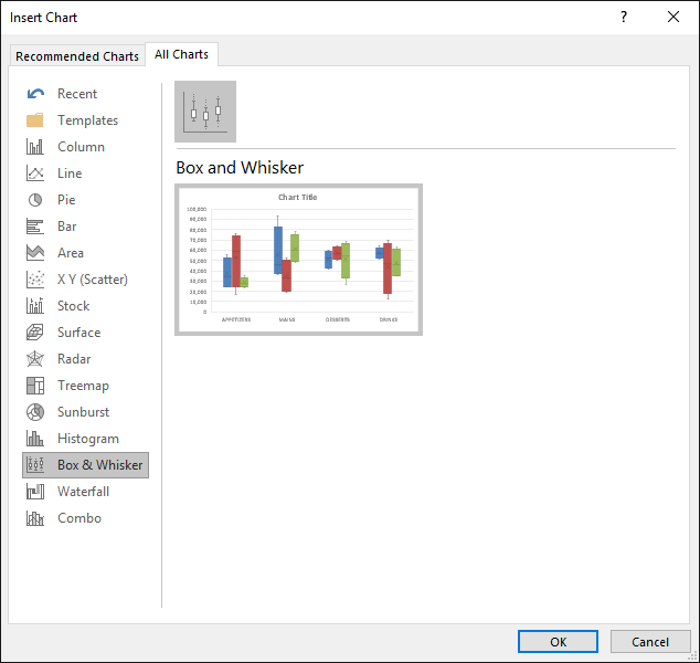
STEP 2: Select All Charts > Box and Whisker > OK
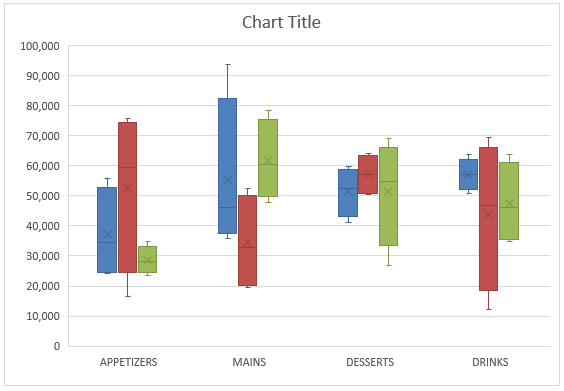
STEP 3: Now you have your Box and Whisker Chart.
STEP 4: You can further customize the look and feel of your Excel Box and Whisker Plot, by going to Chart Tools > Design / Format
STEP 5: In our example, let us go to Chart Tools > Design and pick one of the alternate designs.
Now you have your beautiful looking Box and Whisker chart and you can quickly point out to your management where the outliers lie…
Frequently Asked Questions
What is a Box and Whisker chart used for in Excel?
It’s used to show the distribution of data, including medians, quartiles, and outliers in a visual format.
Can I create a Box and Whisker chart in Excel 2013?
Not natively. The feature is only built into Excel 2016 and later versions.
Where can I find the Box and Whisker chart option in Excel 2016?
Go to the Insert tab → Insert Statistic Chart → Select Box and Whisker.
What kind of data works best for this chart type?
Numeric data with multiple sets, such as test scores, sales figures, or survey results, especially when comparing categories.
Can I format outliers or whiskers in the chart?
Yes, you can format elements like whiskers, boxes, and outliers by right-clicking on them and selecting Format Data Series.

Bryan
Bryan Hong is an IT Software Developer for more than 10 years and has the following certifications: Microsoft Certified Professional Developer (MCPD): Web Developer, Microsoft Certified Technology Specialist (MCTS): Windows Applications, Microsoft Certified Systems Engineer (MCSE) and Microsoft Certified Systems Administrator (MCSA).
He is also an Amazon #1 bestselling author of 4 Microsoft Excel books and a teacher of Microsoft Excel & Office at the MyExecelOnline Academy Online Course.

