Pareto Charts are one of the many new Charts available only in Excel 2016.
They are very visual as it can easily show you the biggest factors in the data set, like seeing which issues are the most common.
A Pareto chart, also called a sorted histogram, is a column chart which sorts the data in descending order. The largest items are listed first for emphasis.
A Pareto chart includes a secondary line chart, symbolizing the cumulative percentage of the total.
The Pareto Principle as explained in Wikipedia and FinanceReference, named for Italian economist Vilfredo Pareto, is based on the observation that most of the effects of an action come from a small amount of the causes. This is often called the 80-20 rule, implying that 80% of the failures come from 20% of the types of defect, or that 80% of one’s sales come from 20% of one’s customers, or pretty much any 80-20 metaphor you can come up with.
To learn more about the Pareto Chart you can read this post here over at PeltirTech.com
In the examplebelow I show you how easy it is to insert a Pareto Chart using Excel 2016.
To upgrade to Excel 2016 you can use this link here: Microsoft Office 2016
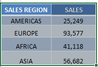
STEP 1: Highlight your table and go to Insert > Recommended Charts
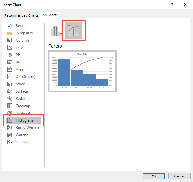
STEP 2: Select All Charts > Histogram > Pareto > OK
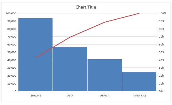
STEP 3: Now you have your Pareto Chart.
STEP 4: You can further customize the look and feel of your Pareto Chart, by going to Chart Tools > Design / Format
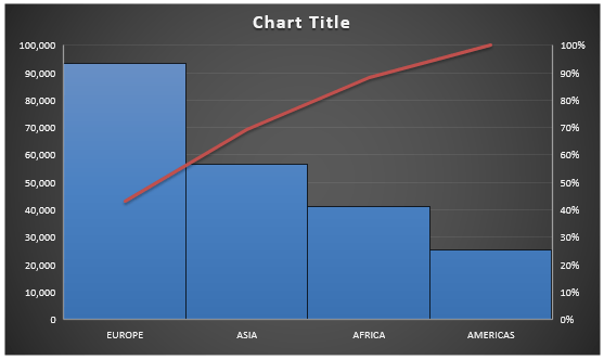
STEP 5: In our example, let us go to Chart Tools > Design and pick one of the alternate designs.
Now you have your beautiful looking Pareto chart and you can quickly point out to your management where the biggest contributors of your sales are on…
Bryan
Bryan is a best-selling book author of the 101 Excel Series paperback books.


