Excel Charts helps you visualize your data to quickly assess information. If you wish to compare a part-to-whole data over time or over different categories, then the Stacked Column Chart is the ultimate tool for you!
Table of Contents
Stacked Column Chart
In Stacked Column Chart, data series of various categories are stacked one upon another in vertical columns. It is used to compare the contribution of a value to a Total. These charts are useful when you want to:
- Compare part to whole data over time
- Compare part to whole data over category
Let’s look at an example to understand how data is displayed in a Stacked Column Chart Excel.
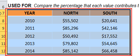
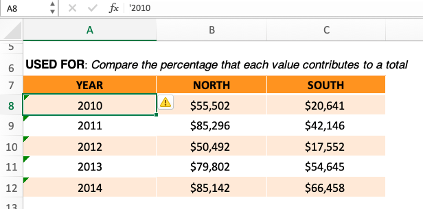
This data table represents the sales amount for the North & South region from the year 2010 to 2014. Using this data, you can create a Stacked Column Chart to compare the sales amount for both the regions over the time period.
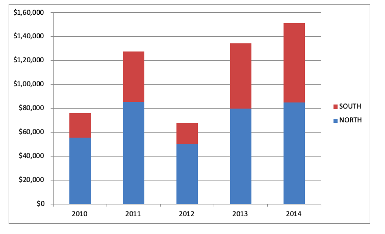
Years used of the analysis are plotted along the X-Axis and the regional sales amount are series and each region’s sales amount are shown on the Y-Axis.
To learn how to create this Chart, go through our blog on Stacked Column Chart.
This representation of data not only helps you to understand the growth of individual segments and also the comparison between the two. You can spot the sales amount for both the North Region (Blue Bar) & South Region (Red Bar) and also see how the sales amounts increase/decrease over time.
In Excel Stacked Bar Chart, data series of various categories are stacked one upon another in horizontal columns.
100% Stacked Column Chart
The 100% Stacked Column chart is an extension of the Stacked Column chart in that it compares the percentage that each value contributes to a Total.
This 100% Stacked column chart is different from the Stacked Column Chart only in terms of representation of the column bars:
- In a Stacked Column chart, the height of each bar is the total value of a category
- In 100% Stacked Column Chart, the height of each bar is the same (100%) and the segments are shown as a percentage of the total value.
So the value of each bar in 100% Stacked Column Chart Excel will always be 100 irrespective of the total value. The vertical axis of this chart contains percentage figures and not absolute value!
For example, if you want to show the percentage of contributions for the North & South sales over the last 5 years then this is the chart for you.
Make sure to download the exercise workbook to follow along:
STEP 1: Select the table on where we want to create the chart.
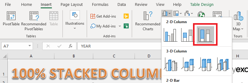
STEP 2: Go to Insert > Column > 100% Stacked Column
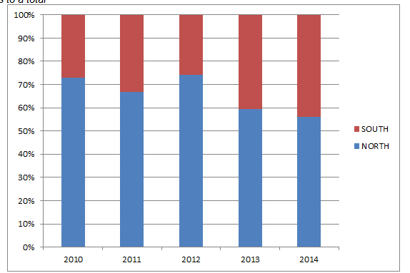
Your chart is now ready:
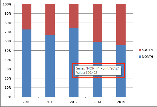
As you can see, it is easy to compare the sales amount for each region with the Excel 100% Stacked Column Chart.
Even though the Y-axis is plotted as a percentage. If you wish to view the sales amount of any region at any year, you can simply hover upon the column and watching the tooltip.
For example, you want to know the sales amount for the North Region in the year 2012. You can hover upon that column and see that the sales amount is $50,492.
Convert Year in Data Table to Text
One thing you need to make sure when creating a chart using this data table is that the first column containing years should be converted to text. If this is not done, then by default Excel will treat them as numerical values and will be included in the calculation of Northern and Southern sales.
To convert a number to text, simply add an apostrophe in front of the number.
Customize 100% Stacked Column
Filter Data in Stacked Column Chart
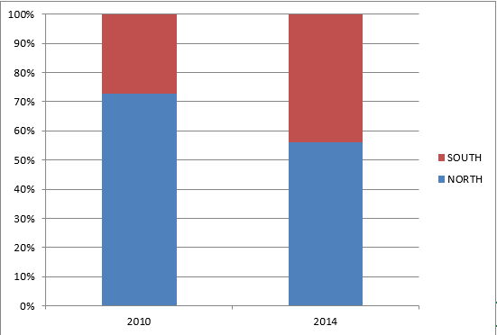
If you wish to display or focus on only a portion of the data, you can filter it in the 100% Stacked Column Chart. Say, you want to compare sales data for the year 2010 with the year 2014 only.
To do so, follow the steps below:
Step 1: Select the previously created chart.
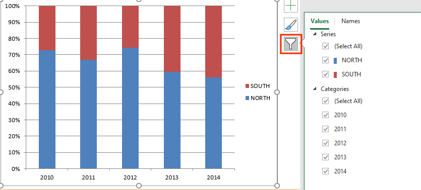
Step 2: On the top-right corner of the chart, select the filter button.
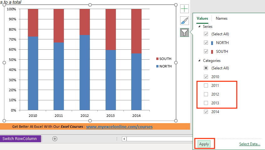
Step 3: Uncheck the Year 2011, 2012 & 2013 and Click on Apply.
100% Stacked Column Chart with only the years 2010 and 2014 would be displayed.
Change the color of the Column
You can change the color of the Column by following the steps:
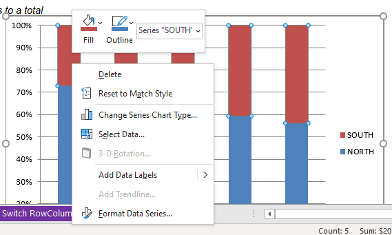
Step 1: Right-click on the chart
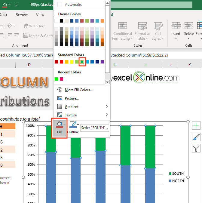
Step 2: Select the Fill option and choose an appropriate color.
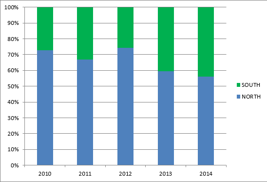
Your changed color chart is ready!
3-D 100% Stacked Column Chart
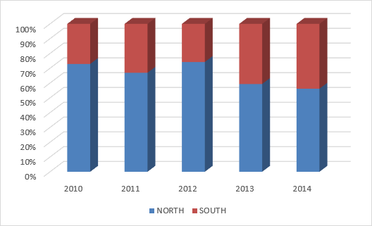
The chart you have created earlier was a 2-D 100% Stacked Column Chart. You can even create a 3-D version of it!
3D is just a visual setting, it has nothing to do with the data. The chart will be plotted with 2 axes only (X-axis and Y-axis)
Step 1: Select the table which you want to create the chart
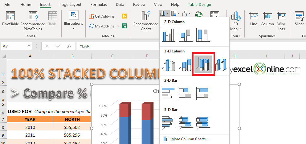
Step 2: Go to Insert > Column > 3-D 100% Stacked Column Chart
This is your 3D 100% Stacked Column Chart.
Switch Row/Column
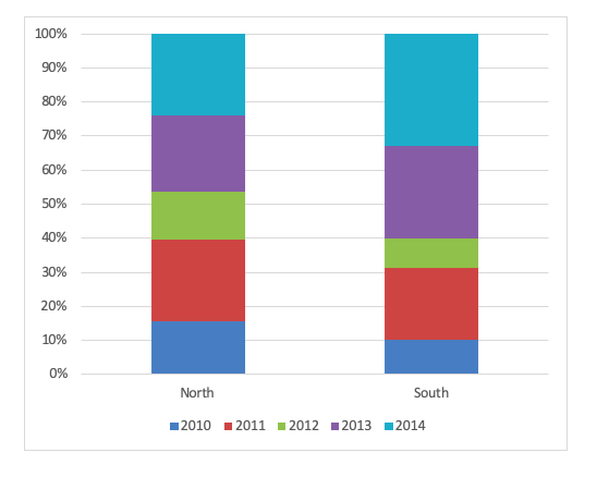
Let us say in your initial data table the column and rows were swapped i.e. the left-most column contained region instead of year.
Your 100% Stacked Column would look like this:
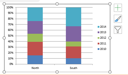
But this is not the chart you were looking for. You want to compare regional sales over time i.e. you want to simply switch row with column.
Step 1: Select the Chart
Step 2: Go to Chart Design > Switch Row/Column
Your desired chart will be ready.
There are a variety of charts in Excel can you may find useful. You can take a look at these blogs on Excel Charts to know more.
Helpful Resource:
Make sure to download our FREE PDF on the 333 Excel keyboard Shortcuts here:
You can learn more about how to use Excel by viewing our FREE Excel webinar training on Formulas, Pivot Tables, and Macros & VBA!
John Michaloudis is a former accountant and finance analyst at General Electric, a Microsoft MVP since 2020, an Amazon #1 bestselling author of 4 Microsoft Excel books and teacher of Microsoft Excel & Office over at his flagship MyExcelOnline Academy Online Course.

