Creating an engaging presentation isn’t just about the content; it’s also about how that content is displayed. Clear, well-organized layouts can make your slides more comprehensible and keep your audience focused. When viewers can quickly grasp your main points thanks to a structured format, they are more likely to stay engaged throughout your presentation.
Download our 141 Free Excel Templates and Spreadsheets!
Key Takeaways
- To add columns in PowerPoint slides, select an existing text box or insert a new one, then click on the Home tab and choose “Add or Remove Columns” to set the desired number of columns up to three directly, or select “More Columns” for additional customization options.
- For layouts requiring more than three columns, navigate to “More Columns” under the Home tab where a dialog box will allow you to specify the exact number of columns and adjust the spacing between them.
- Begin with selecting a predefined layout that includes columns from the “Layout” tab, then insert content like text, images, or other objects into the columns by utilizing the “Insert” tab to enhance the structure and visual appeal of your PowerPoint presentation.
Streamlining Text for Better Understanding
Effective presentations often hinge on the audience’s ability to quickly understand and absorb information. Streamlining text into columns is a strategic way to break down dense paragraphs and enhance comprehension. Columns create a cleaner look and direct the audience’s eyes through the text in manageable chunks. This approach not only makes your slides more visually appealing but also bolsters the audience’s reading experience, leading to better retention of the information presented.
Table of Contents
Laying the Foundation with Columns
What is a Column in PowerPoint?
In the context of PowerPoint, a column is a format that organizes text or graphical content into vertical or horizontal blocks within a slide. Using columns, you can distribute your content in a way that’s neat and tidy, which helps prevent the audience from feeling overwhelmed. Columns are incredibly versatile and can be used for arranging lists, comparing information side by side, or simply breaking up long stretches of text to improve readability. They’re a go-to tool for meticulous presenters aiming to deliver clear and captivating messages.
Method #1: Tweaking Slide Master for Consistent Layouts
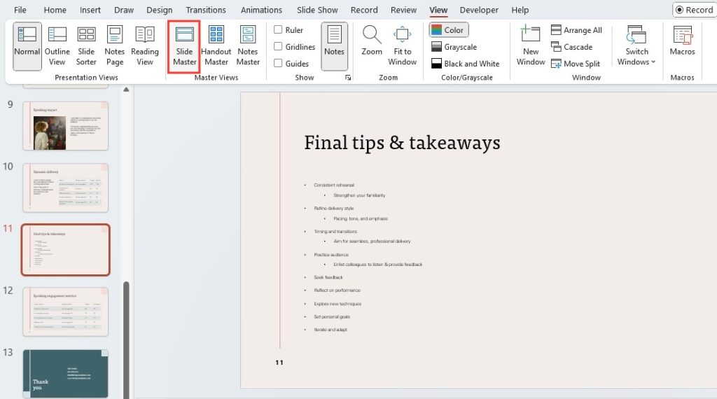
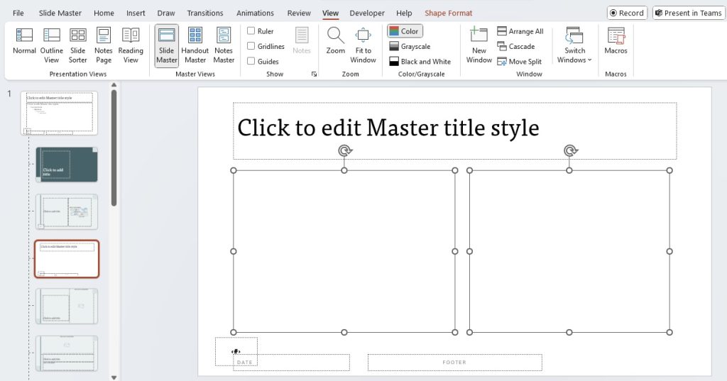
Setting up your slide for multiple columns is the starting point to achieving a structured look in your presentation. Begin by heading to the “View” tab and selecting “Slide Master” to access the underlying slide layouts. Choose a layout that fits the overall style of your presentation and click the “Insert Layout” button. From here, you can pick a two-column layout or more, depending on your needs. This foundational step ensures that all your slides stay consistent in formatting and design, providing a professional look to your presentation.
Method #2: Customizing Text Boxes for Columns
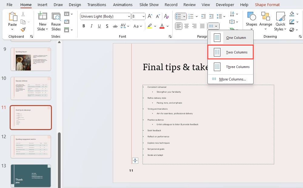
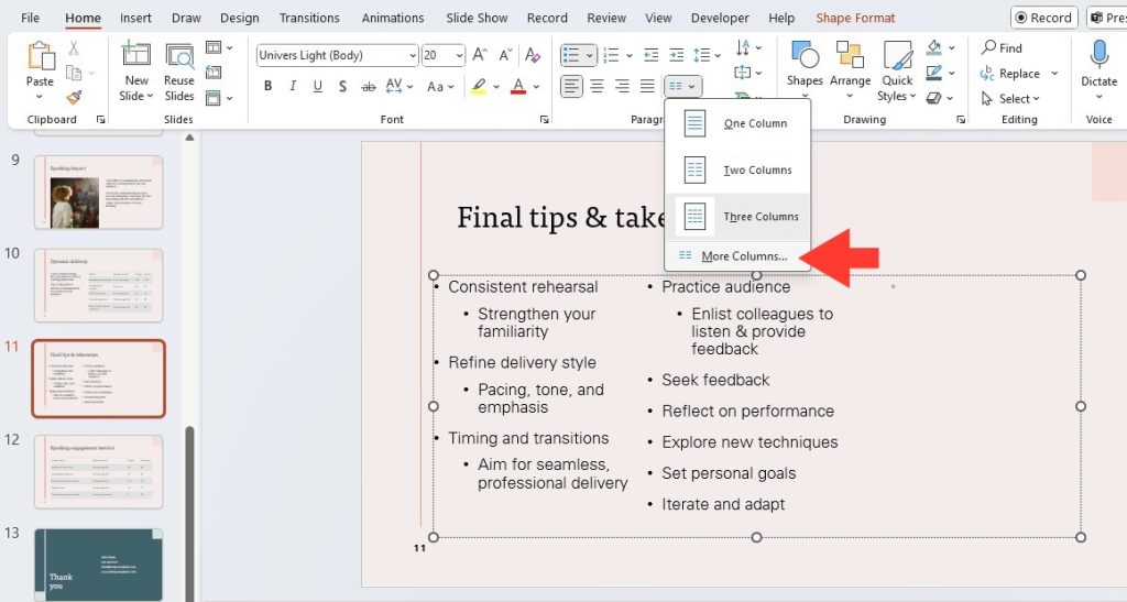
To personalize your presentation, customizing text boxes for columns can be quite useful. Begin by selecting an existing text box or creating a new one by clicking on the “Insert” tab and choosing “Text Box.” Once you have your text box, navigate to the “Home” tab, where you’ll find the columns icon — a small but mighty tool for adjusting the number of columns. Click on it to split your text box into two or more columns or opt for “More Columns” to specify your desired configuration. And just like that, you’ve tailored your slide’s text to match your content needs perfectly.
Enhancing Readability and Aesthetics
Perfecting Alignment and Spacing
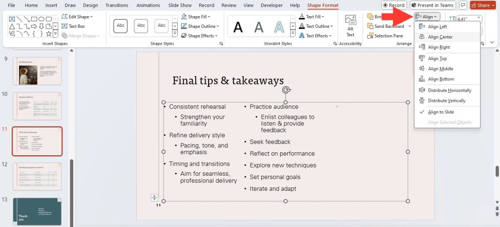
Fine-tuning alignment and spacing is the key to perfecting the professionalism of your slides. Pay close attention to ensuring that text boxes and content within your columns are aligned to the top, bottom, or center as needed. Under the “Format” tab, utilize the “Align” dropdown to lock in your chosen alignment across different elements. For even spacing, use consistent margins within text boxes and even spacing around images and shapes.
To maintain visual balance, ensure that the text’s length across columns is relatively even. Adjusting the space between columns carefully so that it’s neither too cramped nor too wide creates a harmonious look that’s easy on the eyes. Overall, well-aligned and evenly spaced content not only appears more attractive but also promotes better flow and readability.
Choosing the Right Fonts and Sizes
When it comes to readability, the fonts and sizes you choose play pivotal roles. Start by selecting a clear, legible font that fits the tone of your presentation. Sans-serif fonts like Arial or Calibri are often favorites for their neatness and simplicity. For font sizes, aim for a minimum size of 24 points for body text and a larger size for headers to ensure visibility, even at a distance.
Balance is vital—different elements should have varied but complementary sizes to denote importance and maintain hierarchy. Keep in mind that your column’s width might dictate a different font size to ensure that the text does not appear too squished or too sparse. Testing your slide on a larger screen can also help you gauge if the text sizing is adequate.
Best Practices for Using Columns in Presentations
Balancing Text and Visuals
To hold your audience’s attention, striking the right balance between text and visuals is crucial. Your columns should facilitate a seamless blend of words and images, with neither overshadowing the other. If you have a text-heavy column, complement it with a visual-heavy column alongside. This visual variety helps illustrate your points and keeps viewers engaged.
Balancing doesn’t just mean equal parts; it’s about creating harmony. Sometimes, you might lean heavier on visuals to explain a complex idea, while at other times, bullet points may suffice. Always consider the purpose behind each slide—your visuals and text should work together to tell a cohesive story.
When to Use Columns in Your Slides
Columns can be a versatile tool in your presentation arsenal, but knowing when to use them is key. Utilize columns on your slides when you aim to compare and contrast different items, like product features, or when delineating a list into more digestible parts, such as steps in a process. They’re great for displaying pros and cons clearly or when you wish to organize related concepts side by side without confusing your audience.
Additionally, columns come in handy when you’re aiming to mimic a traditional newspaper or editorial layout for storytelling or narrative-based presentations. However, refrain from overusing columns, as they may confuse rather than clarify if the content doesn’t warrant such organization. Always use them purposefully to enhance understanding and to visually segment information for impact.
Overcoming Common Challenges
Adding More Than Three Columns
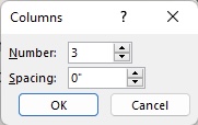
Encountering the need to add more than three columns in PowerPoint is more common than one might think, especially in data-rich or complex presentations. To increase the number of columns beyond the usual cap, head to the ‘Home’ tab and look for the ‘Add or Remove Columns’ button. Click on ‘More Columns’ to open a dialogue box where you can dial in the exact number of columns you need, as well as adjust the spacing between them to align with your slide’s design.
This feature provides a great deal of flexibility for those times when you have multiple points of comparison or when the content naturally segments into more categories. Just remember that with each additional column, ensure your text size and spacing remain reader-friendly.
Transitioning Between Different Column Layouts
Transitioning smoothly between different column layouts within your presentation helps maintain a dynamic and engaging flow. To accomplish this seamlessly, strategically place transitional slides that prep your audience for the layout change. You can use subtle animations that shift the focus gently from one column structure to another or employ clear headings and transition statements in your speech.
If you’re moving from fewer to more columns, or vice versa, consider using PowerPoint’s built-in transition effects like ‘Fade’ or ‘Push’ to help visually cue the change. The key is to make sure that each transition makes sense in the narrative of your presentation and that you’re not changing layouts too frequently, which can be jarring to the audience.
FAQs on Columns in PowerPoint
How Do I Convert a List into Columns in PowerPoint?
To convert a list into columns in PowerPoint, first select the text box containing your list. Then, on the ‘Home’ tab, click the ‘Add or Remove Columns’ button to select the number of columns you’d like to split your text into. If you need to make adjustments, click ‘More Columns’ for further customization. This simple process can help organize your list more effectively across the slide.
Can You Save a Custom Column Layout as a Default in PowerPoint?
Yes, you can save a custom column layout as a default in PowerPoint. Once you’ve created a column layout that suits your needs, go to the ‘Slide Master’ view and apply it to a new layout. Save this layout within the master slides, and it will be available as a default option for any new slides you add to your presentation.
How do I make one column into two in PowerPoint?
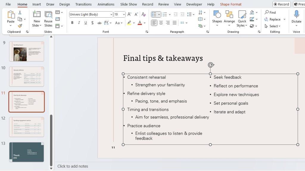
To make one column into two in PowerPoint, click inside the text box you want to split and then go to the “Home” tab. Look for the ‘Columns’ button, usually located in the Paragraph group, and choose “Two,” or select “More Columns” to customize further. This will instantly divide your text box content into two equal columns.
John Michaloudis is a former accountant and finance analyst at General Electric, a Microsoft MVP since 2020, an Amazon #1 bestselling author of 4 Microsoft Excel books and teacher of Microsoft Excel & Office over at his flagship MyExcelOnline Academy Online Course.

