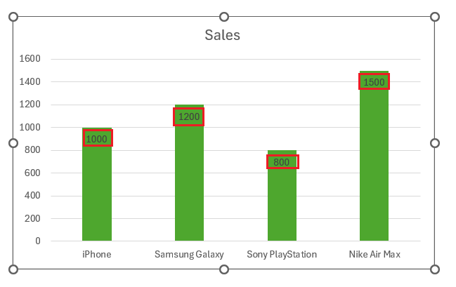
Adding data labels in Microsoft Excel is a straightforward way to make your charts more informative and visually appealing. By displaying specific values directly on data points, data labels help viewers quickly understand the key information without having to interpret the graph. Whether you’re highlighting sales figures, survey results, or performance metrics, data labels can transform a basic chart into a clear and insightful visual tool. Here’s a simple guide on how to add and customize data labels in Excel to enhance your data presentation.
Key Takeaways:
- Data labels turn raw data points into easily understandable information.
- Adding data labels in Excel is a straightforward process through the Chart Design tab.
- Customizing data labels enhances clarity and aligns with your visual style.
- Advanced techniques allow data labels to pull information from different columns.
- Proper positioning and formatting prevent label overlap and improve readability.
Table of Contents
Introduction to Data Labeling in Excel
The Importance of Data Labels in Visualizing Data
Understanding the story that data tells at first glance can sometimes feel like trying to read an unknown language. That’s where data labels come into play, transforming your Excel scatter plots and graphs from a jumble of points or bars into a clear map of information.
Whether you’re comparing revenue against profit margin over the years or assessing the valuation of an array of companies, having data labels is like having a guide by your side, offering immediate understanding by showing the year, value, or identifier directly on the data point.
The Basics of Adding Data Labels to Graphs
Adding data labels to your Excel graphs is a simple yet powerful way to make your data stand out and become more understandable to your audience. When you’re ready to label those all-important points or bars, here’s how you get started: click on the data series that you want to enhance with labels. Add these informative signposts, and your graph will communicate more effectively, ensuring your data doesn’t just exist but tells a compelling story.
Enhancing Your Charts with Data Labels
Step-by-Step Guide to Adding Data Labels
Dive into your Excel charts with confidence, knowing that adding data labels is just a few clicks away. Here’s your step-by-step guide to enrich your graphs:
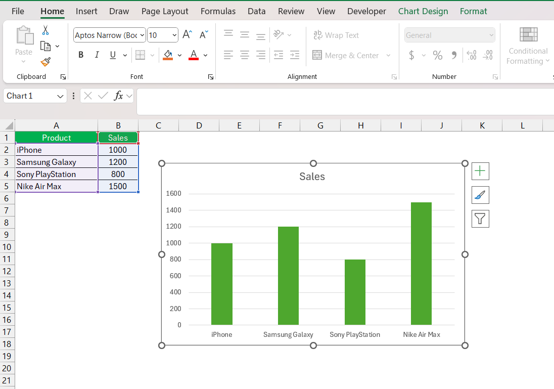
STEP 1: Click on your chart to ensure it’s selected.
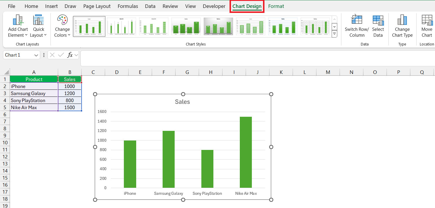
STEP 2: Navigate to the Chart Design tab on the ribbon for options.
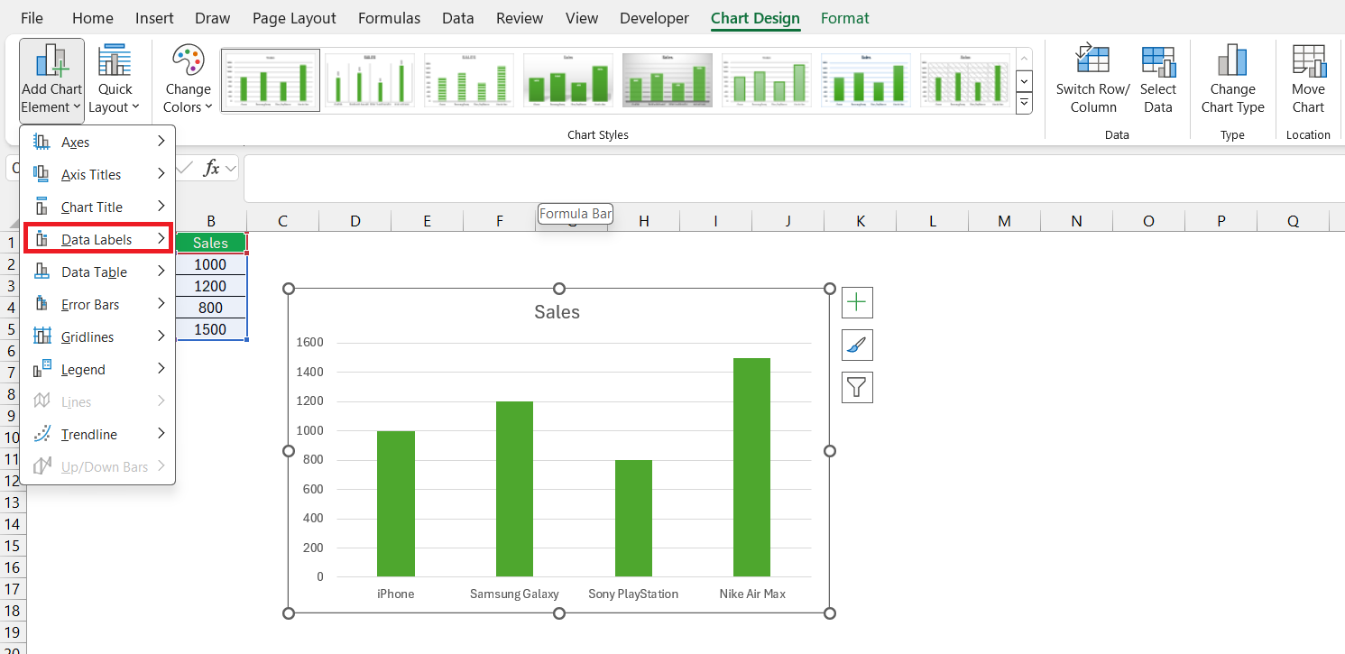
STEP 3: Look for the Add Chart Element drop-down in the Chart Layouts group. Hover over Data Labels, and a side menu will appear.
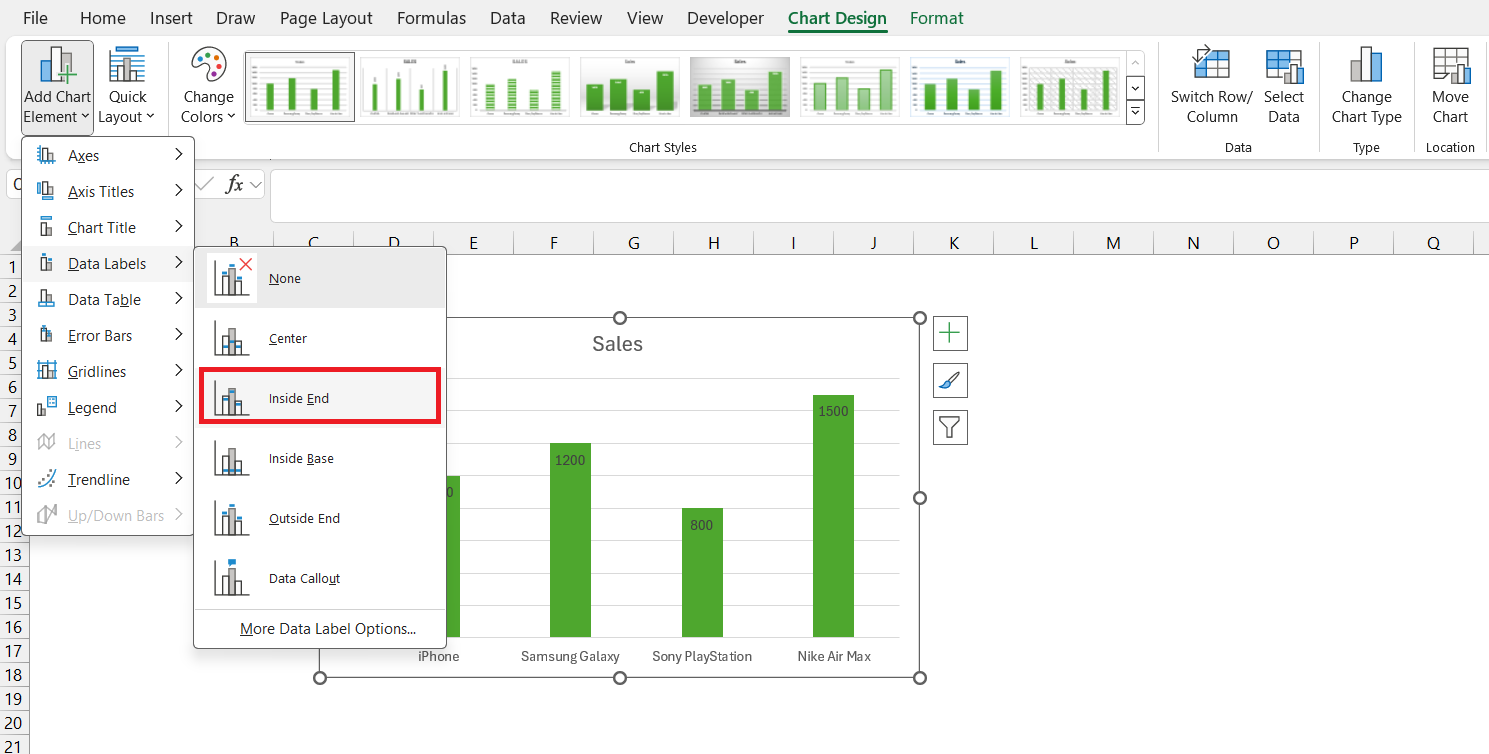
STEP 4: Choose where you want your labels to be positioned—above, below, right, left, center, or inside the data point.
STEP 5: Click on your preferred option, and watch as labels appear on your graph.
Simple, isn’t it? And the beauty of these steps is that with each one, you’re turning complexity into clarity. From explaining quarterly profits with pinpoint accuracy to providing key statistics on your latest research, data labels give your audience the insight they need at just a glance.
Customizing Data Labels for Clarity and Style
Once you’ve added data labels to your charts, customize them to suit your style and to enhance clarity. To give those labels a personal touch that completes your visual story, just follow these quick customization steps:
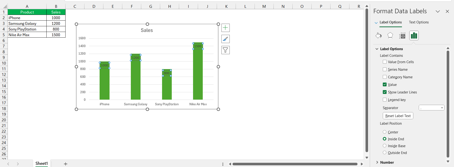
STEP 1: Click on the data labels you’d like to modify. This will open the Format Data Labels sidebar.
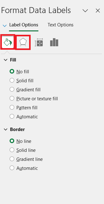
STEP 2: Within the sidebar, you’ll see various options such as Fill & Line to add color or borders, and Effects for shadows and glows.
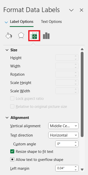
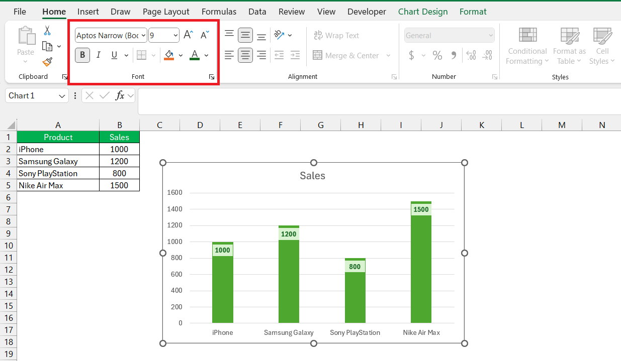
STEP 3: Play with Size & Properties to tweak the width, height, and alignment of labels or to change the text direction and wrap text for better readability.
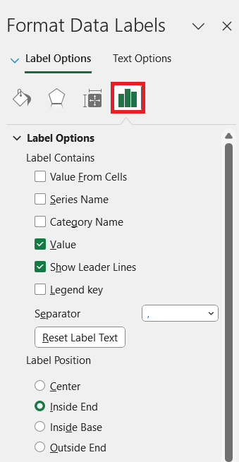
STEP 4: For more detailed content, explore the Label Options tab, where you can choose the kind of data you want your labels to contain, such as value, percentage, series name, or category name.
STEP 5: The fonts, colors, and number formats can easily be adjusted to ensure your data labels match your presentation or report’s theme.
By customizing data labels, you’re not just transforming data; you’re enhancing the user experience. Think of each data label as a potential conversation starter, sparking interest with its clear, succinct, and attractive display of information. With fine-tuned labels, your chart becomes more than a collection of data—it becomes a polished and professional narrative of the story you’re trying to tell.
Advanced Data Label Techniques
Adding Data Labels from Different Columns
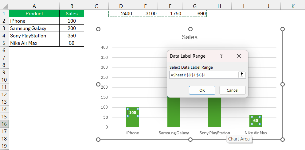
When your Excel graph needs to pull information from different places, don’t sweat; adding data labels from various columns is a breeze. Here’s how they breathe life into your charts with diverse data:
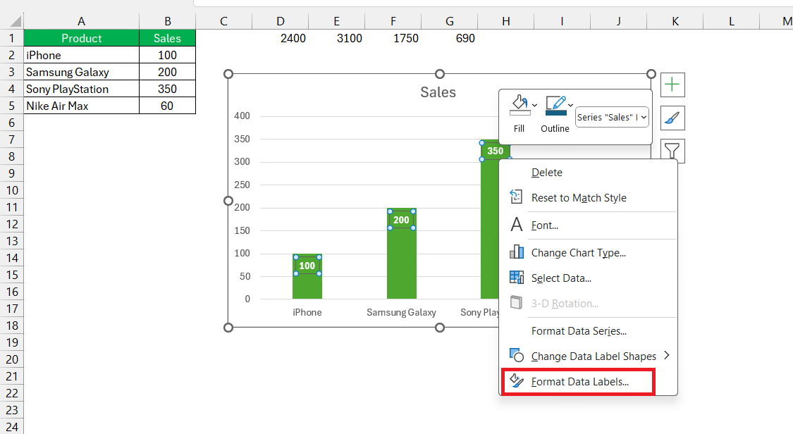
STEP 1: Once you’ve added basic data labels, click on any label to select them all. Click again to select the specific label you want to modify.
STEP 2: Right-click and choose Format Data Labels to bring up options.
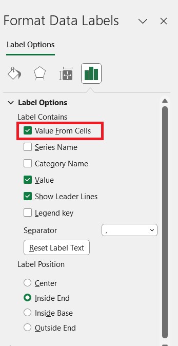
STEP 3: In the Label Options pane, click on Value From Cells.
STEP 4: A new dialog box will appear. Here you select the range of cells in your spreadsheet that contain the information you want to display as your data labels. After selecting the right column, hit OK to apply the labels.
STEP 5: To avoid confusion, remember to uncheck any other types of information that you no longer wish to display, like the default ‘value’ option, unless you want both to show.
Imagine trying to show profitability for different product lines where each dot must tell a product name and its profit margin. By pulling from different columns, data labels can clearly annotate each point with the product name and the figure, creating a graph that’s as informative as it is immediate.
FAQ: Frequently Asked Questions
How do I add data labels in Excel?
To add data labels in Excel, first click on your chart and then click on the “+” symbol that appears to the right side of the chart. From the list, check the box next to “Data Labels” or click on the right arrow and choose your preferred label type. Alternatively, right-click on a data series or point and select “Add Data LiveData labels” from the context menu to apply them.
What is the shortcut to add a data label in Excel?
Unfortunately, there’s no dedicated keyboard shortcut to add data labels in Excel, but you can access the chart elements menu by pressing Alt + J, N on Windows or ^+Option+J+N on a Mac to navigate closer, then use the arrow keys and Enter to toggle data labels.
How do I link data labels to worksheet data in Excel?
To link data labels to worksheet data in Excel, click a data label twice to select it, then click in the formula bar. Enter an equal sign, select the worksheet cell you want to link to, and press Enter. Repeat this for each data label, or drag the first label’s corner to autofill if the range is sequential.
Can I position my data labels outside of the columns or points in an Excel chart?
Yes, you can position data labels outside of the columns or points in an Excel chart. To do this, click the data series to select it, and then choose the ‘Data Labels’ option from the Chart Elements menu. Opt for a position such as ‘Outside End’ or ‘Best Fit’ for your labels, depending on the chart type.
What should I do if my data labels are overlapping or not displaying correctly?
If data labels in your Excel chart are overlapping or not displaying correctly, try the following:
- Adjust the label’s font size and style for better fit.
- Change the label’s position to ‘Outside End’ or use the ‘Best Fit’ option.
- Use the formatting options to add a background fill for better contrast.
- If labels still overlap, consider using leader lines or a callout box style.
These tweaks can prevent overlap and improve readability.
John Michaloudis is a former accountant and finance analyst at General Electric, a Microsoft MVP since 2020, an Amazon #1 bestselling author of 4 Microsoft Excel books and teacher of Microsoft Excel & Office over at his flagship MyExcelOnline Academy Online Course.

