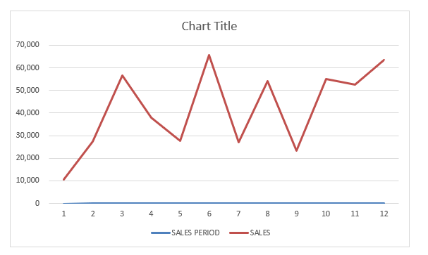
With Excel Charts, it is very easy to create Trendlines for your data. Trendlines show which direction the trend of your data is going, and gives you the trajectory as well.
In this tutorial, you will cover all of these sub-topics in details:
- How to add trendline in Excel
- Different types of trendline
- Format the Trendline
- Use trendline to forecast future data
- Add multiple trendline to same chart
- How to remove trendline in Excel
How to add Trendline in Excel
*** Watch our video and step by step guide below on Trend Chart in Excel with a free downloadable workbook to practice ***
In this example, you will learn how to insert a trendline in Excel using a Line Chart.
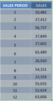
STEP 1:Highlight your table of data, including the column headings:
Go to Insert > Recommended Charts (Excel 2013 & 2016)
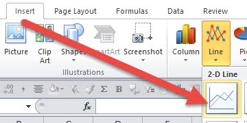
Go to Insert > Line > 2-D Line (Excel 2010)
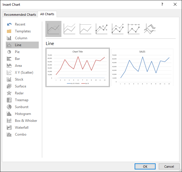
STEP 2: Select All Charts > Line > OK (Excel 2013 & 2016)
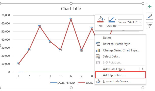
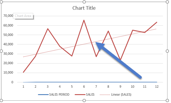
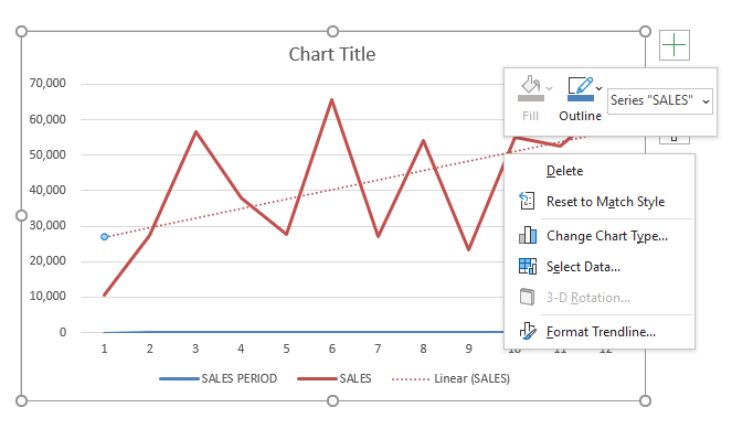
STEP 3: Right-click on the line of your Line Chart and Select Add Trendline.
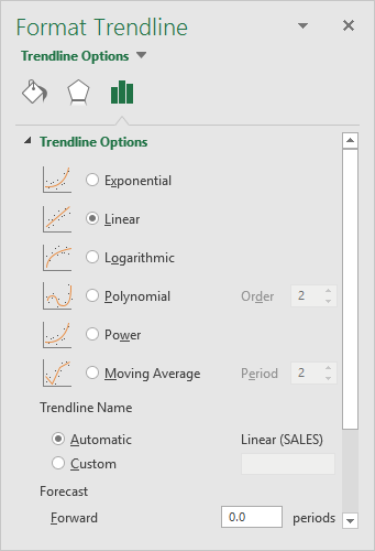
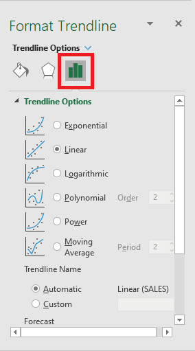
STEP 4: Ensure Linear is selected and close the Format Trendline Window
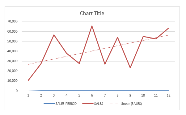
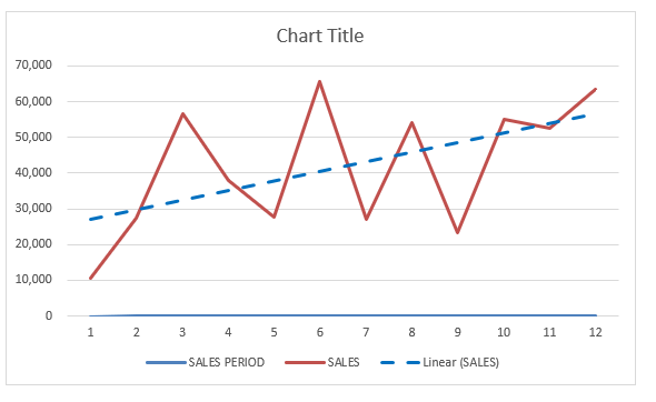
Now you have your Trendline in your chart, and you can predict where the trajectory is going in the succeeding periods:
Different types of Trendline
There are different types of trendlines available to be added to the Excel Charts:
- Linear – It is a straight line that shows the increase/decrease in the value of data over time at a steady rate.
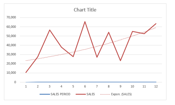
- Exponential – It shows the increase/decrease in the value of data at an increasingly higher rate. It is usually more curved on one side.
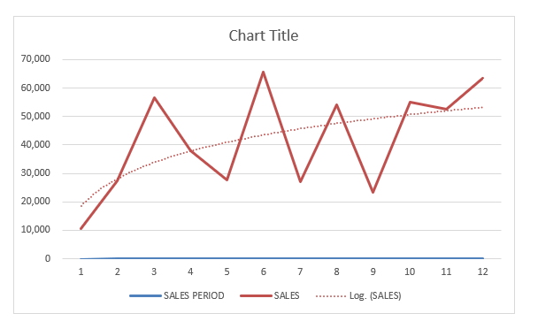
- Logarithmic – This trendline should be used when the data increase/decrease quickly and then levels out.
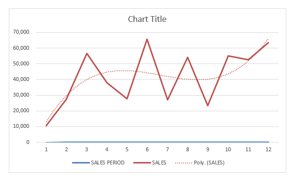
- Polynomial – It is a curved line that should be used when data fluctuates more than one rise and fall.
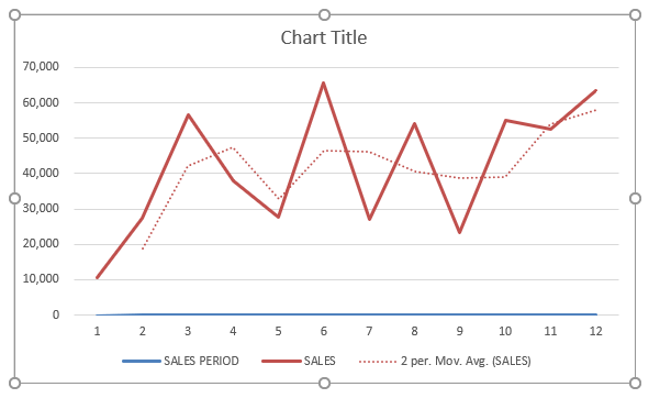
- Moving Average – It is used to smooth the extreme fluctuations of data and show a clearer direction to data trends.
Format the Trendline
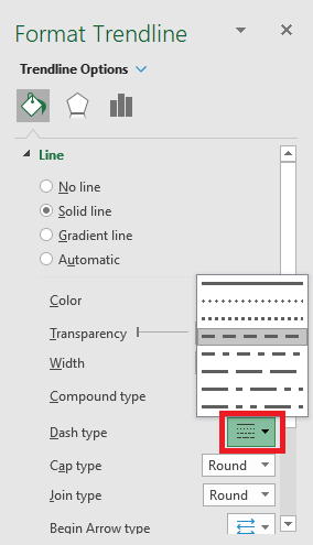
Now that you know how to add trendline in Excel, let’s move forward to understand how to format them. You can change the color, transparency, width, dash type, compound type, cap type, and more for your trendline.
In the example below, you want to change the color of the trendline to blue, increase the width to 2.5, and change the dash type.
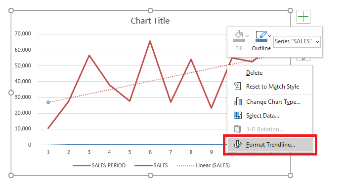
STEP 1: Right-click on the Trendline.
STEP 2: Select the Format Trendline option.
Or, you can skip STEP 1 & 2 and simply double click on the trendline to open the Format Trendline pane.
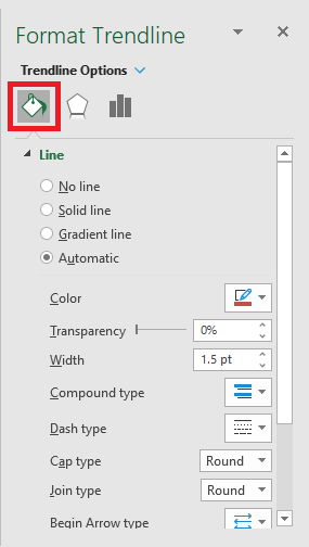
STEP 3: From the Format Trendline pane, click the Fill & Line category.
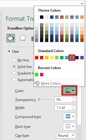
STEP 4: Select color – BLUE
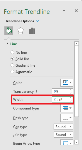
STEP 5: Change the width to 2.5
STEP 6: Change the dash type
Your formatted trendline is ready!
Use Trendline to Forecast Future Data
In Excel, you can extend your data and project the data trend into the future or past using the features of Trendline.
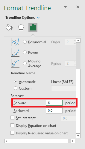
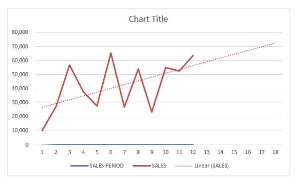
In this example, you want to forecast sales for the next 6 periods. Follow the steps below to understand how to forecast data trends.
STEP 1:Double click on the trendline to open the Format Trendline pane.
STEP 2: Select the Trendline Options tab.
STEP 3: Under forecast, type “6” in the forward box.
Your project data trend for the next 6 periods is created.
You can use trendline to extrapolate the trend of the data into the past. Simply type the period in the backward box instead of the forward box.
Add multiple trendline to same chart
Until now, you have learned how to add trendline in Excel. But you can add multiple trendlines to the same chart. Let’s see how it can be done.
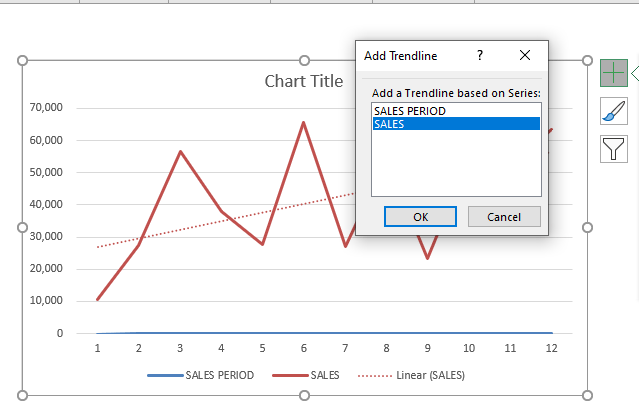
Say, you want to add both linear and moving average trendline to the existing data. Add the first linear trendline as discussed above and then follow the steps below to add another trendline.
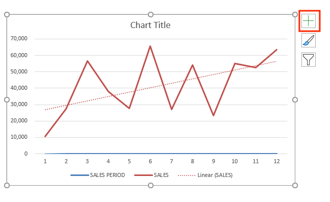
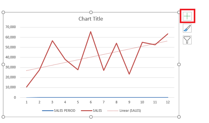
STEP 1: Click on the Chart Elements (“+” icon) on the top-right corner of the chart.
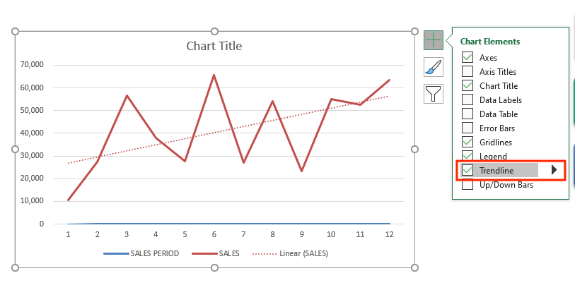
STEP 2: Click on the arrow next to Trendline
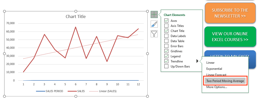
STEP 3: Select Two Period Moving Average from the list
STEP 4: Select the series SALES.
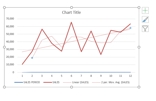
Excel will show both the trendlines on the same chart.
How to remove trendline in Excel
Removing the trendline in Excel Chart is extremely easy and a quick process. Let’s see how it is done.
STEP 1: Click on the Excel Chart.
STEP 2: Click on the Chart Elements (“+” icon) on the top-right corner of the chart.
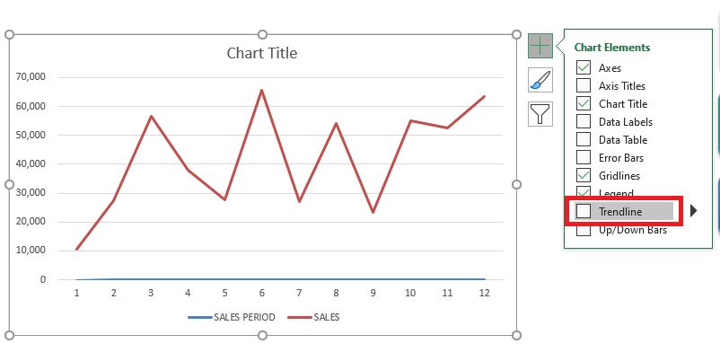
STEP 3: From the dropdown, uncheck Trendline.
Or, you could simply right click on the trendline and click on delete.
Conclusion
In this tutorial, you have covered how to add trendline in Excel, the different types of trendlines, formatting the trendline, extending the trendline into future or past periods, adding multiple trendlines to the same chart, and finally how to remove them.
You can learn more about Excel Charts by going through these blogs!
Further Learning:
Make sure to download our FREE PDF on the 333 Excel keyboard Shortcuts here:
You can learn more about how to use Excel by viewing our FREE Excel webinar training on Formulas, Pivot Tables, and Macros & VBA!

Bryan
Bryan Hong is an IT Software Developer for more than 10 years and has the following certifications: Microsoft Certified Professional Developer (MCPD): Web Developer, Microsoft Certified Technology Specialist (MCTS): Windows Applications, Microsoft Certified Systems Engineer (MCSE) and Microsoft Certified Systems Administrator (MCSA).
He is also an Amazon #1 bestselling author of 4 Microsoft Excel books and a teacher of Microsoft Excel & Office at the MyExecelOnline Academy Online Course.

