Adding a vertical line to an Excel chart is a handy trick that can help highlight specific data points or events in your chart. I’ve often found this technique particularly useful when I need to draw attention to a certain date, a threshold, or any key data in a presentation. Here’s how I go about adding a vertical line to an Excel chart.
Key Takeaways:
- Highlight Key Data: Adding a vertical line in Excel charts emphasizes specific data points, making your presentation clearer and more focused.
- Customizable Appearance: You can adjust the line’s color, style, and thickness to make it stand out or blend with your chart design.
- Effective Communication: Vertical lines act as visual markers, helping your audience quickly grasp important thresholds, deadlines, or events.
- Platform Compatibility: Ensure your Excel chart design, including vertical lines, works well across different platforms by checking compatibility.
- Troubleshoot Overlaps: Managing overlapping series and adjusting gap widths can refine your chart, making the vertical line more distinct and effective.
Table of Contents
Introduction
The Importance of Data Visualization
In the realm of data analysis, visualization is a powerful storyteller. A well-constructed chart or graph can illuminate trends, pinpoint anomalies, and make complex data digestible. It’s about transforming numbers and figures into insights that can be grasped at a glance and understood by all, regardless of their expertise in numbers.
Enhancing Excel Charts with Vertical Lines
Adding vertical lines to Excel charts is akin to underlining key points in a narrative; they draw the eye to significant moments, threshold values, or deadlines. It’s a straightforward yet powerful way to enhance comprehension and retention of data. By integrating vertical lines, we can break down complex datasets into a story that speaks to us visually, allowing for quicker interpretation and more effective communication.
How to Add Vertical Bars in Excel Chart
Create Your Chart
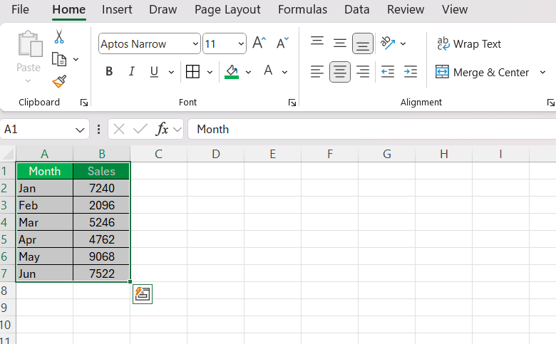
First things first, I start by creating the chart. Whether it’s a line chart, bar chart, or any other type, the process is pretty much the same. I typically have my data organized in a straightforward table format, and then I use Excel’s built-in charting tools to generate the chart. Here’s a quick recap of how I do it:
STEP 1: Select the data range: I highlight the range of data I want to chart.
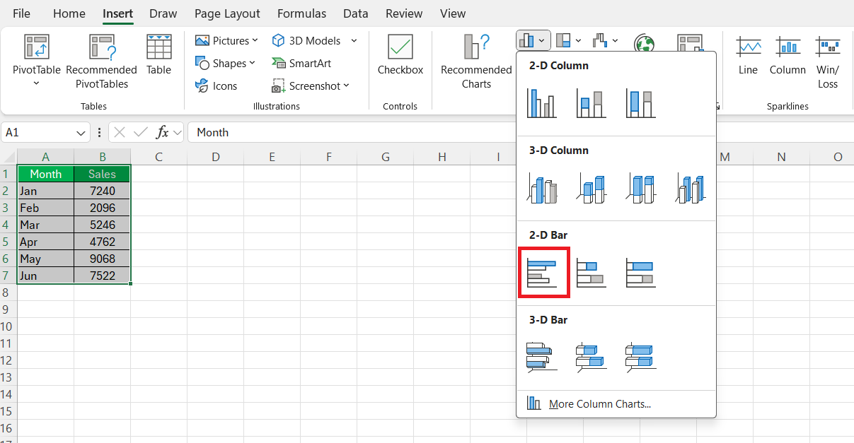
STEP 2: Insert the chart: I go to the “Insert” tab, choose the type of chart that best fits my data, and Excel creates it instantly.
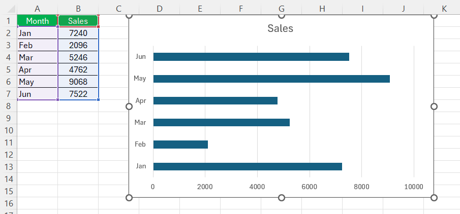
The chart will be added to your Excel worksheet.
Add the Vertical Line Data
Next, I need to add the data that will represent the vertical line. This step is key because it determines where the line will appear on the chart.
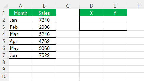
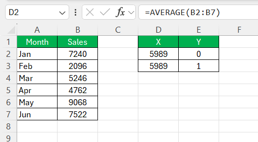
STEP 1: Insert a new column: I insert a new column adjacent to the data that’s already in my chart. Let’s say I’m working with dates in column A and values in column B. I’d add a new column in D. In this new column, I enter the data for the vertical line.
STEP 2: Calculate the Average for the monthly sales value.
Add the Vertical Line to the Chart
Now it’s time to make that vertical line appear in the chart.
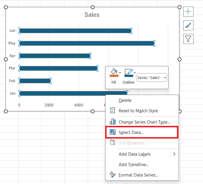
STEP 1: Click on the chart to activate it. Then, right-click the chart, choose “Select Data”.
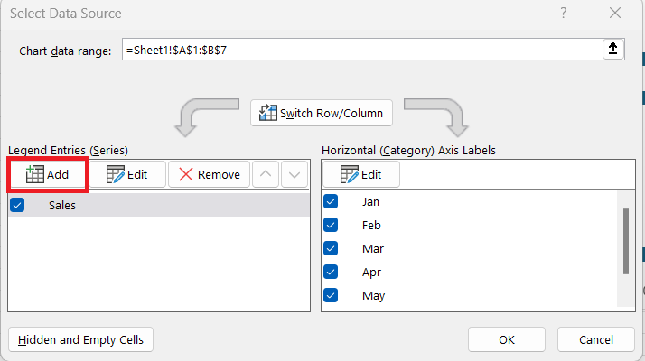
STEP 2: In the Select Data Source dialog box, click “Add” to add a new data series.
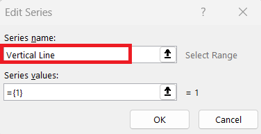
STEP 3: Give this new series a name, like “Vertical Line,” to keep things organized.
STEP 4: Choose the corresponding X values (the category axis) from my data. Click OK.
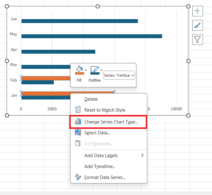
STEP 5: Right-click the new series, and select “Change Series Chart Type”.
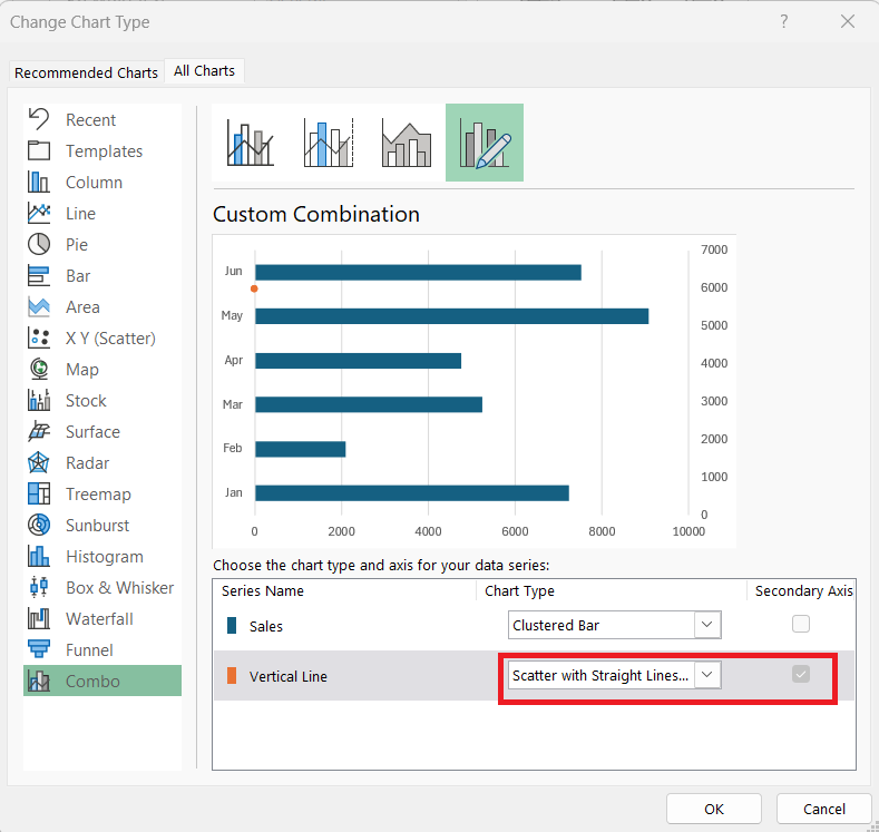
STEP 6: Choose a “Scatter with Straight Lines” chart and switch this series to the secondary axis.
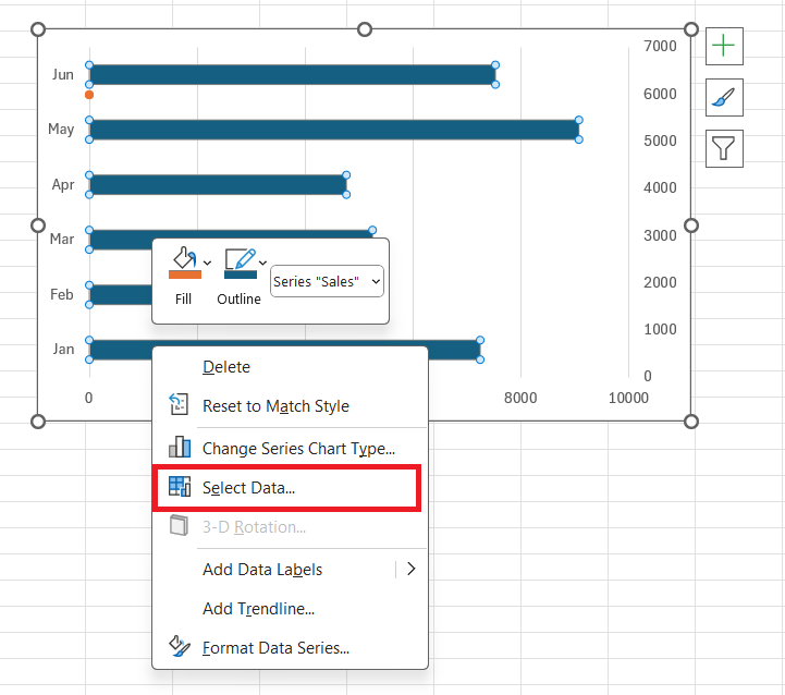
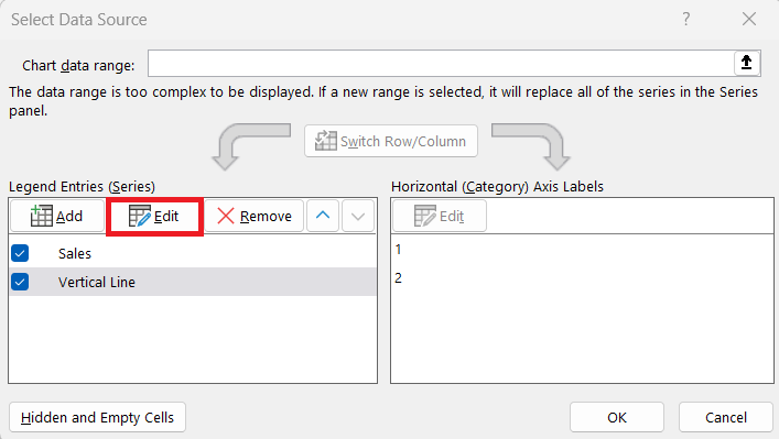
STEP 7: Again, right-click and choose “Select Data”.
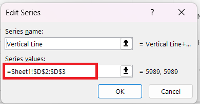
STEP 8: This time we need to select Edit.
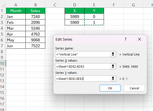
STEP 9: In the Edit Series dialog box, select the X and Y values for the corresponding boxes.
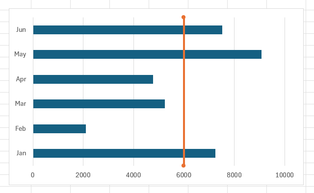
A vertical line will be added to the Excel Chart.
Taking Formatting to the Next Level
To make the vertical line pop, I often customize it.
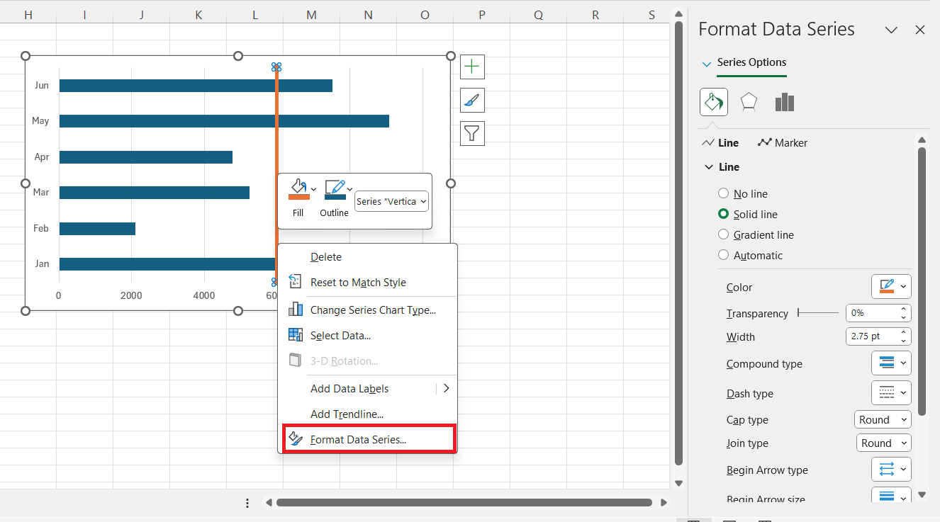
Format the line: I right-click the line in the chart, select “Format Data Series,” and then adjust the line color, style, and thickness to suit my needs. A bold color or a dashed line can help the vertical line stand out against the rest of the data.
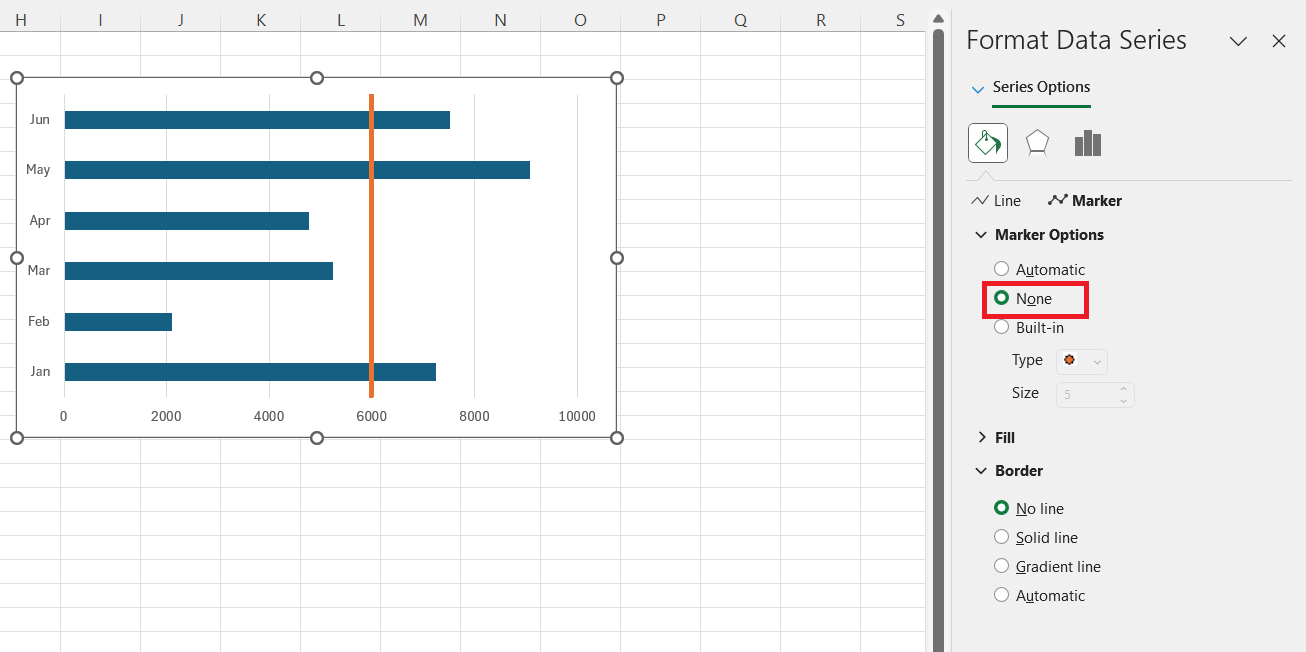
Remove markers: If Excel adds any markers to the line, I remove them to keep the line clean and simple.
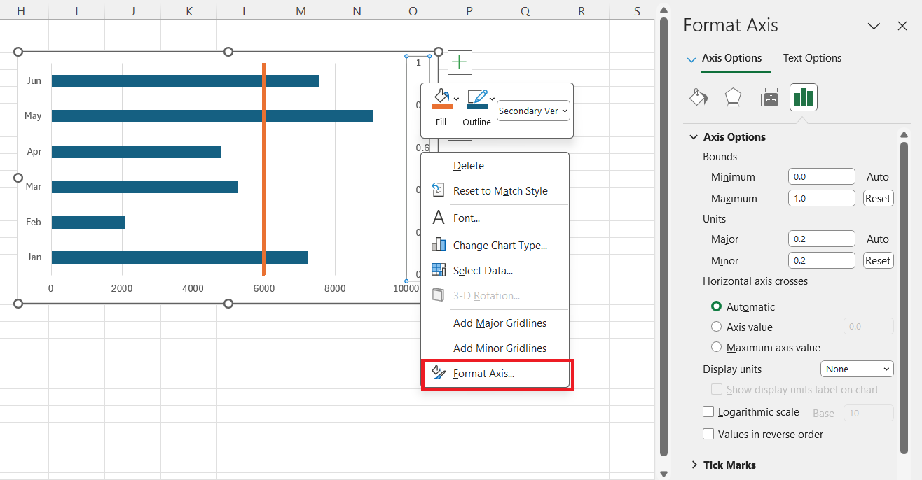
Adjust the secondary axis (if used): If I’ve used a secondary axis, I sometimes need to adjust its range to make sure the vertical line aligns properly with the data.
Troubleshooting Common Chart Issues
Overcoming Accessibility Hurdles on Different Platforms
Ensuring accessibility across various platforms can be a hurdle when dealing with Excel charts. For instance, when sharing charts between Windows and Mac, different versions of Excel might process elements like vertical lines differently.
I tackle this by checking compatibility and ensuring that the chart’s design features translate effectively across versions. It’s also good practice to provide alternative text descriptions for visual elements, allowing users with visual impairments to understand the significance of the vertical lines within the chart.
Adjusting Overlapping Series and Gap Widths
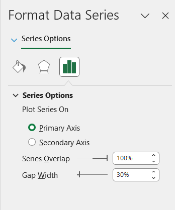
When working with overlapping series and adjusting gap widths in Excel charts, precision is critical. What I often do is configure the series overlap to 100% and the gap width to roughly 30% to attain a visual separation that remains clear and appealing.
Altering the gap width allows space for vertical lines or indicators without cluttering the chart. For the vertical line itself, reducing its width can make it look less like a column and more like a line, achieving the intended highlight effect within the chart’s context.
FAQ
How do I get the vertical scrollbar in Excel?
To add a vertical scrollbar in Excel, head to the ‘Developer’ tab, click ‘Insert,’ and under ‘Form Controls,’ select ‘Scroll Bar.’ Draw the scrollbar where desired, then right-click it, select ‘Format Control,’ and link it to a cell. Set the maximum value and click ‘OK.’ This provides interactive chart navigation.
Why add a vertical line in Excel graphs?
Adding a vertical line in Excel graphs helps to accentuate specific data points, delineate milestones, or divide time periods, making it easier for viewers to follow and understand the data’s narrative.
How Can I Add a Trendline to My Chart in Excel?
To add a trendline in Excel, click on the chart, go to ‘Chart Elements’ (+ symbol by the chart), select ‘Trendline,’ and choose the type that fits the data analysis aims. Customization options let you refine its appearance for clearer data trends.
Why Might I Need to Add a Vertical Line to My Excel Chart?
Adding a vertical line to an Excel chart can be essential for drawing attention to critical thresholds, like sales targets or deadlines. It’s a visual tool guiding viewers straight to the most pivotal parts of your data, aiding in quicker interpretation and decision-making.
How do I add vertical error bars in Excel?
To add vertical error bars in Excel, click on the specific data series, choose ‘Add Chart Element’ from the Chart Design tab, select ‘Error Bars,’ then ‘More Error Bars Options.’ Choose the Vertical error bar options to tailor their appearance, setting it to show only the direction and length you require.
John Michaloudis is a former accountant and finance analyst at General Electric, a Microsoft MVP since 2020, an Amazon #1 bestselling author of 4 Microsoft Excel books and teacher of Microsoft Excel & Office over at his flagship MyExcelOnline Academy Online Course.

