When working with Excel, I often find myself using visual aids to interpret data. Two of the most common tools are bar graphs and histograms. At first glance, they might look similar, but they serve very different purposes. Let me walk you through the key differences – Bar Graph vs Histogram, and by the end, you’ll know exactly when to use each.
Key Takeaways:
- Purpose Defines Use: Bar graphs compare distinct categories, while histograms show distributions of continuous data.
- Visual Similarities: Both use bars but serve different goals—categorical comparisons for bar graphs and frequency analysis for histograms.
- Data Type Matters: Use bar graphs for qualitative data and histograms for quantitative data.
- Customization Enhances Clarity: Adjust labels, bin sizes, and design elements in Excel to make your charts intuitive.
- Know Your Audience: Choose the chart type that best communicates your data’s story effectively.
Table of Contents
Unwrapping the Essentials of Excel Charts
Introduction to Bar Graphs and Histograms in Excel
Excel, a powerhouse for data visualization, allows us to turn raw numbers into compelling stories through charts. To kick things off, let’s familiarize ourselves with two chart types: bar graphs and histograms. Both serve unique functions in the realm of Excel but share a visual kinship, making them occasionally confused cousins.
A bar graph is a versatile tool for comparing discrete categories, whereas a histogram groups continuous data into bins to display distribution frequencies. By selecting the correct chart, we ensure our data speaks with clarity and precision.
Common Ground: Exploring their Similarities
Despite their differences, bar graphs, and histograms share a visual commonality that we can’t ignore. Both use rectangular bars to represent data, which makes them excellent for a visual snapshot of a dataset. These charts provide insights at a glance, a feature that aids in immediate comprehension, making them staples in presentations and reports.
The bars in both chart types allow viewers to compare values directly, and the use of axes provides a structured platform for analysis. It’s this shared DNA that sometimes leads to the mix-up between the two.
Delving into the Details
The Bar Graph Breakdown: Definition and Uses
Diving into the bar graph, uses vertical or horizontal bars to illustrate values across different categories, with each bar’s length or height representing a value. The simplicity of its design means it’s easily digested, regardless of the audience’s statistical proficiency. I’ve observed that they’re routinely employed to compare distinct groups like sales figures or survey responses.
Bar graphs are powerful allies when we need to display variations in data across categories. Considering their versatility, we see them across myriad sectors from business to education, shining a spotlight on differences in a way that’s straightforward and effective.
Bar graphs are not mere data representations; they’re the storytellers of categorical differences, making complex information accessible and comparable to all.
Unlocking Histograms: Purpose and Application
A histogram, often mistaken for its cousin the bar graph, is specifically tailored for displaying the distribution of numerical data into intervals, known as bins. What makes them particularly fascinating is their ability to reveal patterns within the data—the shape of the distribution, central tendencies, and variability. The application of histograms is broad, stretching across fields such as statistics, quality control, and scientific research.
Histograms excel in situations where we’re curious about the frequency of values within continuous data sets. For instance, they can shed light on the typical range of a product’s dimensions or the most common time spent on a website. The insights gleaned from histograms can inform not just everyday business decisions but also strategic pivots and policy development.
When data narratives need to center around patterns and distributions, histograms are our go-to graphical tool in Excel. They transform raw data into actionable insights that can power informed decisions and strategies.
Crafting Your Charts in Excel
Step-by-Step Creation of a Bar Graph in Excel
Creating a bar graph in Excel is straightforward once we understand the steps. Here’s a run-through:
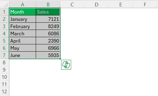
STEP 1: First, we ensure data is neatly arranged—categories in one column and corresponding values in another. Highlight the data range we wish to graph. For a nuanced view, I might compare monthly sales figures over a six-month period.
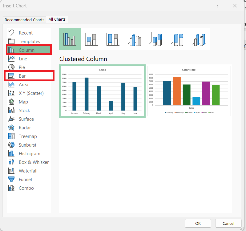
STEP 2: Next, navigate to “Insert” and click on “Recommended Chart.”
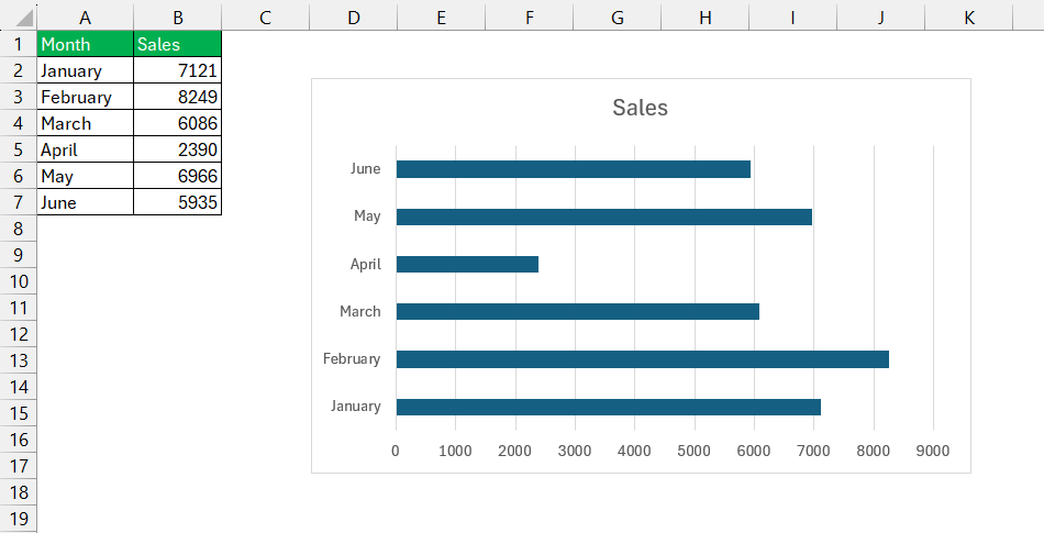
STEP 3: In the Chart Wizard, select “All Charts” tab and choose the “Column Chart” type for a vertical representation—Excel’s term for a bar graph. For a horizontal version, we opt for the “Bar” chart type.
Afterward, check that the data series are in columns within the spreadsheet. The data range should be an accurate reflection of the data selected, including headers if present.
The final steps are straightforward—adding a descriptive title, tweaking design elements like colors or gridlines, and removing the legend if it’s redundant.
Once completed, the chart materializes into a clear visual narrative of the data points. The simplicity of shaping data into a bar graph in Excel belies the power of its functionality, providing us with a means to communicate complex datasets with ease.
Building a Histogram with Excel’s Advanced Tools
Building a histogram in Excel taps into some of the application’s more advanced tools, integrating functionality designed to analyze large sets of data efficiently. Here’s a step-by-step guide to creating a well-defined histogram:
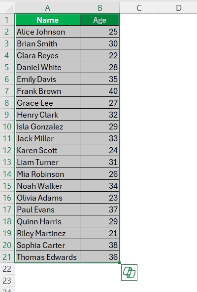
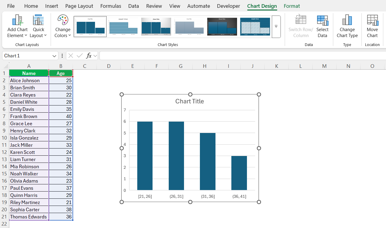
STEP 1: Prepare the data in a single column to form a continuous range. If analyzing the age group across a set of employees, we’d arrange their ages in one column.
STEP 2: Select the data and then choose “Insert” followed by “Recommended Chart.”
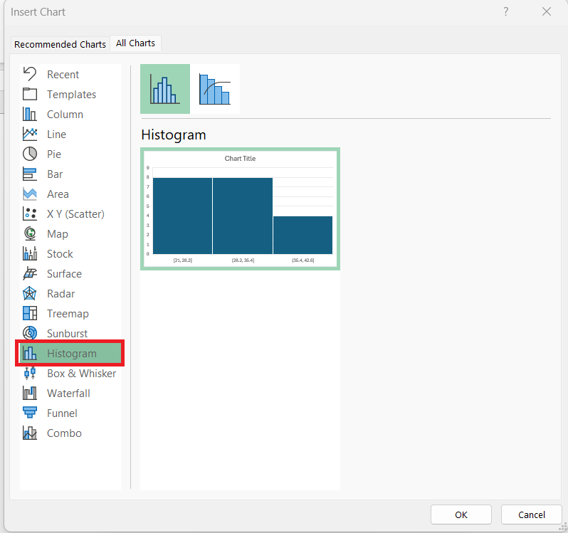
STEP 3: In the Chart Wizard, we select the “Histogram” option, which groups our data into bins. It’s crucial to note that these are not manually defined but algorithmically calculated by Excel to display data distribution accurately.
STEP 4: Adjusting the bins’ size, or ‘bucketing,’ is pivotal depending on our dataset and the story we’re trying to tell. This is done in the “Format Axis” options, where we can refine the bin width and tweak the axis options.
Finally, we personalize the histogram by adjusting titles, colors, and axes labels to make the chart as intuitive as possible for the viewer.
The histogram we create in Excel becomes a potent form of data expression, transforming raw numbers into digestible insight. It’s a skill that’s particularly useful when we aim to showcase trends and ranges within a dataset, like the spread of customer transaction values or frequency distribution of product defects.
The ability to discern these statistical narratives, often hidden within the depths of data, is dramatically enhanced by the considered use of a well-constructed histogram.
Visual Comparisons: Bar Graph vs Histogram
- Know Your Data: If my data is categorical, I stick to bar graphs. For numerical data distributions, histograms are my go-to.
- Customize Your Charts: I always take advantage of Excel’s design options to make my charts visually appealing and easy to understand.
- Label Clearly: Whether I use a bar graph or a histogram, I ensure my axis labels, titles, and legends are clear.
Real-World Excel Tips for Chart Selection
Best Practices for Business Analysis: Bar Graph vs Histogram
In business analysis, leveraging the full potential of data visualization tools is pivotal for informed decision-making. For bar graphs, best practices include using them to benchmark different entities against a given metric such as sales performance by region or customer satisfaction ratings across different service lines. These insights are instrumental in strategy meetings and budget allocations, where visual comparisons spark discussions and drive agendas.
Histograms, with their knack for revealing underlying data distributions, become indispensible when assessing processes, like the time it takes to resolve customer service tickets. Finite details about the spread and skew of data can point towards tendencies, deviations, or opportunities for process optimization. Such information is particularly relevant to operations and quality assurance teams, who can then undertake initiatives for improvement based on hard evidence provided by histograms.
In sum, the use of bar graphs and histograms in business analysis should be dictated by the nature of the data at hand: bar graphs for categorical comparison and histograms for examining data distributions. Clear labels, deliberate bin sizes for histograms, and selective data point highlighting are strategic touches that amplify the usability of these charts in decision-making.
Enhance Reporting with Accurate Chart Usage
Enhancing reporting accuracy hinges on matching the right chart to the data’s story. When assembling reports, we must reserve bar graphs for when we’re illustrating differences or changes across distinct entities or categories, like sales by quarter or customer demographics. This precise use helps stakeholders quickly ascertain where to focus attention or where strategies may be paying off.
When it comes to histograms, these are best deployed in reports analyzing volumes within a particular variable, such as the distribution of customer wait times. This ensures that patterns in the data—be it a bell curve, a skewed distribution, or outliers—are conveyed effectively, providing invaluable insights that could shape operational efficiencies or customer experience strategies.
Accurate chart usage in Excel is not just about aesthetics; it’s about fostering an environment where data speaks honestly and compellingly, with each chart type advancing the narrative in its unique way. Through thoughtful Excel chart selection, we bring specificity and clarity to reporting, a critical step toward being truly data-driven in our analysis and communications.
Frequently Asked Questions
What is a bar graph?
A bar graph is a visual representation that uses bars to compare different sets of data across categories. Each bar’s length or height corresponds to the data’s value, making it easy to see relative sizes. Bar graphs can be oriented horizontally or vertically and are excellent for visualizing differences in quantities across categories.
When can we create a histogram?
We can create a histogram when we have continuous data and want to observe its distribution across different intervals. It’s especially useful for understanding the frequency of data within certain range segments and is often instrumental in statistical analysis and process improvement decisions.
What Defines the Choice Between a Bar Graph and Histogram in Excel?
The choice between a bar graph and histogram in Excel is defined by the data type and the analytical goal. We use a bar graph for categorical data when we aim to compare or visualize differences between groups. In contrast, a histogram is chosen to showcase the distribution and frequency of continuous data. Selecting the right type ensures the data’s story is told effectively and accurately.
Can You Convert a Bar Graph to a Histogram in Excel?
Converting a bar graph to a histogram in Excel isn’t direct as they visualize different data types. However, we can adjust the data and format a bar graph to resemble a histogram by changing the bar spacing and axis scale. Yet, for true continuous data distribution, it’s best to create a histogram from scratch to ensure accuracy in data representation.
How do you choose the appropriate bin width for a histogram?
Choosing the appropriate bin width for a histogram involves considering the range of the data and the level of detail desired. Too narrow bins may clutter the graph with noise, while overly broad bins might oversimplify and obscure important patterns. It’s a balancing act that often requires experimenting with different sizes to best represent the underlying distribution of the data.
John Michaloudis is a former accountant and finance analyst at General Electric, a Microsoft MVP since 2020, an Amazon #1 bestselling author of 4 Microsoft Excel books and teacher of Microsoft Excel & Office over at his flagship MyExcelOnline Academy Online Course.

