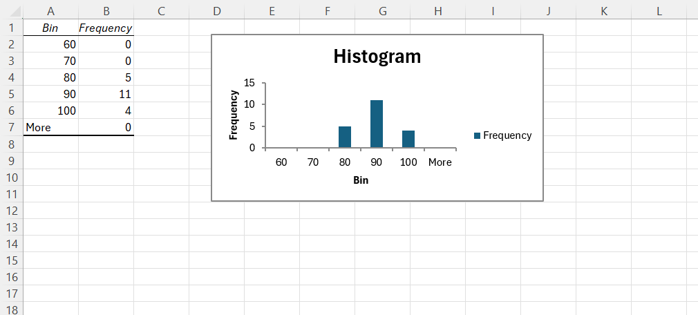
When analyzing data, I often want to understand its distribution to spot patterns or anomalies. One common distribution is the normal distribution, which results in a bell-shaped curve. Creating a bell-shaped histogram in Excel allows me to visualize this distribution and see how closely my data resembles a normal distribution. In this guide, I will show how to create a bell shaped histogram in Excel, explaining each step in detail.
Key Takeaways:
- A bell shaped histogram reflects a normal distribution, with most data points clustering around the mean.
- Proper data preparation is crucial for an accurate bell curve analysis in Excel.
- Configuring Excel’s histogram tool and calculating the mean and standard deviation are key steps.
- Ensuring data cleanliness and choosing the right bin range greatly affect the histogram’s accuracy.
- Bell curves are widely applicable in various fields like quality control, finance, and healthcare for data analysis.
Table of Contents
Mastering the Bell Curve in Excel
What Is a Bell-Shaped Histogram?
A bell shaped histogram reflects the normal distribution of data—what statisticians commonly refer to as the Gaussian distribution. This shape occurs when the frequency of data points peaks in the middle with the mean value and tapers off symmetrically towards each end.
It’s an incredibly useful visual that reflects consistency and helps to understand the general trend of a dataset. To achieve a bell shape, the data must follow the principle that most occurrences happen close to the average, creating that familiar and informative curve.
Setting Up Your Excel Spreadsheet
Preparing Your Data for Analysis
When I prepare data for bell curve analysis in Excel, I start by ensuring the dataset is thorough and relevant to the objectives of the analysis. It’s not just about having numbers—it’s about understanding the story behind those numbers. I collect each piece of raw data and organize it carefully in a spreadsheet, often employing additional categories or labels for clarity and ease of analysis.
Each data point gets its own cell in a single column, ensuring that they are properly sequenced and detectable by Excel’s analytical tools. This clarity in data arrangement allows the highlighting of trends and abnormalities more transparently once the histogram is created. I not only verify the accuracy of each data point but also consider the potential need for cleaning the data, which could involve removing duplicates or correcting outliers that may skew the results.
To keep Excel’s analysis precise, grouping similar points and using supplementary information, such as timestamps, might be a useful tactic. By using Excel’s data validation tools, I maintain the integrity of the dataset, ensuring a bell curve that is both true and meaningful to the context it represents. Moreover, the definition of each variable and its relevance to other data points is always top of mind to support a legitimate analysis outcome.
Configuring Excel’s Histogram Tool
Before plunging into the mechanics of generating a histogram, configuring Excel’s histogram tool is imperative to gain accurate representation from the dataset. I delve into the add-ons menu, making sure the Analysis ToolPak is enabled—an essential prerequisite for delving into histogram creation. By following a few quick steps, I can access the Histogram option directly from the “Data” tab and start creating visual data distributions effortlessly.
STEP 1: Click on the “File” tab at the top-left corner of the screen.
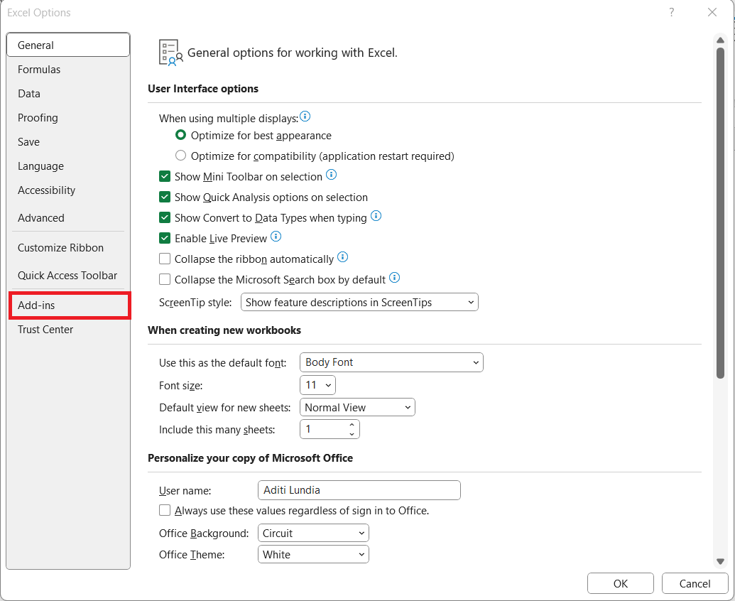
STEP 2: Scroll down and click on “Options” at the bottom of the left-hand menu.
STEP 3: In the Excel Options window, I click on “Add-ins” from the left-hand list.
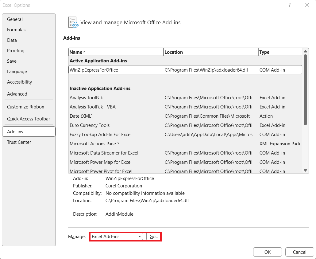
STEP 4: At the bottom of the window, I ensure that “Excel Add-ins” is selected in the “Manage” drop-down, then click “Go.”
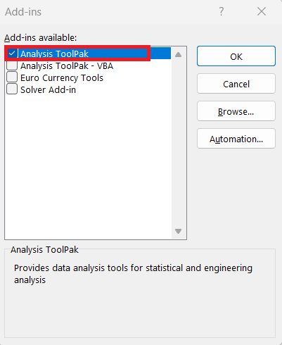
STEP 5: In the Add-Ins window, I check the box next to “Analysis ToolPak” and click “OK.”
Go back to the “Data” tab, where the “Data Analysis” option should now be visible on the right. Click it to use the Histogram tool.
Crafting the Perfect Bell Curve
Step-by-Step Instructions for Creating a Normal Distribution Graph
Creating a normal distribution graph, or a bell curve, in Excel might seem daunting at first, but by following a series of systematic steps, it becomes quite straightforward. Here’s my step-by-step guide:
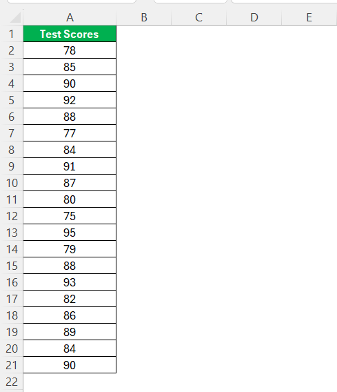
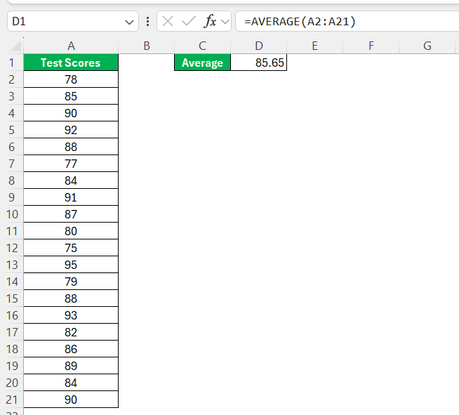
STEP 1: Open Excel and input the dataset I want to analyze.
STEP 2: Calculate the mean by typing =AVERAGE(A2:A21) in an empty cell and press Enter.
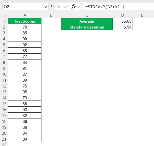
STEP 3: Calculate the standard deviation using the formula =STDEV.P(A2:A21) in another empty cell.
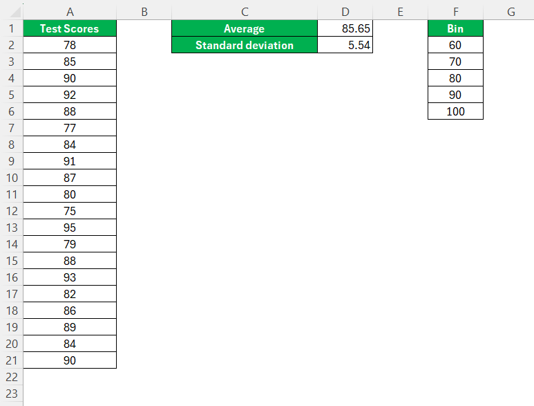
STEP 4: Create a list of bins based on my data range, entering the bin values in a separate column.
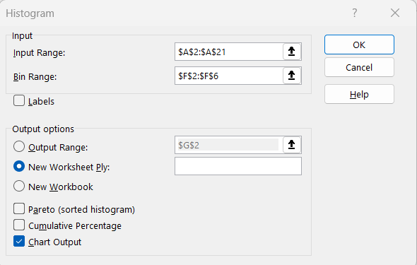
STEP 5: Go to the “Data” tab, select “Data Analysis,” and choose “Histogram,”. Input the data and bin ranges, and check the ‘Chart Output’ tickbox.
The bell shaped histogram is now ready!
Throughout the whole process, my focus remains on ensuring data consistency and accuracy in each operation to result in a reliable bell curve that represents the dataset.
Tips for Accurate Representation of Data with Bell Curves
Ensuring an accurate bell curve representation involves a few vital considerations. First off, I always confirm the data’s normalcy. This means verifying that it’s symmetrically distributed about the mean. I sometimes use a skewness test to be sure. If data doesn’t appear to be normalized, the interpretation of the bell curve might need a different statistical approach.
Next, I’m always meticulous about data cleanliness, which means removing any glaring errors or outliers that could distort the bell curve. The bin range is another critical factor – too wide and I risk oversimplifying the distribution, too narrow and I might be creating unnecessary noise. Precision in these parameters helps to fine-tune the curve against the histogram.
Ensuring that the total area under the curve is equivalent to 1 (or 100%) is also crucial. In probability terms, this denotes that all possibilities have been accounted for.
The mean and standard deviation wield significant influence over the shape of the bell curve. Any alterations here and I see the curve shift or distort, so these should be calculated with the utmost accuracy from a well-maintained dataset. Using Excel’s built-in functions helps to mitigate manual errors.
Finally, overlaying the bell curve onto the histogram allows me to compare the distribution of actual data points to the theoretical distribution. I make sure that the horizontal axis for both the histogram and the bell curve align perfectly for a correct overlay. This step is invaluable and often offers deep insights at first glance.
By minding these tips, I am able to craft a bell curve in Excel that not only visualizes data beautifully but does so with an accuracy that can be trusted for further analysis.
Application of Bell Curves in Data Analysis
Real-World Scenarios Where Histograms Are Essential
In the real world, histograms are essential in numerous scenarios, serving as invaluable tools for both general and specialized data analysis. They shine in quality control processes, where I use them to monitor product dimensions or performance and ensure they adhere to specifications. Any significant deviation from the bell curve prompts immediate attention to the manufacturing process.
In finance, asset managers and traders rely on histograms to understand the distribution of returns, helping them gauge risk and predict performance. For instance, a stock’s historical price data can be assessed to understand volatility and investment risk.
Education researchers and administrators utilize histograms to visualize test scores and academic performance. They assess the curves for insights like the effectiveness of educational strategies or programs.
Healthcare professionals apply histograms in patient data analysis. Weight, blood pressure, and cholesterol levels are all examples where a bell curve aids in identifying norms and anomalies within populations.
In social science research, through the visualization of income distribution or social metrics like survey responses, histograms are paramount in understanding societal structures and dynamics.
In each of these scenarios, not only do histograms provide a clear summary of large data sets, but they also allow experts to extract actionable insights and make informed decisions.
Interpreting Your Bell Curve: Beyond the Basics
Interpreting a bell curve goes well beyond its visually pleasing shape; it’s a process where I decode the underlying significance of data. Here’s how I do it: the center of the bell curve represents the mean of the dataset, essentially showing where the average sits. This central peak is where most of my data values cluster.
Next, I examine the spread of the bell curve—the width of the bell indicates the variance in my data. A narrower bell suggests data points are close to the mean, denoting consistency. Conversely, a wider bell implies greater variability, signaling that the data points differ significantly from the average.
I put special consideration into the tails of the bell curve, which taper off on either end of the mean. These tails encompass the rarity—the extreme values in my dataset. How quickly or slowly they descend towards the horizontal axis informs me about the occurrence of outliers within the dataset.
Standard deviation is my next field of scrutiny. One standard deviation away from the mean (to both sides) generally encompasses about 68% of the data in a normal distribution, while two standard deviations cover about 95%. This ’68-95-99.7 rule’ aids in assessing the probability of outcomes in relation to the mean.
Moreover, I often use the bell curve to predict probabilities. For example, determining the chance a new value will fall within a certain range of the mean can inform risk assessments and future planning.
Understanding the nuances of a bell curve’s shape and spread empowers me to predict, plan, and make decisions grounded in statistical evidence, thus driving meaningful interventions whether in business operations, quality control, or policy development.
FAQs
Can a histogram be bell shaped?
Yes, a histogram can be bell shaped. This occurs when the data it represents is normally distributed, showing a natural frequency distribution that peaks at the mean and symmetrically tapers off towards both ends. This bell shape is a visual indicator of the data’s adherence to the characteristics of a normal distribution.
How Do I Know If My Bell Curve is Correctly Shaped?
To verify if the bell curve is correctly shaped, I check for symmetry about the central peak, which should correspond to the data’s mean. Additionally, I confirm that about 68% of the values fall within one standard deviation of the mean, and approximately 95% within two standard deviations—a principle known as the empirical rule. If these conditions are met, the curve is likely correctly shaped.
What If My Data Doesn’t Fit the Normal Distribution Model?
If my data doesn’t fit the normal distribution model, I explore alternative statistical methods suited for non-normal distributions, such as transformation techniques or non-parametric tests. I might also consider using different types of charts that better represent the given data, like box plots or scatter plots, to provide meaningful insights.
How do I customize a histogram in Excel?
To customize a histogram in Excel, I usually right-click on the histogram chart and select ‘Format Data Series.’ From there, I can adjust bin widths, change colors and outlines, add data labels, and modify the axis scales. Experimentation with these settings allows me to present the data in a nuanced and insightful manner.
What is a skewed bell curve?
A skewed bell curve occurs when the distribution of data isn’t symmetrical. In a positively skewed curve, the tail extends towards the right, indicating that there are more high-end values. Alternatively, a negatively skewed curve has a tail that stretches left, showing an abundance of low-end values. This skewness affects data interpretation and statistical calculations.
John Michaloudis is a former accountant and finance analyst at General Electric, a Microsoft MVP since 2020, an Amazon #1 bestselling author of 4 Microsoft Excel books and teacher of Microsoft Excel & Office over at his flagship MyExcelOnline Academy Online Course.


