Bubble charts in Excel are one of those visualization tools that can seem a bit intimidating at first, but once you get the hang of them, they become incredibly useful, especially when you’re trying to display three dimensions of data on a two-dimensional graph. In this article, I’m going to walk you through what a bubble chart is, when to use it, and how to create one in Excel.
Key Takeaways:
- Bubble charts in Excel visually represent three dimensions of data on a two-dimensional graph, combining X and Y coordinates with bubble size.
- They are ideal for comparing multiple variables and detecting patterns, especially in financial analysis and project management.
- Creating a bubble chart in Excel involves organizing data in three columns and using the “Insert Bubble Chart” option under the “Scatter” charts.
- Customization, such as adding data labels, axis titles, and color coding, enhances the clarity and impact of the bubble chart.
- Bubble charts have limitations, such as clutter and overlap, requiring careful design to avoid misinterpretation.
Table of Contents
Introduction to Bubble Charts in Excel
Unveiling the Power of Data Visualization
When I first discovered bubble charts, I was amazed at how they could transform complex data into a visual language that was immediately interpretable. Data visualization is a potent tool—it shapes raw data into a form that can reveal insights, patterns, and stories lurking behind the numbers.
What is a Bubble Chart and When to Use It?
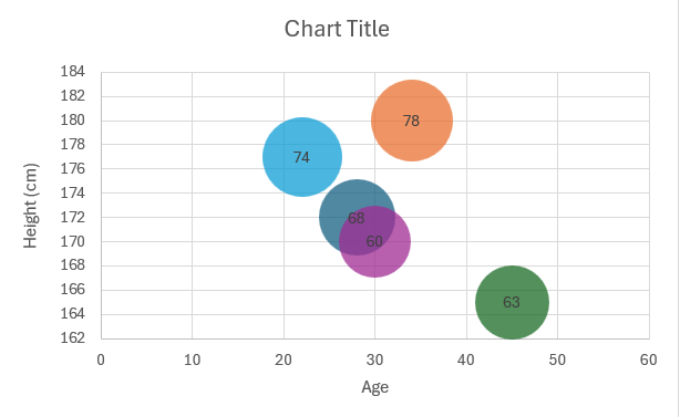
A bubble chart is not just any other chart; it’s like a scatterplot given an extra dimension of meaning. Each bubble on the chart represents a data point, where the placement reflects two variables, and the size of the bubble adds a third variable into the mix. This could represent anything from market share to population, depending on your data.
I find it particularly suited for situations where conventional charts fall short. If you’re dealing with more than two variables and need to display a third dimension without complicating the graph, a bubble chart is your go-to tool. It shines in financial analysis, project management, and economics, simplifying the comparison of entities based on multiple metrics. When it’s essential to track relationships, differences, and trends across data points that are all interrelated, that’s when a bubble chart can truly enhance my understanding of the dataset.
Creating a Bubble Chart in Excel
Step-by-Step Instructions
Creating a bubble chart in Excel is straightforward. Here’s a step-by-step guide:
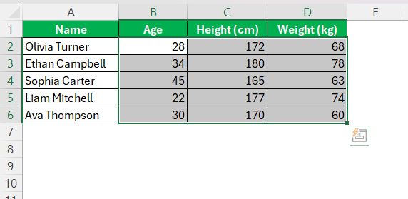
STEP 1: Make sure your data is organized in three columns. For instance, let’s say you have data for different people with corresponding values for their age, weight and height. Your data should look something like this:
STEP 2: I highlight the complete data range excluding headers.
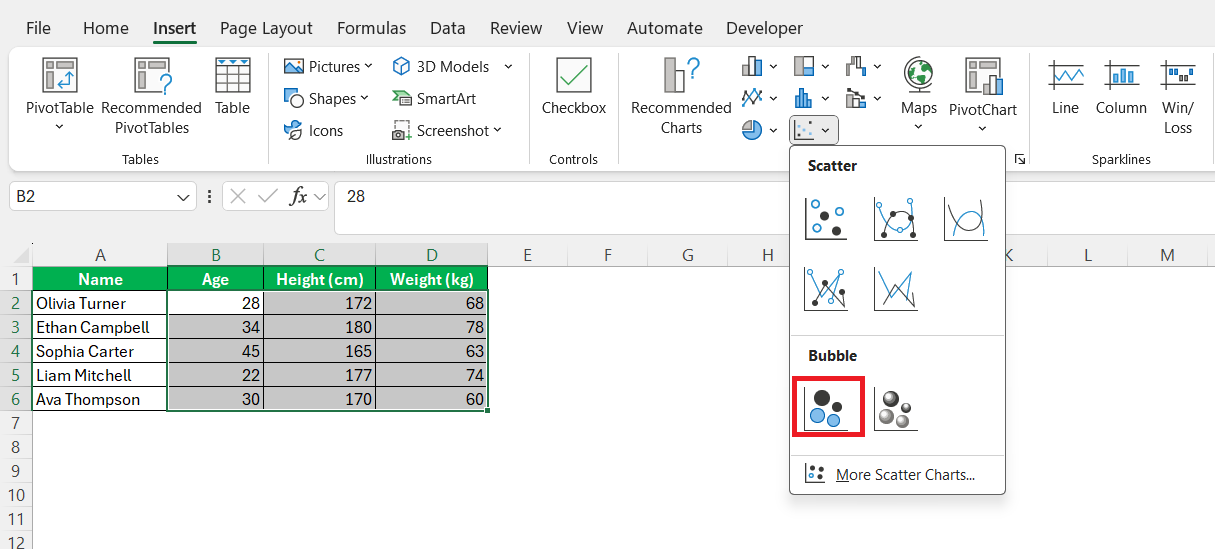
STEP 3: I navigate to the “Insert” tab on the Excel ribbon. There is a sense of excitement at this point. From the charts group, I click on the “Insert Scatter (X, Y)” or just hover to see all options.
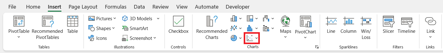
STEP 4: Then, I choose Bubble from the array that appears—beginning the transformation process.
Excel now springs into action, automatically generating a preliminary bubble chart, which, though raw, starts to tell the story hidden within the numbers.
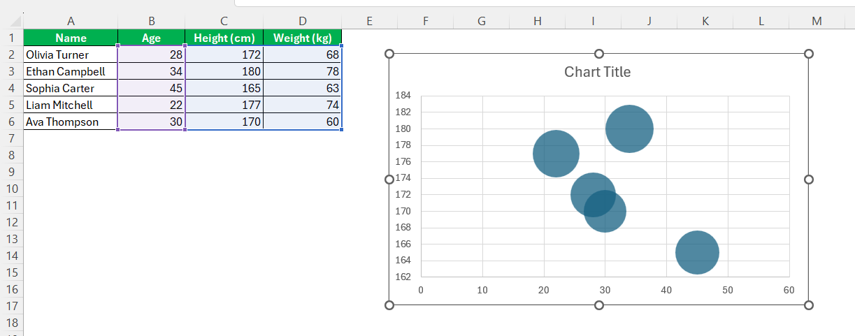
This creates the rudimentary framework of our bubble chart, setting the stage for further customization and refinement which will truly bring our data to life.
Adding Data Labels to a Bubble Chart
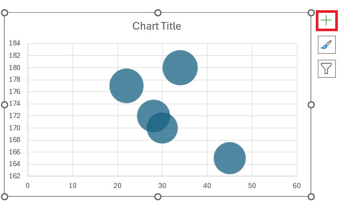
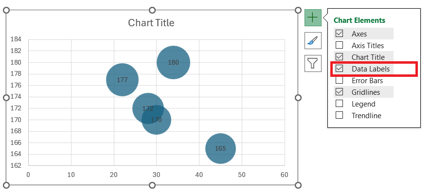
STEP 1: First, I click on the bubble chart that I’ve already created in my Excel worksheet. I then click on the green plus (+) icon that appears next to the chart when it’s selected. This icon represents Chart Elements.
STEP 2: From the Chart Elements menu, I check the “Data Labels” option. The labels will automatically appear on the bubbles in the chart.
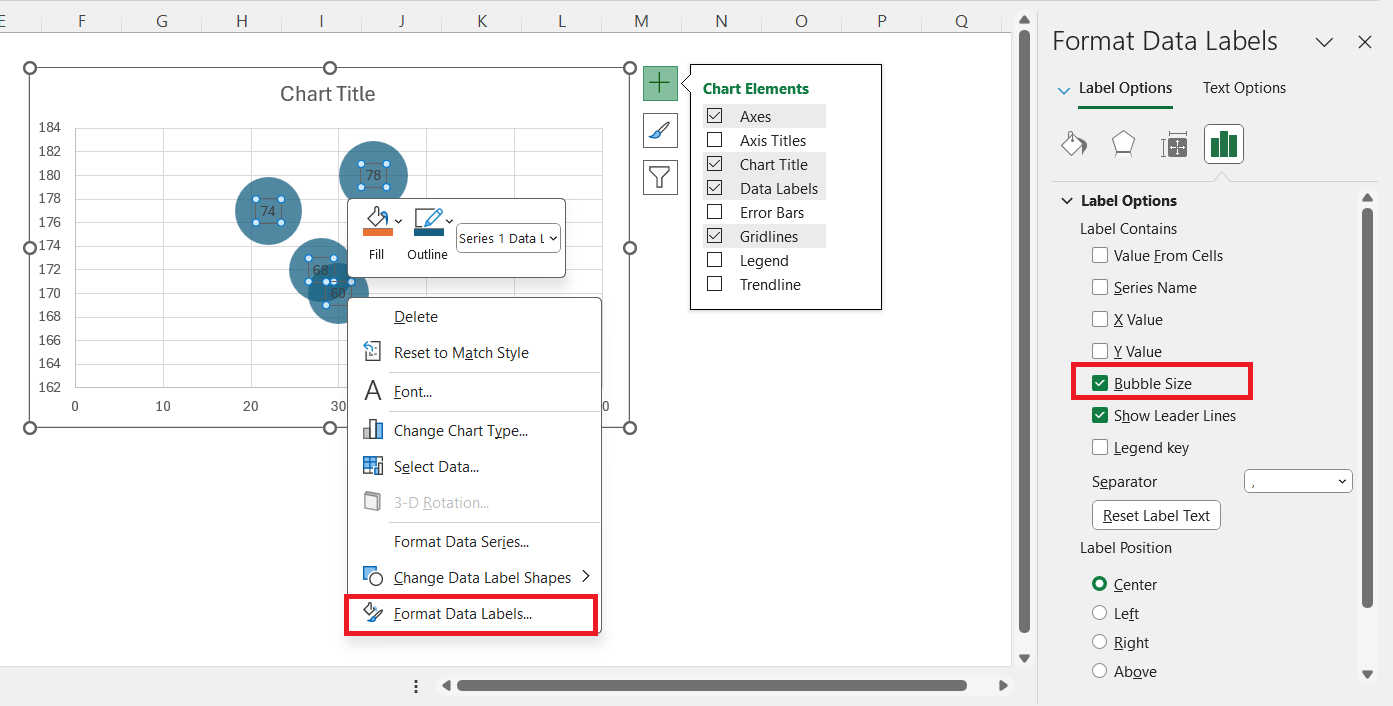
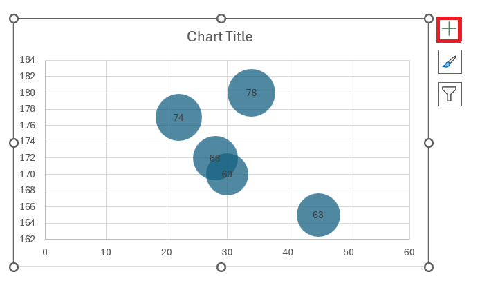
STEP 3: If I want to customize the data labels, I right-click on any of the labels and choose “Format Data Labels.” In the Format Data Labels pane, I can choose what information to show, like the bubble size, X or Y values, and more.
Adding Axis Titles to a Bubble Chart
STEP 1: I start by clicking on my bubble chart to make sure it’s selected. Just like before, I click on the green plus (+) icon next to the chart.
STEP 2: I check the “Axis Titles” option in the Chart Elements menu. This adds titles to both the horizontal (X-axis) and vertical (Y-axis).
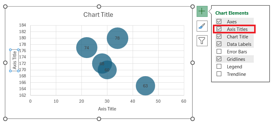
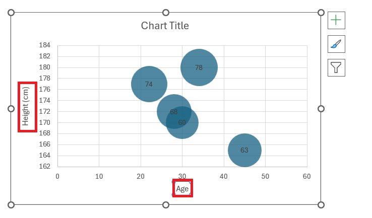
STEP 3: I click on the default “Axis Title” text that appears on each axis to edit it. I type in the title that best describes the data for each axis.
Bringing Your Bubble Chart to Life
Customize with Color and Scale
Colors add not just aesthetic appeal but can significantly enhance the comprehension of data. I approach this customization with an eye for balance; too many colors can overwhelm, while too few might not convey the variation effectively. Here’s a play-by-play:
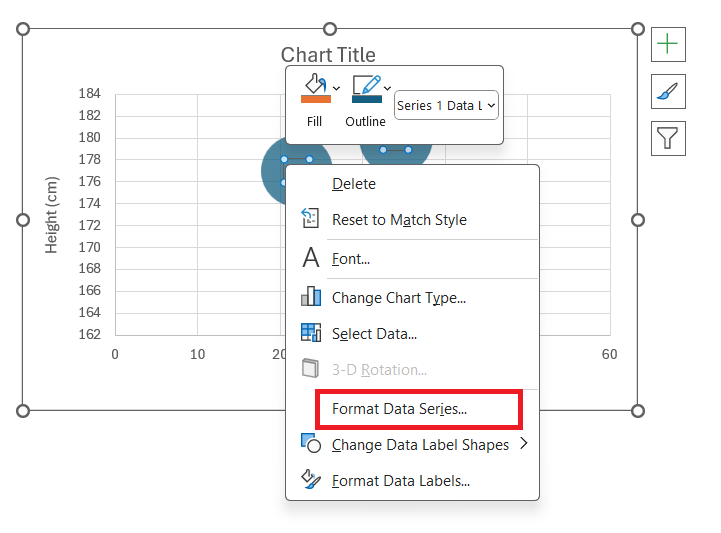
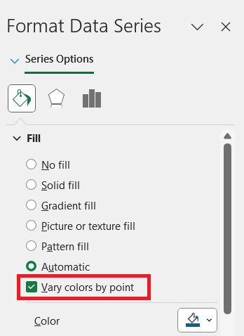
STEP 1: Right-click on the chart and select ‘Format Data Series’.
STEP 2: On the Format Data Series pane, I click on the Fill icon for bubble fill options.
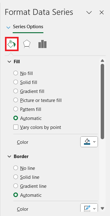
STEP 3: By selecting ‘Vary colors by point,’ the chart bursts into a spectrum where each bubble has a distinct hue based on its values, much like a painter adding life to a canvas with color.
Balanced color-coding alongside appropriate scaling gives me a chart that’s as informative as it is captivating.
Formatting Tips for Visual Clarity
Achieving visual clarity in bubble charts is essential for effective communication. Here’s what I’ve learned:
- Simplicity is Key: The chart should never be cluttered. I use only necessary elements and remove gridlines or backgrounds that don’t serve a purpose.
- Consistent Formatting: Uniformity in data labels, bubble sizes, and axes specifications maintain a clean look.
- Strategic Color Use: I employ colors to distinguish data points or to represent different categories, but I keep the palette limited and complementary.
- Descriptive Titles and Labels: Axis titles and data labels must be concise but informative. They guide viewers along the data narrative without the need for extra interpretation.
- Size Accordingly: When scaling bubbles, I ensure they’re all visible and proportional, so even the smallest bubble is noticeable.
The effectiveness of any chart lies in its ability to tell a story—formatting for clarity ensures that your story is understood at a glance.
Tips & Tricks
Best Practices for Presenting Clear Trends
Presenting clear trends in a bubble chart demands a thoughtful approach. Here’s what I adhere to:
- Start with the Axes: I ensure that the variables on both the X and Y axes are well-chosen to signify the chart’s core message.
- Bubble Size and Trend Visualization: I use bubble size uniformly to display a third variable and steer clear of exaggerated scaling that could mislead viewers.
- Use a Grid Sparingly: While a grid can help with precision, I use it minimally to avoid visual distractions.
- Guide with a Legend: To reveal what different bubble sizes mean, I always include a legend. Without it, viewers can misinterpret the data.
- Strategic Color Coding: If additional variables are involved, I use a color gradient or distinct color schemes to signify different categories, increasing the interpretability of trends.
- Avoid Unnecessary Decoration: I keep things simple. Extraneous visual elements that don’t serve a clear function are excluded.
Sticking to these practices, one can ensure a bubble chart remains an incisive tool for trend visualization.
Advantages and Disadvantages of Bubble Charts
Bubble charts can be illuminating when it comes to showcasing complex datasets. I’ve seen their advantages firsthand:
- Multidimensional Analysis: They splendidly represent three variables on a two-dimensional plot.
- Pattern Detection: I’ve uncovered hidden correlations and outliers that might be missed in tabular data.
- Information Density: They pack a wealth of information into a single chart without appearing cramped.
However, there are disadvantages to contend with:
- Clutter: If I have too many data points, the chart can quickly become a mess.
- Overlap: Bubbles can overlap, causing confusion and making it hard to distinguish between data points.
- Perception Issues: It takes skill to interpret bubble charts, and incorrect sizing can skew perception.
In essence, the power of bubble charts in Excel hinges on my awareness of these strengths and limitations.
FAQ: Maximizing Your Excel Bubble Charts
What is a bubble chart used for?
A bubble chart is used for displaying three dimensions of data. With its help, we can visualize relationships, comparisons, and patterns among data points. It’s particularly useful when I want to compare and contrast a set of numbers and understand the interaction between different variables.
How do you create a bubble chart in Excel?
To create a bubble chart in Excel, I organize my three sets of data, select them, and then head over to the ‘Insert’ tab. From there, I click on ‘Chart’ and choose ‘Bubble’. Excel then inserts the chart into my worksheet, from where I can custom-tailor it to meet my needs.
What are the 4 variables in a bubble chart?
In a bubble chart, the four variables typically include two for the axes (X and Y), one for the bubble size (usually reflecting volume or magnitude), and an optional fourth variable, which might be color-coded to represent different categories or time progression.
What is the difference between bubble and scatter?
The main difference between a bubble and scatter plot is the third dimension in bubble charts, represented by the bubble size. While scatter plots show the relationship between two variables, bubble charts add a size aspect, allowing me to present an additional data set.
What Are Some Common Mistakes to Avoid When Creating a Bubble Chart?
Some common mistakes to avoid when creating a bubble chart include:
- Overlooking the significance of the third variable, which can lead to a confusing message if it doesn’t contribute meaningfully to the overall story; it’s better to use simpler plots in such cases.
- Ignoring the potential for overplotting, which results in a cluttered chart that is hard to read; this can be managed by adjusting transparency and bubble size, but may also indicate the need for an alternative chart type.
- Failing to place the two most crucial variables or relationships on the vertical and horizontal axes, as this can obscure key trends and insights that the chart is intended to convey.
Aditi Lundia


