In this article, I’ll explore the fascinating world of bullet charts in Excel, a powerful tool for visualizing performance metrics. As someone who enjoys simplifying complex data, I find bullet charts incredibly effective for displaying comparisons and progress toward goals. Join me as I delve into how to create and utilize bullet charts to enhance your dashboards and reports.
Key Takeaways:
- Bullet charts compare a primary measure to a target while adding performance ranges for context.
- Excel lacks a built-in bullet chart, but you can create one using stacked bar charts and formatting tricks.
- Bullet charts are more space-efficient than gauge charts, making them ideal for dashboards with limited space.
- These charts are useful in tracking KPIs, project progress, or budget performance in reports.
- When creating bullet charts, avoid overcrowding data and unclear target markers for better readability.
Table of Contents
Unlocking the Mystique of Bullet Charts
What Is a Bullet Chart?
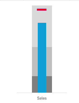
A bullet chart is a variation of a bar chart but offers more information by allowing you to display a primary measure, compare it to a target, and add qualitative ranges for performance thresholds (such as poor, average, and excellent). It consists of five key elements:
- The Actual Value: This is the main measure or performance value you’re tracking.
- The Target: A reference point showing the goal or target to meet.
- The Performance Ranges: These qualitative ranges (e.g., low, medium, high) show how well the actual value performs relative to expectations.
- Comparative Marker: Often represented as a small line or bar to visually indicate the target or goal.
- The Scale: Provides the context for the measurement by showing the minimum, maximum, and intermediate values.
Why Use Bullet Charts?
Bullet charts provide a compact way to visualize data. Unlike gauge charts, which often take up a lot of space but convey limited information, bullet charts can pack in more data without overwhelming the viewer. They are particularly useful for KPIs (Key Performance Indicators) in dashboards where space is a premium.
Creating a Bullet Chart in Excel
While Excel doesn’t have a built-in bullet chart option, we can create one by combining a stacked bar chart with some additional formatting tricks. I’ll guide you step by step through creating one using Excel’s existing tools. Let’s get started!
Step-by-Step Guide to Creating a Bullet Chart
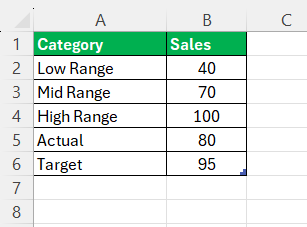
STEP 1: The first step in creating a bullet chart in Excel is to structure your data properly. Let’s say we’re tracking the performance of sales against a target, and we want to visualize this performance in a bullet chart.
Your data should look something like this:
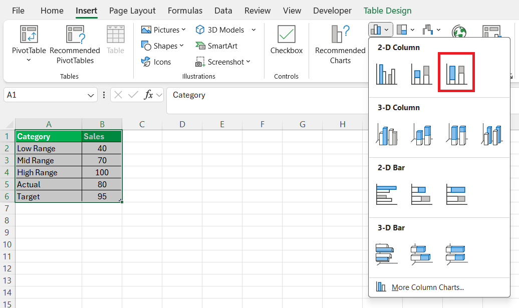
STEP 2: Highlight the table containing the data. Go to the Insert tab, select Column Chart, and choose 100% Stacked Bar.
STEP 3: Select the chart and then go to the Chart Design tab and select Switch Row/Column.
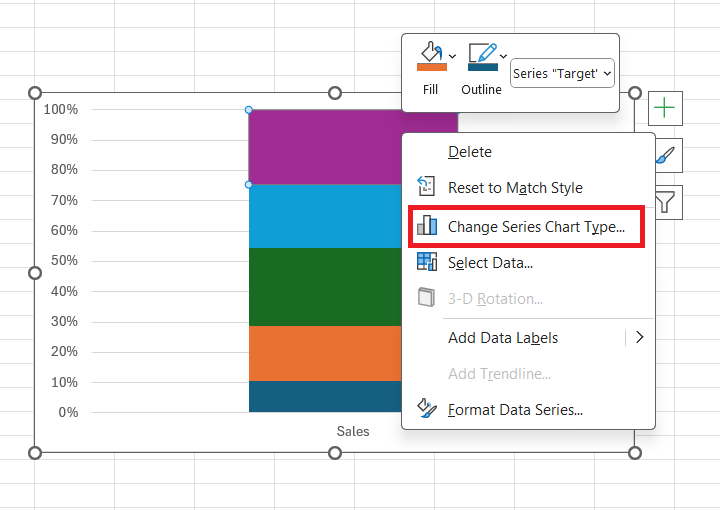
STEP 4: Right-click on the bar representing ‘Target’ and select Change Series Chart Type.
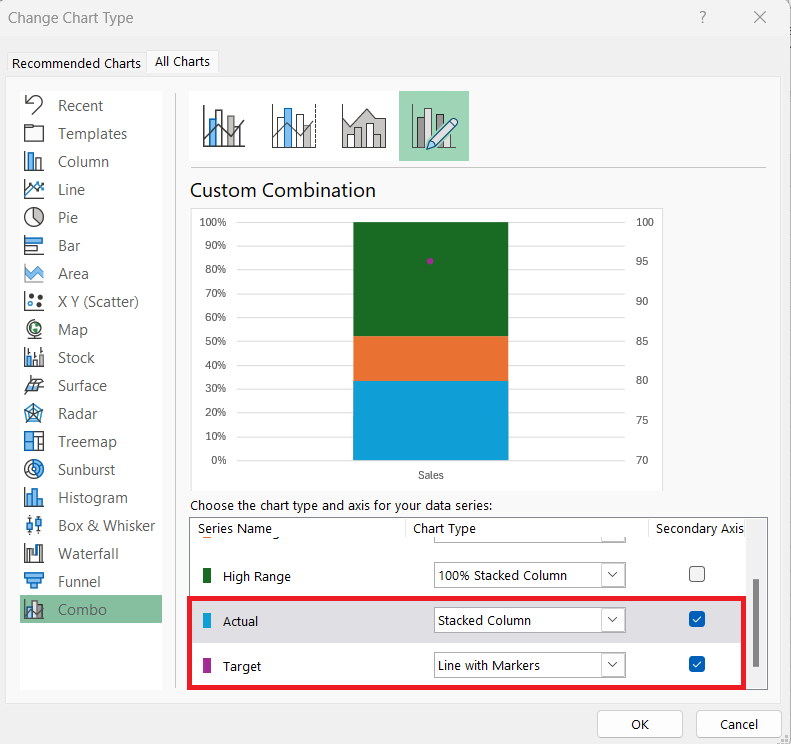
STEP 5: In the Change Chart Type dialog box, make the following changes –
- For Target – Change the chart type to Line with Markers and check the box for the secondary axis.
- For Actual – Change the chart type to Stacked Column and check the box for the secondary axis.
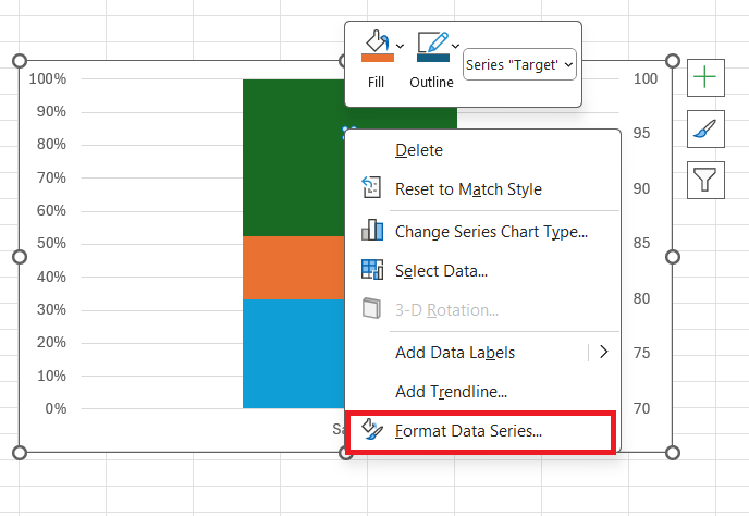
STEP 6: Right-click the marker for Target and select Format Data Series.
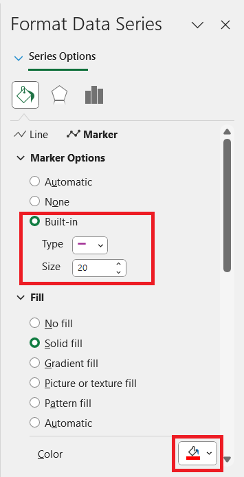
STEP 7: In the dialog box, go to Fill > Marker > Marker Options > Built-in. Select the line, change the size to 20, and color to red.
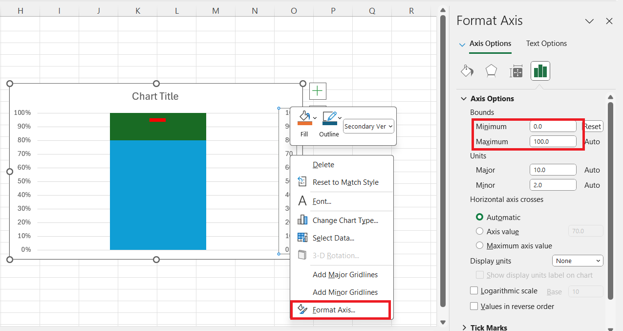
STEP 8: Right-click on the secondary axis and select Format Axis. Set the minimum bound to 0 and the maximum bound to 100.
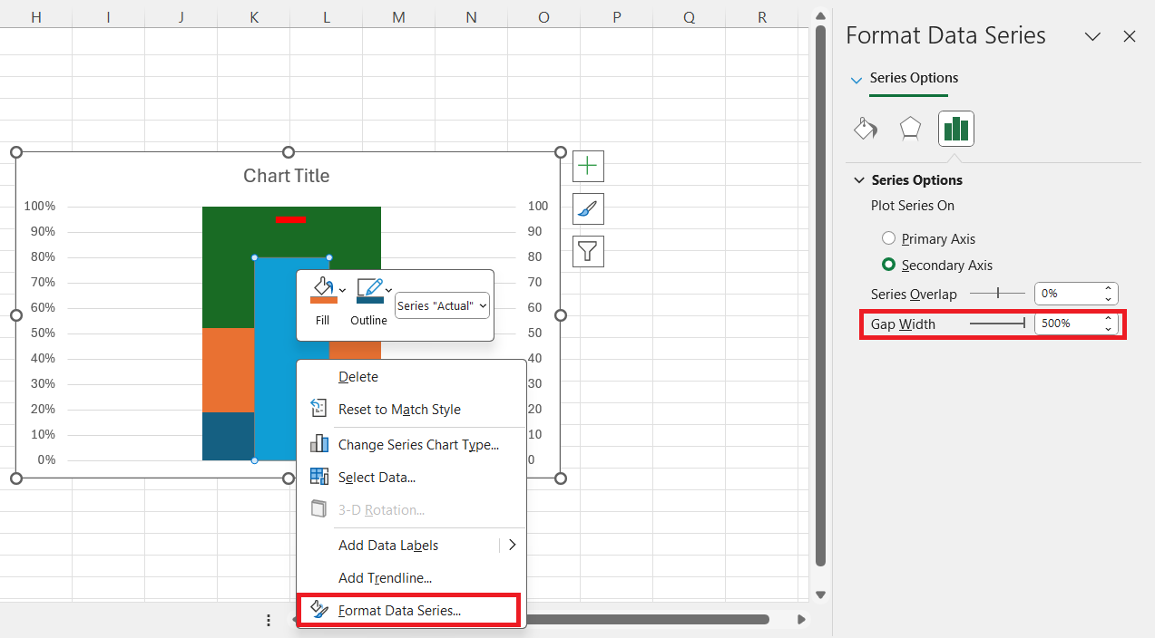
STEP 9: Right-click on the Actual data series and select Format Data Series. In the dialog box, set the Gap width to 500%.
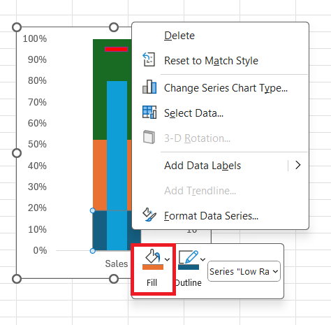
STEP 10: Right-click on the bar and change the fill color.
Now, you have a functional bullet chart in Excel!
Tips & Tricks for Bullet Charts
Advantages of Bullet Charts
- Space Efficiency: Bullet charts are much more compact than traditional gauge charts.
- Information Density: They can convey a target, actual performance, and qualitative performance ranges in a single compact space.
- Ease of Interpretation: The visual layout of a bullet chart makes it easy to quickly see how well actual performance stacks up against the target.
When to Use Bullet Charts
Here are some scenarios where bullet charts are especially useful:
- Performance Dashboards: If you’re building a dashboard to track key metrics, bullet charts can help display multiple data points without clutter.
- Monthly or Quarterly Reports: Bullet charts are excellent for tracking progress toward goals, such as sales targets or production benchmarks.
- Project Management: Track project completion versus deadlines, highlighting when things are on track or behind schedule.
Limitations of Bullet Charts in Excel
Excel, while versatile, doesn’t natively support bullet charts, so you need to rely on workarounds. The process I described above is not as straightforward as inserting a typical bar chart or pie chart. Additionally, if your data changes frequently, you may need to adjust the formatting and scaling manually.
Moreover, interpreting performance ranges can sometimes be subjective. It’s important to carefully choose the thresholds that accurately represent the data.
Bullet Charts in Action
Real-world Examples of Bullet Chart Utility
In the real world, I’ve observed how bullet charts become powerful allies across divergent sectors. Sales teams employ them to compare individual performance against quotas, while financial departments monitor budgets, shining light on whether they’re singing to the tune of fiscal prudence or facing a budgetary discord.
In strategy meetings, bullet charts distill complex forecast data, so stakeholders can immediately grasp how actual revenues stack up against projections. The utility of bullet charts in these scenarios lies in their proficiency to communicate complex data in a comprehensible way that drives informed action.
Interpretation Tips for Reading Between the Bars
As for reading between the bars of our conjured bullet charts, there are a few interpretation tips that help me unlock even deeper insights. I always start by identifying the central feature measure—this is our performance indicator shining bright in the graphical ensemble. Then, I scout for the reference line or marker that signifies our goal or threshold.
The intersection between the performance and this line tells me a tale of triumph or one where ambitions haven’t yet been met. I also scrutinize any color gradations or additional comparative measures that provide context, making sure to consult the legend to understand their meanings thoroughly.
Frequently Asked Questions
What is a bullet chart in Excel?
A Bullet chart in Excel is a data visualization tool used to compare a primary performance measure, such as current revenue, against a target, like a quarterly sales goal. It’s a bar chart that includes qualitative ranges to gauge performance at a glance, perfect for illustrating how well objectives are being met within a single, concise graph.
How Can I Make My Bullet Chart Stand Out?
To make a bullet chart stand out, focus on clarity and simplicity. Select contrasting colors for different data points to ensure they are easy to distinguish. Minimalist design cuts clutter, and customizing elements like chart titles and labels to be informative yet succinct can also enhance readability. Lastly, leveraging Excel’s style and color formatting features breathes life into the usually staid numbers, ensuring that your bullet chart captures and retains attention.
Can you make a bullet chart in Excel?
Yes, you can make a bullet chart in Excel, although it’s not an in-built chart type. You will implement it using a combination of bar charts and clever formatting tricks. This involves creating a stacked bar or column chart to serve as the bullet graph’s base and then adding additional data series to represent targets, all followed by fine-tuning the aesthetics for clarity and impact.
What are the different types of bullet charts in Excel?
In Excel, bullet charts are typically differentiated by their orientation; they can be crafted horizontally or vertically, depending on the data and dashboard layout. Each type serves the same purpose—to compare performance against a target—but their arrangement can be tailored to best suit the data’s context or the space available on your Excel dashboard. Whether using a horizontal or vertical bullet chart, the presentation and the story it tells remain sharp and insightful.
What Are Common Mistakes to Avoid When Creating Bullet Charts?
When creating bullet charts, common mistakes include overcrowding with too much data, which can dilute the chart’s impact. Using similar colors for different data points can lead to confusion, and setting inappropriate scales may obscure the performance context. Not clearly defining the target and actual measures can make the chart ambiguous. Ensuring simplicity, clarity, and context are keys to avoiding these pitfalls and crafting an effective bullet chart.
John Michaloudis is a former accountant and finance analyst at General Electric, a Microsoft MVP since 2020, an Amazon #1 bestselling author of 4 Microsoft Excel books and teacher of Microsoft Excel & Office over at his flagship MyExcelOnline Academy Online Course.

