When working with data that involves plotting a curve, calculating the area under the curve can provide insightful information. In Excel, this can be done using various methods, depending on the nature of your curve and the data points you have. Here, I’ll walk you through a couple of ways to calculate the area under a curve in Excel.
Key Takeaways:
- Choose the Right Chart: Use a scatter plot or line chart in Excel to accurately represent your data and visualize the area under the curve.
- Approximation Methods: For a simple estimation, use rectangles (Riemann sums) or the trapezoidal rule for improved accuracy in calculating the area.
- Customizations Enhance Precision: Adding gridlines, data labels, and other chart customizations in Excel can help in calculating areas more precisely.
- Trapezoidal Rule for Accuracy: The trapezoidal method offers a closer approximation for non-linear curves compared to using rectangles.
- Excel’s Versatility for Integration: Though Excel doesn’t have a direct “Area Under Curve” function, combining formulas and charting tools allows you to perform these calculations effectively.
Table of Contents
Introduction to Area Under the Curve
Understanding the Concept in Excel
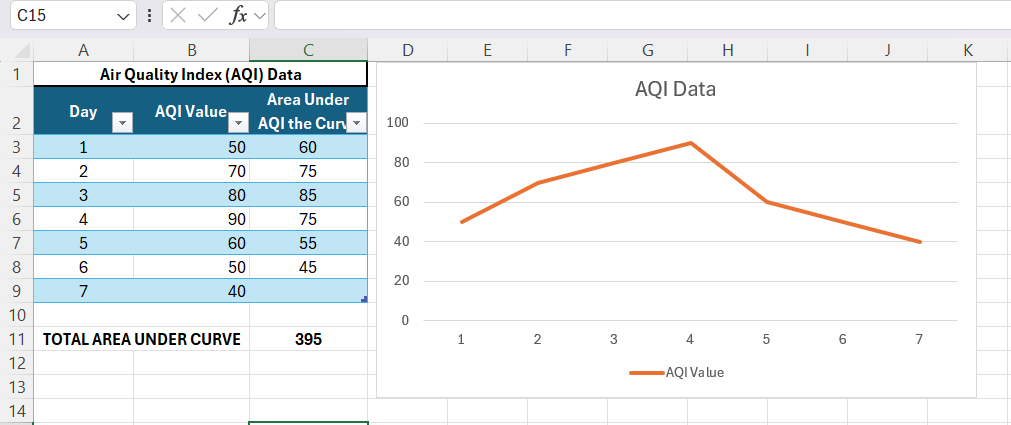
In Excel, the concept of analyzing data through graphical representations often involves calculating the area under a charted line or curve, which can convey a wealth of information. In technical terms, this area signifies an integral in calculus—a concept vital for understanding the cumulative effect of data points plotted over a period. This could represent growth over time, total revenue versus expenditures, or a drug’s blood concentration in pharmacokinetics or AQI data area under the curve, among numerous other applications.
While Excel doesn’t provide a direct function labeled as “Area Under the Curve,” the tool’s versatility allows me to utilize formulas and features to perform this calculation effectively.
The Basic Approach to Calculating Area in Excel
Using Simple Rectangles for Approximations
For starters, one way to approximate the area under a curve in Excel involves using the simplest geometric shape: the rectangle. This method is akin to the mathematic Riemann sum, which breaks down the area into a series of contiguous rectangles. Although it is not the most precise, it’s a quick way to get a rough estimate.
To apply this in Excel, I delineate each segment of the x-axis and compute the area for each rectangle—formed by the x-segment width and the y-axis value at the start or the end of each segment. Summing these areas gives me an approximation of the total area. The smaller the rectangles (i.e., the more segments I create), the closer this approximation will mirror the actual area.
I recorded the speed of a vehicle during a 5-hour trip and now want to approximate the total distance traveled. To do this, I’ll use a simple method that involves calculating the area under the speed curve using rectangles. I followed these simple steps:
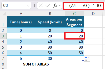
STEP 1: First, I enter the time and speed values into an Excel spreadsheet.
STEP 2: Next, I calculate the area for each time segment using rectangles. The formula I’ll use for each rectangle’s area is:
Area=Width×Height
The width is always 1 hour, and the height is the speed at the start of each interval.
In Excel, I enter the formula in column C. For example, in cell C2, I input:
“=(A3 – A2) * B2” and drag this formula down till last segment C6
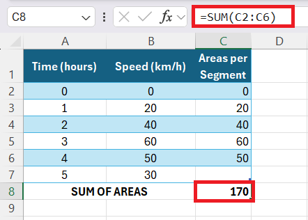
STEP 3: Finally, I sum the calculated areas. In a new cell (let’s say C8), I input:
However, due to the simplicity of this approach, it’s best reserved for instances where precision isn’t paramount, or the curve closely aligns with a step function.
Applying the Trapezoidal Rule for Better Accuracy
When precision matters, I often turn to the trapezoidal rule for a more accurate approximation of the area under a curve. This technique is essentially an upgrade from using rectangles, as it replaces them with trapezoids, which better conform to the shape of most curves.
In practice, for each pair of adjacent data points along the x-axis in Excel, I draw a trapezoid under the curve and calculate its area. The formula for the area of a trapezoid, defined as ((a+b)/2 \times h), becomes ((y1+y2)/2 * (x2-x1)) in this context, where y1 and y2 are the data values at consecutive x-values x1 and x2. Summing these individual trapezoids’ areas provides me with the total area under the curve. These steps helped me:
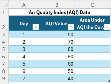
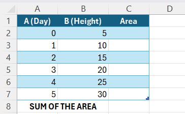
STEP 1: First, I enter the day and height values into an Excel spreadsheet.
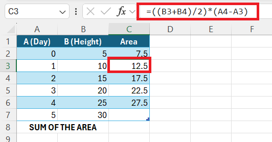
STEP 2: To calculate the area for each trapezoid formed by adjacent data points, I use the formula:
Area=(y1+y2)/2*(x2−x1)
In Excel, this translates to:
=((B2+B3)/2)*(A3-A2)
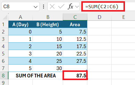
STEP 3: Finally, I sum the calculated areas to find the total growth over the 5 days. In a new cell (let’s say C8) enter formula: “=SUM(C2:C6)”.
By leveraging the trapezoidal rule in Excel, I can derive a figure that is remarkably close to the actual area, which can be crucial for detailed and critical data analysis—especially when dealing with linear data interpolation or financial forecasting.
Step-by-Step Guide to Calculate Area Under the Curve
Creating the Right Type of Chart
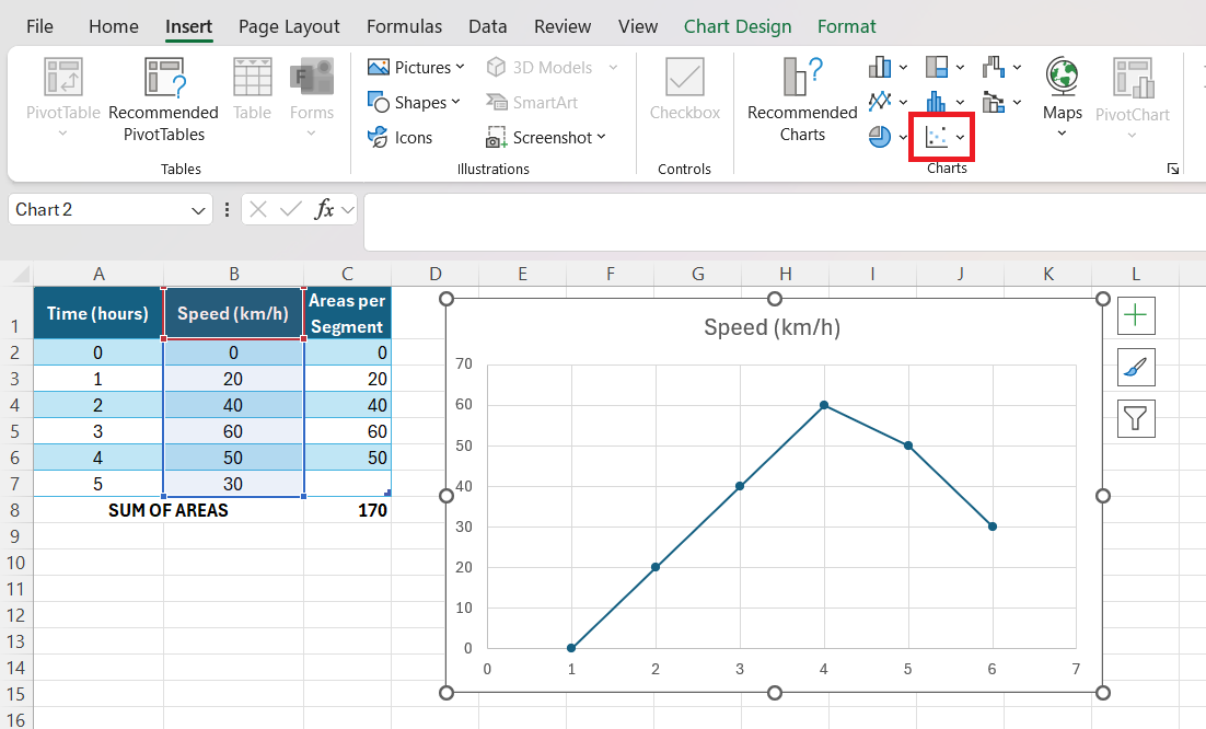
Before diving into the calculations, it’s imperative I choose the appropriate chart type to visualize the data effectively. In Excel, the right chart is often a scatter plot for discrete data points or a line chart for continuous data sets. These chart types let me accurately depict the relationship between the variables and understand the trend before me.
Creating the right type of chart involves selecting the data range and navigating to the ‘Insert’ tab, where I select ‘Scatter’ or ‘Line’ from the variety of chart options available.
It’s important that this initial visualization aligns closely with the shape of the actual data curve to ensure that any subsequent area calculation reflects the real-world scenario as closely as possible.
Customizing Charts for Area Calculation
Once I’ve created the right type of chart, customizing it for area calculation is crucial. This personalization enhances readability and precision, enabling me to see the exact heights and baselines of the shapes I’ll be working with. Here’s how I approach chart customization:
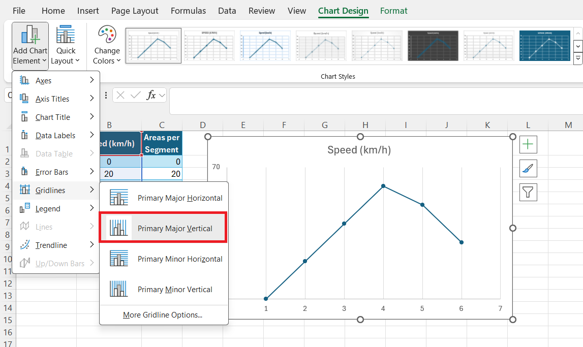
First, I add vertical gridlines to delineate distinct intervals on the x-axis, making it easier to divide the curve into sections for area approximation.
Then, I add data labels to display the actual values at specific data points, further informing my estimation of the area beneath each segment of the curve.
These simple adjustments create a chart that’s not only visually appealing but also optimized for more accurate area calculation.
FAQs
Can Excel calculate area under the curve?
Yes, Excel can estimate the area under the curve using numerical methods like the Trapezoidal Rule or by calculating definite integrals of trendline equations for plotted data points. It lacks a direct function but can handle the task using various approximations or add-ins for more complex analysis.
What is the formula for area under the curve?
The area under the curve is commonly calculated using the integral of the curve’s equation between two points. For straight-line graphs, it’s (base * height), for trapezoids (base1 + base_2)/2 * height), and for curves, it involves more complex integral calculus, utilizing the definite integral of the function representing the curve.
How Do I Create An Accurate Chart For Area Calculation In Excel?
To create an accurate chart in Excel for area calculation, use a scatter plot or line chart to represent your data precisely. Customize it by adding gridlines and data labels, and adjusting transparency for clarity. Choose the right data range and insert the correct type of chart for the data set.
What Are Some Common Mistakes To Avoid While Calculating Area?
When calculating area under curve in Excel, avoid common mistakes like using too few data points, which reduces accuracy. Be sure not to mix up data ranges, misapply formulas, or forget to account for the scale of the axes. Also, ensure that the methodology matches the complexity of the curve to avoid significant errors in estimation.
John Michaloudis is a former accountant and finance analyst at General Electric, a Microsoft MVP since 2020, an Amazon #1 bestselling author of 4 Microsoft Excel books and teacher of Microsoft Excel & Office over at his flagship MyExcelOnline Academy Online Course.

