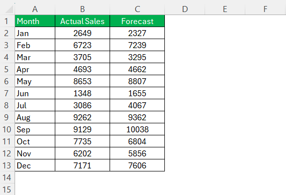
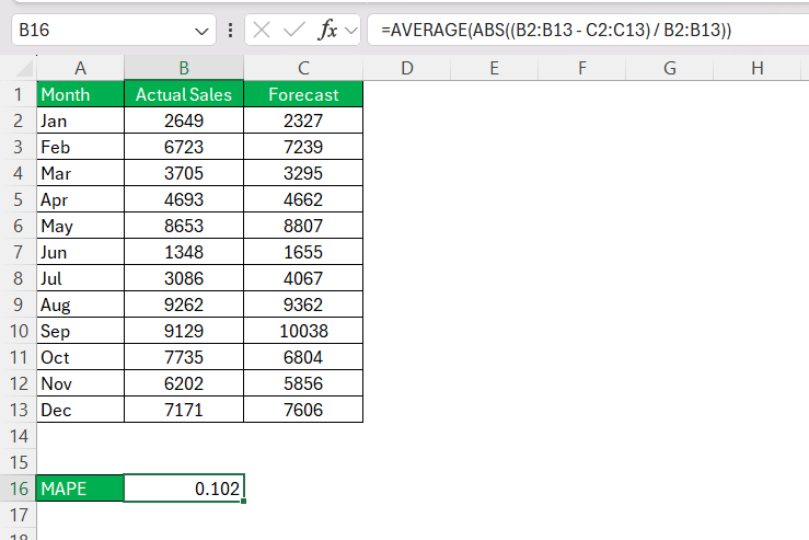
As someone who frequently analyzes data, I often rely on error metrics to evaluate the accuracy of my forecasts. One of my go-to metrics is the Mean Absolute Percentage Error (MAPE). It’s straightforward to calculate in Excel and gives me a clear picture of how far off my predictions are from the actual values in percentage terms.
In this article, I’ll walk you through how to calculate MAPE in Excel step by step. Whether you’re a beginner or an experienced user, this guide will help you integrate MAPE formula into your data analysis workflow seamlessly.
Key Takeaways:
- MAPE Simplifies Forecast Analysis: It translates forecast errors into easy-to-understand percentages, making comparisons across datasets straightforward.
- Accurate Data Is Crucial: Ensure no zeroes or errors in your dataset to avoid misleading results in MAPE calculations.
- Excel Automates MAPE: Use formulas like
=AVERAGE(ABS((actual - forecast) / actual) * 100)for quick and reliable calculations. - Real-world Impact: Businesses leverage MAPE to improve inventory management, refine demand planning, and enhance customer satisfaction.
- Beware of Outliers: Exclude non-recurring anomalies from your data to maintain reliable and meaningful MAPE insights.
Table of Contents
Introduction to MAPE in Excel
The Importance of Forecast Accuracy
In the ever-evolving world of business, precise forecasting is a pivotal factor that can determine the success of supply chain management, financial planning, and overall operational strategies. Being adept at forecast accuracy, a process that measures how closely forecasts align with actual demand becomes a linchpin for reducing inventory costs and enhancing service delivery.
Understanding MAPE and Its Significance
Mean Absolute Percentage Error, or MAPE is one of those tools I find indispensable when it comes to scrutinizing the accuracy of forecast models. It tells us how off our predictions are on average, translating discrepancies into percentage terms. This conversion to percentages is particularly significant, as it provides a clear, intuitive means of comparing the accuracy of different forecasting models or strategies across diverse datasets.
MAPE is not only a comprehensive gauge during the model validation phase but also becomes a reliable ongoing performance metric, ensuring that forecasts remain consistent over time.
Step-by-Step Guide to Calculating MAPE
Preparing Your Data for Calculation
Before diving into calculations, it’s crucial that I organize the data efficiently. First, we must ensure that we’re dealing with actual demand figures as opposed to sales data, as unmet demand due to stockouts can skew the accuracy if not correctly accounted for. We should also have the forecast numbers by the same granularity, usually by article and time period, such as weekly or monthly.
For effective tracking, setting up a centralized database or table to log this historical data is recommended. If maintaining an extensive history seems daunting, focusing on the most recent month’s data could be a more manageable starting point. However, do keep in mind that longer histories generally provide a more robust basis for forecast accuracy assessments.
Don’t forget to assign weights to the items based on their value—sales price is typically used, though purchase price might also be appropriate. This prioritizes items that have a more significant impact on the bottom line and ensures a more nuanced approach to the MAPE calculation.
Formula Breakdown and Execution
When it comes to calculating MAPE, understanding the formula’s components is key. Let’s break down the basic structure: MAPE is essentially the average of absolute errors relative to actual values, expressed as a percentage. With my Excel sheet ready, I execute the following steps:
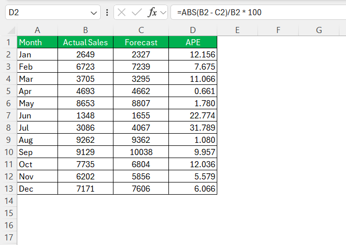
- Compute the Absolute Percentage Error (APE) for each data point using the formula:
=ABS(actual - forecast)/actual * 100. Here,ABSis a function that returns the absolute value, ensuring that I’m dealing with non-negative error margins.
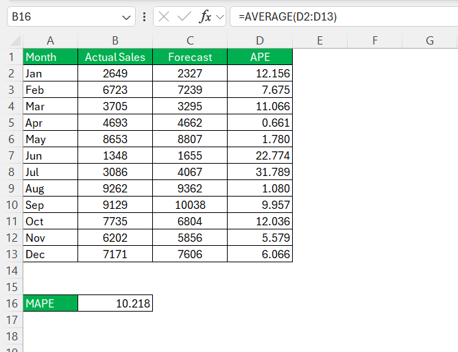
- Derive the MAPE by averaging all computed APEs. The formula goes as follows:
=AVERAGE(range of APEs). This is where theAVERAGEfunction comes into play, neatly calculating the mean value of my absolute percentage errors, the result of which represents my MAPE.
If there are many data points, I prefer using the AVERAGE function on the entire range where APEs are located rather than manually selecting each cell. It’s an effective way to simplify the process, especially when dealing with extensive datasets.
Once executed, the resulting single percentage figure tells me the average deviation of my forecasts from actual values—an invaluable insight for tweaking forecasting models for enhanced accuracy.
Tips for Accurate MAPE Calculations
Automate the Process with a Single Formula
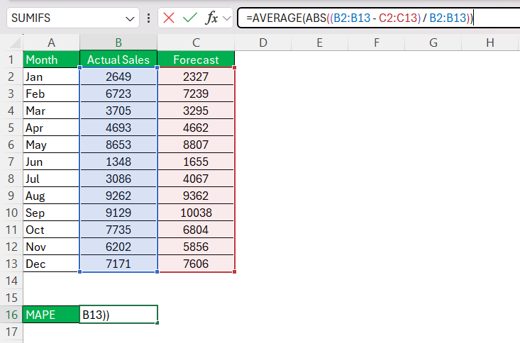
If you’re comfortable with array formulas, you can calculate MAPE in a single step:
STEP 1: Use this formula:
=AVERAGE(ABS((A2:A4 – B2:B4) / A2:A4))
STEP 2: Press Ctrl+Shift+Enter (for older versions of Excel) or just Enter (in Microsoft 365).
This approach avoids the need for an intermediate column and directly gives you the MAPE.
Avoiding Common Mistakes
Achieving accuracy in MAPE calculations hinges on vigilance against common pitfalls. For instance, oversight in including zeroes or negative numbers in the actual values can cause the formula to either inflate or be undefined, misleading the analysis. Therefore, vetting data for such anomalies before running the calculation is crucial.
Additionally, the proverbial “garbage in, garbage out” holds true for MAPE. It’s essential to cross-verify the relevance and correctness of both actual and forecasted data sets. Even something as benign as date misalignments can disrupt the calculations.
Lastly, remember that outliers can significantly distort the mean value, which is the backbone of MAPE. An atypically high or low data point, reflecting a non-recurring event, should be rationalized or omitted for the regular operation’s insight.
Maintaining a meticulous approach to preparing and analyzing your data sets goes a long way in steering clear of these mistakes and bolstering the reliability of your calculations.
Ensuring Reliable Data Inputs
To attain reliable data inputs for MAPE, thoroughness is key. We should ensure that historical forecasts are matched correctly with their corresponding actual demand, not sales, to prevent skewed results due to stockouts. It’s also prudent to maintain a well-structured single dataset that merges all relevant data. In doing so, we minimize the chances of errors cropping up from disjointed or incomplete records.
Additionally, quantifying each item’s relative importance via value data becomes necessary—usually pegged to the sale or purchase price. This differential weighting accentuates the higher-margin items and reflects their true impact on forecasting accuracy.
Furthermore, tracking the history of active versus inactive items is insightful. It helps in differentiating which items are currently influencing the demand forecast and which are not, thus contributing to a more nuanced analysis.
Any discrepancies spotted in these preparatory stages need to be amended before proceeding to the actual MAPE calculation to ensure the integrity of the forecast accuracy measurement.
Real-world Applications of MAPE
Case Studies: MAPE in Action
I’ve come across several case studies where businesses implemented MAPE and reaped significant benefits. In one instance, a retail company integrated MAPE into their inventory planning system. By doing so, they reduced overstock by 15% in the first quarter post-implementation, demonstrating MAPE’s efficacy in improving stock levels and financial health.
In another scenario, a manufacturing firm used MAPE to refine its demand planning. Adjustments driven by the MAPE insights led to a 20% improvement in forecast accuracy over six months. This, in turn, enhanced their production scheduling, inventory management, and ultimately, customer satisfaction.
Such case studies exemplify how companies across industries are leveraging the power of MAPE to make data-driven decisions, streamline operations, and boost profitability.
How Businesses Leverage MAPE for Better Decision-Making
Businesses tap into MAPE as a diagnostic tool to sharpen their forecasting models in pursuit of near-perfect foresight. By routinely measuring forecast performance using MAPE, they can pinpoint areas where adjustments are needed, such as refining demand planning algorithms for more accurate inventory levels, thus reducing both shortage risks and excess stock carrying costs.
Additionally, MAPE insights guide pricing strategies during sales slumps or surges by enabling predictive adjustments, ensuring that revenue goals stay on target. In sectors like energy, where consumption patterns are pivotal, MAPE-driven analyses help in optimizing purchasing and distribution to align with market-demand forecasts.
Concisely, MAPE is not just a number on a report—it’s a strategic compass pointing businesses toward improved efficiency, customer service, and financial performance.
FAQ Section
What is MAPE?
MAPE stands for Mean Absolute Percentage Error. It’s a measure used to determine the accuracy of forecast models by calculating the average percentage error between the forecasted and actual values. The lower the MAPE, the more accurate the model’s predictions are.
How to calculate MAPE formula?
To calculate the MAPE formula, you subtract the forecasted value from the actual value, divide it by the actual value, and take the absolute value to remove any negative signs. Do this for each data point, multiply by 100 to get percentages, and then average these to get the MAPE.
What Is the Most Challenging Aspect of Working with MAPE in Excel?
One of the most challenging aspects of working with MAPE in Excel is ensuring there are no zeros in the actual values, as this causes division by zero errors. Additionally, dealing with data inconsistencies and managing large datasets for accurate MAPE analysis can also be complex.
Can MAPE Be Automated in Excel for Large Datasets?
Yes, MAPE can be automated in Excel for large datasets. This can be done by writing custom functions in VBA, setting up dynamic ranges, and using data tables, which update calculations automatically as new data is added.
What is mean absolute percentage error?
Mean Absolute Percentage Error (MAPE) is a statistical measure used to assess the accuracy of a forecasting method. It calculates the average of absolute errors as a percentage of actual values, providing insight into how much predictions deviate from reality on average.
John Michaloudis is a former accountant and finance analyst at General Electric, a Microsoft MVP since 2020, an Amazon #1 bestselling author of 4 Microsoft Excel books and teacher of Microsoft Excel & Office over at his flagship MyExcelOnline Academy Online Course.

