When working with data in Excel, I often find that using charts is the best way to visualize information. Excel offers a variety of chart types, each suited for different data sets and purposes. In this guide, I’ll walk through the most common chart types in Excel and how they can be used effectively.
Key Takeaways:
- Excel charts simplify data analysis by making trends, patterns, and comparisons easy to understand.
- Choosing the right chart type depends on the data set and the insights you want to highlight.
- Customizing charts with colors, labels, and formatting improves clarity and aligns with presentation needs.
- Excel’s built-in features, such as recommended charts and formatting tools, streamline chart creation.
- Businesses and non-profits leverage Excel charts to drive decision-making, optimize processes, and communicate insights effectively.
The Role of Graphs in Data Analysis
Graphs are critical tools in data analysis, as they convert complex data sets into visual formats that are easier to understand and interpret. With a quick glance at a graph, one can often discern trends, outliers, and patterns that might be hidden in raw data tables. For instance, a line graph showing the rise and fall of yearly sales can immediately highlight which months performed better than others. This visualization is more effective than scanning columns of numbers trying to spot the difference.
Graphs also aid in storytelling with data, allowing us to present findings in a compelling way. Whether it’s tracking the growth of a user base over time or comparing market share between competitors, graphs serve to simplify the message and make the information accessible to a wider audience.
Navigating Excel’s Chart Types
Navigating through Excel’s realm of chart types can seem daunting at first glance, but with a bit of guidance, you can select the appropriate chart for your data with ease. Microsoft Excel offers a diverse array of chart options to match every kind of data set and storytelling need. Whether you’re looking to compare values, show trends over time, highlight distribution, or illustrate relationships, there’s a chart type specifically designed for the task.
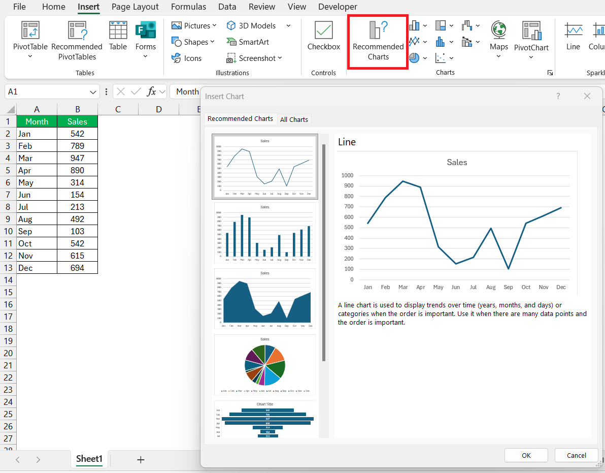
To access the different chart types, simply click on the “Insert” tab and explore the “Chart” dropdown menu.
This menu is not only a gateway to standard charts like bar and line graphs but also to more specialized ones like radar and combo charts. Each chart type is best suited for certain data patterns, and Excel even offers recommendations based on your selected data.
Table of Contents
Feature Focus: Top Excel Chart Types
1. Column Chart
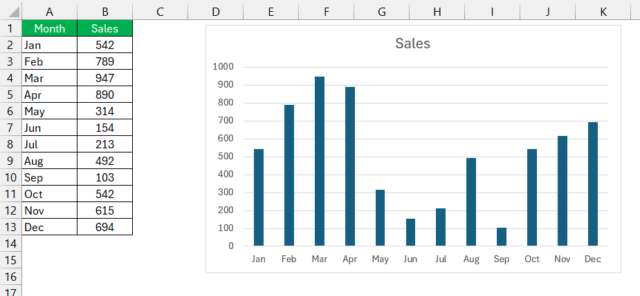
I frequently use column charts to compare values across categories. This chart type displays vertical bars, making it easy to see trends and differences. It’s especially useful for showing sales performance, survey results, or any data where I need to compare categories side by side.
Best for: Comparing values across categories.
2. Bar Chart
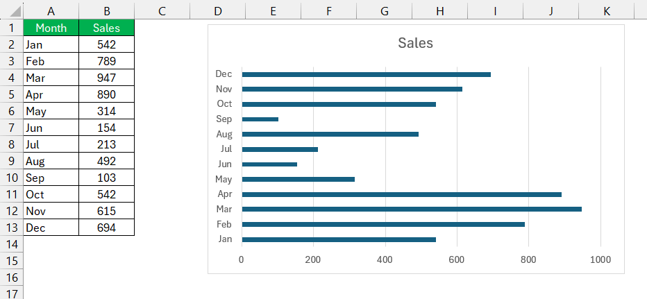
A bar chart is similar to a column chart, but it uses horizontal bars. I prefer using this chart when I have long category labels or when I need to emphasize comparisons more clearly.
Best for: Comparing large data sets with long labels.
3. Line Chart
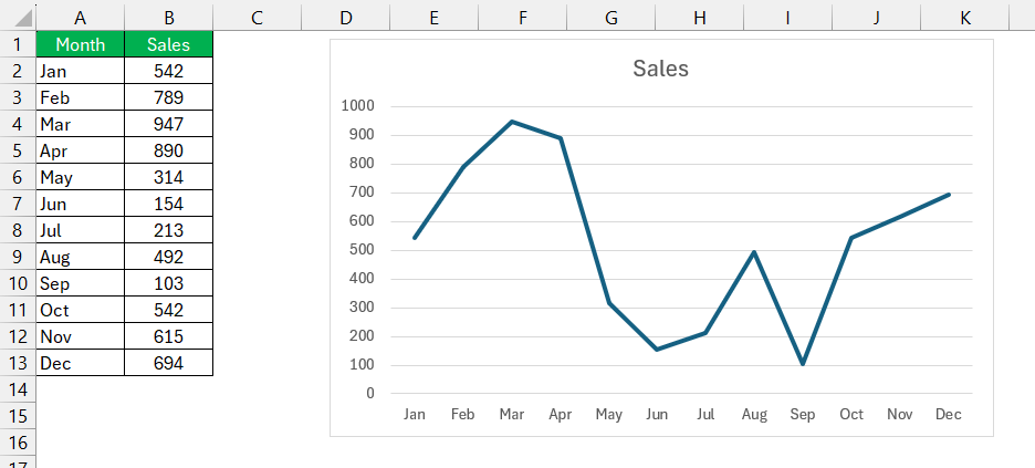
Whenever I need to show trends over time, a line chart is my go-to choice. This chart connects data points with a continuous line, making it perfect for tracking stock prices, sales trends, or temperature changes.
Best for: Showing trends and patterns over time.
4. Pie Chart
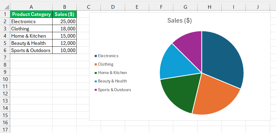
When I need to display proportions or percentages, I use a pie chart. This chart type divides a whole into slices, each representing a category’s contribution. However, I make sure not to use it for too many categories, as it can become cluttered.
Best for: Showing proportions or percentage breakdowns.
5. Doughnut Chart
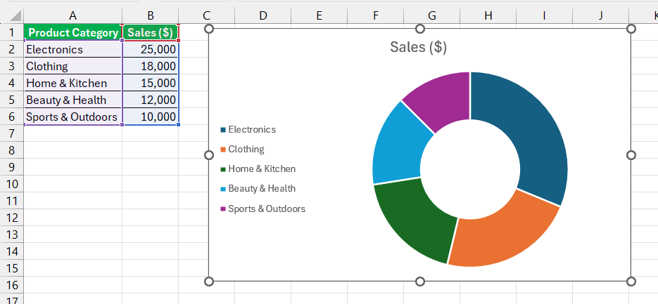
A doughnut chart is like a pie chart but with a hole in the center. I use it when I need to compare multiple data sets in a visually appealing way.
Best for: Representing proportions with multiple series.
6. Area Chart
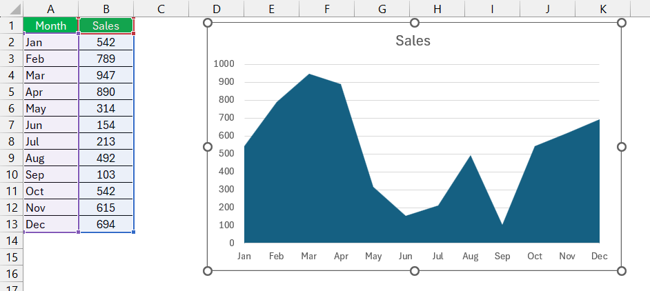
I turn to area charts when I need to show the magnitude of a trend over time while also emphasizing volume. This chart is similar to a line chart but with the area below the line filled in.
Best for: Highlighting trends while showing volume.
7. Scatter Chart
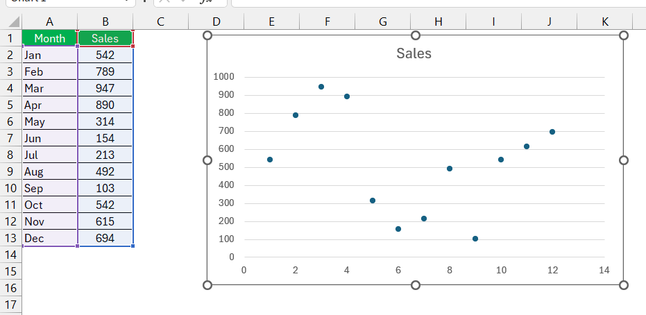
If I need to show relationships between two numerical variables, a scatter chart works best. It’s ideal for scientific data, correlation studies, and performance analysis.
Best for: Identifying relationships between variables.
8. Bubble Chart
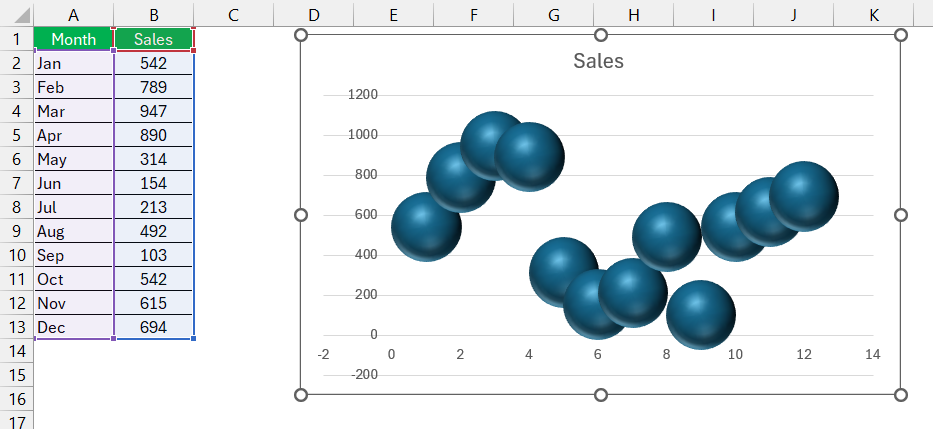
A bubble chart is an extension of a scatter chart, where data points are represented by circles of varying sizes. I use this when I need to add an extra dimension of data, such as sales volume by region.
Best for: Displaying three data variables simultaneously.
9. Stock Chart
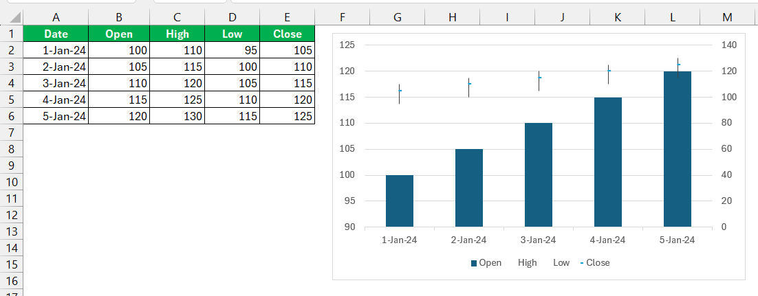
For financial data, I use stock charts. These charts are designed to display stock market trends, including opening and closing prices, as well as highs and lows.
Best for: Analyzing stock market trends.
10. Radar Chart
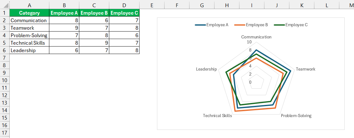
A radar chart helps me compare multiple variables at once. It’s useful when I want to visualize performance across several categories, such as employee skills or product features.
Best for: Comparing multiple categories on a common scale.
11. Waterfall Chart
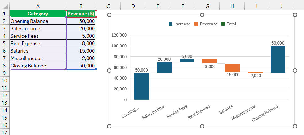
I use waterfall charts to show how a value changes over time due to positive and negative contributions. It’s useful for financial analysis, such as tracking profits and losses.
Best for: Understanding cumulative changes in data.
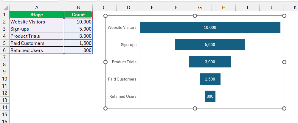
12. Funnel Chart
A funnel chart is great for showing data that flows through a process, such as a sales pipeline. It helps me visualize drop-offs at different stages.
Best for: Visualizing data flow through a process.
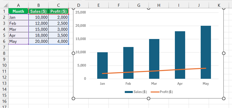
13. Combo Chart
Sometimes, I need to combine different chart types in one visualization. A combo chart allows me to display multiple data series using different chart styles, like combining a column and a line chart.
Best for: Comparing multiple types of data in one chart.
Tips & Tricks for Creating Effective Charts
- Keep it simple: Avoid cluttering your charts with too many data points or labels.
- Use appropriate colors: Contrast helps in readability, but excessive colors can be distracting.
- Label your axes and data: This ensures clarity for the audience.
- Choose the right chart type: The type of data determines which chart will be most effective.
- Use data filters: When dealing with large data sets, filtering can help in focusing on key insights.
- Leverage Excel’s built-in formatting tools: Features like trendlines, legends, and data labels enhance visualization.
Real World Applications of Excel Graphs
Business Success Stories – How Excel Charts Drive Decisions
Excel charts play a crucial role in business strategy by transforming data into actionable insights. A manufacturing company, for instance, used a Combination Chart to identify production bottlenecks, leading to targeted machine upgrades and improved efficiency. Area Charts help retailers manage seasonal inventory by visualizing sales trends and stock levels, preventing shortages or overstocking.
In the tech industry, Scatter Plots correlate user engagement with app performance, guiding product development and user experience improvements. These examples show how businesses leverage Excel charts beyond reporting—to drive strategy, optimize processes, and enhance decision-making.
Non-Profit Narratives – Spreading Awareness with Data
Non-profits use Excel charts to tell compelling, data-driven stories. Line Charts illustrate environmental trends, such as deforestation’s impact on endangered species, driving public engagement and donations. Pie Charts foster donor trust by transparently breaking down expenses, while Bar Charts compare the impact of social programs over time.
Histograms showcase beneficiary demographics, helping organizations tailor initiatives. By converting raw data into persuasive visuals, Excel charts become powerful advocacy tools, mobilizing action and raising awareness.
Frequently Asked Questions
What are the Most Effective Excel Chart Types for Presenting Data Clearly?
The most effective Excel chart types for presenting data clearly are Bar or Column Charts for comparing categories, Line Charts for showing trends over time, and Pie Charts for displaying proportions in a data set. These charts are widely used because of their ability to communicate information quickly and easily. Bar/Column Charts provide a visual comparison of different items or groups, Line Charts are superb for tracing how values change over a period, and Pie Charts offer a simple way to show how parts of a whole relate to each other.
What are the top 3 charts in Excel?
The top 3 charts in Excel, often favored for their versatility and clarity, are the Column Chart, for comparing categories or changes over time; the Line Chart, ideal for visualizing trends and progressions; and the Pie Chart, which is excellent for showing the proportional makeup of a whole. Each of these chart types is commonly used because of its ability to succinctly and effectively convey different types of data to an audience.
How Can I Customize My Excel Graph To Reflect My Brand or Presentation Style?
Customizing your Excel graph to reflect your brand or presentation style involves adjusting colors, fonts, and layouts to match your brand identity. Start by selecting the graph, then access the ‘Format’ options where you can change the color scheme to match your brand colors. Change the font style and size for titles and axis labels under the ‘Home’ tab to align with your brand’s typography. You can also modify the background and add logos or images to create a consistent look with your other brand materials. Excel’s flexibility in customization allows you to tailor every aspect of your graph to ensure it fits seamlessly with your brand’s visual aesthetic.
When Is It Better to Use a Combination Chart Instead of a Single Chart Type?
It’s better to use a Combination Chart instead of a single chart type when you need to compare different datasets that have varying scales or units of measurement. It’s also ideal when you want to illustrate the relationship between two variables while maintaining their distinct values, such as showing sales volume and profit margin together. Combination Charts help convey complex, multifaceted data in a single, cohesive visual, aiding in the interpretation of how one dataset influences or correlates with another.
Can Excel Handle Large Datasets for Graphing Purposes?
Yes, Excel can handle large datasets for graphing purposes, although performance may vary depending on your system’s capabilities. It’s optimized to manage thousands of rows and columns, but the more extensive the data, the more resources it requires. For extremely large datasets, it may be more efficient to use Excel’s Power Pivot feature or consider specialized data visualization software to ensure smooth operation and prevent slow down or crashes due to heavy data processing demands.
John Michaloudis is a former accountant and finance analyst at General Electric, a Microsoft MVP since 2020, an Amazon #1 bestselling author of 4 Microsoft Excel books and teacher of Microsoft Excel & Office over at his flagship MyExcelOnline Academy Online Course.

