A Clustered Column Chart in Microsoft Excel is a dynamic tool for transforming complex data into clear visual narratives. These charts feature groups of bars standing side by side, each representing a different category and displaying proportional values. With their ability to compare data across related categories, clustered column charts offer a powerful means of analysis and presentation.
Key Takeaways:
- Visualization Power: Clustered column charts turn rows of numbers into visually compelling stories, highlighting patterns and trends with ease.
- Selecting the Right Data: Like selecting ingredients for a recipe, choosing the right data is crucial for effective chart creation. Ensure comparability, balance, and consistency in your datasets.
- Excel Interface Navigation: Excel’s user-friendly interface simplifies the process of creating clustered column charts. With just a few clicks or shortcuts, you can insert and customize your Excel chart effortlessly.
- Customization for Clarity: Adding labels, titles, and colors enhances the clarity and impact of your clustered column chart, transforming it into a well-told narrative.
Table of Contents
Introduction to Clustered Column Charts
Defining the Clustered Column Chart
Imagine a tool that takes complex data and makes it instantly comprehensible. That’s the magic of the clustered column chart. Picture rectangular bars of varying heights, standing side by side in small groups, or “clusters.”
Each column’s height is proportional to the value it represents, and each cluster compares these values across different but related categories. This visualization is not just for show; it’s a powerful way to analyze and present data with striking clarity.
Importance of Visualization in Data Presentation
You’ve heard that a picture is worth a thousand words, right? Well, in the realm of data, visualization carries the same weight. A clustered column chart turns rows of numbers into a visual story, making patterns, trends, and exceptions stand out at a glance.
It’s a transformative way to communicate information that sticks with your audience, helping them understand the significance of data without getting lost in a sea of figures. Effective visualization is indispensable when you’re aiming to make an impact, whether in a boardroom or classroom.
Step-by-Step Guide to Creating a Clustered Column Chart
Selecting the Right Data for Your Chart
When you’re ready to whip up a clustered column chart, think like a master chef selecting ingredients for a signature dish—choose the right data, and half your work is done. Ensure your data sets are comparable, like monthly sales figures across quarters or product performance in various regions.
Strike a balance; too many categories can overwhelm, and too few might oversimplify. Consistency is another key ingredient, so each category should have an equal number of data points.
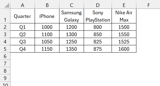
For example, quarterly sales data of multiple products over a year is the prime candidate for an effective clustered chart. When your data is well-selected, your chart becomes more than just bars and numbers—it becomes a story.
Navigating the Excel Interface to Insert a Clustered Column Chart
Transforming your data into a clustered column chart is a breeze, thanks to Excel’s user-friendly interface. Follow the steps below to insert the Clustered Column Chart in Excel –
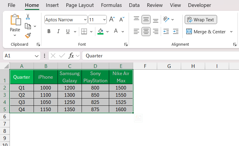
STEP 1: Enter or select the data you want to visualize in the clustered column chart. Make sure your data is organized in columns or rows with labels for each set of data
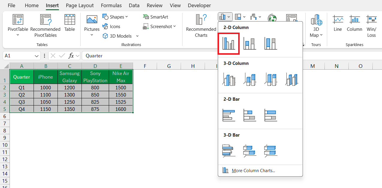
STEP 2: Go to the “Insert” tab on the Excel ribbon at the top of the window.
STEP 3: In the “Charts” group, click on the “Column” button. From the dropdown menu, select “Clustered Column.”
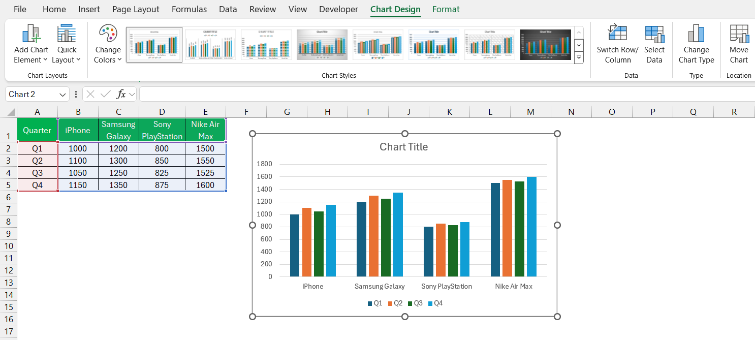
This will insert a clustered column chart into your worksheet.
For those who appreciate quick shortcuts, think of ALT + F1 as your instant solution—simply select your data and use these hotkeys to generate a chart immediately. Customization and refinement can follow, but initially placing the chart on the page is as straightforward as it gets.
Customizing Your Clustered Column Chart for Maximum Impact
Adding Labels and Titles for Clarity and Precision
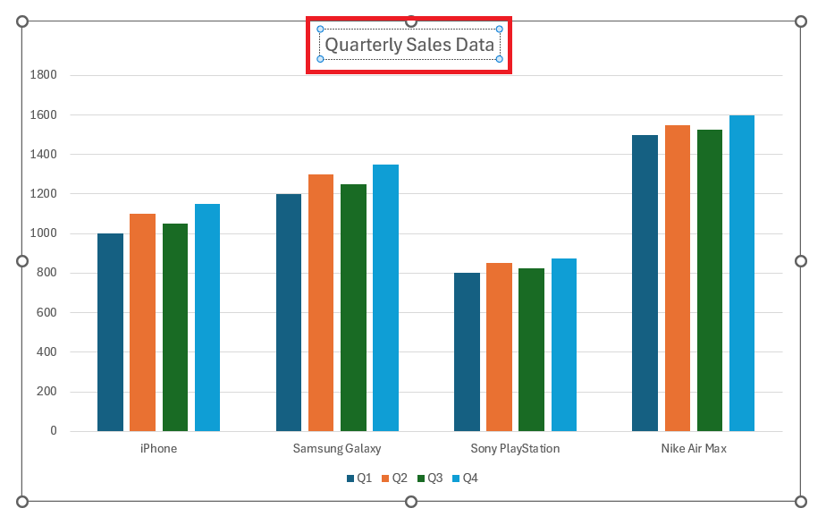
Your clustered column chart is shaping up nicely, but it’s the labels and titles that will narrate the story of your data. It’s like naming the characters in a book; without them, the story can lose meaning. Kick off with a chart title that packs a punch – short, informative, and elucidating the plot of your data story in a single line.
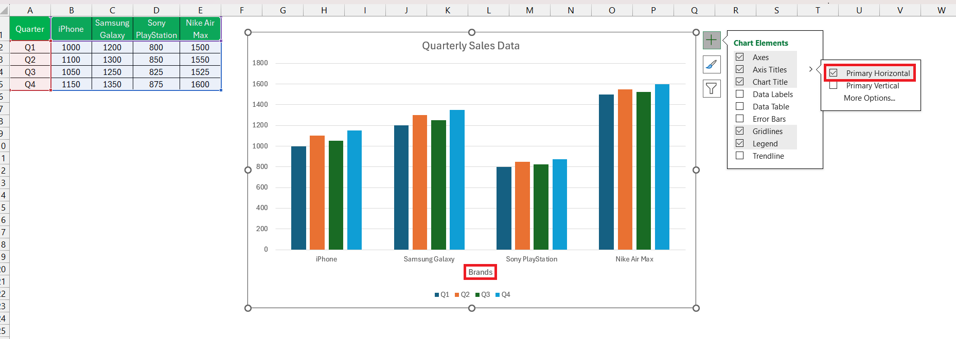
Then move on to your x and y-axes; label them like you’re introducing the protagonists – what they represent and their scale of operation.
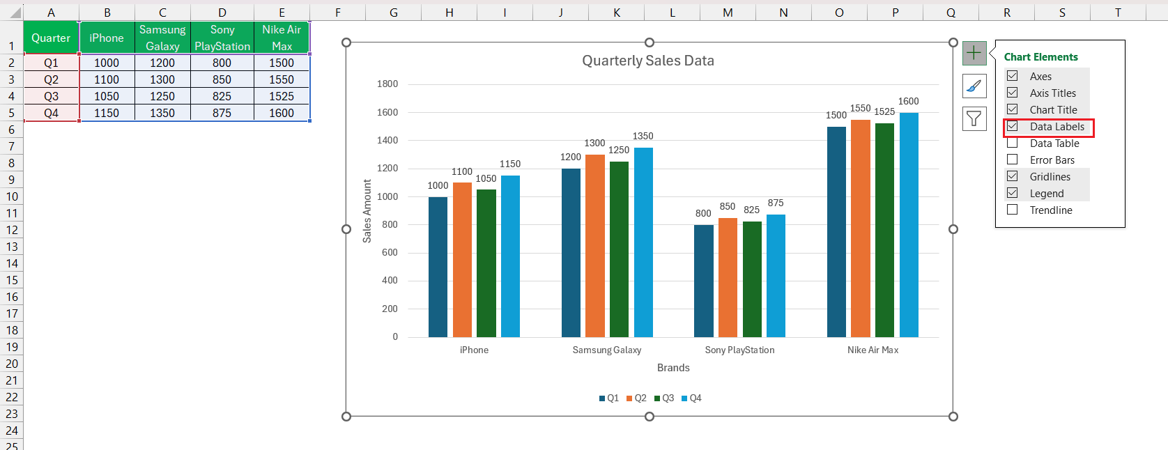
For data labels, each column gets a tag, indicating the exact values so viewers can skip the cross-references and dive straight into insights.
Lastly, add a legend when working with multiple data series. Legends are like subtitles in a film – they clarify who’s who at a glance.
By adding these elements, you turn a simple visualization into a well-told narrative that viewers can follow without a second guess.
Exploring Chart Styles and Colors to Enhance Visual Appeal
Now, let’s get creative and breathe life into your chart with style and color. You wouldn’t present a monochrome dish to your guests, and the same goes for your chart. With Excel, you have a palette at your fingertips. Apply different colors to separate your data series, playing around with contrasts—think a cool ocean blue against a fiery sunset orange for instant separation of concepts and attention-grabbing visualization.
Don’t shy away from the Chart Styles pane. Like trying on outfits before a big event, click through the gallery of professional styles to find the one that best suits your data’s story. These styles can include subtle effects, such as shadows or 3D appearances, that add a compelling layer to your chart’s narrative.
Just remember, while it’s fun to experiment, in the end, simplicity often wins. Choose styles and colors that enhance, not distract, from the data you are showcasing.
Tips and Tricks for Streamlining Your Chart Creation Process
Working smarter, not harder, in Excel means unlocking those nifty tips and tricks that streamline your chart creation process. Start with keyboard shortcuts—memorize a few go-to combos to cut down the clicks. For instance, “Ctrl + C” to copy and “Ctrl + V” to paste can be a lifesaver when managing chart data. Likewise, “Alt + F1” immediately creates a chart from the selected data, placing it right in your worksheet.
Another gem is setting default chart types and templates. If clustered column charts are your mainstay, save one with your preferred style as a template. Next time, you’re just a right-click away from a custom chart type that fits right into your workflow.
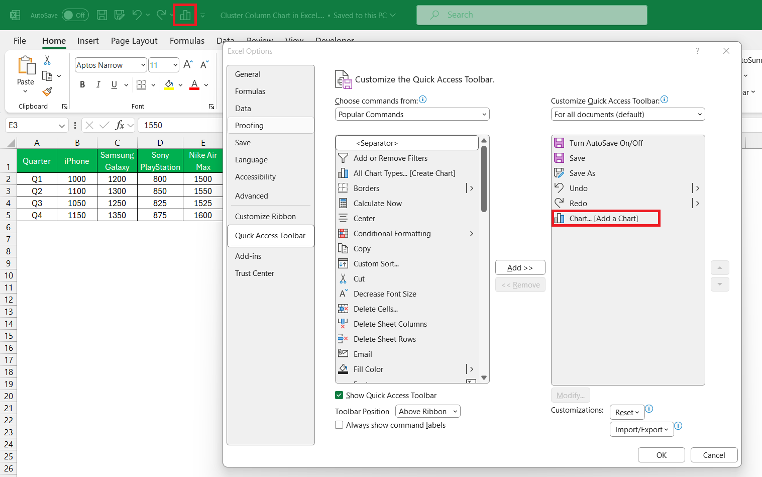
Remember the Quick Access Toolbar? Customize it with commands you frequently use when building charts, like adding data series or formatting axes. These beauties can summarize massive datasets, providing a streamlined source for your clustered column charts.
By incorporating these tips, crafting charts becomes less of an ordeal, and more of a quick, satisfying process.
Comparison and Analysis
Clustered Column Charts versus Other Chart Types
Choosing the right type of chart is like picking the right tool for the job, and clustered column charts have their own superpowers. They tower over pie charts when it comes to comparing categories across groups. Unlike pie charts that excel in showing percentages of a whole, clustered column charts enable viewers to make quick, side-by-side comparisons.
When you stack them against line charts, it’s clear that trends over time are the line chart’s realm, while clustered columns win the day for snapshot comparisons across multiple categories at a given time.
Then there are stacked column charts, which are kin to our heroes. They also show parts of a whole but stack data in a single column. This makes them less ideal when you want to compare the sizes of individual categories side by side, something at which clustered column charts excel.
In summary, when you have related categories that beg for direct comparison, reach for a clustered column chart. It’s the difference between a general view and a revealing snapshot that tells the full story of your data.
Case Studies: Effective Use of Clustered Column Charts in Various Industries
Clustered column charts are like Swiss Army knives—versatile across various industries. In retail, they break down monthly sales across multiple stores, revealing which locations are star performers. In healthcare, they might compare patient admissions by department, highlighting areas with the highest demand for services.
The finance sector uses them to showcase the performance of different investment portfolios across quarters, while in education, they could detail average test scores across subjects for multiple classrooms, pinpointing where students shine or need improvement.
And that’s not all; marketing teams leverage these charts to compare campaign performances across different channels, getting a clear picture of where to allocate their budgets.
These case studies exemplify the chart’s ability to dissect and display complex datasets in a way that is digestible and actionable, truly a testament to its usefulness across any field.
FAQ
How to create an Excel clustered column chart?
To create a clustered column chart in Excel, first, arrange your data in columns or rows. Highlight the data, including headers. Click the ‘Insert’ tab, choose the ‘Column’ chart dropdown, then select ‘Clustered Column.’ A new chart will appear in your spreadsheet, ready for further customization. Remember, the key is organizing your data neatly before making the chart.
What is the meaning of a clustered column chart in Excel?
A clustered column chart in Excel visually represents data using groups of vertical bars, where each bar’s height corresponds to a data value. These clusters facilitate the comparison of different categories or subcategories within a dataset, allowing you to easily compare and contrast values across multiple series.
What is the difference between clustered and stacked column charts in Excel?
Clustered column charts in Excel place bars side by side for comparison, while stacked column charts stack data vertically, segmenting a single column for each category to show the proportion of each value to the whole. Clustered charts are for comparisons, while stacked charts show individual parts of a whole.
When is it most appropriate to use a Clustered Column chart?
A Clustered Column chart is most appropriate when you want to compare multiple categories and subcategories across different data series, showcasing differences and similarities. It’s ideal for visualizing data where each category has multiple groups to be compared, such as sales of different products across several quarters.
How do you customize the gap width between columns in Excel?
To customize the gap width between columns in Excel, right-click a column in the chart, select ‘Format Data Series,’ and then adjust the ‘Gap Width’ percentage under the Series Options. This controls the space between the clusters of columns. If you want the columns closer but not overlapping, set the gap width to a lower percentage.
John Michaloudis is a former accountant and finance analyst at General Electric, a Microsoft MVP since 2020, an Amazon #1 bestselling author of 4 Microsoft Excel books and teacher of Microsoft Excel & Office over at his flagship MyExcelOnline Academy Online Course.

