Excel Pivot Tables are a powerful tool for organizing and analyzing data. One of the most effective ways to enhance the visual appeal and clarity of your data is through the use of color scales. Color Scales in Pivot Table are new in Excel 2010 and they highlight the smallest and largest data points within your Pivot Table. It works like a heat map, in that it gives the highest number a shade of color and the lowest number a different shade of color, so your numbers can stand out at a glance. In this post, I’ll guide you through understanding, applying, and mastering color scales within pivot tables to reveal patterns and insights effortlessly.
Key Takeaways:
- Color scales act like heat maps, instantly highlighting high and low values in your pivot table.
- They make trends and outliers obvious, improving decision-making speed and clarity.
- Customizing color scales lets you align visuals with brand colors or specific data narratives.
- Proper data preparation is essential for applying color scales effectively and without errors.
- Avoid visual clutter by using color formatting sparingly and prioritizing clarity over decoration.
Table of Contents
The Power of Color Scales
Why Use Color Scales?
Color scales in Excel Pivot Tables make it easier to identify trends, outliers, and patterns within your data. They use gradient shades to represent variations in value, enabling quick assessments at a glance. For instance, by transforming numerical data into a visual spectrum, color scales allow us to see performance highs and lows instantly. Additionally, they reduce the cognitive load, making data interpretation more intuitive and less time-consuming.
Transforming Data Visualization
Color scales elevate data visualization by providing immediate, visual cues that highlight significant data points and trends. When we apply these scales to a pivot table, we can effortlessly transform raw numbers into engaging, informative graphics. This transformation allows us to spot correlations and anomalies quickly, making complex data accessible and actionable. Moreover, it empowers us to communicate insights effectively by emphasizing key areas of focus without overwhelming our audience with numbers alone.
Getting Started with Color Scales in Pivot Tables
Preparing Your Data for Success
Before diving into color scales, it’s crucial to prepare your data effectively. Start by ensuring your data set is clean and organized. Remove any duplicates, correct errors, and ensure consistency across data formats. Next, structure your data in a tabular format with clear headings. This clarity assists with accurate pivot table creation and ensures smoother application of color scales. Always preview your data to verify it aligns with your analytical objectives, as a well-prepared dataset simplifies the visualization process and maximizes insight extraction.
Step-by-Step Guide to Applying Color Scales
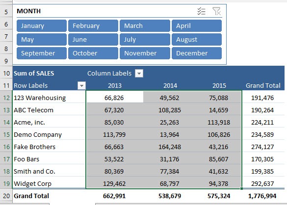
STEP 1: Select the range of cells that you want to apply the Color Scale to
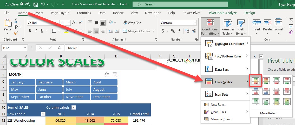
STEP 2: Go to Home > Styles > Conditional Formatting > Color Scales
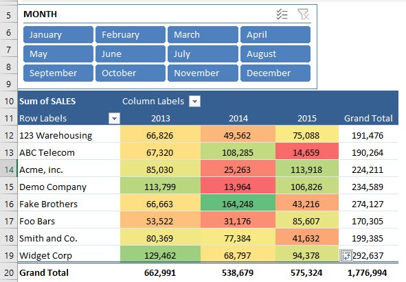
STEP 3: Now you have your Color Scale applied! Let us have some fun in the slicer above
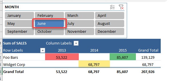
STEP 4: Select any month in the slicer and your Color Scale will still be applied
These steps not only simplify visualization but also enrich the overall analytical process, allowing you to make data-driven decisions quickly and effectively.
Customizing Color Schemes
Customizing color schemes in Excel allows us to tailor the visual impact of data in a pivot table according to specific preferences or thematic needs. Here’s how to customize effectively:
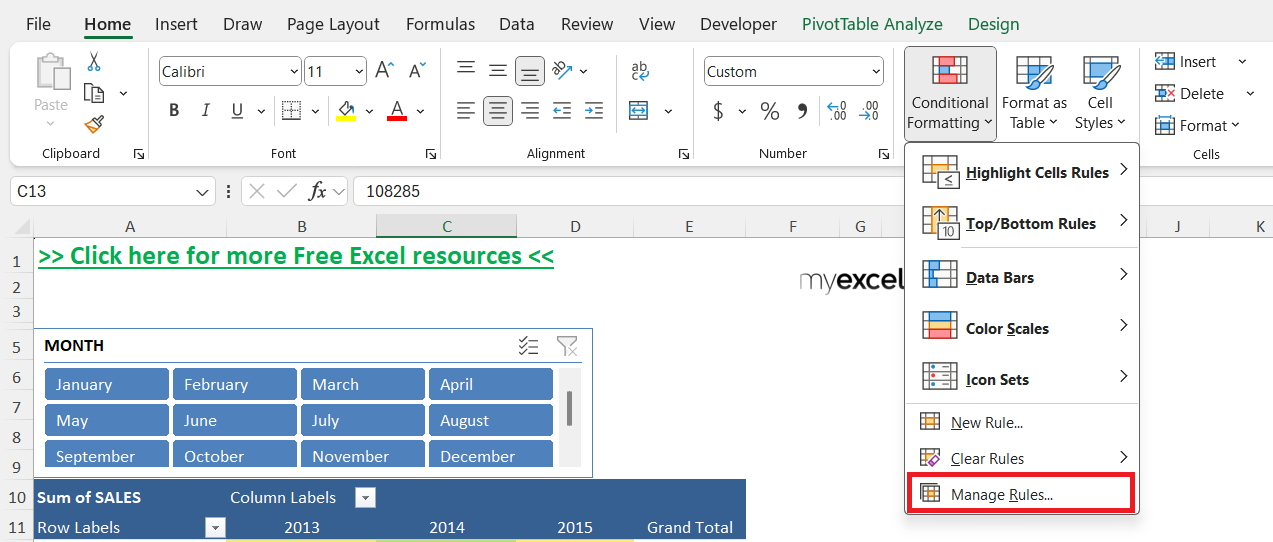
STEP 1: After applying a basic color scale, go to “Conditional Formatting” and select “Manage Rules” to open the rules manager.
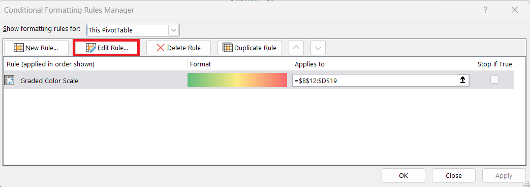
STEP 2: Highlight the rule you wish to modify and click “Edit Rule” to enter a detailed customization panel.
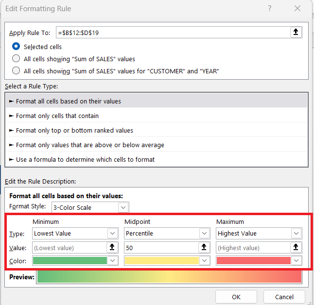
STEP 3: Within this panel, you can change the start, midpoint, and end colors to align with your branding or specific data requirements, providing greater flexibility in visual representation. Specify exact numerical values or percentiles for each part of the scale to ensure the gradient reflects your data distribution accurately.
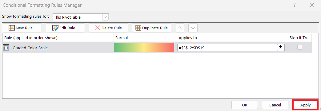
STEP 4: Select Apply and preview these changes on your pivot table to confirm visual effectiveness and clarity. This step ensures the customized scheme highlights the desired data points accurately.
This level of customization not only enhances the personal touch but also ensures the data’s story is conveyed precisely, making it easier for stakeholders to draw meaningful conclusions.
Best Practices for Effective Presentation
Choosing the Right Color Scale
Choosing the right color scale for a pivot table is crucial for effective data visualization. Here’s how we can select the most appropriate scale:
- Understand the Data & Audience: Match color scales to your data type and the message you want to convey. Use green-red for performance metrics, and consider brand guidelines or audience expectations.
- Reflect Data Distribution: Use two-color scales for linear data and three-color scales for datasets with clear divisions.
- Ensure Accessibility: Choose high-contrast or colorblind-friendly palettes to accommodate all viewers.
- Test for Clarity: Preview color scales with actual data to confirm readability and impact.
Selecting the right color scale enhances both comprehension and presentation, making it easier to communicate key data patterns and insights.
Avoiding Overuse and Visual Clutter
Avoiding overuse and visual clutter in pivot tables is pivotal to maintaining readability and impact. Here’s how we can ensure clarity in our presentation:
- Highlight Key Insights Only: Use color sparingly to emphasize critical data, avoiding overapplication that causes clutter.
- Limit Conditional Formatting: Stick to two or three formats max to avoid visual overload.
- Simplify Layout and Color: Use soft, neutral tones and ensure clear grouping and labels for easier navigation.
- Review Regularly: Periodically assess readability and gather feedback to refine presentation quality.
By employing these strategies, we ensure that our data presentations are not only visually appealing but also functionally informative, allowing viewers to grasp insights quickly without being overwhelmed.
FAQs
What are Color Scales in Excel Pivot Tables?
Color scales are a type of conditional formatting that apply gradient colors to cells based on their values. They visually distinguish high and low numbers by assigning colors—like green for high and red for low. This helps users quickly interpret data without manually analyzing each value. It’s like adding a heat map directly inside your pivot table.
Can I use multiple color scales in the same pivot table?
Yes, but it’s recommended to limit them to avoid overwhelming the viewer. Using more than two to three conditional formats can lead to visual clutter, reducing the clarity and effectiveness of your table. If you must use multiple, ensure they are applied to distinct sections with clear labeling to maintain coherence.
How do I customize a color scale to match my brand or theme?
After applying a basic color scale, go to Conditional Formatting > Manage Rules, then select and edit the rule. From there, you can adjust the start, midpoint, and end colors to match your brand palette or visual preferences. You can even use specific values or percentiles to control how the gradient behaves, giving you full control over the visual output.
Why is my color scale not updating when I change data with slicers?
Color scales should update dynamically, but sometimes formatting lags due to cached values or protected sheets. Ensure your pivot table is refreshed after slicer interactions. If the issue persists, reapply the color scale or check whether the range was manually locked to a static data block.
Are color scales accessible for users with color blindness?
Not always by default—but they can be. To ensure accessibility, use high-contrast palettes or pair color scales with additional indicators like icons or data bars. Avoid red-green combinations as they’re difficult for many users with color vision deficiencies. Excel doesn’t validate accessibility, so manual testing or feedback is recommended.
John Michaloudis is a former accountant and finance analyst at General Electric, a Microsoft MVP since 2020, an Amazon #1 bestselling author of 4 Microsoft Excel books and teacher of Microsoft Excel & Office over at his flagship MyExcelOnline Academy Online Course.

