When it comes to visualizing data, Excel offers numerous chart types, but sometimes one chart type isn’t enough to capture all aspects of our data. That’s where combo charts come in. In this guide, I’ll walk you through everything you need to know about creating and customizing combo chart Excel.
By the end, you’ll be ready to combine chart types to create impactful visuals that help you better understand your data.
Key Takeaways:
- Excel combo charts combine multiple chart types, making it easier to understand layered data stories.
- Combo charts are perfect for comparing datasets with different units or scales, like sales and profit.
- You can customize axis labels, colors, and data labels, tailoring the chart to highlight key data points clearly.
- Combo charts are particularly effective for executive summaries, showing multiple metrics in one concise visualization.
- Keep combo charts simple; too many data series can make them cluttered and hard to interpret.
Table of Contents
Introduction to Excel Combo Charts
The Beauty of Combining Data Visualizations
Combining data visualizations within Excel unlocks a myriad of possibilities for conveying complex data in a comprehendible manner. I’m excited to share the beauty of this approach, which turns numbers and data points into a distinct story.
Imagine being able to display related datasets together, contrasting their differences and similarities with utter clarity. The flexibility of Combo Charts in Excel is indeed a marvel for data enthusiasts and professionals alike.
Unveiling the Concept of a Combo Chart
A Combo Chart integrates multiple chart types into a single, coherent visualization, providing a macro and micro perspective of the dataset. For instance, one can display financial trends over time with a smooth line graph while simultaneously showcasing discrete values through vertical bars.
This hybrid chart is particularly adept at handling different data types and scales, allowing me to compare and contrast data in a way that would be impossible with a standard, singular chart form. Direct your eyes to a stock market analysis Combo Chart, and you’ll witness the dance between volume traded and stock price over time, revealing insights that might otherwise be masked.
The Steps to Combo Chart Success
Starting with Your Data Set
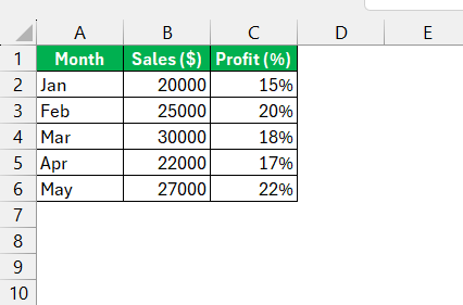
Before creating a combo chart, it’s essential to ensure that my data is organized correctly in Excel. Here’s a simple example to get us started:
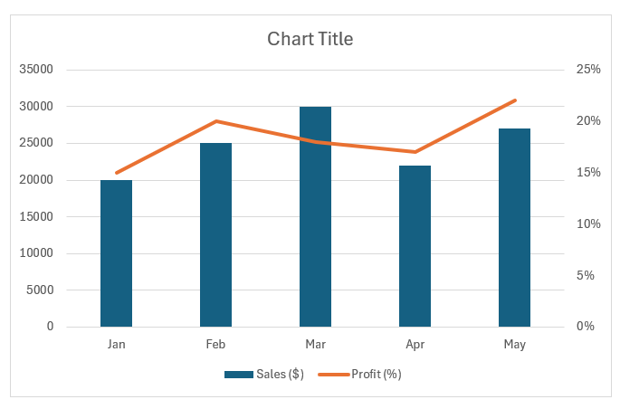
In this case, I have monthly sales data in dollars and profit data in percentages. I want to show “Sales” as columns and “Profit” as a line chart. I always ensure that my data mirrors the original source documents in accuracy, is free from outliers unless they’re relevant, and is formatted consistently – think similar units and decimal places.
Only then is the stage truly set for creating an Excel masterpiece.
Inserting Your First Combo Chart
Once our data is primed and prepped, it’s time to dive into crafting our first Combo Chart. With a few clicks in Excel’s ribbon interface, we’ll breathe life into those sterile columns of figures:
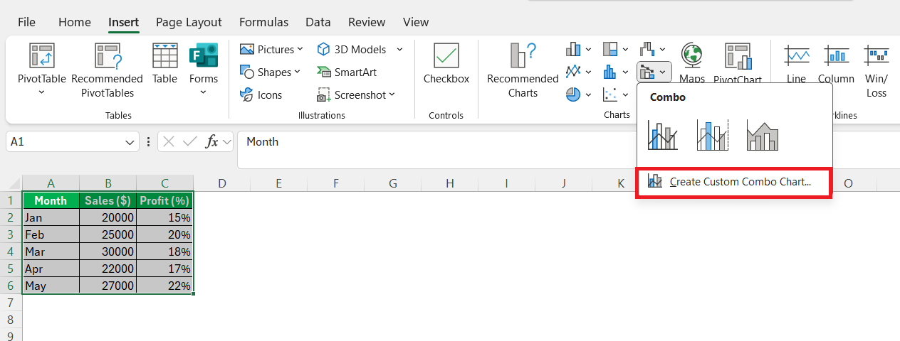
STEP 1: After selecting the data, I click on the ‘Insert’ tab and look out for the ‘Combo’ chart option within the Charts group.
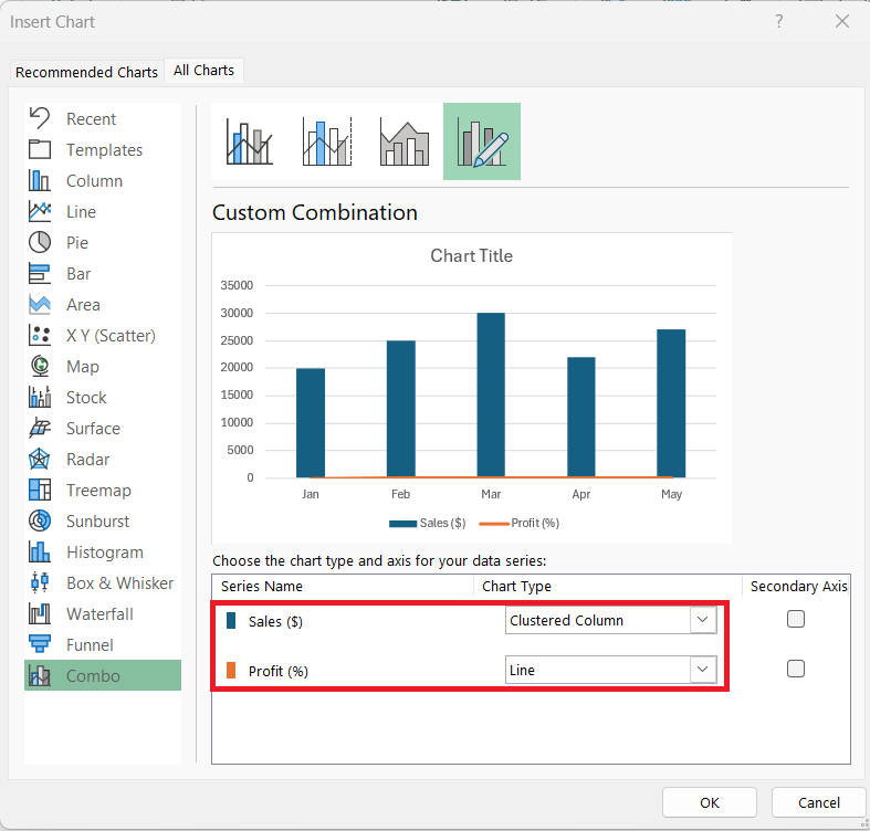
STEP 2: In the Insert Chart dialog, Excel will show a list of my data series (Sales and Profit). I’ll set Sales to Clustered Column and Profit to Line.
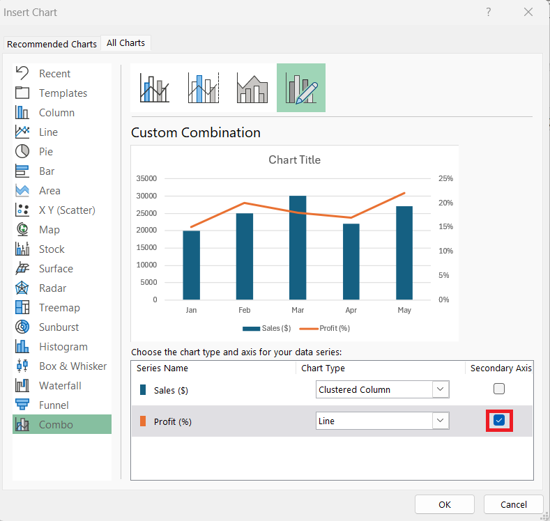
STEP 3: Since profit percentages are much smaller in scale compared to sales, I’ll check the box to add a Secondary Axis for the Profit line. This helps the data series stand out better.
I always keep in mind that each element I insert serves a purpose. If it doesn’t tell us something useful, it’s visual clutter. That’s why I take my time with this step, ensuring that every series adds meaning to the overall narrative.
The result? A robust initial Combo Chart that conveys complex information at a glance.
But let’s not settle for basic—onward to customizations that will truly make our chart shine.
Customizing the Combo Chart
Adjusting the Axes
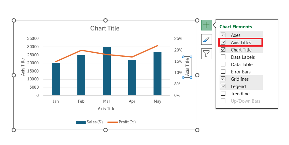
Secondary Axis Labeling: To ensure the chart is easy to interpret, I’ll add axis titles. I’ll select the chart, go to Chart Elements (the plus icon), and check Axis Titles.
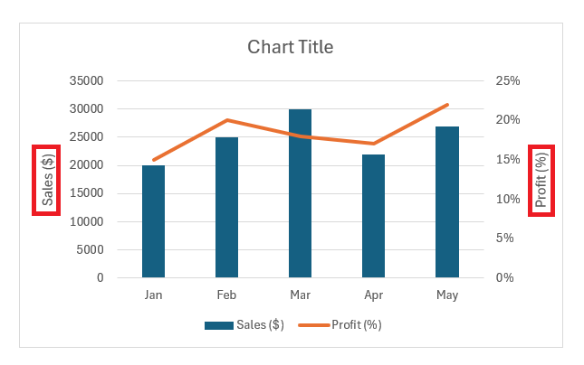
Modify the Secondary Axis Title: For the secondary axis (Profit %), I’ll click on the axis title box and type “Profit (%)”. I’ll do the same for the primary axis with “Sales ($)”.
Changing Chart Colors
Since I want the two data series to stand out from each other, I’ll modify their colors by following the steps below –
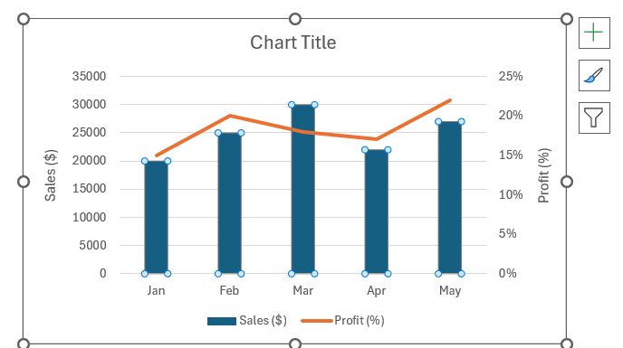
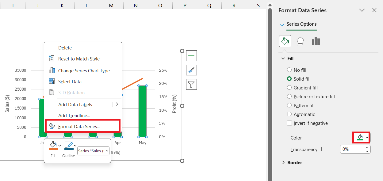
STEP 1: I’ll click one of the bars representing Sales. Excel will select all bars in the series.
STEP 2: Right-click and choose Format Data Series. In the Format panel, I can pick a color that represents sales—perhaps a solid green.
STEP 3: Change the Line Color for Profit: I’ll do the same with the line for Profit, choosing a color that contrasts with the Sales columns, like a bright red.
Adding Data Labels
To give context to each data point, I’ll add data labels.
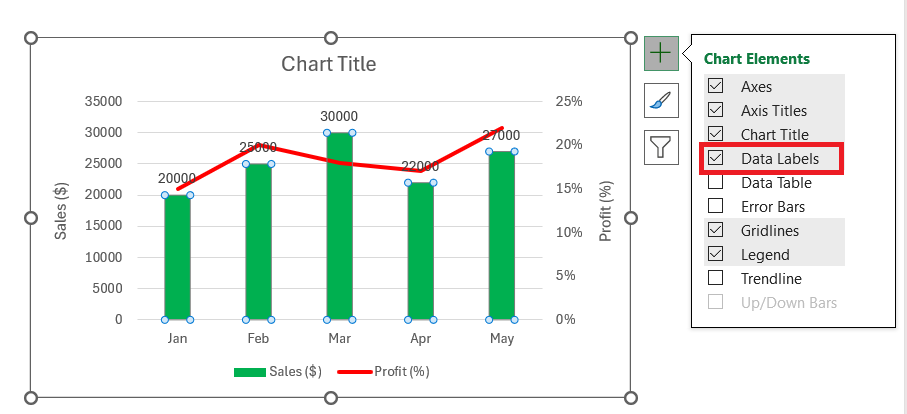
Select Data Labels: I’ll click the Chart Elements icon again, then check Data Labels. Excel will add data labels to both the Sales and Profit series.
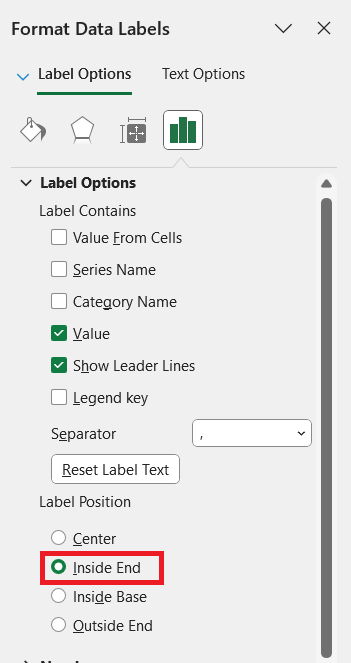
Position the Labels: I can right-click each data series’ labels and format them to appear in the most readable location, such as inside or above the bars for the Sales series.
Practical Uses for Combo Charts in Excel
When to Opt for a Combination Approach
We opt for a combination approach when our data story is layered. If I’m grappling with multiple variables—say, sales over time and customer satisfaction ratings—the Combo Chart gives room for each dataset to breathe. It’s about balancing the narrative: when one dataset is best represented by a line graph’s fluidity, and another requires the stark presentation of a column chart.
Or during those times when actual vs. target data needs to meld together in a single snapshot. It’s not just about saving space, it’s about enriching understanding. That’s when I know a Combo Chart is not just an option, but a necessity.
Real-world Scenarios for Maximum Effectiveness
In the real world, Combo Charts prove their worth by adding layers to stories such as financial performance analyses, showcasing how ad spending correlates with obtained conversions over time, or comparing product unit sales against revenue. They’re particularly effective in boardroom presentations where executives need to quickly grasp performance indicators, or when illustrating how well marketing campaigns are converting based on different factors.
For those entangled in the vast seas of digital marketing, for example, Combo Charts help pinpoint which channels yield the best return on investment, consolidating seemingly disparate metrics into a cohesive analysis.
Overcoming Challenges with Combo Charts
Identifying Common Pitfalls
As with most complex tools, the road to Combo Chart mastery is not without its stumbling blocks. A recurrent trouble spot I’ve noticed is the deceptive allure of overloading a chart with too many data series, turning it into an enigmatic puzzle rather than an analytical tool.
Another issue arises with the improper pairing of chart types that can result in misleading interpretations, or choosing a secondary axis scale that skews the data perspective. I always remind myself to keep it simple and intentional, ensuring every component of the chart has a clear purpose and communicates effectively.
Tips for Presenting Complex Data Simply
At the art of presenting complex data, simplicity is tantamount. Starting with a clear, readable font ensures that from the front row to the last, everyone is in the loop. I’ve found contrasting colors to be essential, providing visual cues that distinguish data series without a squint.
The mantra ‘less is more’ rings true when resisting the temptation to add one too many series or over-the-top embellishments. A combo chart is about insight, not overload; when in doubt, I pare back to the essentials. It’s these distilled charts, uncluttered and focused, that make an impact and stand the test of understanding.
FAQs on Combo Charts in Excel
What is a combo chart?
A combo chart in Excel is a visualization tool that combines two or more chart types into one, such as a column chart with a line chart, to present different kinds of data on the same graph. It’s incredibly useful for comparing multiple data series with different units or scales.
How do I create a combo chart in Excel?
To create a combo chart in Excel, select your data, go to the ‘Insert’ tab, click on ‘Combo Chart’, and select ‘Create Custom Combo Chart’. You can then choose the chart types for each data series and assign them to the appropriate axis.
Can I create a combo chart with more than two types of charts?
Yes, in Excel, you can create a combo chart with more than two types of charts. While it might be less common, you can assign different chart types to multiple data series as needed for your analysis.
How do I add a second axis to my Excel combo chart?
To add a second axis in a combo chart, click on the chart, then navigate to ‘Chart Tools’ on the ribbon. Select ‘Design’, followed by ‘Change Chart Type’. Choose ‘Combo’ and for the series you want on the secondary axis, check the ‘Secondary Axis’ option before clicking ‘OK’.
How to link combo box to chart in Excel?
To link a combo box to a chart in Excel, create the combo box using ‘Developer’ tools, then configure it with your input range and cell link. Use the linked cell in chart data formulas or as a part of named ranges that the chart references, which updates the chart based on the combo box selection.
John Michaloudis is a former accountant and finance analyst at General Electric, a Microsoft MVP since 2020, an Amazon #1 bestselling author of 4 Microsoft Excel books and teacher of Microsoft Excel & Office over at his flagship MyExcelOnline Academy Online Course.

