A Pareto chart is one of the most useful tools for analyzing data in Excel. Named after economist Vilfredo Pareto, it follows the 80/20 rule, where 80% of outcomes come from 20% of causes. This chart highlights key factors, making it ideal for identifying which items are most significant. In this article, I’ll show you how to create a Pareto chart in Excel, helping you prioritize issues and focus on the areas that need the most attention. Let’s dive in!
Key Takeaways:
- A Pareto chart follows the 80/20 rule, showing that 80% of outcomes come from 20% of causes.
- It combines bar and line graphs to highlight the most significant factors in a dataset.
- Pareto analysis helps focus on key issues, allowing for more strategic decision-making.
- Excel’s Pareto chart feature simplifies visualizing data for business and quality control.
- Customization and dynamic features in Excel enhance the chart’s interactivity and relevance.
Table of Contents
Introduction to Pareto Charts in Excel
What is a Pareto Chart?
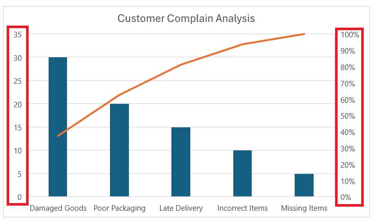
A Pareto chart combines both bar and line graphs. The bars represent individual values in descending order, and the line represents the cumulative total. This layout helps highlight the most significant factors in a dataset.
For example, in quality control, you might use a Pareto chart to show which defects occur most frequently. In business, it could reveal which clients contribute most to your revenue. The key is to focus on the few causes that lead to the most significant effects.
Unveiling the Power of the 80/20 Rule
Unpacking the mysterious and powerful Pareto principle has been transformational across industries. At its core, the 80/20 Rule suggests that a minority of causes, inputs, or effort – typically around 20% – result in the majority of the outcomes, outputs, or rewards, approximately 80%.
In the realm of data analysis, this rule takes shape in Pareto Charts, which are incredible tools for visualizing this distribution and highlighting which factors are contributing most to an issue.
The Significance of Pareto Analysis in Data Interpretation
Pareto Analysis stands as a monumental pillar in interpreting complex datasets, which often feel overwhelming. When I dive into a sea of numbers, Pareto Analysis serves as a guiding beacon, enabling me to sift through the trivial many and spotlight the vital few.
It’s this distillation of data that helps transform decision-making from a game of guesswork into a strategic, informed process. By focusing on the most significant factors – those 20% causing 80% of the problems or delivering 80% of the results – we are empowered to deploy resources and efforts where they can create the most impact.
Step-by-Step Guide to Creating a Pareto Chart
Preparing Your Data for a Pareto Chart
Before we can create a Pareto chart, we need to make sure the data is set up correctly in Excel. Here’s what you need:
- Categories: This column should contain the different factors, such as types of defects or customer complaints.
- Frequency: This is where you list how many times each category occurs. These numbers should be placed next to their corresponding categories.
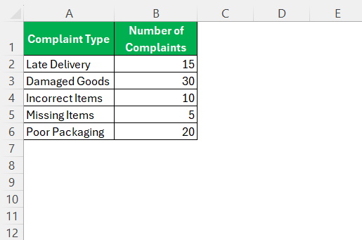
Let’s say I’m analyzing customer complaints in a product. My categories might be “Late Delivery,” “Damaged Goods,” “Incorrect Items,” and so on. The frequency would reflect how many complaints were received for each issue.
Creating Pareto Chart
Here’s how to create a Pareto chart in Excel using a straightforward step-by-step format:
STEP 1: Input Your Data
Enter your data into an Excel worksheet. You’ll need two columns: one for the categories (e.g., complaint types) and one for the corresponding values (e.g., number of complaints).
STEP 2: Sort Data in Descending Order
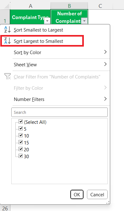
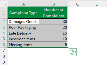
Highlight the dataset, go to the “Data” tab, and click “Sort.” Sort the values from largest to smallest so that the most significant categories are at the top.
STEP 3: Select the Data Range
Highlight the category and value columns, ensuring all relevant data is selected for the Pareto chart.
STEP 4: Insert the Pareto Chart
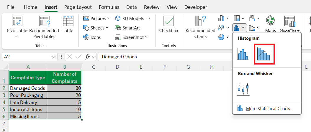
Go to the “Insert” tab. In the “Charts” group, click on “Insert Statistical Chart,” and choose “Pareto.” Excel will create the chart based on your data.
STEP 5: Customize the Pareto Chart
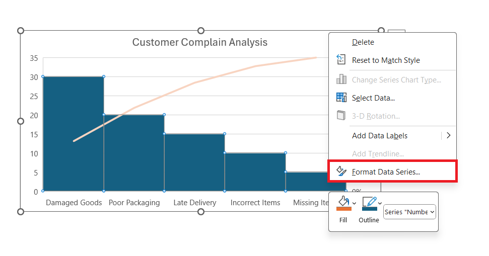
Change the chart title, edit axis labels, and adjust colors if needed by right-clicking on the chart elements and selecting “Format” options.
Review the bars and cumulative percentage line to identify which categories are contributing most to the overall data.
Tips to Enhance Your Pareto Chart
Advanced Formatting Tricks for a Professional-Looking Chart
Mastering a few advanced formatting tricks is instrumental in elevating your Pareto Chart from standard to professional. For instance, I set the primary vertical axis for the values and the secondary vertical axis for the cumulative percentage, ensuring they are both clear and impactful.
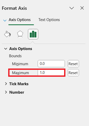
Adjusting the gap width and depth of the bars brings a classic Pareto look, eliminating unnecessary white space. Also, using the ‘Format Axis’ option, I cap the secondary axis at 100% or 1.0, setting a clearer standard for interpretation.
These subtle yet powerful refinements are what turn a good chart into a great one.
Utilizing Dynamic Features for Interactive Data Representation
Delving into Excel’s dynamic features opens up new possibilities for interactive data representation. By employing dynamic arrays and names, I create a Pareto Chart that adapts as the underlying data changes, keeping it ever-relevant and valuable.
Utilizing options like data validation lists and slicers further personalizes the analysis experience, enabling viewers to filter and examine data subsets on the fly. This interactivity not only makes the data more approachable but also invites an exploratory approach to uncovering insights which static charts might miss.
Common Challenges and Solutions
Limitations of Pareto Charts
While Pareto charts are powerful, they do have limitations. It’s essential to recognize that they focus on frequency, not the severity of the issue. For instance, while “Late Delivery” might occur more often than “Damaged Goods,” the latter could be more damaging to the company’s reputation.
Additionally, Pareto charts work best with categorical data. If you’re dealing with continuous data, you might need to use a different chart type.
Case Studies and Examples
Real-World Applications of Pareto Charts in Business
I’ve witnessed Pareto Charts revolutionize the way businesses identify and prioritize issues. For example, in inventory management, a Pareto Chart can swiftly illuminate a handful of products resulting in the most revenue and informing stock decisions.
Similarly, in customer service, these charts identify the few common complaints that, once resolved, significantly enhance customer satisfaction. By bringing data to the forefront of decision-making, Pareto Charts are a linchpin in the continuous improvement efforts of many successful organizations.
Success Stories: Enhanced Decision-Making with Excel’s Pareto
The success stories are what make Excel’s Pareto Charts an undeniable asset. Consider a manufacturing firm that discovered 80% of defects stemmed from 20% of the processes through a Pareto analysis, leading to targeted quality improvements and saving costs considerably.
Or a sales team that used a Pareto Chart to prioritize client issues, boosting satisfaction rates and, in turn, client retention. These narratives underscore the remarkable influence that a proper Pareto Chart in Excel can have in aiding astute and enhanced decision-making.
FAQs
How do I create a Pareto chart in Excel?
To create a Pareto chart in Excel, select your dataset, go to the ‘Insert’ tab, choose ‘Insert Statistic Chart,’ and then pick the Pareto option. Excel will automatically generate the chart, organizing your data into a visual hierarchy of bars arranged in descending order, accompanied by a cumulative percentage line. If necessary, make further customizations in the Design and Format tabs for a more polished look. It’s a quick process to visualize the principle that most effects come from relatively few causes.
What is the Pareto 80 20 rule in Excel?
The Pareto 80/20 rule in Excel, named after economist Vilfredo Pareto, is a guideline suggesting that in many scenarios, 80% of effects come from 20% of the causes. In Excel, this can be visualized using a Pareto Chart, which ranks causes to show which few are responsible for the majority of effects, helping in identifying the most significant factors in datasets for targeted action.
Can Pareto Charts Be Automated in Excel?
Yes, Pareto Charts can be semi-automated in Excel using built-in tools. With a sorted dataset and a cumulative percentage column, simply use the Pareto chart type in the ‘Insert’ tab to generate the chart automatically. For full automation, especially when dealing with dynamic data, Excel’s tables, named ranges, and pivot tables can be configured to update the Pareto Chart as new data is entered, minimizing manual adjustments.
How Do You Keep a Pareto Chart Updated with Real-Time Data?
Keeping a Pareto Chart updated with real-time data in Excel requires using tables for your dataset. Once you’ve converted the range of data into a table, any new information added will automatically reflect in the chart. For further automation, combine Excel tables with pivot charts and employ the refresh function to keep the visualization up to date. This way, the chart remains current, displaying the latest available information without the need for constant manual intervention.
What does a Pareto chart do?
A Pareto chart helps identify and prioritize problem areas in processes, highlighting the most significant factors that contribute to a larger effect. By comparing the frequency, cost, or other important measures, a Pareto chart separates the “vital few” from the “trivial many” and is an effective visual tool for focusing on areas that will have the greatest impact if addressed.
John Michaloudis is a former accountant and finance analyst at General Electric, a Microsoft MVP since 2020, an Amazon #1 bestselling author of 4 Microsoft Excel books and teacher of Microsoft Excel & Office over at his flagship MyExcelOnline Academy Online Course.

