Excel Radar Charts can be used to compare multiple variables to a central point and show the difference between sub-groups. Radar Chart in Excel is very handy to show a rating on several performance areas. It is useful when analyzing results from a survey, compare target vs actual values, performance review, etc.
Key Takeways
-
Radar Charts Visualize Multi-Skill Ratings – Radar charts are ideal for displaying performance across multiple criteria (e.g., communication, teamwork, leadership) in a single view.
-
Easy to Create from Structured Data – With categories in rows or columns and scores for each, Excel can quickly generate a radar chart via the Insert > Chart menu.
-
Compare Multiple Employees or Reviews – Add multiple data series to compare different employees, time periods, or departments on the same chart.
-
Great for Identifying Strengths and Gaps – The shape of the radar chart highlights areas of excellence or weakness, making it a powerful tool for HR and managers.
-
Customizable for Clear Presentation – You can adjust the fill, lines, colors, and labels to improve readability and align the chart with your report branding.
Table of Contents
What is an Excel Radar Chart?
Excel Radar Charts are used to show a multi-variate comparison in a 2-dimensional form.
It is a graphical representation of data that can be used to display a lot of information into a single image.
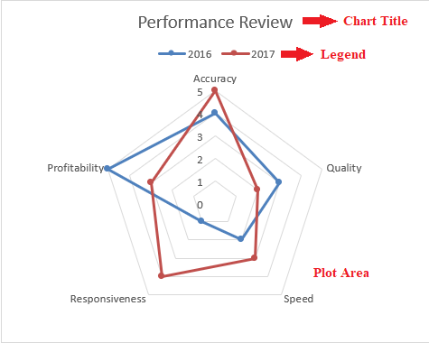
It is sometimes called a spider or star chart. Each spike in the chart represents a data and the length of the spike is the magnitude of that data point.
A Radar Chart has three main sections in it: Plot Area, Chart Title, and Legend. A Plot Area
Types of Excel Radar Charts
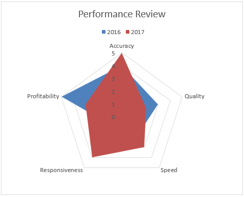
Radar Charts are of 3 types – Radar, Radar with markers, and Filled Radar.
- Radar Chart – This is a basic radar chart and it displays values that are relative to the central point.
- Radar with Markers – This is a Radar Chart that displays markers on the data points.
- Filled Chart – In this Radar Chart, the entire radar is filled with a color.
Let’s look at the detailed tutorial on How to create a Radar Chart in Excel!
Examples of Excel Radar Charts
Example 1: Performance Chart
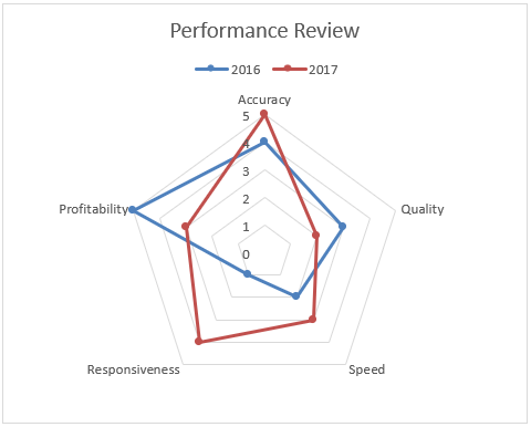
When I had to give out performance reviews, it was a very helpful snapshot for me to show to my colleagues how their performance was compared to last year!
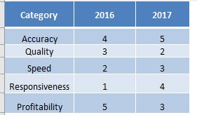
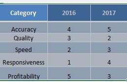
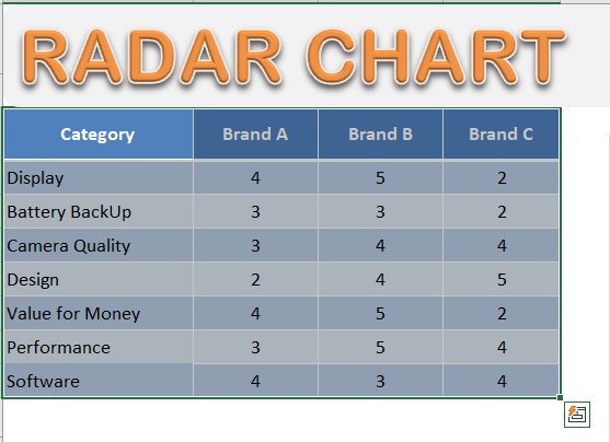
Here is an example of a table with several ratings:
In this example, I show you how easy it is to insert a Radar Chart using Excel.
STEP 1: Highlight your table and go to:
Insert > Recommended Charts (Excel 2013 & above)
Insert > Other Charts (Excel 2007 & 2010)
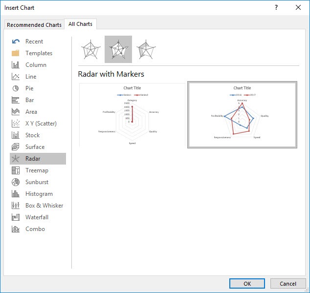
STEP 2: Select All Charts > Radar > Radar with Markers > OK
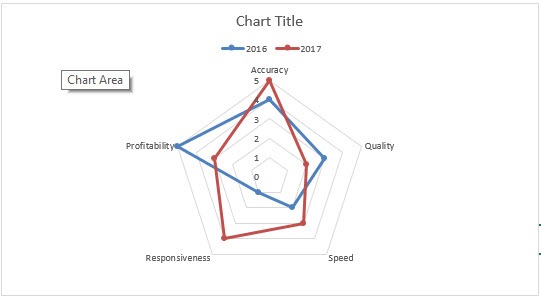
STEP 3: Now you have your Radar Chart.
Now you can use your radar chart to convince your own boss that your performance has skyrocketed this year!
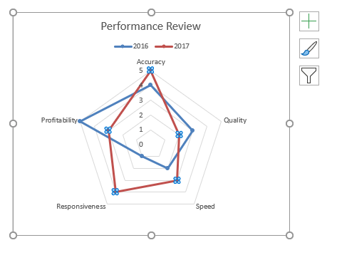
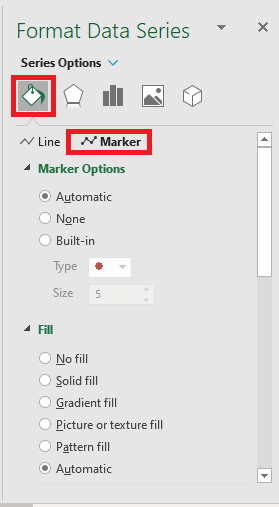
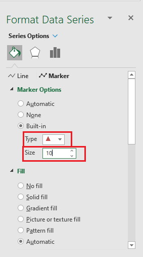
You can even change the shape and size of the marker displayed on the line. To do that, follow the steps below:
STEP 1: Select the line and Press Ctrl +1 to open the Format Series dialog box.
STEP 2: Select Fill Icon and then Select Marker.
STEP 3: Under Built-in option, select type and size that you want.
Let’s try to use this chart with another example!
Example 2: Competitive Analysis
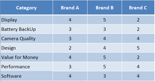
A survey was conducted regarding the comparison of 3 different Mobile Phone Brands and the results were combined in the data table.
In the table below, you have a survey data that compares 3 mobile company brands based on various categories.
Looking at this data in one glance, it will be difficult to judge which brand is preferred by the customers. So, let’s create an Excel Radar Chart using this data.
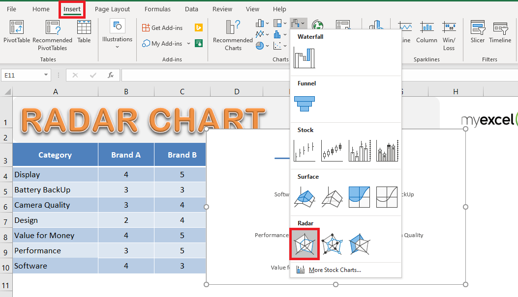
STEP 1: Select the table containing the data.
STEP 2: Go to Insert > Waterfall, Funnel, Stock, Surface or Radar Chart > Radar Chart (In Excel 2019)
Go to Insert > Stock, Surface or Radar Chart > Radar Chart (In Excel 2013)
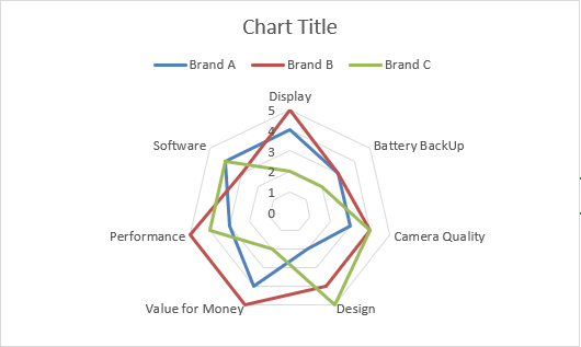
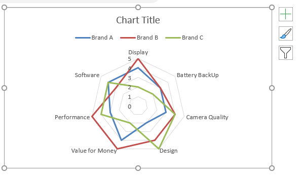
Your Excel Radar Chart will be ready.
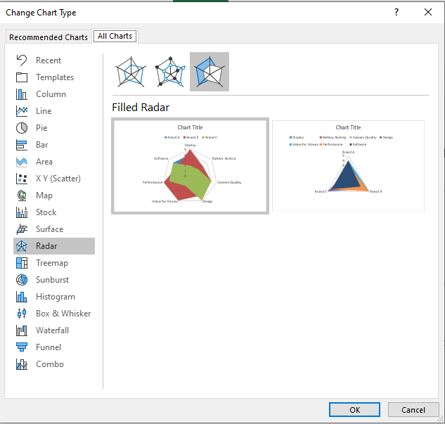
To change the type to Radar with markers or filled Radar Chart:
STEP 1: Select the existing chart
STEP 2: Go to Chart Design > Change Chart Type
STEP 3: In the Change Chart Type dialog box, select the desired chart you want to change to and then Press OK.
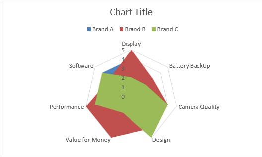
If you select Filled Radar Chart, this is how your chart will look like.
From the chart, you can easily infer that based on the survey result, Brand B is preferred over the other two.
Example 3: Sales Analysis
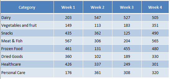
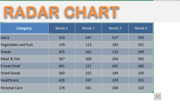
The below data shows weekly sales performance (in $ ‘000) of various products sold in a supermarket:
You can use this data to create a Radar Chart in Excel.
STEP 1: Select the Data Table
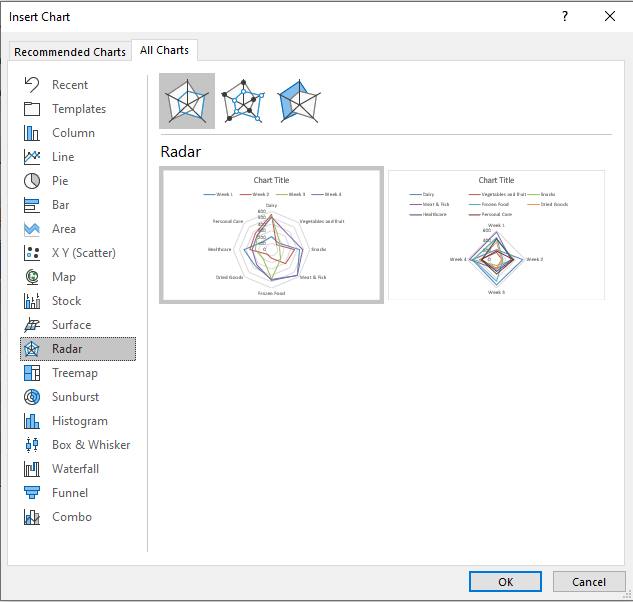
STEP 2: Go to Insert > Recommended Chart (Excel 2013 & Above)
Insert > Other Charts (Excel 2007 & 2010)
STEP 3: In the Insert Chart dialog box, Go to All Charts > Radar Charts and then Press OK.
This is how your Sales Analysis Excel Radar Chart will look like:
In the Radar Chart, the weekly sales figure for various products are shown with the axes varying from 0 to 600.
Sales for each product are easily comparable on their own axis and the overall difference is visible based on the size and shape of the polygon formed.
Let’s discuss in detail the merits and limitations of using a Radar Chart!
Advantages and Disadvantages of Excel Radar Charts
Advantages:
- It is useful to show a lot of information in a single image.
- It is more useful when you want to know the overall picture, not an exact value.
- It is useful when values or categories are not directly comparable.
Limitations:
- The more the number of webs in the chart, the more complicated it gets and harder to analyze.
- Too much data makes the chart crowded and harder to interpret.
- It is not ideal for making a trade-off decision.
Frequently Asked Questions
What kind of data is best suited for a radar chart?
Radar charts work well with rating scale data across multiple dimensions, such as employee performance scores (e.g., 1 to 5 scale) in categories like leadership, adaptability, and productivity.
How do I insert a radar chart in Excel?
Select your data, go to Insert > Charts > Radar, and choose the standard radar or filled radar option for visualization.
Can I compare more than one employee in a radar chart?
Yes! Each employee can be represented as a separate data series, allowing you to view multiple performance profiles on the same chart.
How do I make the chart easier to read?
Use data labels, apply contrasting colors, and consider using the filled radar chart to visually separate different data series.
Can I use a radar chart for year-over-year reviews?
Definitely. Plot each year as a separate series to visually compare an individual’s performance growth or decline over time.
Conclusion
In this article, you have learned in-depth about the Radar Chart Excel, its types, steps to create a chart in excel, and its advantages and disadvantages.
Excel provides a plethora of charts to choose the right one for your data. To take a look at them, click here.

Bryan
Bryan Hong is an IT Software Developer for more than 10 years and has the following certifications: Microsoft Certified Professional Developer (MCPD): Web Developer, Microsoft Certified Technology Specialist (MCTS): Windows Applications, Microsoft Certified Systems Engineer (MCSE) and Microsoft Certified Systems Administrator (MCSA).
He is also an Amazon #1 bestselling author of 4 Microsoft Excel books and a teacher of Microsoft Excel & Office at the MyExecelOnline Academy Online Course.
