When it comes to visualizing data in Excel, area charts are one of my go-to tools. They allow me to represent data points over time or across categories in a way that’s both visually appealing and analytically powerful. Whether I’m tracking sales over the year, analyzing trends, or comparing the contributions of different datasets, area charts help me see the bigger picture at a glance.
Key Takeaways:
- Area charts in Excel are powerful tools for visualizing data trends and contributions over time.
- They effectively show cumulative values by filling the area under lines, making comparisons easier.
- Proper data structuring, with clear labels and consistent intervals, is crucial for accurate chart representation.
- Stacked area charts are ideal for comparing different groups’ contributions to a total.
- Customizing colors, labels, and scales enhances the clarity and impact of area charts.
Table of Contents
Excel Area Charts Unveiled
Grasping the Basics of Area Charts
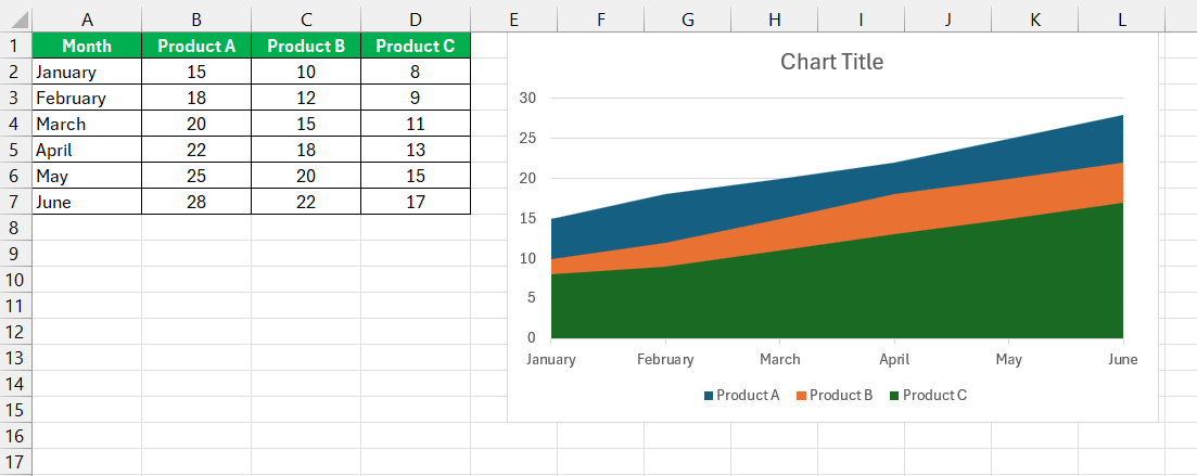
An area chart in Excel is essentially a line chart with the area below the lines filled with color. This filled area makes it easier for me to see how different values accumulate over time or across categories. These charts are especially useful when we want to highlight the total value across a trend or compare multiple groups’ contributions. This layout provides a clear visual of how values accumulate over time or across categories.
Understanding Its Significance in Data Visualization
Area charts play an indispensable role in data visualization. Their primary purpose is to illustrate how one or more groups’ quantities change over a continuous range like time. They’re particularly effective when communicating the volume beneath a line chart, effectively mapping out the magnitude of changes over time.
By shading the spaces below lines, area charts not only enhance visual appeal but also serve an analytical purpose. They make it easier for me to perceive the relative contribution of different datasets and comprehend the cumulative effect of data points.
Preparing for Speed: Data Setup Simplified
Before we even start creating the chart, I make sure my data is well-structured. Here’s how I prepare:
- Sequence data logically: The strength of an area chart lies in showing how values develop over time or across categories. I ensure that my data points are sequenced chronologically or logically.
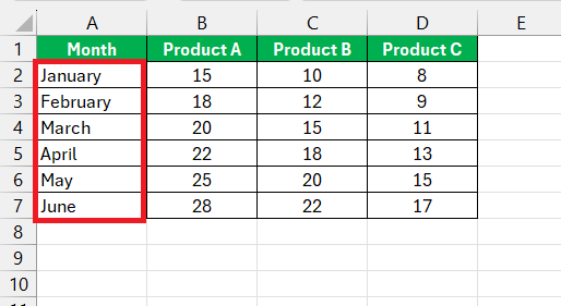
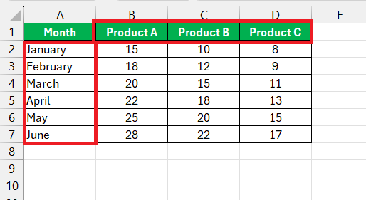
- Label clearly: Each row and column should be clearly labeled. Time intervals or categories go on the X-axis, while the values I’m tracking go on the Y-axis.
- Maintain uniformity: Consistency is key. I make sure the time intervals are uniform, whether I’m using days, months, or years. This ensures my chart accurately reflects trends.
- Positive values only: Area charts work best with positive values, as they represent the area beneath the line. I check that all my values are positive and properly formatted.
The Race Against Time: Crafting an Area Chart Fast
Step-by-Step: Creating an Area Chart in Under 60 Secs
Creating an area chart quickly in Excel is straightforward if you follow these concise steps:
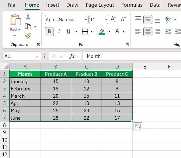
STEP 1: Highlight the complete data range you wish to visualize, including the headers.
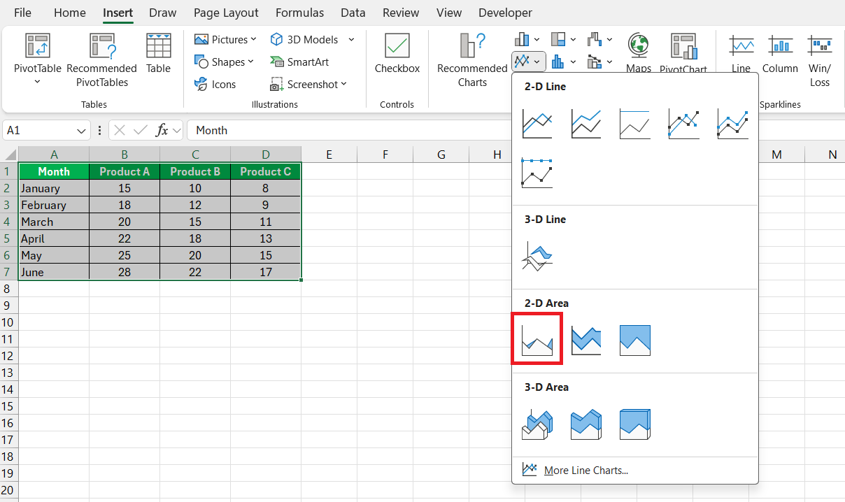
STEP 2: Navigate to the ‘Insert’ tab. Click on the ‘Area Chart’ icon in the Charts group.
STEP 3: From the drop-down, choose the specific type of area chart you want, such as ‘Stacked Area’.
The chart instantly appears on your worksheet.
Adjustments and customization can be made afterward, but these six steps quickly generate a basic Excel area chart.
Advanced Quick Tips: Elevate Your Chart in a Blink
Enhancing Visual Appeal with Simple Tweaks
Enhancing the visual appeal of area charts can often be achieved with some straightforward adjustments:
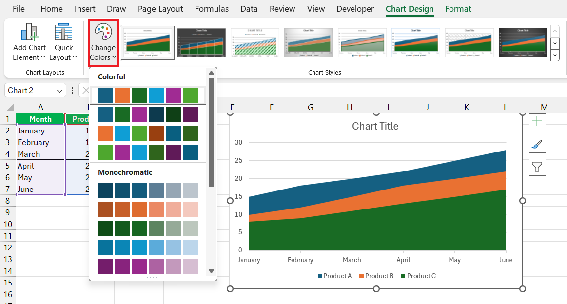
- Ink a consistent and appealing color scheme. Choose colors that highlight the most important data and are easily differentiated by the viewer.
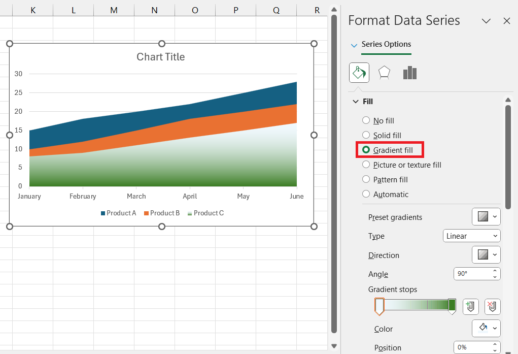
- Apply subtle gradients to suggest volume or intensity if the data speaks to such qualitative measures.
- Utilize Excel’s built-in chart designs for a professional look that aligns with your presentation or report’s theme.
- Don’t overlook the power of white space. Prioritize legibility and impact over squeezing in numerous elements.
With these tweaks, an ordinary area chart transforms into a compelling story about your data.
Streamlining Comparisons with a Stacked Area Chart
Stacked area charts are my go-to when I want to compare data visually and immediately understand their contribution to a total. Here’s how to streamline your comparisons:
- Ensure your categories are complementary and logically stackable. That is, their combined values should represent a meaningful total.
- Start with the largest category at the base and work upwards to maintain readability and symmetry.
- Pay attention to the scale of your Y-axis; it should accommodate the cumulative values of your stacked categories.
- Annotate strategically to highlight trends, discrepancies, or significant shifts within the stacked segments.
A well-crafted stacked area chart makes comparative analysis intuitive, revealing the proportionate relationships within a dataset at a glance.
Overcoming Common Hurdles Quickly
Diagnosing and Solving Typical Area Chart Pitfalls
When we stumble upon issues with area charts, diagnosing and solving them can often be done rapidly:
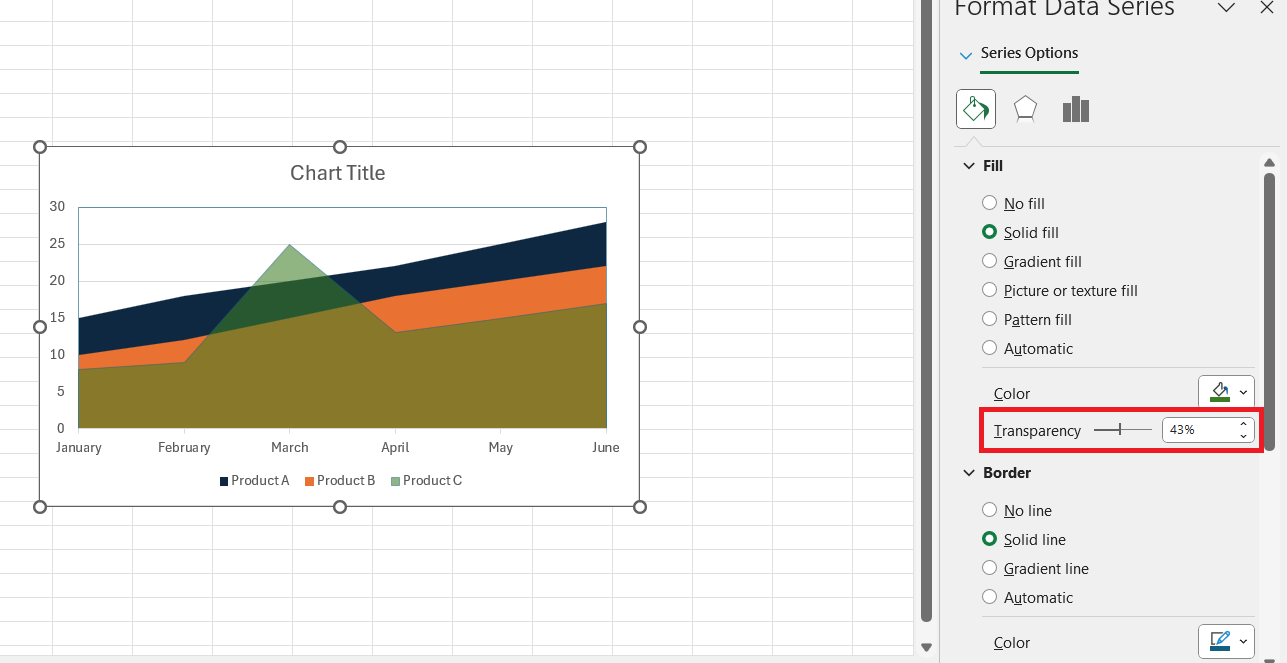
- Overlapping Data: If multiple data series overlap confusingly, consider adjusting transparency or switching to a stacked area chart for clarity.
- Unreadable Legends: Relocate or resize your chart legend to ensure that each entry is legible and does not interfere with the chart’s data.
- Inconsistent Data Ranges: Verify that your axis scales are consistent across similar charts to avoid misinterpretation.
- Misinterpreted Data: To avoid interpretation errors, double-check that your labels and data pointers accurately represent the data series.
By tackling these common pitfalls, we can enhance both the appearance and the accuracy of our area charts, making the data more accessible to our audience.
Optimizing Charts for Maximum Clarity and Impact
Optimizing our area charts for maximum clarity and impact is paramount. Here are key strategies:
- Prioritize Your Data: Emphasize the most important data series through bolder colors or more pronounced areas, while muting less critical series.
- Minimize Clutter: Remove any unnecessary labels, gridlines, or decorations that do not serve the data’s story.
- Standardize Axes: Maintain uniform axes scales across comparative charts to facilitate straightforward comparison.
- Opt for Readability: Ensure text size and font styles are legible across various devices and when printed.
- Analyze Responsively: Make sure your charts adapt well when translated to different presentation mediums, from large monitors to mobile screens.
Remember, the goal is to craft charts that not only illustrate the data points but also the narrative behind them.
Area Charts FAQs
How do I create an area chart in Excel?
To create an area chart in Excel, follow these succinct steps:
- Highlight your data range.
- Click on the ‘Insert’ tab.
- Choose the ‘Area Chart’ icon.
- Select your preferred area chart type.
- Your chart will appear instantly on your spreadsheet.
It truly is a process that can be done in moments.
What is the area chart used for?
An area chart is primarily used to visualize how quantities grow or decline over time or to show the cumulative effect of a series of data points, highlighting the total value across a trend.
They are excellent for revealing volume changes and the significance of trends in data.
Can I Build an Area Chart for Any Type of Data?
While area charts are versatile, they’re best suited for data that is continuous and changes over time, such as stock prices, sales numbers, or weather patterns. They may not be appropriate for all data types, especially where categories are discrete or not part of a progression.
How do I format an area chart in Excel?
Formatting an area chart in Excel is quite easy:
- Click on the chart to select it.
- Use the ‘Chart Design’ and ‘Format’ tabs in the ribbon for style and layout changes.
- Right-click on elements you wish to modify, like axes or area fills, for more specific formatting options.
- Adjust colors, fill patterns, line styles, and add labels or legends as needed.
These steps can quickly enhance the readability and aesthetic of your chart.
What Are Some Quick Fixes for Common Area Chart Issues?
Quick fixes for common area chart issues include:
- Adjusting scale: If data is hard to read, modify the axis scale for better visibility.
- Reducing clutter: Simplify by limiting data series and decluttering axes labels and legends.
- Enhancing overlap: To distinguish overlapping areas, play with color opacity and order of data series.
- Improving clarity: Use direct labeling on the chart and add annotations to draw attention to key points.
These adjustments can greatly improve your chart’s comprehensibility.
John Michaloudis is a former accountant and finance analyst at General Electric, a Microsoft MVP since 2020, an Amazon #1 bestselling author of 4 Microsoft Excel books and teacher of Microsoft Excel & Office over at his flagship MyExcelOnline Academy Online Course.

