Creating flowcharts in PowerPoint is a fantastic way to visualize processes, brainstorm ideas, or simply organize information in a clean and structured format. PowerPoint’s built-in tools make it easy to design flowcharts that look professional and help convey information effectively. In this guide, I’ll walk you through each step, from choosing the right shapes to connecting them seamlessly for an eye-catching and useful flowchart.
Key Takeaways:
- Flowcharts in PowerPoint visually simplify complex processes, making presentations more engaging.
- Use native shapes for full customization or SmartArt graphics for quick flowchart designs.
- Consistent symbols, colors, and arrows help enhance flowchart clarity and readability.
- Animations can reveal flowchart steps gradually, improving audience understanding.
- Export flowcharts as high-resolution images or PDFs to share them outside PowerPoint effectively.
Table of Contents
Unveiling the Essentials of Flowcharts in PowerPoint
The Role of Flowcharts in Effective Presentations
Flowcharts stand out as a visual tool that can turn complex processes into accessible, easy-to-follow diagrams. In PowerPoint presentations, I’ve found flowcharts to significantly enhance the way we communicate ideas. They help break down lengthy explanations into streamlined, intuitive visuals. Your audience can follow your thinking more easily, making your presentations far more effective.
Quick Overview: What Is a Flowchart?
A flowchart is a visual representation of a sequential process that outlines every step from start to finish. It’s particularly advantageous because it clarifies how individual steps flow into each other. In a flowchart, various shapes symbolize different types of actions or decisions while arrows illustrate the progression from one step to the next. This simplicity allows anyone to grasp complex workflows at a glance.
Crafting Your First Flowchart with Ease
Choose Between Templates or Starting from Scratch
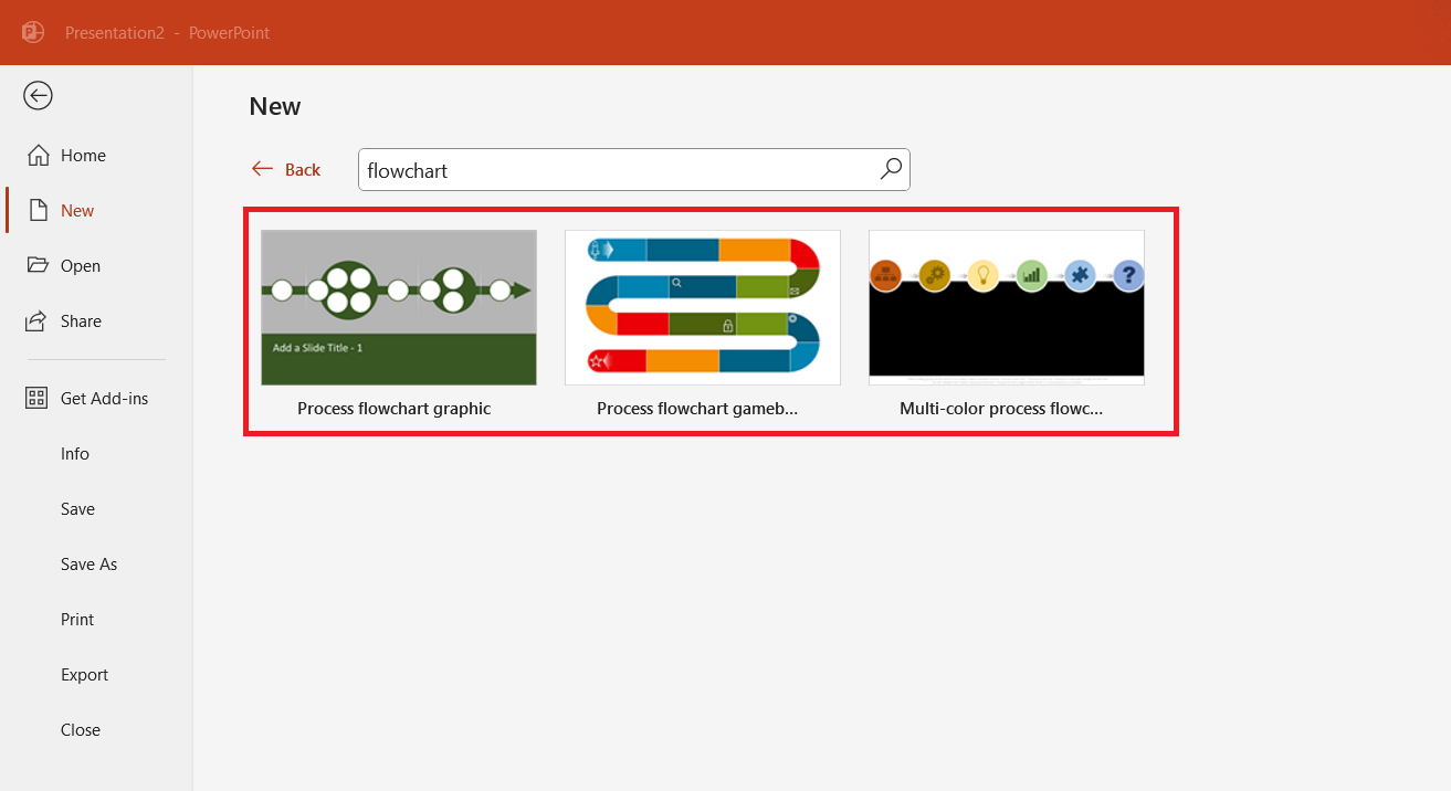
When creating a flowchart in PowerPoint, we’ve got two solid avenues: using ready-made templates or crafting one from scratch. Pre-built templates offer a head start with expertly designed frameworks tailored to a variety of processes. These can be supremely convenient, as they save us from the nitty-gritty of designing layout and let us dive directly into tailoring content.
Alternatively, if we opt to start from a blank slate, we get the unique opportunity to custom-design each element, providing a more personalized touch to the flowchart.
To strike the right balance, always consider both the time available and the specific needs of your content when deciding which route to take.
Utilizing Native Shapes and SmartArt Graphics
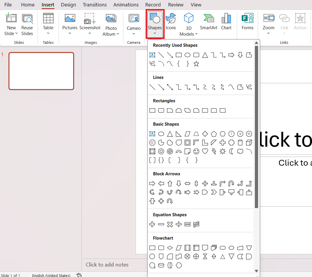
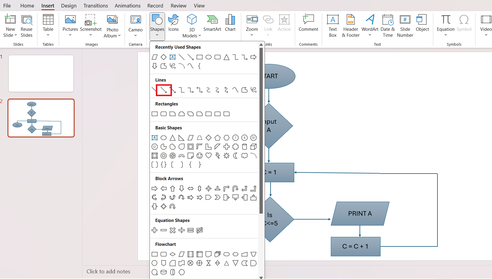
PowerPoint provides us with two practical tools to create flowcharts: native shapes and SmartArt graphics. Native shapes are individual elements we can drag onto our canvas, resize, and connect freely to reflect the specifics of our process. Using these shapes, we have the flexibility to design customized and complex flowcharts.
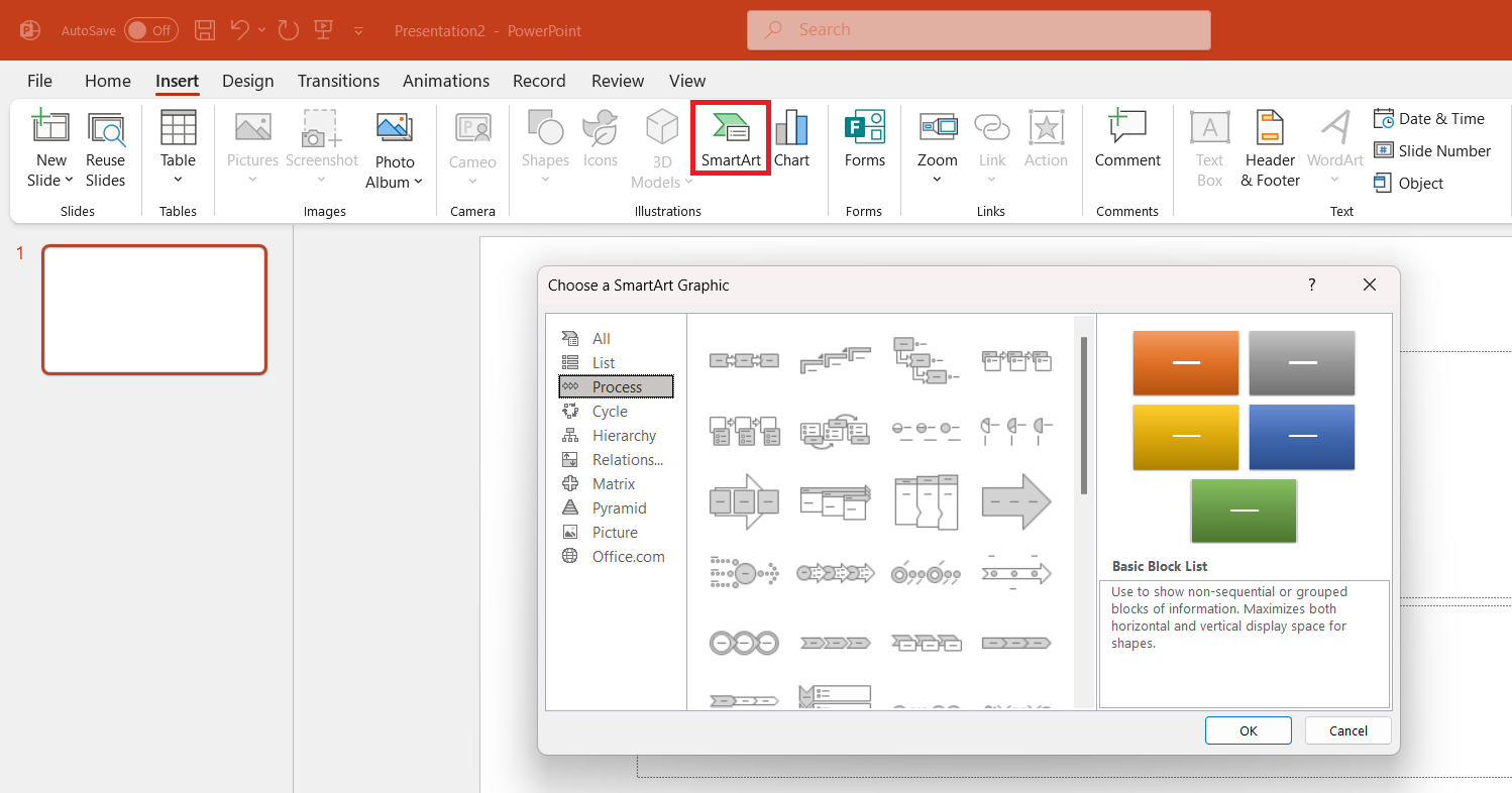
On the other hand, SmartArt graphics offer a quick solution with pre-made flowchart templates. While these are less flexible than native shapes, SmartArt is perfect for more straightforward processes and when time is of the essence. Just click “Insert,” then “SmartArt,” choose “Process,” and pick a style that resonates with the flow of the information.
Remember, the end goal is to convey a message in the clearest way possible, whether through the customization of shapes or the convenience of SmartArt.
Styling Tips for Impactful Flowcharts
Selecting Colors and Fonts Wisely
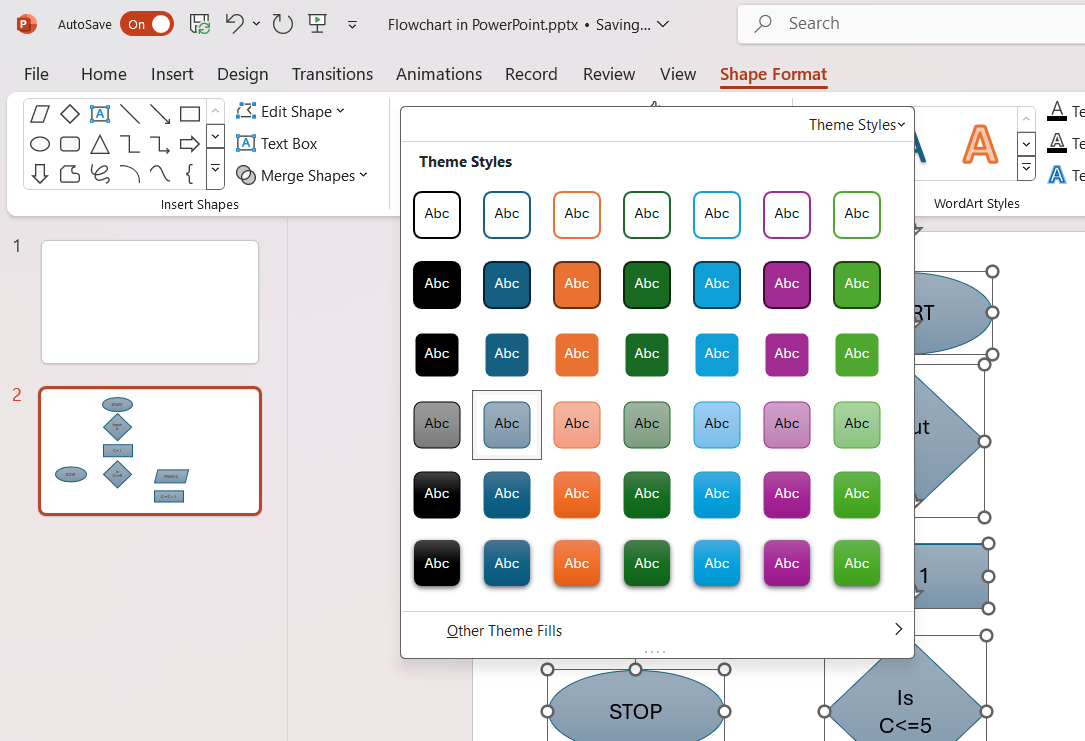
The choice of colors and fonts in a flowchart isn’t just about aesthetics; it’s crucial for readability and audience engagement. Stick to a professional yet appealing color scheme, with a palette of 3-4 complementary colors to maintain visual coherence.
Highlight critical steps with a distinct color, but take care not to overwhelm. As for fonts, choose a clear, legible typeface and maintain a consistent size hierarchy to differentiate titles, subtitles, and content.
Remember, the key lies in finding a balance between visual appeal and practicality; the colors and fonts should enhance the flowchart’s readability, not detract from it.
Keeping Consistency with Symbols and Arrows
For our flowcharts to genuinely communicate processes with clarity, maintaining symbol and arrow consistency is non-negotiable. We should standardize our use of shapes: circles or ovals for start and end points, rectangles for process steps, diamonds for decision nodes, and so on. This uniformity helps audiences to follow the chart fluently without confusion.
Furthermore, arrows should clearly indicate the flow from one step to the next. We ought to ensure they point accurately and don’t overlap in a way that muddles the process direction. Investing time to adjust these arrows pays off, as it prevents any ambiguous interpretations of the flowchart.
Consistency here not only sharpens the visual appeal but also reinforces the logical structure that our audience depends on to follow the information trail.
Advanced Techniques for Dynamic Flowcharts
Incorporating Animations and Transitions
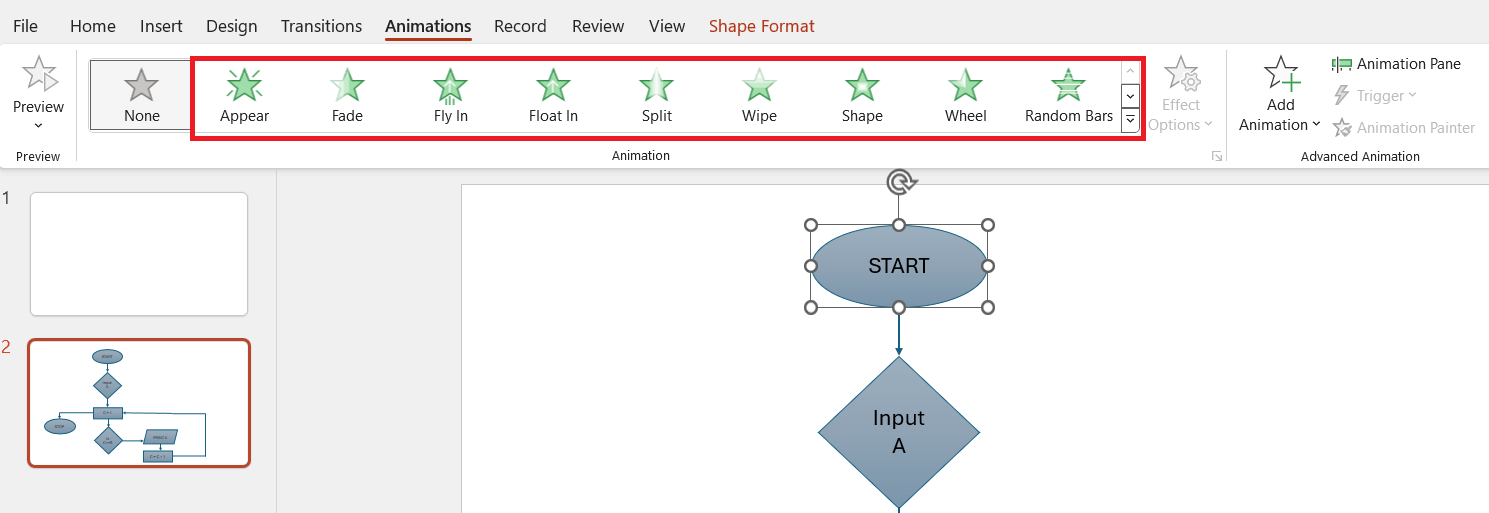
Animating a flowchart can transform a static visual into a dynamic storytelling tool. In PowerPoint, we can make individual elements of the flowchart come alive, one by one, with the use of animations. This step-by-step revelation of the process ensures that our audience can follow along without getting lost in a complex diagram. To animate, click on a shape, then go to the “Animations” tab. Here, we can choose from a broad range of effects.
Transitions between slides also play a role in keeping the audience engaged. The transition should be subtle yet effective, avoiding any distraction from the content itself. Importantly, any animation or transition should serve a purpose, enhancing the audience’s understanding rather than simply being decorative.
Optimizing Flowchart Readability and Design
Simplifying Complex Information
The essence of a powerful flowchart is its ability to distill elaborate information into simple visuals. To achieve this, we must focus on the core elements of the process, stripping away any details that don’t directly contribute to the flow or understanding. Use keywords and brief phrases instead of full sentences in your chart blocks to avoid overloading the audience with text. This selective condensation not only improves readability but also enhances retention.
When we simplify complex information, we’re not reducing its significance but rather making it accessible to a broader audience. A succinctly crafted flowchart renders the intricate straightforward, leading to effective communication and informed decision-making.
Ensuring Clarity with Adequate Text Spacing
A well-spaced flowchart is a legible flowchart. We need to ensure that text within each shape has enough breathing room, not cramped or overwhelming. This means judicious use of spacing around text, consistent font sizes that consider the hierarchy of information, and sufficient gap between the shapes themselves. PowerPoint’s alignment and distribution tools are a godsend for these tasks; they help us standardize the spacing effortlessly.
Adequate text spacing isn’t merely about making the flowchart look good; it’s about making sure every word and symbol is easily identifiable at a glance. The clearer our flowchart is, the more confident our audience will feel navigating the information we present.
Technical Insights for Seamless Flowchart Integration
Adapting Your Flowchart for Various Presentation Formats
Flowcharts aren’t confined to the PowerPoint environment. We often need them to be versatile, and ready for various presentation formats, whether it’s printing, integrating into a report, or displaying on different devices. For optimal adaptation, consider the target medium early in the design process. For printed materials, ensure high contrast and avoid colors that may blend when in grayscale. When a digital format is the end goal, optimize flowchart dimensions to suit standard screen sizes and resolutions.
By planning for adaptability, we pave the way for our flowcharts to serve their purpose in any format – a universal translator of complex processes.
Tips on Exporting and Sharing Flowcharts Outside PowerPoint
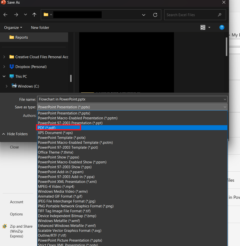
Sharing our meticulously crafted flowcharts outside of PowerPoint needs careful handling to preserve visual integrity. The go-to method is exporting the slide as a high-resolution image (PNG or JPEG), which ensures a crisp, viewer-friendly outcome across various platforms. Alternatively, saving the PowerPoint slide as a PDF file might better serve the purpose for a document-centric distribution, preserving the layout and ensuring compatibility.
For collaborating on flowcharts, programs like OneDrive or SharePoint allow for easy sharing of the original PowerPoint file so others can view and edit the flowchart directly. Never forget to check formatting after exporting, as this safeguards against any unexpected content shifts or quality issues.
FAQs on Creating Flowcharts in PowerPoint
How do you create a flowchart in PowerPoint?
To create a flowchart in PowerPoint, open a new slide, then click on the “Insert” tab. Choose “SmartArt” under the Illustrations group and select “Process” for traditional flowcharts or “Cycle” for circular processes. Pick the flowchart design that suits your needs and click “OK” to insert it. Customize by adding text to the shapes and use the “Design” and “Format” tabs to style your flowchart.
How Do I Choose the Right Template for My Flowchart?
Choosing the right flowchart template hinges on the nature of your process and your audience’s needs. Look for a template that closely mirrors your process flow. Consider the number of steps and decision points, and ensure there is a logical progression represented in the template. Also, simplicity is key; opt for a template that communicates clearly without unnecessary complexity.
Can I Animate Individual Elements of My Flowchart?
Yes, individual elements of your flowchart in PowerPoint can be animated. Click on the shape you want to animate, then go to the “Animations” tab. From here, you can select the animation effect of your choice. To apply animations to elements one after the other, use the “Effect Options” to choose “After Previous.”
What Are the Best Practices for Aligning Flowchart Elements?
Best practices for aligning flowchart elements in PowerPoint include using the alignment and distribution tools for even spacing and alignment. Select multiple shapes and find these options under the “Format” tab. Align shapes to the top, bottom, left, or right for uniformity, and distribute horizontally or vertically to evenly space elements. These practices ensure your flowchart looks neat and professional.
How Can I Share My Flowchart with People Who Don’t Have PowerPoint?
To share a flowchart with those who don’t have PowerPoint, export the slide containing the flowchart as a PDF or image file, which can be viewed on most devices. Click “File,” then “Save As” and choose PDF or an image format. Another option is to upload the presentation to a cloud service like OneDrive and share a link, allowing recipients to view it online without needing PowerPoint.
John Michaloudis is a former accountant and finance analyst at General Electric, a Microsoft MVP since 2020, an Amazon #1 bestselling author of 4 Microsoft Excel books and teacher of Microsoft Excel & Office over at his flagship MyExcelOnline Academy Online Course.

