Treemap Charts are one of the many new Charts available only in Excel 2016.
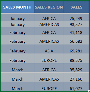
They are very visual as it can easily show you patterns, like based on your summary of sales grouped by month.
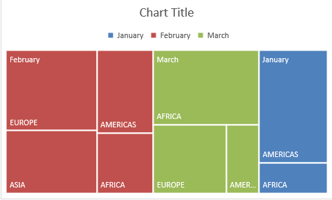
The tree branches are represented by rectangles, wherein each rectangle’s size would denote how big the value (in this case, Sales) would be.
The treemap chart would show each category in each unique color to make it easy to differentiate between each other.
In this example I show you how easy it is to insert a Treemap Chart using Excel.
To upgrade to Excel 2016 you can use this link here: Microsoft Office 2016
STEP 1: Highlight your summary table and go to Insert > Recommended Charts
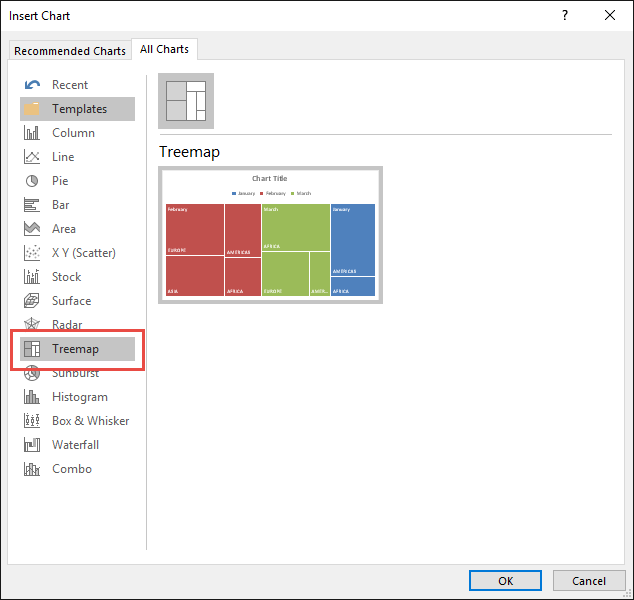
STEP 2: Select All Charts > Treemap> OK
STEP 3: Now you have your Treemap Chart.
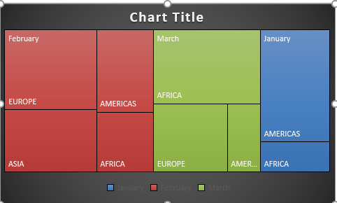
STEP 4: You can further customize the look and feel of your Treemap Chart, by going to Chart Tools > Design / Format
STEP 5: In our example, let us go to Chart Tools > Design and pick one of the alternate designs.
Now you have your beautiful looking Treemap chart and you can quickly point out to your management where the regions with the biggest Sales are…

Bryan
Bryan Hong is an IT Software Developer for more than 10 years and has the following certifications: Microsoft Certified Professional Developer (MCPD): Web Developer, Microsoft Certified Technology Specialist (MCTS): Windows Applications, Microsoft Certified Systems Engineer (MCSE) and Microsoft Certified Systems Administrator (MCSA).
He is also an Amazon #1 bestselling author of 4 Microsoft Excel books and a teacher of Microsoft Excel & Office at the MyExecelOnline Academy Online Course.


