Waterfall Charts are one of the many new Charts available only in Excel 2016.
When I was working at General Electric, I had to create Excel 2016 Waterfall Charts on a monthly basis using formulas….ouch!
They are very popular in the current corporate environment as they graphically show the positive and negative movements within your Monthly Net Profit or Cash Flow.
In this article, we will discuss the following concepts regarding an Excel 2016 Waterfall Chart:
- What is a Waterfall Chart?
- When to Use Waterfall Chart?
- How to Create an Excel 2016 Waterfall Chart?
- Conclusion
Let’s look into each of these points one-by-one!
What is a Waterfall Chart?
Waterfall Chart is an advanced type of Column Chart.
They are very useful in that they show how the initial value is affected by a series of positive and negative expenses through a series of changes.
The first and last column represents total starting and ending values whereas the intermediate columns represents a series of changes from one period to another.
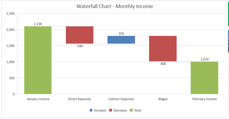
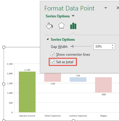
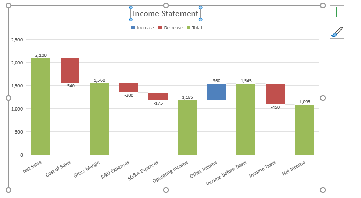
This is how an Excel 2016 Waterfall Chart looks like:
As you can see the columns are color-coded to distinguish between total, positive and negative values.
Here, Green Bars is for the total column, Blue Bars are for positive values and Red Bars are for negative values.
They are also called Excel Bridge Chart and they show how the intermediate columns connect the start and end columns.
When to Use Waterfall Chart?
The main purpose of creating Excel 2016 Waterfall Chart is to show the change in value from the starting point to the final result.
They are mainly used in business applications but can be used to illustrate any process with additions and subtractions based on a starting value.
It can be used to evaluate the following :
- Change in company’s profit
- Change in inventory levels
- Change in product’s earnings
- Budget change in a project
- Tracking demographic changes
- Change in cash flow
Let’s take a look at how to create a Waterfall chart in Excel 2016.
How to Create an Excel 2016 Waterfall Chart?
In this example, I show you how easy it is to insert a Waterfall Chart using Excel 2016.
NB: If you do not have Excel 2016 installed, there are a couple of great Excel add-ins that allow you to insert these charts in Excel 2013 and prior:
The Waterfall Chart Creator by TheSpreadsheetGuru
Peltier Tech Charts for Excel by Jon Peltier
Want to know how to create a Waterfall Chart?
Example 1:
Watch it on YouTube and give it a thumbs up!
Follow the step-by-step tutorial on how to create a Stacked Waterfall Chart Excel 2016 and make sure to download the Excel Workbook and follow along:
download excel workbookWATERFALL-CHART.xlsx
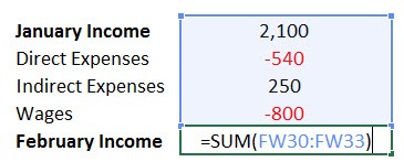
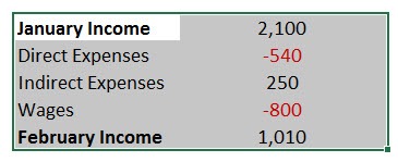
STEP 1: Enter the values in your workbook with the Starting Total e.g. January Income.
Then add the positive and negative values, like direct & indirect expenses.
Finally enter the Ending Total e.g. February Income, which will Sum all of the above values.
STEP 2:Highlight all the data and go to Insert > Recommended Charts
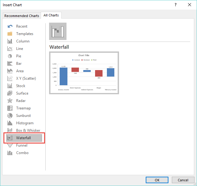
STEP 3: Select All Charts > Waterfall > OK
STEP 4: Double Click on the Starting Totals column (e.g. January Income) and this will bring up the Format Data Point dialogue box.
“Check” the Set as Total box
NB: This will set this column’s value so it starts on the horizontal axis at zero and will not “float”
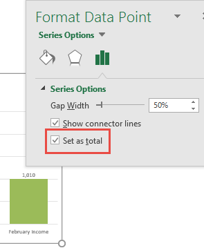
STEP 5: Now select the Ending Total with your mouse and once again, “Check” the Set as Total box
Now you have your beautiful looking Excel 2016 Waterfall chart and you can quickly point out to your management where the variances have occurred…
Example 2:
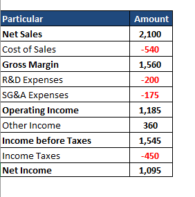
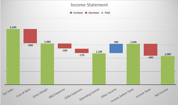
We will use the Waterfall Chart to understand the income statement overview and change analysis.
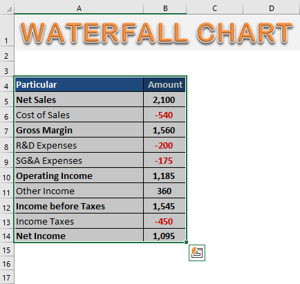
STEP 1: Select the Data Table
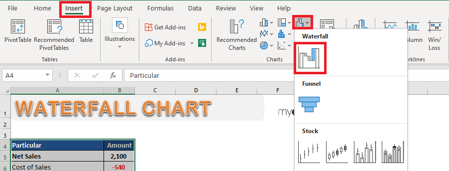
STEP 2: Go to Insert > Waterfall Icon > Waterfall Chart.
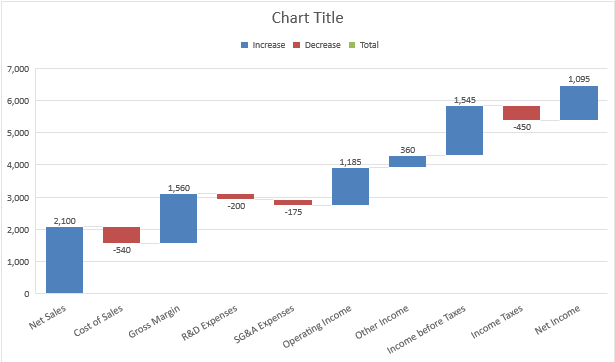
STEP 3: Waterfall Chart will appear on the sheet.
Net Sales, Gross Margin, Operating Income, Income before taxes, and Net Income are all either Total or Subtotal values, not additional values.
As you can see Excel has incorrectly considered all the columns as additional values (color-coded as either blue or red). Let’s fix it!
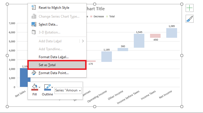
STEP 4: Right Click on Column and select Set as Total.
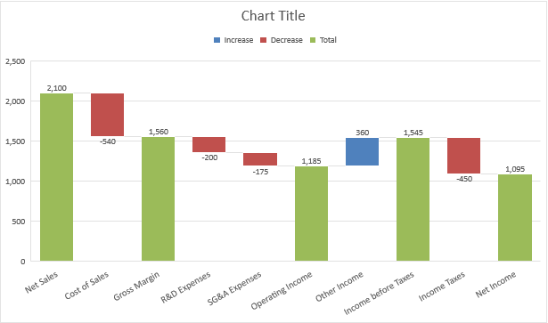
Net Sales is now shown as Total Value (Green Color).
STEP 5: Let’s do the same for Gross Margin, Operating Income, Income before taxes, and Net Income.
STEP 5: Double Click on Chart title and rename it.
STEP 6: To change the layout of the Waterfall Chart, Go to Chart Design > Select a Chart Style.
Your edited Waterfall Chart is ready!
Conclusion
In this article, you have learned that the Waterfall in Excel 2016 is an excellent way to display how individual data contributes to an overall total.
It is used to display how a net value has been arrived by analyzing the cumulative effect of positive and negative values based on a starting point.
You can go through the details regarding the new charts available in Excel 2016 by clicking here.
John Michaloudis is a former accountant and finance analyst at General Electric, a Microsoft MVP since 2020, an Amazon #1 bestselling author of 4 Microsoft Excel books and teacher of Microsoft Excel & Office over at his flagship MyExcelOnline Academy Online Course.

