When working with large datasets in Excel, it’s important to present information in a way that is visually appealing and easy to interpret. One of my favorite ways to enhance data presentation is by using Data Bars in Conditional Formatting. Data Bars provide a quick and effective way to compare values within a range, making it easy to spot trends, patterns, and outliers at a glance.
In this article, I’ll walk you through everything to define Data Bars in Excel, including how to apply them, customize them, and make the most of this powerful feature.
Key Takeaways:
- Data Bars in Excel provide a visual representation of numerical values, making comparisons easier.
- Customizing Data Bars allows control over colors, minimum/maximum values, and whether to show numbers.
- Managing negative values requires using different colors and adjusting axis settings for clarity.
- Data Bars are most effective for quick trend analysis but should be used carefully with extreme value ranges.
- Pairing Data Bars with other formatting options, like Color Scales and Icon Sets, enhances data readability.
Table of Contents
Define Data Bars
What Are Data Bars in Excel?
Data Bars in Excel are effective visual tools embedded within cells that use conditional formatting to represent data values graphically. They provide a bar chart-like illustration that can help quickly compare numerical values in a row or column. These bars vary in length, proportionate to the cell’s data value relative to the others in the selected range, enabling a quick visual comparison.
The Visual Impact of Data Bars on Data Presentation
The visual impact of Data Bars on data presentation cannot be overstated. By transforming raw numbers into graphical elements, Data Bars allow us to perceive trends, variations, and patterns at a glance. They make spreadsheets less intimidating and more accessible, especially for those who may not be adept at interpreting numerical data.
The length of each bar correlates directly to its value, making it simple to spot outliers and identify which figures stand out, and which are comparatively lower or higher.
Step-by-Step Guide to Adding Data Bars
Quick Application of Data Bar Formatting
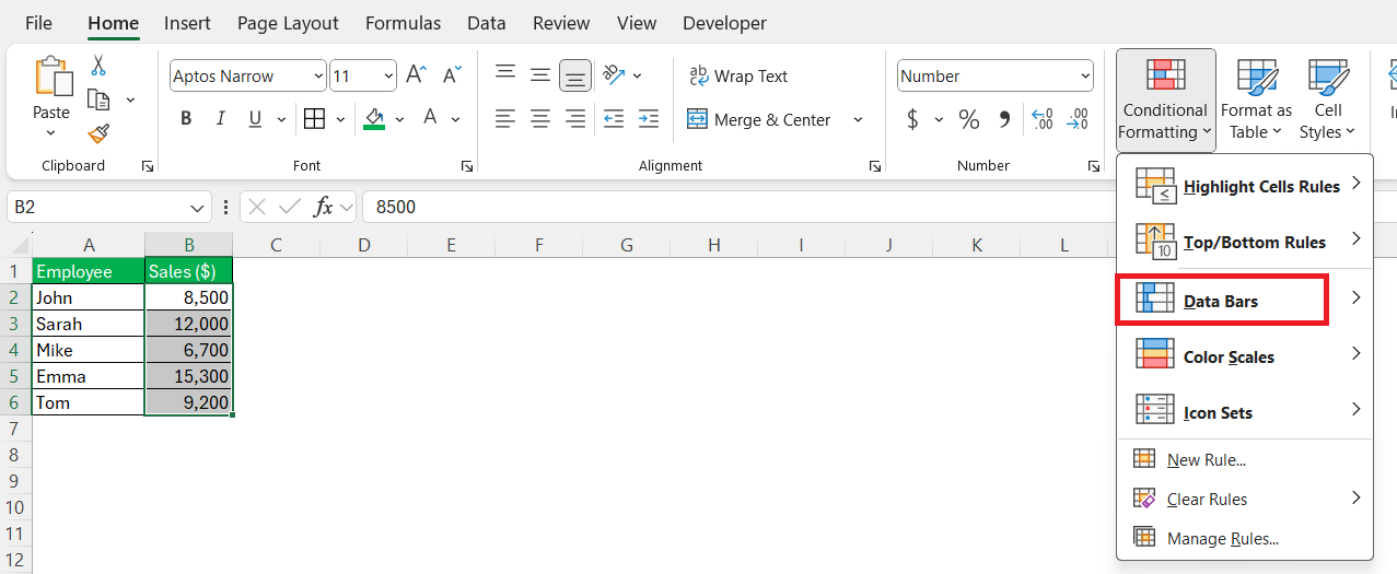
Applying Data Bar formatting to your spreadsheet is a quick process. First, select the range of cells you wish to format. Then, go to the ‘Home’ tab and find the ‘Conditional Formatting’ button in the ‘Styles’ group.
Click on it and choose ‘Data Bars’.
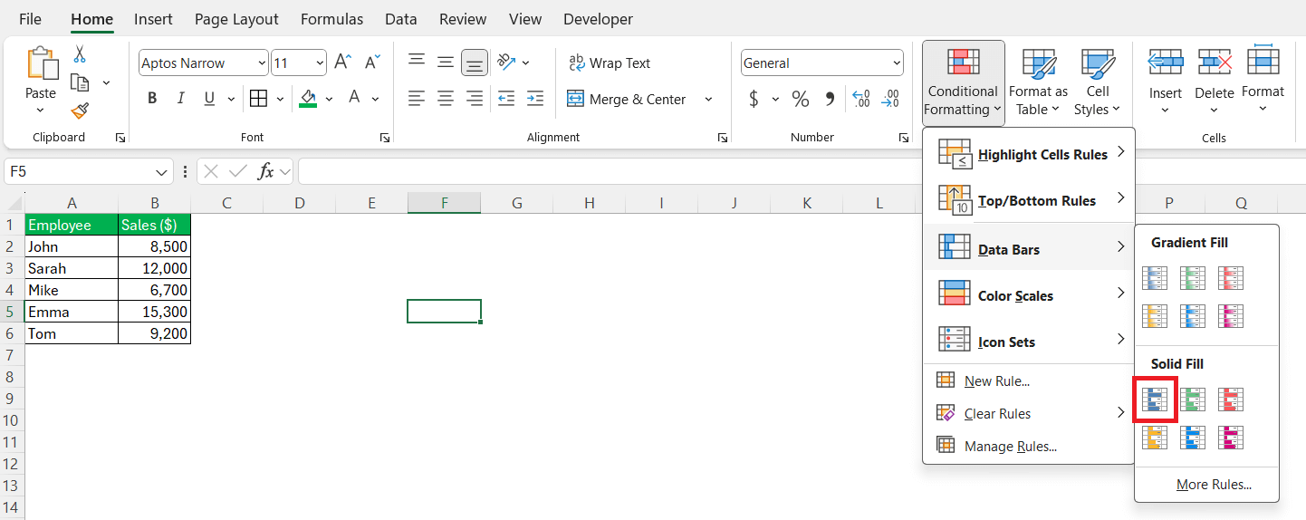
Here, you can pick from a selection of pre-set color schemes.
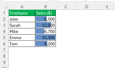
Once selected, Excel automatically applies the data bars to your cells, instantly enhancing the data’s visual representation.
Customizing Data Bars for Your Spreadsheet
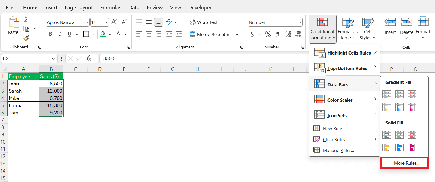
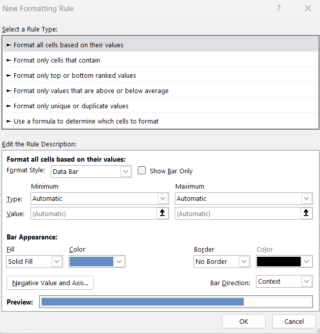
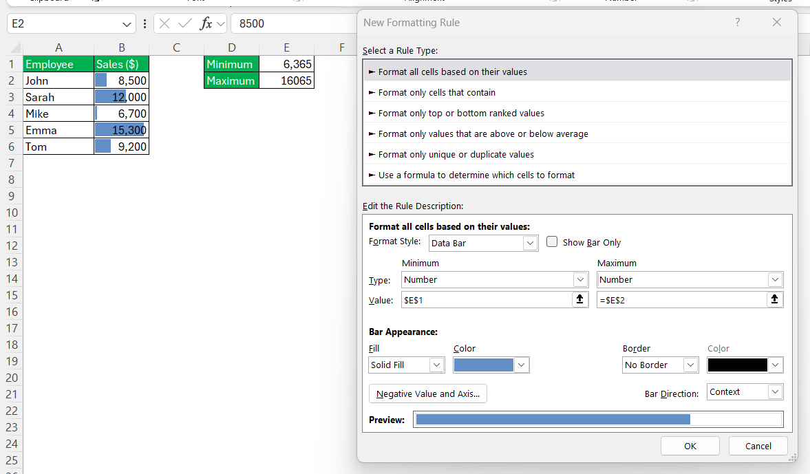
For a more tailored look, customizing Data Bars to suit your spreadsheet’s needs is essential. After initiating the ‘More Rules’ option under ‘Conditional Formatting’, I explore the various customization options in the dialog box.
I can set precise minimum and maximum values, opt for numerical or percentage-based thresholds, choose custom colors for the fill and border for a distinctive look, and even decide the bar’s direction.
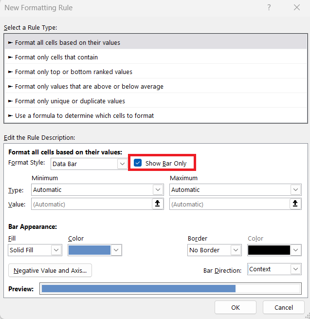
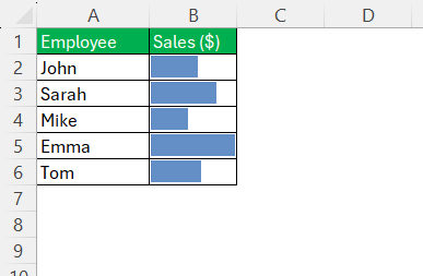
If I need to focus exclusively on the visual cues, I tick the ‘Show Bar Only’ option to hide the actual number but keep the data representation intact.
The cell will now show the data bar only.
Advanced Techniques and Tips
Managing Data Bars for Negative Values
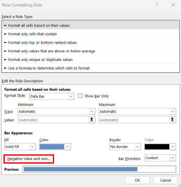
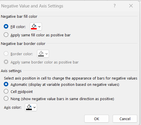
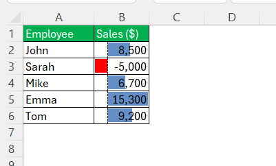
Managing data bars for negative values can be slightly more complex, but Excel has got us covered. When the dataset contains both positive and negative numbers, Excel can differentiate them by applying data bars in two colors—making it easy for us to spot them quickly. To manage this, we select the cells and choose the ‘More Rules’ option under ‘Conditional Formatting’. Select Negative Values and Axis in the dialog box.
Here, I customize the appearance with different fill and border colors, and set the axis position, so both positive and negative values are visually represented in one coherent system.
The positive and negative values will now be differentiated by colors.
Making the Most of Minimum and Maximum Value Settings
Making the most of minimum and maximum value settings in Excel Data Bars is crucial for accurate data visualization. As an expert journalist, I recommend customizing these settings to avoid misinterpretation.
By default, Excel sets the shortest bar at zero and the longest at the highest value, but this can be adjusted. One might use the formulas =MIN(range)*0.95 and =MAX(range)*1.05 to ensure there’s a visible bar for the smallest value and a small margin for the largest.
This granularity enhances the distinction between data points, especially when they cluster closely together.
Elevating Your Data Analysis Game with Data Bars
When to Use Data Bars in Your Excel Analysis
I recommend using Data Bars in Excel analysis when you need to compare or track data trends quickly across a range without performing detailed numerical analysis. They’re particularly powerful for illustrating performance metrics, inventory levels, or financial data, allowing stakeholders to digest and act on the insights immediately.
Data Bars shine in situations where visual simplicity and immediate comprehension are vital, such as executive summaries or dashboard reports.
Excel Data Bars Vs. Other Conditional Formatting Options
When comparing Excel Data Bars to other conditional formatting options like Color Scales and Icon Sets, it becomes clear that each offers distinct visualization strengths. Data Bars give a quick visual cue on the magnitude and are ideal for comparing individual contributions to a whole. Color Scales, in contrast, apply a color gradient, which is effective for spotting general trends and outliers. Icon Sets insert symbols like arrows or traffic lights, offering categorical indicators of performance or status.
In choosing between these options, I consider the type of data and the message I wish to convey. If precise quantitative comparison is key, Data Bars are superior. For a visual heat map of values, Color Scales are more appropriate, and for categorical data or thresholds, Icon Sets are optimal.
Enhancing Reports with Data Bars
Integrating Data Bars into Forms and Reports
Integrating Data Bars into forms and reports in applications like Microsoft Access is a game-changer for visual data representation. In forms, especially continuous forms, Data Bars enhance the user interface by providing a quick scan of relative values. For reports, they convey the magnitude of data without the need for charts, saving space and increasing the report’s readability.
The integration process typically involves selecting the desired field, activating the layout view, and applying conditional formatting rules similar to those in Excel.
Create Visually Stunning Spreadsheets with Data Bars
Creating visually stunning spreadsheets with Data Bars in Excel involves leveraging their full potential to make the data not only comprehensible but also aesthetically pleasing. Enhancing spreadsheets this way can turn them into powerful tools for communication.
By carefully selecting the color palette to match the branding or report theme, ensuring the bar size is proportional across the sheet, and maybe even introducing gradient fills or border formatting, one can elevate a standard spreadsheet to a professional and engaging level. Remember, the goal is not just to display data, but to tell a palpable story with it.
Best Practices for Using Data Bars
While Data Bars are a great tool, I always follow these best practices to ensure they are effective:
- Avoid using them with drastically different numbers (e.g., values ranging from 1 to 1,000,000) as smaller numbers may not be visible.
- Use a consistent color scheme that matches the theme of the report.
- Pair them with other formatting techniques, such as color scales or icon sets, to enhance readability.
- Ensure clarity by adjusting bar appearance, such as using solid fills for a bolder look.
Frequently Asked Questions
How to define data bars in Excel?
To define data bars in Excel, I go through a few simple steps:
- Select the range of cells I want to apply data bars to.
- Navigate to the ‘Home’ tab, then to the ‘Styles’ group, and choose ‘Conditional Formatting’.
- Click on ‘Data Bars’ and select from the available pre-set options, or for more control, choose ‘More Rules’ to customize.
It’s in the ‘New Formatting Rule’ dialog box that I can define the specifics of the data bars, such as their color, axis, direction, and whether to show the value within the cell.
How Do I Edit Data Bar Formatting After Initial Setup?
Editing Data Bar formatting after the initial setup is fairly straightforward:
- I simply click on any cell within the range where Data Bars are applied.
- Then head to the ‘Home’ tab, click on ‘Conditional Formatting’, and select ‘Manage Rules’.
- I locate the rule for the Data Bars and click ‘Edit Rule’ to make any desired changes, be it adjusting the bar color, the axis settings, or the values’ visibility.
After tweaking the settings to my satisfaction, I save the changes to see them reflected instantly on the spreadsheet.
Can I Link Data Bars to Another Cell’s Value?
Absolutely, I can link Data Bars to another cell’s value in Excel. This requires a bit of a workaround since there’s no direct option to do so. First, I copy the original values to a new column using a formula like =A1 to maintain a link to the original data. Then, I select the new column and apply Data Bars through ‘Conditional Formatting’. Finally, in the ‘Edit Rule’ dialog box, I tick the ‘Show Bar Only’ checkbox to display only the bars, making them a visual representation of the linked cells’ values.
Which Data Bar Fill Type is Better to Choose?
Choosing the right Data Bar fill type depends on the context of the data visualization. For sheets where numbers won’t be displayed within the cells, Solid Fill is the best option as it offers a bold and clear visual cue without any additional distraction. Conversely, Gradient Fill works better when numbers will remain visible. The gradient’s lighter colors at the end of the bars ensure that the numbers are easy to read. When using Gradient Fill, changing the numbers to Bold font further enhances visibility.
What does a data bar represent?
A data bar in Excel represents the value in a cell relative to other cells in the range selected for data bar formatting. The length of the bar correlates with the cell’s content, visually showcasing how that number compares to the others. Larger values have longer bars, making them easy to distinguish at a glance. Data bars can quickly highlight trends, show progress, or indicate where figures stand in relation to a dataset’s overall distribution.
John Michaloudis is a former accountant and finance analyst at General Electric, a Microsoft MVP since 2020, an Amazon #1 bestselling author of 4 Microsoft Excel books and teacher of Microsoft Excel & Office over at his flagship MyExcelOnline Academy Online Course.


