Learn about Excel with our Free Microsoft Excel Online Course!
Key Takeaways
- To create multiple donut charts in PowerPoint, you can add additional data series to the default donut template, which allows for a comparison of different data points in terms of both rank and percentage completion.
- Donut charts in PowerPoint come with easy customization options where numeric values can be adjusted by inputting formulas, enabling you to tailor your data presentation to specific needs and analysis.
- The Donut PowerPoint Charts and Pie Chart templates are fully editable, including aspects like color, size, orientation, and shading, providing you with the flexibility to align the visual design with your presentation’s theme and messaging.
The Rise of Donut Charts in Presentation Visuals
Donut charts have been rising in popularity in the business world, especially when it comes to presentation visuals. They offer a fresh, modern look that grabs attention and allows viewers to process information quickly. With their visually interesting format, they can turn a typical data set into a compelling story, making them a go-to choice for presenters looking to jazz up their slides. Their ability to sort and compare data clearly makes them not just an eye-candy, but a functional tool in the art of data visualization.
Table of Contents
Crafting Engaging Donut Charts for PowerPoint
Necessary Tools and Resources for Creating Donut Charts
To create donut charts that are both beautiful and informative, you’ll need the right tools and resources. Most of the heavy lifting can be done with PowerPoint itself, which comes equipped with a default donut chart template. But you shouldn’t stop there. To go the extra mile, consider tapping into additional resources such as advanced chart design software or data visualization plugins that integrate smoothly with PowerPoint.
Explore our extensive library of templates for the times when built-in tools don’t quite cut it. They often include ready-to-use, customizable donut charts suited for different datasets and scenarios, which can save you time and give your presentations a professional sheen.
Step-by-Step Process to Design Your First Donut Chart
Designing your first donut chart might seem daunting, but with these simple steps, you’ll have an attractive and effective chart ready for your presentation in no time.
STEP 1: Open PowerPoint and go to the slide where you want to insert the donut chart.
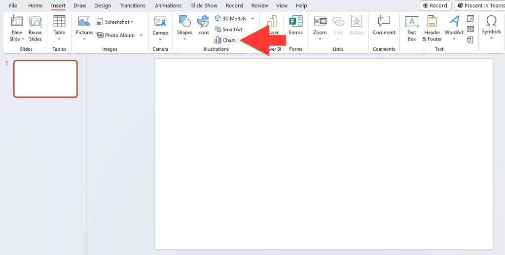
STEP 2: Click on the “Insert” tab in the PowerPoint ribbon at the top of the screen.
STEP 3: In the “Illustrations” group, click on the “Chart” option. This will open the Insert Chart dialog box.
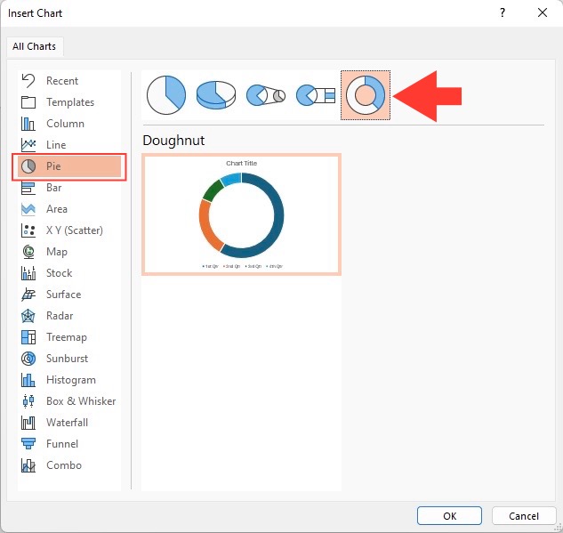
STEP 4: In the Insert Chart dialog box, select “Pie” from the list of chart types on the left sidebar.
STEP 5: Choose the “Doughnut” sub-type from the options displayed. This will insert a blank doughnut chart onto your slide.
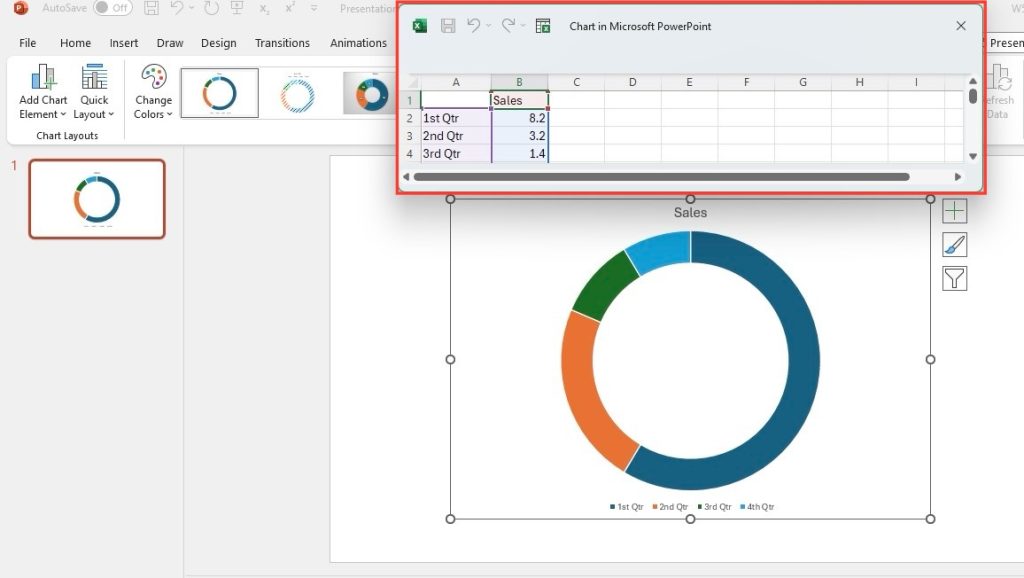
STEP 6: Now, a new Excel spreadsheet will open with placeholder data for your chart. Replace this data with your own data by typing directly into the cells, or you can copy and paste your data from another source.
STEP 7: Once you have entered your data, close the Excel spreadsheet. Your doughnut chart will now be populated with your data on the PowerPoint slide.
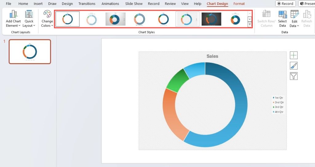
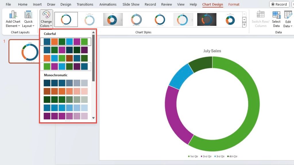
STEP 8: To customize the appearance of your doughnut chart, click on it to select it. You can then use the Chart Tools options in the ribbon to change the chart style, colors, labels, and more.
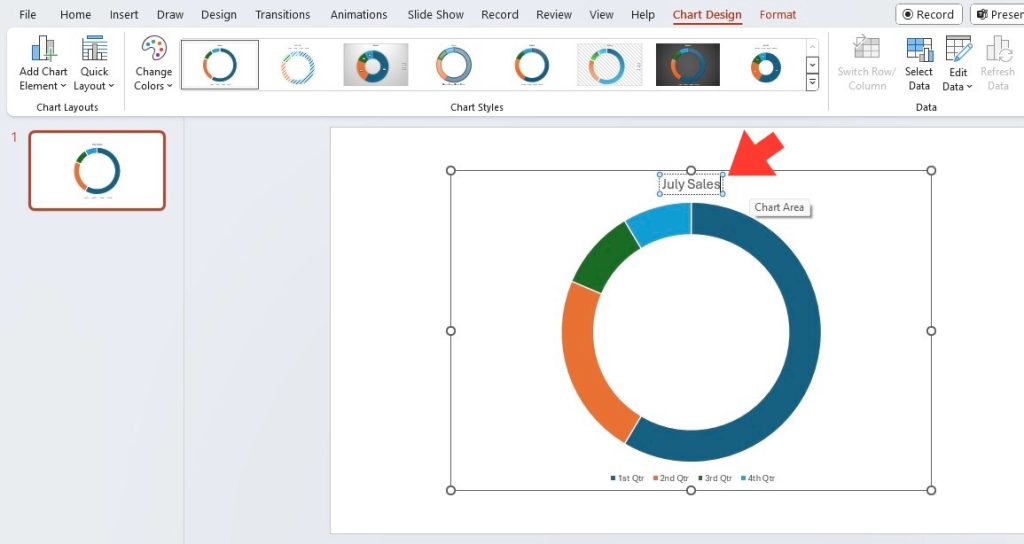
STEP 9: To add a title to your chart, click on the “Chart Title” placeholder text above the chart and type in your desired title.
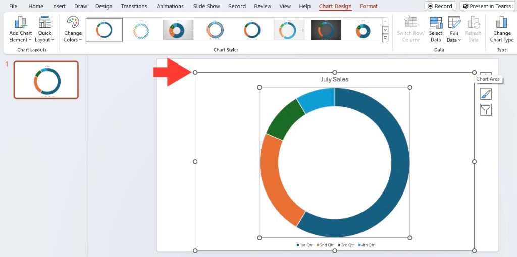
STEP 10: Finally, resize and position your doughnut chart on the slide as needed by clicking and dragging the corners or edges of the chart.
Remember, practice makes perfect. Play around with different styles and configurations to see what works best for your data.
Tips and Tricks for Enhanced Visual Impact
Colors and Contrasts: Making Data Stand Out
Colors and contrasts are your secret weapons in making data pop off the screen. Smart color use in your donut charts can massively enhance the viewer’s ability to understand and retain information. Think thematic colors – like shades of blue for water or green for environmental elements. Match the fill shades to your data categories for intuitive understanding.
But be mindful of contrasts. You want high contrast between text and background to maintain legibility, but also between segments to easily differentiate data points. Be wary of overpowering colors or dizzying contrasts that can obscure the data rather than highlighting it.
Adding Interactivity to Donut Charts
Adding a dash of interactivity to donut charts not only makes your data more engaging but can also make complex information easier to digest. Consider enabling hover-over effects, where viewers can get more information about a specific segment as they hover their cursor over it. Clickable segments that drill down to more detailed data can also add depth to your presentation.
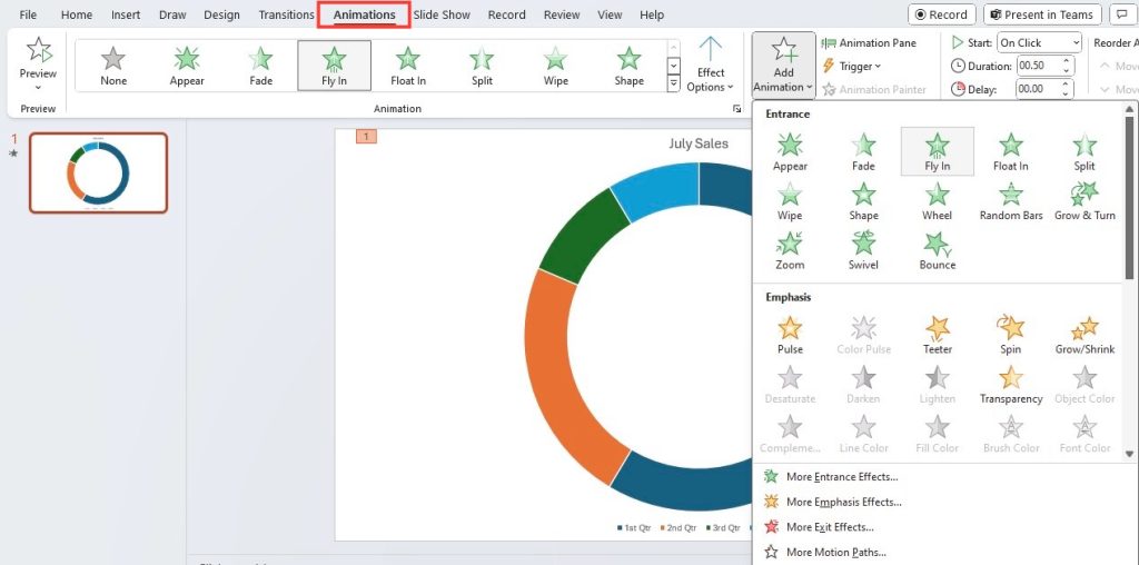
PowerPoint supports animation sequences which can make individual slices of the donut chart appear or expand sequentially, guiding the viewer’s eye through your data narrative smoothly. Interactive charts keep your audience engaged, encouraging active participation rather than passive observation.
Best Practices in Donut Chart Aesthetics
The Do’s and Don’ts of Donut Chart Formatting
When it comes to donut chart formatting, there are some guidelines you’ll want to remember. Do prioritize simplicity; use legible fonts and avoid overloading your chart with too much text. Do choose a color scheme that’s accessible to all viewers, including those who may be color-blind. And do make sure to highlight the most important piece of data, perhaps by using a bolder color or exploding the segment.
On the flip side, don’t let creativity overpower clarity. Avoid using colors that are too similar to distinguish, don’t clutter your chart with unnecessary labels or legends, and don’t forget to test your chart’s readability across different devices and screen sizes.
Maintaining Readability and Clarity in Complex Data
When presenting complex data, the goal is to simplify without distorting the message. Whenever you’re working with donut charts, remember to focus on making your data readable and clear at a glance. This might involve breaking down your data into smaller chunks or using multiple donut charts to show different layers or aspects of the data. Labels should be concise, and callouts or annotations can be used to highlight key points without crowding the chart.
Consider the sequence in which the information is presented – positioning the most important data segments in the upper half of the donut can enhance readability. And always put yourself in the audience’s shoes – if they can’t grasp the key takeaways within a few seconds, it’s time to go back to the drawing board.
Advanced Donut Chart Techniques
Incorporating Multimedia Elements into Donut Charts
Going beyond basic charting tools, incorporating multimedia elements can truly elevate your donut charts. Imagine interspersing short clips or audio snippets that play when a segment is clicked, providing an auditory complement to your visual data. Or picture integrating hyperlinks within segments that take viewers to related documents or webpages for more in-depth information.
To incorporate multimedia, start by embedding the multimedia files into your PowerPoint presentation, ensuring the links are active and files are functional within the slideshow mode. These elements, when used sparingly and purposefully, can create a richer, more immersive experience for your audience.
Animations and Transitions: Bringing Charts to Life
Animations and transitions are like the heartbeat of a captivating presentation. They breathe life into your donut charts, transforming them from static visuals to dynamic storytellers. Use PowerPoint’s palette of animations to introduce chart segments with a flourish, underscoring key points as you narrate your data’s story.
Perhaps start with a simple fade or fly-in to draw attention to the whole chart, and then use wipes or zoom effects to focus on individual slices. Just remember, the key is subtlety; use transitions that enhance rather than distract, ensuring that your audience’s focus remains on the data rather than the animation itself.
Frequently Asked Questions
How are donut charts different from pie charts?
Donut charts differ from pie charts mainly by having a hollow center, which can help viewers focus better on the proportions of each slice. This visual break can also aid in comparing segments of data, as our brains can more easily assess the lengths of the arcs rather than the angles in pie slices. Plus, the center space of a donut chart can be used to include additional information or data summaries.
Can donut charts display multiple data series effectively?
Absolutely, donut charts are quite adept at displaying multiple data series. By adding concentric rings, each representing a different series, you can compare and contrast various datasets. This layered approach provides a clear visual of how subsets of data relate to one another across different series, all within a single cohesive chart.
What are some common mistakes to avoid when designing donut charts?
When designing donut charts, avoid overcomplicating them with too many segments, which can overwhelm viewers. Steer clear of using similar colors for adjacent segments, as this can cause confusion. Beware of incorporating too much text or overly detailed labels that can make the chart cluttered and harder to read. Lastly, ensure that the chart’s proportions accurately reflect the dataset to avoid misrepresenting the information.
Are there any accessibility concerns with using donut charts in presentations?
Yes, accessibility should always be a consideration. Donut charts, like all visual aids, can be a barrier for those with visual impairments. To improve accessibility, use contrasting colors and provide alternative text for each segment of the chart. Also, supplying the data in a textual format, such as an accompanying table, can help those using screen readers or who process information better in non-visual ways.
John Michaloudis is a former accountant and finance analyst at General Electric, a Microsoft MVP since 2020, an Amazon #1 bestselling author of 4 Microsoft Excel books and teacher of Microsoft Excel & Office over at his flagship MyExcelOnline Academy Online Course.

