Download our 141 Free Excel Templates and Spreadsheets!
Key Takeaways
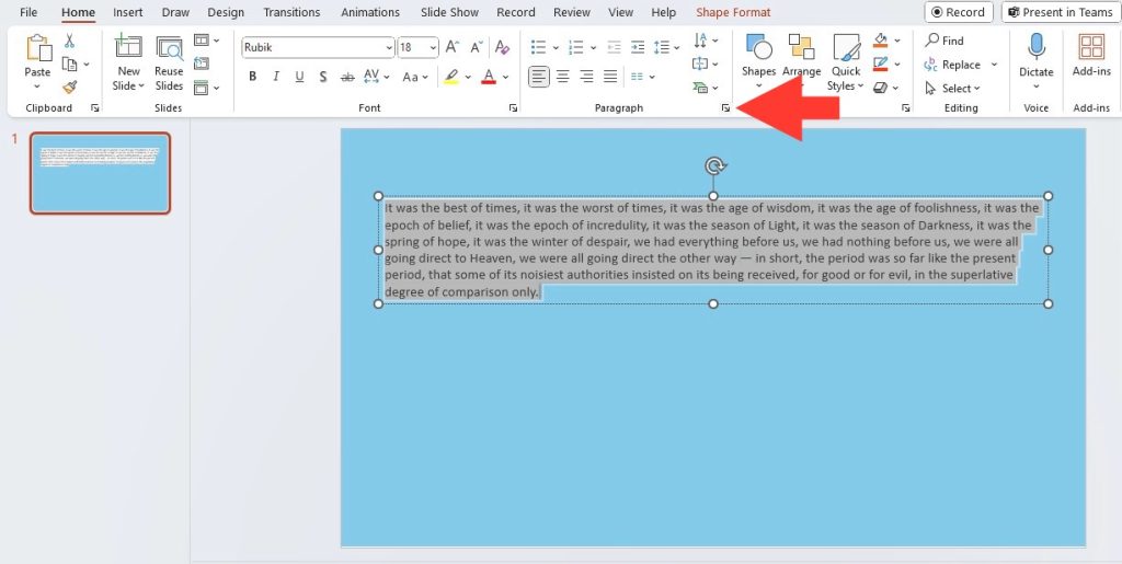
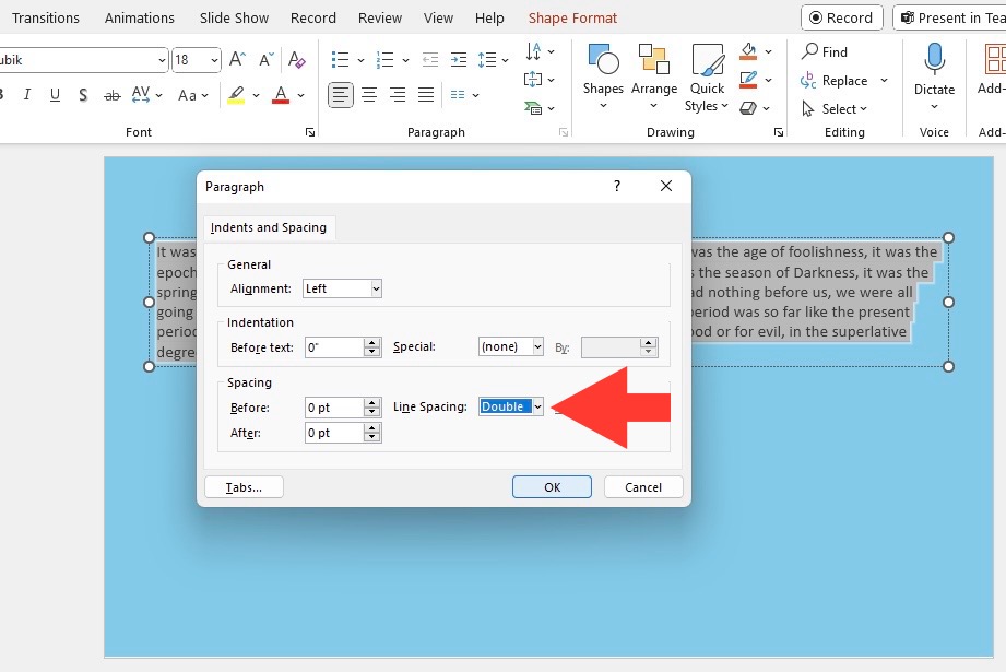
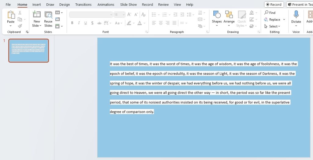
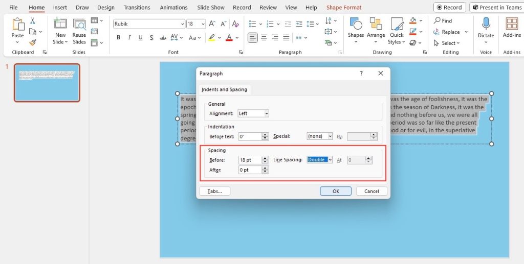
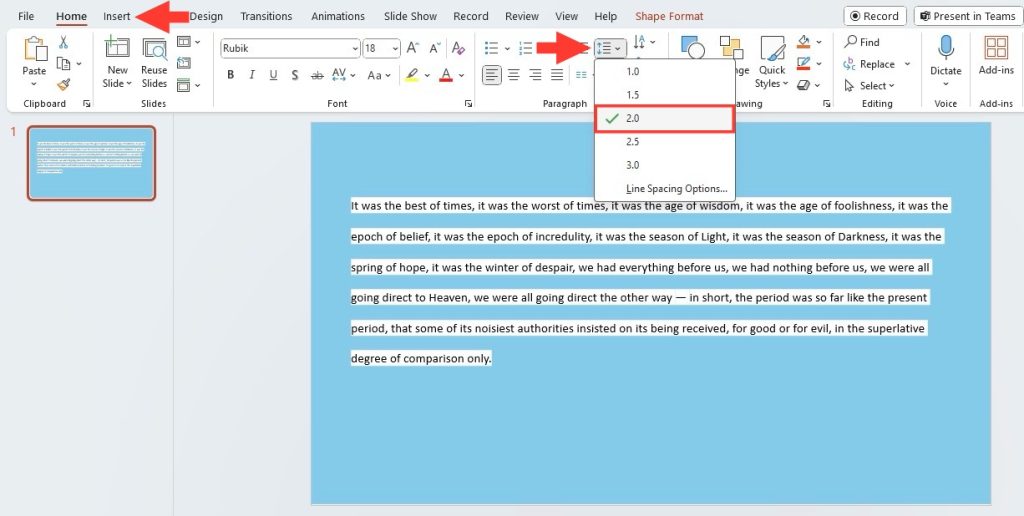
- To double space text in PowerPoint, after highlighting the desired paragraphs, click on the “Line Spacing” icon and select “Double” from the Line Spacing Options in the dialog box that appears.
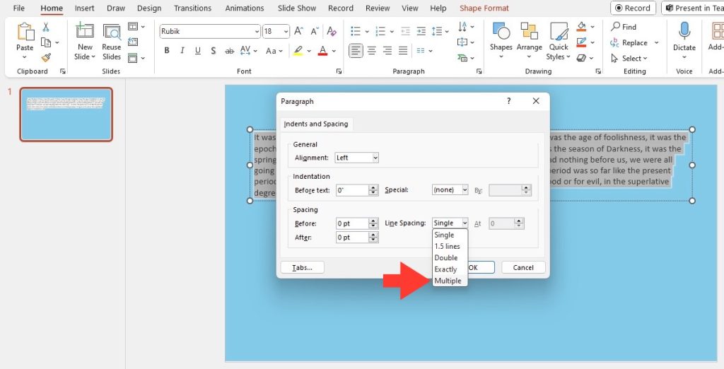
- For a more customized spacing, choose “Multiple” in the Line Spacing section and type “2.00” up to two decimal points in the ‘At’ box to achieve double spacing, then click “OK.”
- Avoid making line spacing too narrow to prevent text from appearing crowded; if characters get cut off or the text seems congested, increase the spacing slightly above double spacing for readability.
Quick Guide to Text Formatting in PowerPoint
Navigating through PowerPoint’s wealth of features might seem daunting, but text formatting is a breeze once you know where to look. If your priority is to captivate your audience with visually appealing text, mastering font size, style, bullet points, alignment, and spacing is key. A primary element of this is learning how to double space your text, which can significantly enhance readability and overall aesthetic. Let’s dive into the basics before getting into the nitty-gritty of double spacing.
Table of Contents
Step-by-Step Instructions to Double Space Your Text
Accessing the Right Tools in PowerPoint
To start reshaping your presentation’s text, you need to tap into the right set of tools. In PowerPoint, everything you need is at your fingertips in the Home tab’s Paragraph group. Here you’ll find options for line spacing, vertical alignment, and more. To unveil even more detailed options, including double spacing, just click the dialog box launcher, a small icon located at the corner of the Paragraph group.
Doubling the Space with Ease
Achieving that perfect spacing is easier than you might think. Once you’ve located the Paragraph dialog box launcher, a world of possibilities opens up. By simply selecting the text you want to adjust and then choosing “Line Spacing Options,” you can select “Double” from the dropdown menu. Voila—your text instantly has more breathing room, making your slide easier to read and more professional in appearance.
Tips and Tricks for Better Text Presentation
Adjusting Spacing for Clarity and Impact
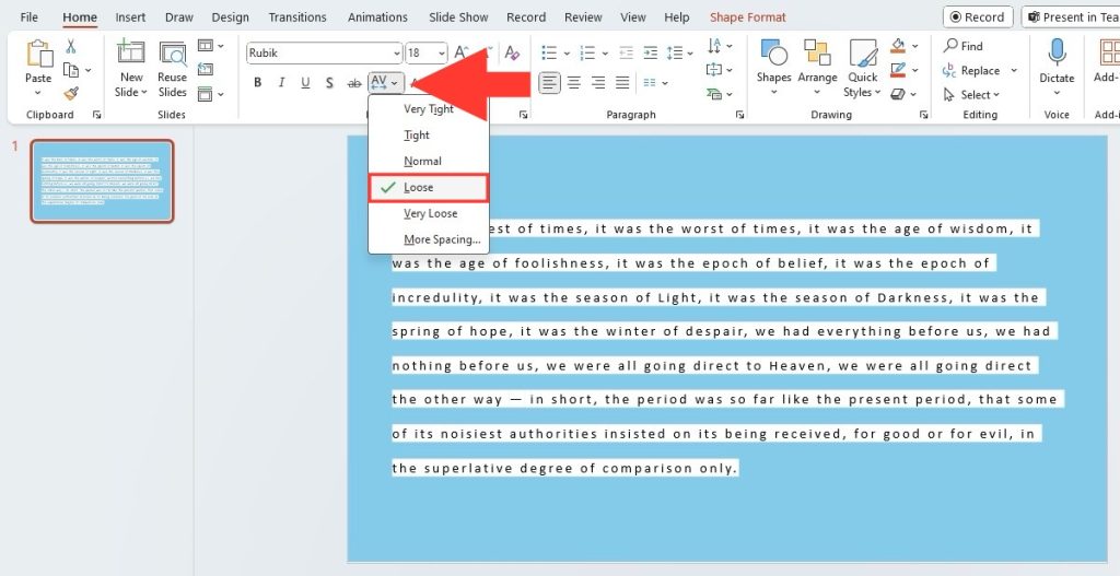
Adjusting the spacing is a subtle yet powerful way to add clarity and impact to your slides. Whether you’re spreading out characters to fill a space or tightening them for a more compact look, careful attention to detail will set your presentation apart. And it’s not just about aesthetics—proper spacing can guide the audience through your content, emphasizing particular points and ensuring your message leaves a mark.
To fine-tune character spacing for impact, go to the ‘Home’ tab and in the ‘Font’ group click on ‘Character Spacing’. You can choose from preset options like ‘Tighter’ or ‘Looser’, or for a more custom approach, select ‘More Spacing’ and experiment with the ‘Expanded’ or ‘Condensed’ options.
Remember, beyond just double spacing lines, adjusting paragraph spacing tailors the overall look and feel of your slide. By opening the Paragraph settings, enter your preferred values in “Before” or “After” to control the space above or below paragraphs, further enhancing readability and visual appeal.
Fine-Tuning Your Presentation’s Aesthetics
Fine-tuning your presentation’s aesthetics is much like adding the final polish to a masterpiece. The way your text sits on a slide is as important as the content itself, as it greatly determines how the audience interacts with your information. From font choices and sizes to color schemes and alignments, these elements play in harmony to achieve a visually pleasing experience.
Don’t shy away from exploring PowerPoint’s design features, which can assist in creating uniformly styled slides. Consistency in design leads to a more professional look, and using the ‘Format Painter’ can be a lifesaver to replicate formatting across different text boxes.
Remember, your ultimate goal is to align form with function. Your slide’s design should cater to the objective of your presentation, whether to inform, persuade, or entertain.
Common Pitfalls to Avoid When Double Spacing
Over-spacing Issues and Readability
When you’re getting your slides show-ready, be wary of over-spacing. Excessive space between lines or paragraphs can disrupt the flow and make your text look sparse and disconnected. It can lead to your audience hopping from one line to another, struggling to follow the narrative thread of your presentation.
Finding the sweet spot is essential: enough space to avoid cramping but not so much that it looks like your words are floating adrift in a sea of emptiness. This balance ensures that each slide delivers its message with precision and your audience can absorb the content smoothly, without any visual stumbling blocks.
Consistency in Text Formatting Across Slides
Consistency is the linchpin of a cohesive presentation. A uniform look in text formatting across all slides not only looks professional but also helps maintain your audience’s focus on the content, not the varying styles. This implies a steady use of font types, sizes, color schemes—and of course, spacing.
Stick to the same line and paragraph spacing rules throughout to solidify the structure of your presentation. If one slide has double-spaced bullet points, they all should. Use the Slide Master feature to set these formatting rules universally, ensuring that any new slide you add automatically shares the same established styling.
FAQ Section
Is there a shortcut to apply double spacing to multiple text boxes at once?
Yes, there is. You can quickly apply double spacing to multiple text boxes by selecting all text boxes you want to format—hold down ‘Shift’ while clicking on them. Then, under the ‘Home’ tab, click the ‘Line Spacing’ icon in the Paragraph group and choose ‘Double’. All selected text boxes will update simultaneously.
What’s the difference between line and paragraph spacing?
Line spacing affects the vertical space between lines within a paragraph, enhancing legibility, while paragraph spacing adjusts the gap before or after paragraphs, helping to distinguish separate blocks of text or ideas within your presentation.
How do I adjust line spacing in PowerPoint beyond double space?
To adjust the line spacing beyond double space in PowerPoint, select your text, then go to the Home tab, click on the Paragraph dialog box launcher, choose ‘Multiple’ under Line Spacing, and set your desired spacing value up to two decimal points. Confirm by clicking ‘OK’.
When typing references in a powerpoint presentation is everything still supposed to be double spaced?
In PowerPoint presentations, references do not have to be double spaced; spacing should be optimized for readability and design consistency within your slides. Single spacing can be used for cleaner formatting and to maximize the use of slide space.
John Michaloudis is a former accountant and finance analyst at General Electric, a Microsoft MVP since 2020, an Amazon #1 bestselling author of 4 Microsoft Excel books and teacher of Microsoft Excel & Office over at his flagship MyExcelOnline Academy Online Course.

