Scatter Charts in Excel could be used for fun in situations where your boss is away and you have nothing else to do but learn the undoubted power of Microsoft Excel!
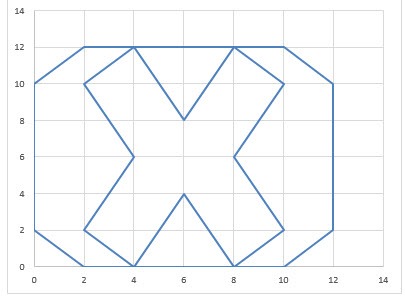
I was just playing around with drawing lines, and I tried recreating my logo with an Excel Scatter Chart:
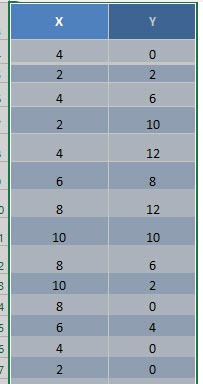
You will just need a little trial and error to create your logo by specifying the X and Y coordinates, but it is easier than you may think!
In this example I show you how easy it is to insert a Scatter Chart using Excel.
STEP 1: A great tip is to hand draw your logo first using a blank graph paper (print here) which has X & Y units per grid line equaling 2.
Then with a little trial and error, by changing the X and Y values, you will get your perfect logo.
Highlight your table and go to Insert > Recommended Charts
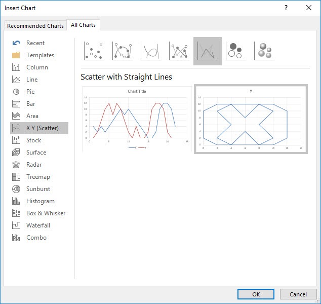
STEP 2: Select All Charts > X Y (Scatter) > Scatter with Straight Lines > OK
This type ensures that straight lines are drawn to connect the dots.
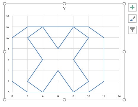
STEP 3: Now you have your Scatter Chart – Logo!
HELPFUL RESOURCE:

Bryan
Bryan Hong is an IT Software Developer for more than 10 years and has the following certifications: Microsoft Certified Professional Developer (MCPD): Web Developer, Microsoft Certified Technology Specialist (MCTS): Windows Applications, Microsoft Certified Systems Engineer (MCSE) and Microsoft Certified Systems Administrator (MCSA).
He is also an Amazon #1 bestselling author of 4 Microsoft Excel books and a teacher of Microsoft Excel & Office at the MyExecelOnline Academy Online Course.


