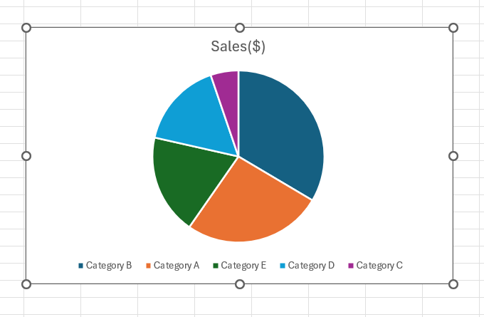
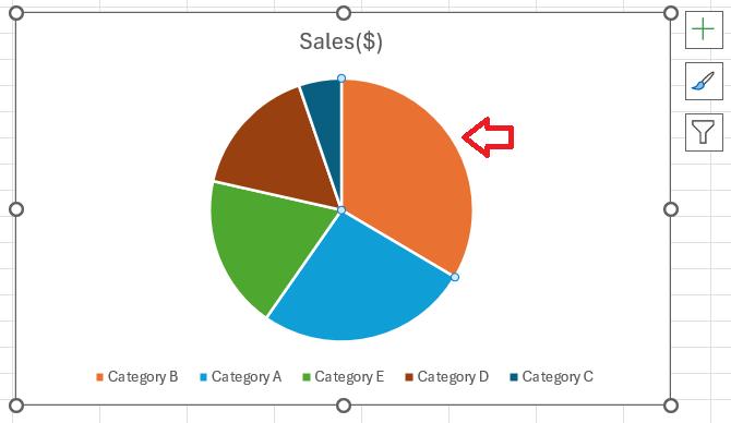
To draw a pie chart in Microsoft Excel is a straightforward process that visually represents data as proportional slices of a circle, making it easy to compare parts of a whole. To draw a pie chart, you first need to organize your data in a single column or row, accompanied by corresponding labels. Then, by using Excel’s Chart tools, you can quickly generate a pie chart that highlights the relative sizes of your data segments, enhancing your data analysis and presentation.
Key Takeaways:
- Organize Your Data: Arrange categories in one column and values in another for a clear pie chart.
- Easy Pie Chart Creation: Highlight your data, go to the ‘Insert’ tab, select ‘Pie Chart,’ and choose a style. Excel will create the chart.
- Customize Your Chart: Adjust size, apply color schemes, and use themes to make your chart visually appealing and easy to understand.
- Highlight Important Data: Use features like exploding slices to emphasize key data points and make them stand out.
- Freeze Multiple Rows/Columns: Select the cell below and to the right of the desired sections, go to ‘View,’ click ‘Freeze Panes,’ and choose ‘Freeze Panes’ to lock rows and columns in place for a comprehensive view.
Table of Contents
Pie Charts: A Visual Slice of Data
Why Use a Pie Chart?
Pie charts are a staple in the world of data visualization for several good reasons. They provide a quick, visual snapshot of the breakdown of data, highlighting how individual segments stack up against the whole.
Imagine a business scenario where a company needs to relay its revenue streams to stakeholders in a manner that is immediately comprehensible. A pie of revenues with color-coded slices representing different business segments can convey, in a single glance, which segments are the heavy hitters and which ones might need more attention.
A pie chart’s strength is its simplicity; it requires minimal explanation yet conveys complex data sets effectively, provided the number of categories is kept in check. However, if viewers find themselves squinting at slivers of data slices, it’s probably time to consider an alternative. Remember, a crowded pie defeats its own purpose of clarity.
The Basics of Pie Charts in Excel
Creating a pie chart in Excel might seem like a task that requires complex skills, but it’s surprisingly simple. At its core, a pie chart represents one data series – that means a single row or column of numbers, each accompanied by a corresponding category label.
A neatly organized data set is the secret behind a pie chart that’s as easy on the eyes as it is informative. If a chart is cluttered or confusing, it defeats the pie chart’s main purpose: to simplify data comprehension. Keeping that in mind here’s to slice your data in a way that serves the message you want to deliver clearly and deliciously!
Preparing Your Data for the Perfect Pie
Organizing Data for Pie Chart Clarity
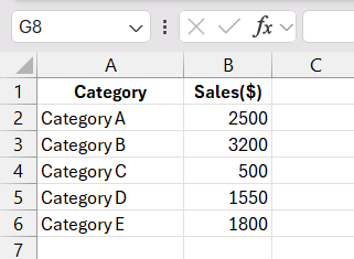
To turn your raw data into a pie chart masterpiece, the organization is key. It’s crucial to arrange your data in a way that Excel can interpret easily. Before you even hit that ‘Insert Chart‘ button, make sure your figures are well-ordered, typically with categories in one column and corresponding data in the next. Clarity reigns supreme here, as jumbled or incomplete data will only result in a confusing chart.
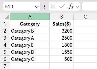
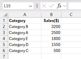
It’s also a savvy move to sort your data beforehand. Arranging your categories in descending order—from the largest to the smallest value—sets the stage for a pie chart that’s intuitive and impactful.
Crafting Your First Pie Chart in Excel
Steps to Create a Basic Pie Chart
Creating your first pie chart in Excel is a walk in the park if you follow these straightforward steps. Remember, it’s all about converting your neatly organized data into a visually appealing and informative graphic.
STEP 1: Open your Excel workbook and ensure your data is properly organized.
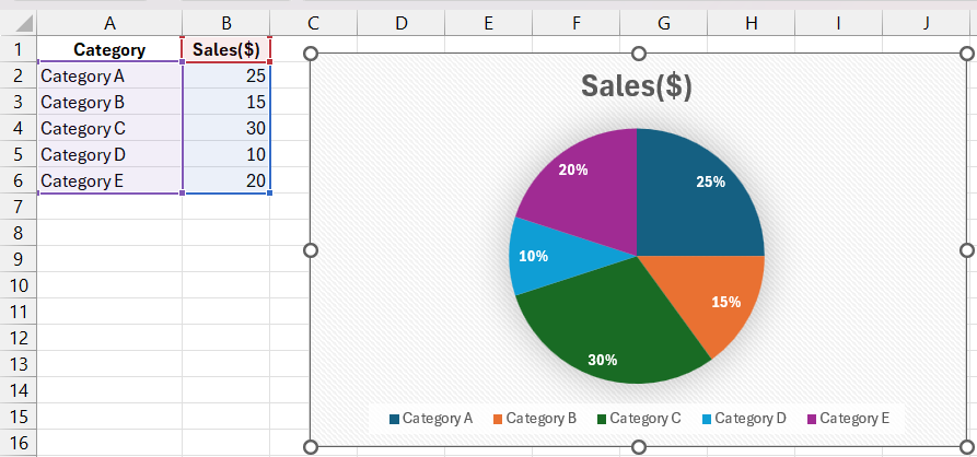
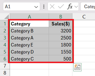
STEP 2: Highlight the data range that you want to represent in your pie chart (including both the categories and their values). Drag your mouse to highlight your data spans A1:B6 with labels as per the current example.
STEP 3: Navigate to the ‘Insert’ tab in the Excel ribbon.
STEP 4: Look for the ‘Charts’ group within the ‘Insert’ tab.
STEP 5: Click on the Pie Chart icon, which will show different pie chart options.
STEP 6: Choose the style of pie chart you desire – a simple 2-D pie chart is a solid place to start.
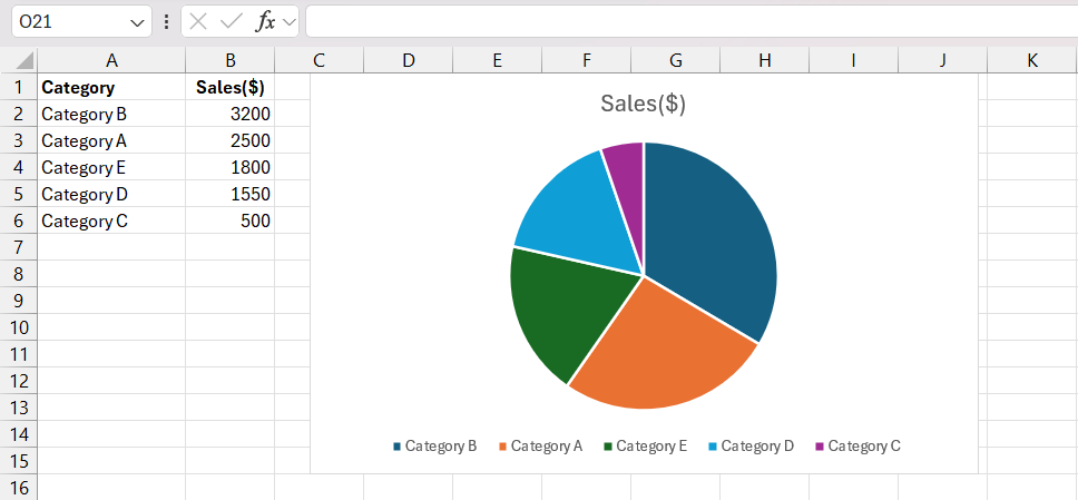
STEP 7: Excel will generate your pie chart and place it as an object within your current worksheet.
And voilà! You’ve just created a basic pie chart. But don’t stop there; consider this your canvas. Excel offers a suite of tools to fine-tune your chart, from sizing to colors, to make sure it represents your data most effectively.
Making Adjustments for a Clearer Presentation
Once you’ve crafted your basic pie chart, you may find that some tweaks are needed to ensure your data’s story is presented as clearly as a lotion on your skin. Excel makes it a breeze to polish your chart until it shines with clarity and professionalism.
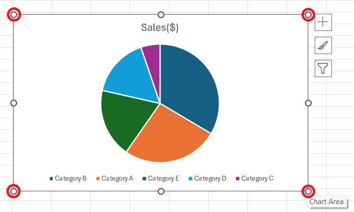
If your chart feels cramped or details are hard to read, it’s time to resize. A simple click on one of the corners and dragging it out can scale your chart up for better visibility. Keep the ‘Lock aspect ratio’ checkbox ticked to maintain the proportions while resizing; this keeps your pie looking like a pie, not an abstract art piece.
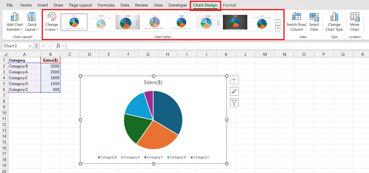
Use predefined themes for the chart and preview themes by hovering over the options in the ‘Chart Styles‘ section of the ‘Chart Design’ tab.
Enhancing the Aesthetics of Excel Pie Charts
Customizing Color Schemes and Chart Styles
Bringing your pie chart to life with a splash of color is not just about aesthetics; it’s about making your data more digestible. The right color scheme can make your chart more accessible and easier to interpret, helping you to highlight the most important pieces of your data pie.
To customize the colors of your chart:
STEP 1: Click on your pie chart to select it.
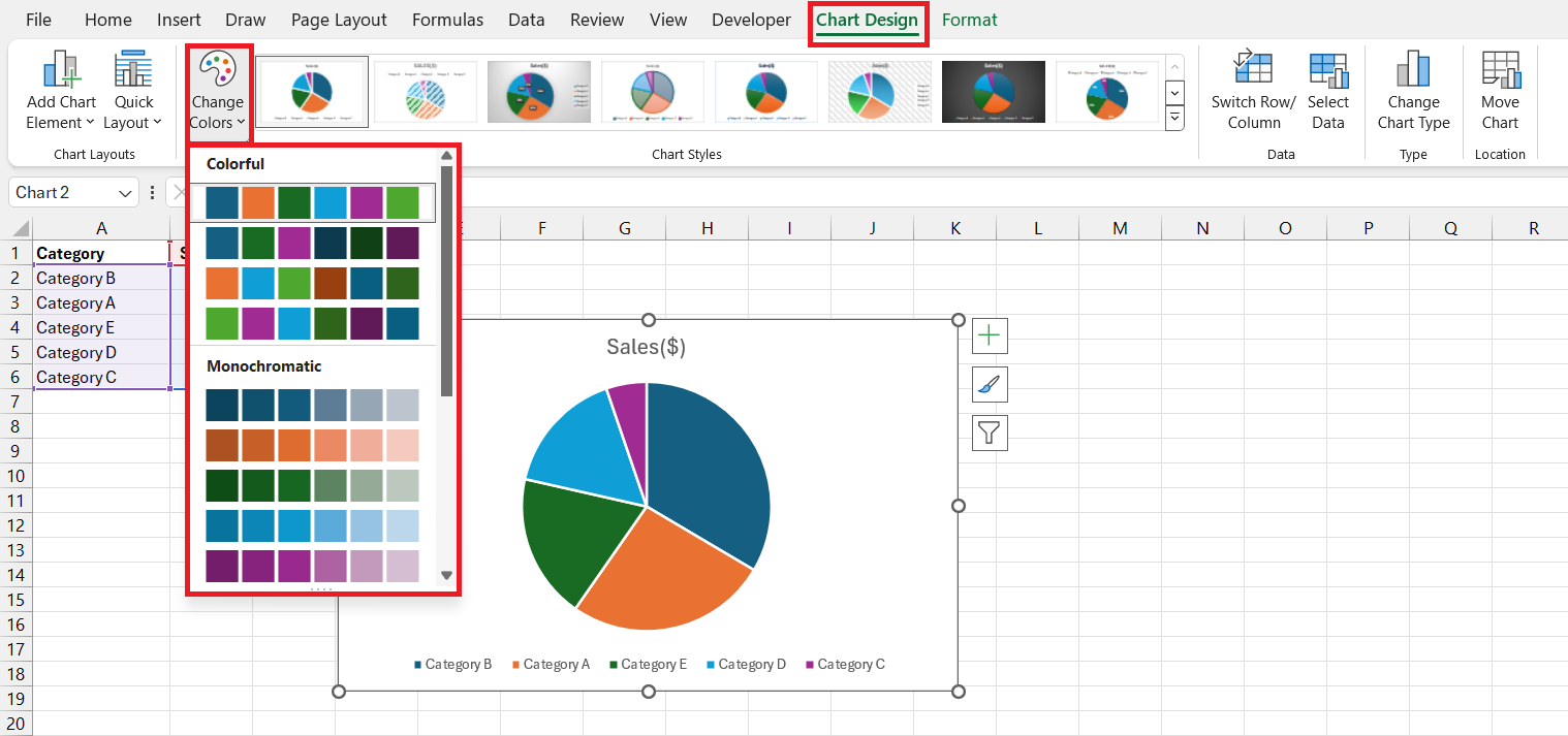
STEP 2: Head over to the ‘Chart Design’ tab on Excel’s ribbon.
STEP 3: Click the paint palette icon to explore color scheme options.
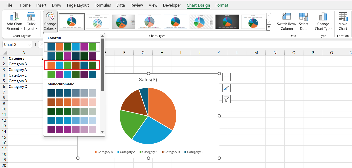
STEP 4: Hover your cursor over different palettes to see a live preview on your chart.
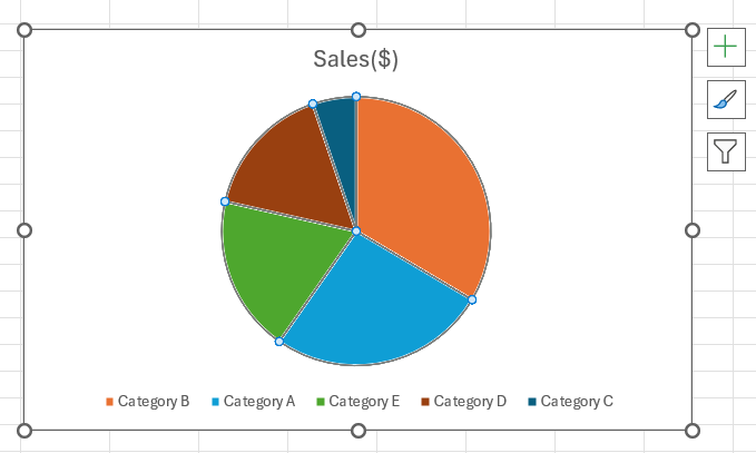
STEP 5: Once you’ve found the palette that sings the right tune for your data, click to apply it to your chart.
Bright colors tend to stand out, so use them strategically to draw attention to key data points. Conversely, if you’re looking to downplay certain areas, opt for more subdued tones.
Exploding and Rotating Pie Slices for Emphasis
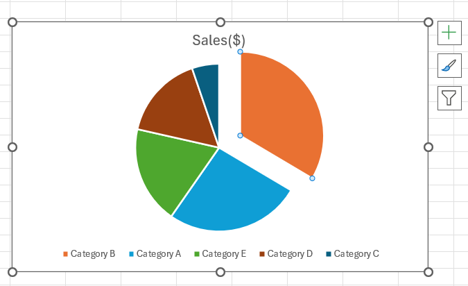
Ever felt like some pieces of your data deserved the spotlight? Exploding pie slices is an Excel feature that allows you to do just that. They emphasize particular sections of your chart, making them “pop” for added focus. It’s particularly handy when dealing with many values or when you need to draw attention to specific slices without overstating others.
To add an explosion of emphasis to your chart:
STEP 1: Give a single click to select your pie chart, and then another click on the specific slice you wish to highlight.
STEP 2: Carefully click and drag that slice away from the center of the pie, creating the ‘exploded’ look.
Rotating your pie chart is another clever trick to help guide your audience’s eyes. Maybe you have a slice that you’d like to start the ‘conversation’ with. In Excel, it’s straightforward to rotate the chart and place any slice front and center.
Here’s how to rotate your pie for the perfect slice arrangement:
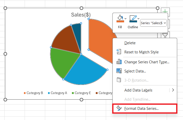
STEP 1: Right-click on the pie chart and select ‘Format Data Series’.
STEP 2: In the ‘Series Options’, adjust the ‘Angle of First Slice’ slider until your preferred piece is in the desired starting position.
One thing to keep in simultaneous rotation with your pie slices is caution. Overdoing the explosion effect can scatter the visual emphasis like a pie left unattended on a windowsill in a cartoon—before you know it, every slice has gone its own way, and the overall picture is lost.
FAQs About Pie Charts in Excel
How to draw a pie chart in Excel?
To draw a pie chart in Excel, simply:
- Organize your data with values in one column and labels in another.
- Highlight the cells with your data.
- Navigate to the ‘Insert’ tab.
- Click on the ‘Pie Chart’ icon.
- Choose your preferred pie chart style from the dropdown menu, and Excel will insert the chart for you.
How to make a pie chart with percentages in Excel?
To make a pie chart with percentages in Excel:
- Enter your data in one column and corresponding labels in another.
- Highlight the range of data for the pie chart.
- Go to the ‘Insert’ tab and select ‘Pie Chart’.
- After the chart appears, right-click it and choose ‘Add Data Labels’.
- Right-click the data labels and select ‘Format Data Labels’, then choose ‘Percentage’ to display percentages on the chart.
What Are Some Alternatives to Pie Charts for Presenting Data?
Some alternatives to pie charts include bar charts, line charts, column charts, and stacked area charts. Bar charts are great for comparing individual values, line charts excel for showing trends over time, column charts compare values across categories, and stacked area charts show part-to-whole relationships and changes over time. Each type has its unique advantages, depending on the complexity and nature of the data you’re presenting.
How Can I Make My Excel Pie Chart Stand Out?
To make your Excel pie chart stand out, customize the color scheme to match your presentation theme and use contrasting colors for emphasis. Experiment with ‘Exploding’ a slice to highlight important data points. Apply a professional chart style and include clear, concise titles and labels that are easy to read. Additionally, keep your chart simple and unclutter; a minimalistic design often has more impact.
How to format a pie chart in Excel?
To format a pie chart in Excel, first, select the chart. Then, use the ‘Chart Tools’ menu options ‘Design’ and ‘Format’ to explore styles and customization options. Adjust the ‘Format Data Series’ settings to change slice colors, explode slices, add a border, or modify the angle of the first slice for rotation. Right-click individual elements like the chart area, plot area, or legend to customize fonts, add fills, and set specific element properties.
John Michaloudis is a former accountant and finance analyst at General Electric, a Microsoft MVP since 2020, an Amazon #1 bestselling author of 4 Microsoft Excel books and teacher of Microsoft Excel & Office over at his flagship MyExcelOnline Academy Online Course.

