When I work with data in Excel, I often find myself creating the same type of chart repeatedly. Manually adjusting the chart’s formatting each time can be time-consuming and tedious. That’s where chart templates come in handy. By creating a chart template, I can save my preferred chart style and reuse it whenever I need, ensuring consistency and saving time.
Key Takeaways:
- Chart templates save time by eliminating repetitive formatting tasks in Excel, ensuring consistent data visualization.
- They standardize design across multiple charts, maintaining brand consistency and professional appearance in reports.
- Creating a template is straightforward: customize a chart, then save it as a template for future use.
- Templates enhance efficiency by allowing you to quickly apply established designs to new data sets, streamlining workflow.
- Managing templates involves organizing, updating, and occasionally purging to keep your collection relevant and efficient.
Unveiling Excel’s Magic Trick: Chart Templates
What Are Excel Chart Templates?
Excel chart templates are pre-configured chart designs that we can create in Microsoft Excel to standardize the way our data is visualized. These templates save the formatting, color, size, and layout of a chart, which we can then apply to new data sets with consistency and speed.
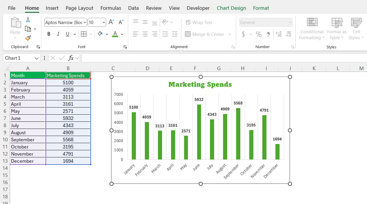
Imagine we’ve spent time perfecting a bar chart with company colors and meticulous label placement; a chart template allows us to replicate these efforts across multiple reports without starting from scratch.
The Time-Saving Benefits for Excel Users
The time-saving benefits for Excel users are considerable when employing chart templates. First and foremost, chart templates dramatically reduce the time spent on data visualization. We bypass the repetitive formatting tasks each time we need to create a similar chart. This allows for immediate visual representation, making it far easier to present or understand complex data sets.
Additionally, these templates enforce a level of consistency, ensuring that all charts conform to a certain standard, whether for internal reports or client presentations. This not only saves time but also enhances brand consistency. Plus, since chart templates are reusable, the more we work with them, the more time we save in the long run.
Excel chart templates also help us focus on the actual data analysis rather than the aesthetics of our charts, streamlining the workflow process. And for those of us not particularly skilled in design, templates offer a professionally crafted appearance to our charts, elevating our work with minimal effort.
How to Save as a Template
Steps to Preserve Your Customized Excel Charts
Preserving our customized Excel charts as templates is a straightforward process. Here’s how I do it step-by-step:
STEP 1: After we’ve created and personalized our chart, we click on the chart area to select it.
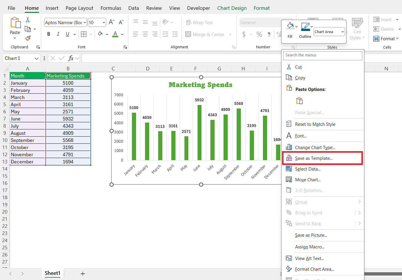
STEP 2: When the chart is active, we right-click on the design and select ‘Save as Template’.
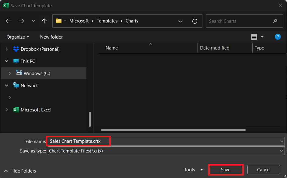
STEP 3: In the pop-up dialog box that appears, we choose a memorable and descriptive name for our template. This makes it easier to identify and select for future use. Click Save.
With these steps, the chart template will be stored as a ‘.crtx’ file, which is the Excel chart template format. The template will be available for future use, and we can apply it to new data sets, significantly cutting down on the time needed for reformatting.
Tips for Managing an Arsenal of Chart Templates
Managing an arsenal of chart templates requires both organizational and strategic considerations. Here’s how I keep mine in order:
- Organize by Purpose: Categorize your templates by their usage, like financial, marketing, sales, or project management. This simplification helps in quickly finding the right template for the right task.
- Regularly Update: Over time, our charting needs evolve. Ensure templates are updated to reflect current design trends, color schemes, or branding guidelines to keep them fresh and relevant.
- Naming Conventions: Set clear and descriptive names for templates, such as ‘Quarterly_Sales_Pie’ or ‘Annual_Report_Line’, which signify the chart type and intended use.
- Template Previews: Create a reference document or folder with screenshots of each chart template. It serves as a quick visual guide for selecting the appropriate template.
- Version Control: If a template gets updated, label it with a version number or date. For instance, ‘Chart_Template_v2’.
- Purge Periodically: Revisit the collection periodically to remove outdated or seldom used templates. This decluttering ensures efficiency and avoids confusion.
- Centralized Storage: If working in a team, save chart templates on a shared drive or cloud storage. Ensure everyone accesses the same versions, which aids in maintaining consistency across all documents.
Reapplying the Magic: Utilizing Your Templates
Transfiguring New Data with Established Designs
Transfiguring new data with established designs using Excel chart templates is like performing a data visualization magic trick. With the established template, all that’s needed is to highlight the new data set we want to visualize. Here’s the simple process:
STEP 1: We go to the ‘Insert’ tab and select ‘Recommended Charts’, just as we would for a standard chart.
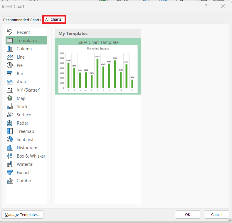
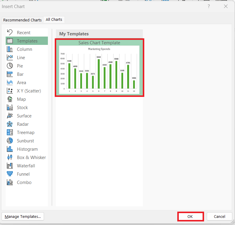
STEP 2: In the ensuing dialog box, we switch to the ‘All Charts’ tab and select ‘Templates’.
STEP 3: This reveals all of our saved chart templates. From there, we select the template that suits our data and click ‘OK.’
The new chart instantly takes on the formatting and styling of our chosen template. However, it’s essential to tweak the details such as chart title and axis labels to align with our new data set. The visual consistency across different datasets makes our presentations appear polished and professional without repeated effort.
Tackling Common Issues When Applying Templates
When applying templates, we might encounter some common issues that can hamper our efforts to swiftly transform charts. Here’s how I handle these scenarios:
- Mismatched Data Ranges: If our template was designed for a different data range, we might need to adjust our chart data by right-clicking and selecting ‘Select Data’. From there, we correct the range to ensure our template fits the new data appropriately.
- Incompatible Chart Types: Some data might not suit the chart type of our template. It’s crucial to choose a template with a chart type that can represent our data effectively. If necessary, we can change the chart type after applying the template without losing formatting.
- Template Isn’t Applying: Occasionally, Excel might not recognize our chart template. If this happens, we should ensure the template file is located in the default chart templates directory or manually browse to the location where we saved the template.
- Font and Color Issues: Excel versions or system settings might alter our template’s look. To prevent this, we keep fonts standard and colors within the safe ranges that are less likely to change across different systems.
- Chart Size Doesn’t Fit: While a template doesn’t preserve chart size, we can manually resize our chart to fit the desired space on our spreadsheet or presentation by dragging the chart corners.
Evolving Your Collection: Editing and Deleting Templates
Enhancing Templates for Improved Visualizations
Enhancing chart templates for improved visualizations involves iterative refinement. As we collect feedback or discover new data visualization strategies, we update templates to reflect best practices. Here are the steps I follow to enhance templates:
- Incorporate Feedback: If audiences suggest that certain elements of a chart are unclear or could be represented better, we integrate that feedback into the template design.
- Stay Current with Trends: Design trends in data visualization change over time. Keeping an eye on current trends and integrating them into our charts can keep our presentations fresh and engaging.
- Optimize Accessibility: Revisit color choices to ensure they are accessible to all audiences, including those with color vision deficiencies. Tools like the Colorblind Excel add-on can help simulate how our charts are perceived with different types of color vision deficiencies.
- Refine Data Points: Sometimes, adding or reducing data points can make a significant difference. We decide which elements are most important and focus our chart on those.
- Utilize Advanced Features: Familiarize with new Excel features and functions that can add clarity or interactivity to our charts, like slicers for filtering or new chart types.
Once we’ve made enhancements, we save the template again with a new name or version number to mark the improvement, ensuring that the next time the template is used, it provides an even clearer and more engaging visualization of our data.
When to Remove Outdated or Unused Chart Templates
Deciding when to remove outdated or unused chart templates is like decluttering a workspace; it streamlines choice and ensures efficiency. I recommend removing templates if:
- Branding Changes: Anytime company branding guidelines are updated, including color schemes and logos, associated templates become obsolete and should be removed to avoid misalignment.
- Infrequent Usage: If we notice a template hasn’t been used for an extended period, say, over a year, it’s likely no longer relevant to our current data visualization needs.
- Evolving Data Types: As our data evolves and the types of analyses we perform change, some chart templates may no longer be suitable. Removing these keeps our template library lean and relevant.
- Feedback Indicates Confusion: If certain templates consistently cause confusion or misinterpretation among our audience, they’re not serving their purpose and should be retired.
- Excel Updates: New versions of Excel sometimes introduce new chart types and features; older templates may not make the best use of these advancements.
When we decide a template is no longer of use, we right-click on it in the ‘Manage Templates’ section and select ‘Delete’. This simple act helps maintain a curated collection of chart templates that are valuable and frequently used.
Frequently Asked Questions (FAQ)
Where is the chart template in Excel?
The chart template is found in the ‘Chart Templates’ folder within Excel when applying it to a chart. To use it, select the chart, go to the ‘Design’ tab, choose ‘Change Chart Type’, and select ‘Templates’. If you need to locate the actual file, it’s typically in the default Templates folder on your computer.
How do you create a chart in an Excel template?
Design and format your chart, then right-click it and choose ‘Save as Template’. Name the template and save it. Excel stores it with a ‘.crtx’ extension in the default chart templates location. You can use this template later by selecting it from the ‘Templates’ folder when creating a new chart.
How Can I Change the Default Chart Type in Excel?
Go to the ‘Insert’ tab, click the small arrow at the bottom of the ‘Charts’ group, right-click your preferred chart type in the ‘Insert Chart’ dialog, and choose ‘Set as Default Chart’. Click ‘OK’ to save this setting.
How to use a saved chart template in Excel?
Select your data range, go to the ‘Insert’ tab, and open the ‘Charts’ drop-down or ‘Dialog Box Launcher’. In the ‘Insert Chart’ dialog, switch to the ‘All Charts’ tab, click on the ‘Templates’ folder, select your saved template, and click ‘OK’.
John Michaloudis is a former accountant and finance analyst at General Electric, a Microsoft MVP since 2020, an Amazon #1 bestselling author of 4 Microsoft Excel books and teacher of Microsoft Excel & Office over at his flagship MyExcelOnline Academy Online Course.

