Spine charts stand out as a powerful instrument for depicting distributions, trends, and patterns within datasets. Microsoft Excel, widely recognized as a versatile spreadsheet software, offers robust capabilities for constructing spine charts, thereby enabling efficient data visualization. This article explores the nuances of spine charts in Excel, uncovering their attributes, uses, and optimal methods for crafting compelling visual representations.
Key Takeaways:
- Spine Charts excel in showcasing the relative importance of different variables by arranging bars symmetrically around the spine, enabling easy comparison of positive and negative impacts.
- In scenarios requiring the visualization of multiple factors simultaneously, Spine Charts offer a compact yet comprehensive solution, condensing information into a single, easy-to-read chart.
- The visual symmetry of Spine Charts can make complex data more intuitive, effectively communicating trends, differences, and outliers, thus enhancing data-driven decision-making.
- Spine charts find diverse applications across domains including market segmentation, product mix analysis, financial analysis, healthcare analytics, and social sciences, offering valuable insights for informed decision-making.
Table of Contents
Introduction to Spine Chart
In the world of data analysis and presentation, charts play a pivotal role in conveying complex information in a visually appealing and understandable manner. Among the myriad of chart types available, spine charts stand out as a powerful tool for illustrating distributions, trends, and patterns within datasets.
Excel, being one of the most widely used spreadsheet software, offers robust functionalities for creating spine charts, enabling users to effectively visualize their data. In this article, we delve into the intricacies of spine charts in Excel, exploring their features, applications, and best practices for creating impactful visualizations.
Understanding Spine Charts
Spine charts are a specialized type of stacked bar chart that visualizes categorical data with two or more categorical variables. Unlike traditional stacked bar charts where bars are of equal width, spine charts vary the width of bars to represent the proportion of data within each category. This variation in width creates a dynamic visual representation, making it easier to compare the distribution of categories across different variables.
The key components of a spine chart include:
- Vertical Axis: Represents the categories of one variable.
- Horizontal Axis: Represents the categories of another variable.
- Stacked Bars: Each bar represents a combination of categories from the two variables, with the width of the bar corresponding to the proportion of data in that category combination.
Creating Spine Charts in Excel
Step-by-Step Guide
Now, let’s delve into how to create a Spine Chart in Excel:
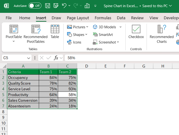
STEP 1: Organize your data into a table with two columns – one for the variables or factors you want to compare, and another for their respective values.
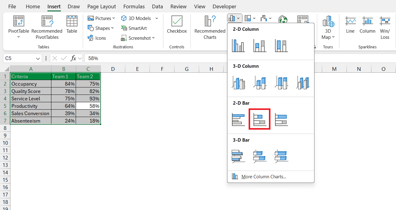
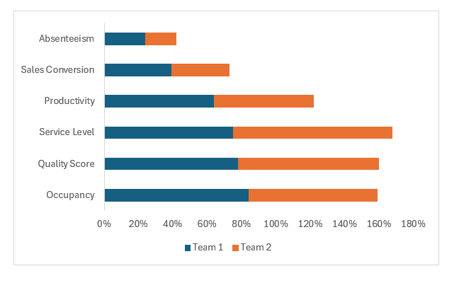
STEP 2: Select your data, including both columns and navigate to the ‘Insert’ tab. Choose ‘Bar Chart‘ and select a 2-D basic chart type.
STEP 3: Once the chart is inserted, format it to resemble a Spine Chart. Start by removing any unnecessary elements like gridlines.
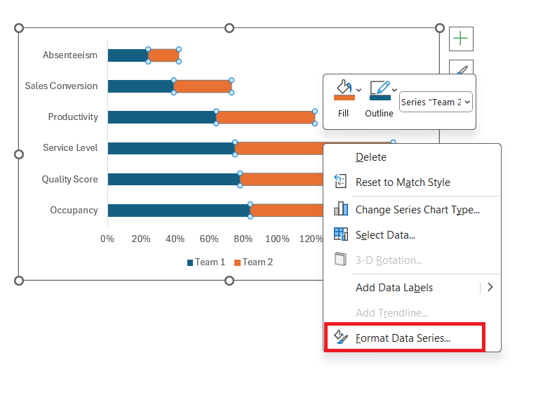
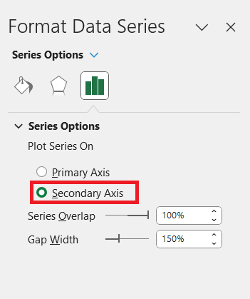
STEP 4: Right-click a data series and select Format Data Series.
STEP 5: In the Format Data Series dialog box, select Plot series on Secondary Axis.
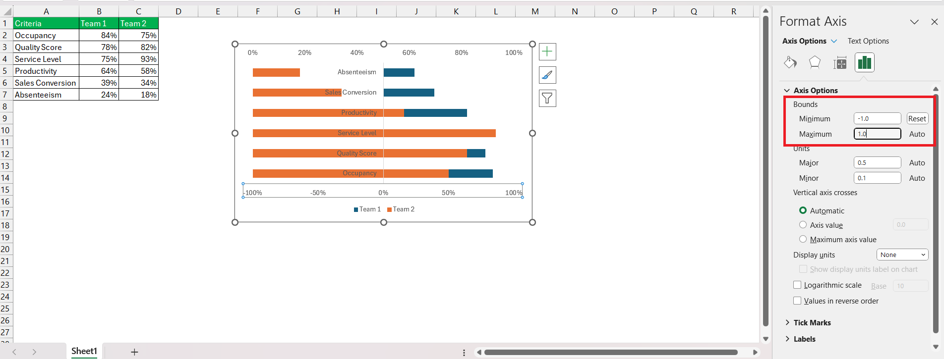
STEP 6: Right-click on the axis and select Format Axis. In the Format Axis dialog box, set the minimum bound as -1 and the maximum bound as 1.
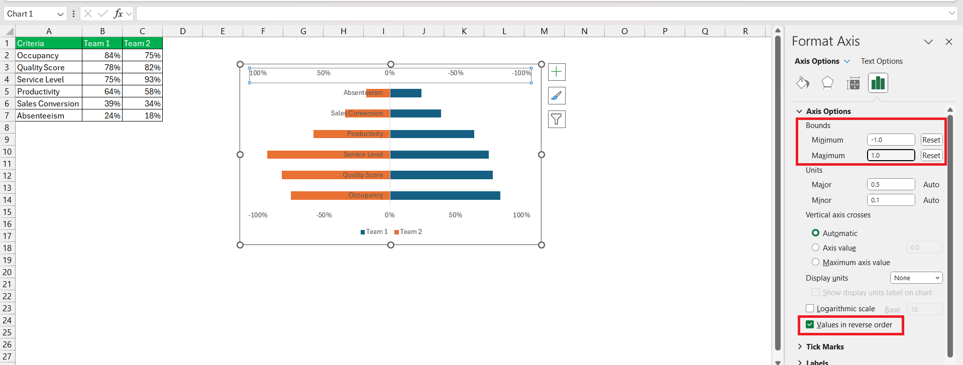
STEP 7: Right-click on the secondary axis and select Format Axis. In the Format Axis dialog box,
- Set the minimum bound as -1 and the maximum bound as 1.
- Check the box – Value in reverse order.
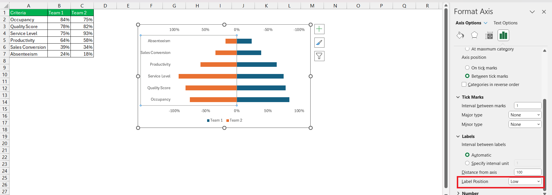
STEP 8: Format the vertical axis – Set Label Position as Low.
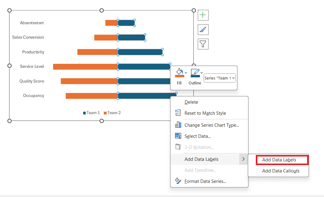
STEP 9: Right-click and select Add Data Labels > Add Data Labels.
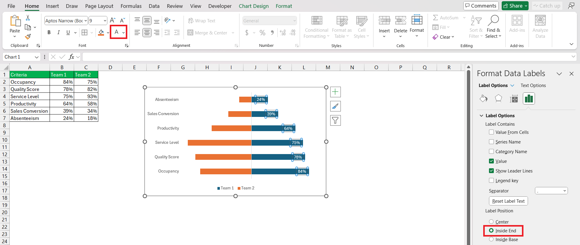
STEP 10: In the dialog box, set Label Position as Inside End and color as White.
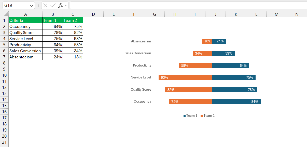
And Voila, the Spine Chart is now ready!
Why Use Spine Charts?
- Comparative Analysis: Spine Charts excel in showcasing the relative importance of different variables. By arranging bars symmetrically around the spine, they allow for easy comparison of positive and negative impacts.
- Compact Representation: In scenarios where you need to visualize multiple factors simultaneously, Spine Charts offers a compact yet comprehensive solution. They condense information into a single, easy-to-read chart.
- Visual Impact: The visual symmetry of Spine Charts can make complex data more intuitive. They effectively communicate trends, differences, and outliers, enhancing data-driven decision-making.
Best Practices for Creating Spine Charts:
To ensure the effectiveness and clarity of spine charts in Excel, consider the following best practices:
- Data Simplification: Limit the number of categories within each variable to avoid clutter and facilitate readability.
- Consistent Scaling: Maintain consistent scaling on the vertical and horizontal axes to accurately represent the proportions of data.
- Color Coding: Use color coding to differentiate between categories and highlight specific patterns or trends within the chart.
- Axis Labeling: Provide clear and descriptive labels for the vertical and horizontal axes to help users interpret the chart accurately.
- Chart Title and Legend: Include a descriptive title and a legend to provide context and aid interpretation, especially when presenting the chart to an audience.
- Interactivity: If feasible, incorporate interactivity features such as tooltips or drill-down options to enable users to explore detailed information within the chart.
Practical Applications
Spine charts find applications across various domains where categorical data analysis is prevalent. Some common applications include:
- Market Segmentation: Analyzing customer segments based on multiple categorical variables such as demographics, purchasing behavior, and geographical location.
- Product Mix Analysis: Evaluating the performance of product lines or categories across different regions or sales channels.
- Financial Analysis: Visualizing the distribution of expenses or revenues across different cost centers or business units.
- Healthcare Analytics: Studying patient demographics and medical conditions to identify trends and patterns in disease prevalence or treatment outcomes.
- Social Sciences: Exploring survey data to understand relationships between demographic factors and opinions or behaviors.
Conclusion
Spine Charts offer a unique and insightful way to visualize data in Excel. By leveraging their ability to represent both positive and negative impacts symmetrically, you can gain deeper insights into your data and make more informed decisions.
Whether it’s financial analysis, risk management, or market research, Spine Charts empowers you to unlock the full potential of your data visualization endeavors. So next time you’re exploring data in Excel, consider adding Spine Charts to your toolkit for a clearer perspective.
FAQs
What is a spine chart?
A spine chart is a visualization tool used to display data in a way that emphasizes the differences between categories. It typically resembles a spine with branches representing data categories.
How to make a spine chart?
To create a spine chart, organize your data into categories and corresponding values. Plot these values along a central axis, branching out to visually represent each category’s value.
How does a spine chart differ from other chart types?
Unlike traditional charts like bar or line graphs, a spine chart emphasizes the distribution of values among categories rather than trends over time or comparisons between individual data points.
Can a spine chart in Excel accommodate multiple data sets?
Yes, a spine chart in Excel can accommodate multiple data sets by plotting each set along the central axis, branching out accordingly to represent the values of each category.
How do I ensure my spine chart is both accurate and visually appealing?
To ensure accuracy, double-check your data input and axis scaling. For visual appeal, choose contrasting colors for branches, use clear labeling, and avoid clutter by limiting the number of categories or data points displayed.
John Michaloudis is a former accountant and finance analyst at General Electric, a Microsoft MVP since 2020, an Amazon #1 bestselling author of 4 Microsoft Excel books and teacher of Microsoft Excel & Office over at his flagship MyExcelOnline Academy Online Course.

