How to Create Flyers in PowerPoint – Step-by-Step Guide
Crafting Your Flyer: The Preliminary Steps.
Step 1 - Pick the Perfect PowerPoint Template.
When starting your flyers in PowerPoint, your first action should be scouting for a template that aligns with your vision.PowerPoint provides a feast of design options under the Design tab which is a good starting point.
For those who yearn for more, sites like Slidesgo offer a bounty of PowerPoint templates to satisfy any stylistic craving.
Once you select a template, download and open it, then customize by selecting the slides you like and tweaking the elements to fit your needs.
Crafting Your Flyer: The Preliminary Steps
Step 1 – Pick the Perfect PowerPoint Template
When starting your flyers in PowerPoint, your first action should be scouting for a template that aligns with your vision. PowerPoint provides a feast of design options under the Design tab which is a good starting point. For those who yearn for more, sites like Slidesgo offer a bounty of PowerPoint templates to satisfy any stylistic craving. Once you select a template, download and open it, then customize by selecting the slides you like and tweaking the elements to fit your needs.
Learn about Excel with our Free Microsoft Excel Online Course!
Key Takeaways
- Open a new PowerPoint presentation and select a blank slide. Choose the flyer’s layout and dimensions under the “Design” tab and format the background through the right-click menu.
- Insert text and visual elements. Use the “Insert” tab to add text boxes and pictures, adjust their size and placement, and apply formatting and styles for presentation.
- Finalize design and hierarchy. Arrange and align elements for a balanced look, ensure visual hierarchy with varied font sizes and colors, review the design for readability, and save or export the finished flyer.
Step 2 – Customize Slide Dimensions for Your Flyer
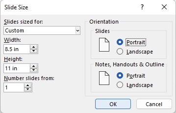
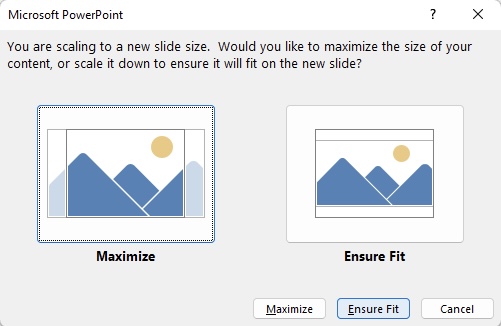
To ensure your content fits perfectly and your flyer looks professional when printed, setting the right slide dimensions is vital. Open PowerPoint, go to the “Design” tab, and click on “Slide Size.” Choose “Custom Slide Size” for precise adjustments. For letter-sized paper (8.5″x11″), the dimensions work great in the U.S. and Canada. Otherwise, the A4 size (8.27″x11.69″) is an international standard. Remember that once you’ve set the dimensions, PowerPoint will ask if you want to maximize or scale your content – choose Ensure Fit to maintain the layout’s integrity.
Pro Tip: Decide the size before adding content to avoid distortion or quality loss during resizing.
The Art of a Magnetic Flyer Design
Step 3 – Inserting an Eye-Catching Image
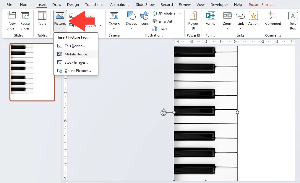
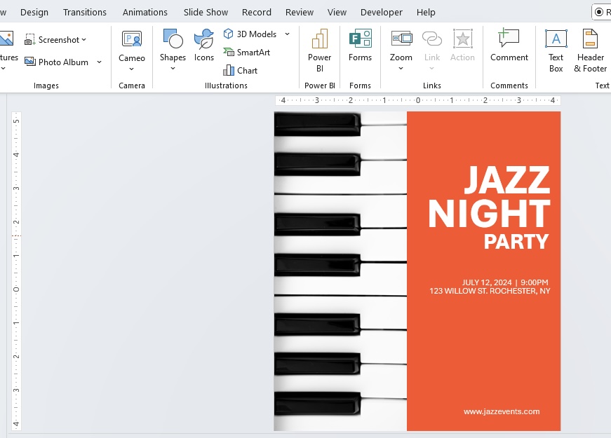
Choosing and inserting the right image can make your flyer beyond ordinary—it propels it into captivating territory. Start by picking an image that’s high-resolution; this ensures no matter the size, your visuals remain crisp and powerful. Look for an image that immediately relays your industry or function, especially something relevant and innovative. With the desired image in hand, add it to your slide by clicking the “Insert” tab and selecting “Pictures.” If it’s a large, high-quality image, it will naturally cover a significant part of your slide—no stretching needed! If the chosen image doesn’t fit well, consider searching for a larger resolution to ensure top-notch clarity.
Remember, the first thing people will notice is that image; let it be a beacon that draws them in and opens the doorway to your message.
Step 4 – Implementing Your Unique Brand Aesthetics
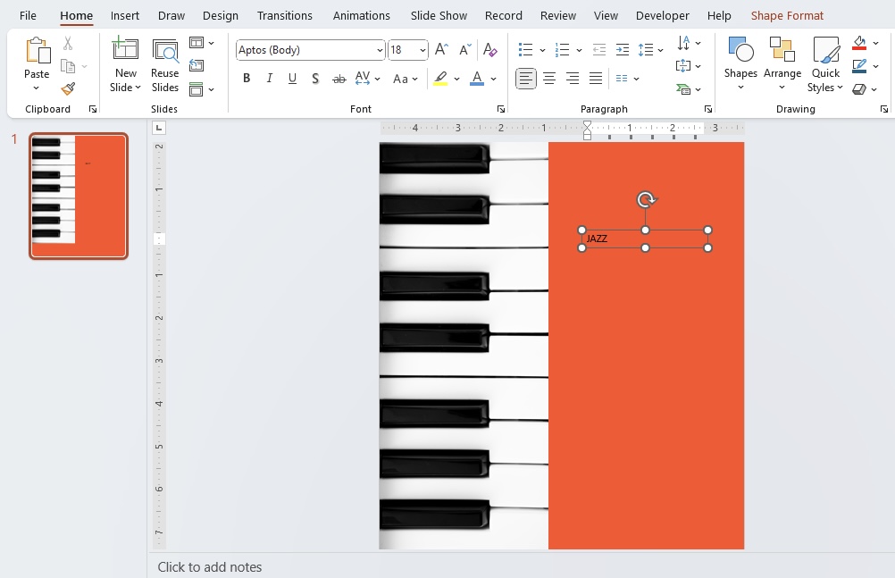
Your flyer isn’t just a piece of paper; it’s your brand ambassador, so injecting your flyer with your unique brand aesthetics is non-negotiable. Start by uploading your logo; this vital asset marks every flyer as distinctly yours. Dive into your brand’s color palette and splash it across your flyer’s elements: backgrounds, fonts, and graphics. Keen on making an emotional connection? Use colors mindfully—reds and oranges for excitement, blues and greens for trust and calm. Play with backgrounds, preferring ones that align with your message and don’t outshine your content. Gradients and overlays? They’re your allies to add depth and a professional touch.
Your brand’s personality deserves to shine—through meticulous customization, leave a lasting imprint in the viewer’s mind, making them crave more from your brand.
Content that Connects and Converts
Step 5 – Composing a Compelling Heading
A compelling heading isn’t just about snappy words—it’s your hook, your flyer’s opening act! Think clear, crisp, and direct, offering just enough to spike curiosity while hammering home your message. Your viewers should grasp what you offer in a glance. If your company specializes in cloud-based solutions, make that known! Cluster the keywords like “Cloud-Based Solutions” in larger, bolder fonts and color them to stand out, while supporting words like “We Specialize In” can be smaller, yet still legible.
The heading is a promise of value that guides viewers deeper into your flyer, and when you nail it, you’re set for success. It’s not just text; it’s your voice calling out to them.
Step 6 – Mapping Out the Message with Precision
The message you put forth should resonate with your audience, convincing them to take action. Start with outlining the key points you want to convey. Think simplicity and clarity; you’re aiming for instant understanding. Specify what you are offering or highlighting—be it an event, a product, a service, or a business update,—and get straight to the point. Directly link the benefits to the customer’s needs or problems.
Use bullet points or numbered lists for easy skimming if you’re listing features or benefits. And don’t overload your flyer with text—the best flyers are those with space to breathe. Keep the key message and call-to-action (CTA) prominent and accessible.
Precision in your message equates to precision in results. When viewers see your flyer, the path you want them to take should be clear and irresistible.
Finishing Touches to Amplify Professionalism
Step 7 – Infusing Brand Elements and Logos
To etch your brand identity onto your audience’s memory, infuse your flyer with unmistakable brand elements and logos. Placing your logo in the top corner, preferably on the right, offers high visibility without overpowering your main message. Complement the logo with your brand’s color scheme, fonts, and any other graphic elements that serve as your unique signatures to create a cohesive look.
Remember to maintain enough white space around your logo to avoid clutter. This not only ensures that your logo is unobstructed but also contributes to the overall clean, professional aesthetic of the flyer.
Viewers should be able to connect your logo—and thus your brand—to the products or services you’re advertising without a second thought. That’s the hallmark of a flyer that cements brand recognition.
Step 8 – Proofread and Add Contact Information
Before you call your flyer finished, initiate one of the most critical steps: proofreading. Carefully scrutinize every word and sentence for typos, grammar blunders, and syntax squabbles. An error-free flyer not only looks more professional, but it also reinforces your credibility.
Subsequently, seamlessly integrate your contact information. Display your email address, phone number, website, or physical address, ensuring they’re simple to find and read. For added flair, place these details on a distinct background strip to make them pop. Affix a QR code for a smooth transition from paper to digital, guiding your audience straight to your website or social media.
A flyer sans contact information or one riddled with errors is akin to a handshake with no eye contact—it lacks connection and assurance. Double-check, then triple-check, and furnish all necessary avenues for your potential customers to reach out.
From Creation to Circulation
Step 9 – Reviewing Your Design Style and Consistency
Once your flyer is populated with content, images, and brand elements, it’s paramount to step back and review the overall design. Seek style consistency across the flyer – uniform color schemes, fonts, and imagery that align with your brand identity reinforce a strong, cohesive message. Check that visual elements are balanced and that there’s a natural flow guiding the viewer’s eyes from the headline, through the content, to the call-to-action.
Ensure your flyer doesn’t just look good on-screen but also in print. Test print a copy to catch any discrepancies that might not be visible on your computer.
By fine-tuning design elements for harmony and professionalism, your flyer will not only capture attention but also sustain it—turning casual glances into engaged reads.
Step 10 – Exporting Your PowerPoint Flyer Correctly
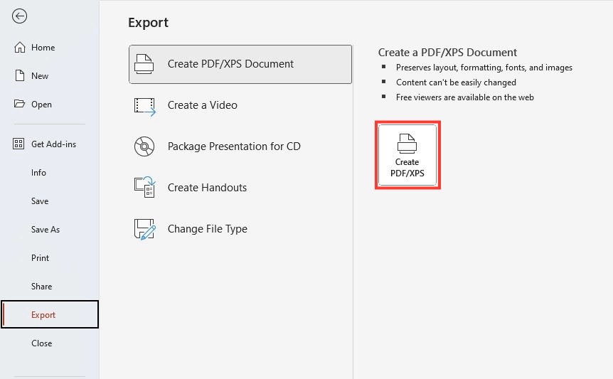
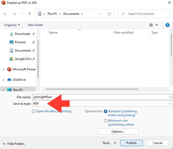
The final step turns your digital creation into a sharable, printable masterpiece. Navigate to “File” and select “Export.” Choose “Create PDF/XPS Document,” then click the corresponding button. In the pop-up window, choose where to save the file, ensuring the name clearly identifies the flyer. Before clicking “Publish,” remember—if multiple slides are open and you only need the flyer, click “Options” and specify the slides to save in the “Range” section.
The importance of this step can’t be overstressed—PDFs preserve your design’s integrity, ensuring what you created is what the world sees, whether on-screen or in hand.
Through this, your flyer is ready to make its way into the world, in the impeccable form you designed it to be—consistent, crisper, and professional.
Why PowerPoint is the Go-To Tool for Flyers
The Simplified Accessibility of PowerPoint for Design
You might wonder, why PowerPoint for flyer design? Beyond its initial reputation as a presentation tool, PowerPoint impresses with its sheer accessibility. Whether you’re a seasoned designer or someone with no professional design background, PowerPoint’s user-friendly interface makes it a breeze to navigate and create. With slide templates, drag-and-drop functionality, and easy alignment tools, you have a seamless path from a blank slide to a compelling flyer.
And the best part? You probably already have it installed on your computer. No need for new software or steep learning curves. Dive right in and start creating!
The power of PowerPoint lies in its democratization of design—putting the ability to create stunning, professional flyers at everyone’s fingertips.
Advantages Over Traditional Design Software
PowerPoint comes with a host of advantages over traditional design software, simplifying the creation process without sacrificing quality. Unlike professional design programs that have a labyrinth of complex features, PowerPoint is user-friendly, allowing quick mastery and design development. It’s not only a standard in office software suites but also boasts familiar tools and a versatile array of design elements. This ensures that everyone from beginners to experts can produce high-quality designs without the requirement of specialized graphic design knowledge.
Moreover, PowerPoint offers cost benefits, eliminating the need for expensive subscriptions or licenses associated with traditional design software. Accessibility, simplicity, and affordability make PowerPoint an unexpectedly powerful tool for designing flyers that stand out.
The ease with which one can share and collaborate on PowerPoint files also outshines many design software options, making it an ideal choice for quickly disseminating marketing materials like flyers.
Turning Browsers into Buyers with Strategic Flyer Placement
Digital Distribution Strategies for Your PowerPoint Flyer
Once your flyer is polished and ready to go, it’s time to strategize its digital distribution. Remember, the goal is to make your content land in the right inboxes, feeds, and screens. Convert your flyer into a PDF for easy sharing via email—a format that’s practically universal. Incorporate it into your email marketing campaigns to reach your current subscribers or use it as an attractive lead magnet to gather new contacts.
Social media platforms are also your allies here. Capitalize on the visuals of your flyer by sharing it as an image post or story. Complement your digital presence with strategic hashtags and compelling captions to promote sharing and engagement.
For broader visibility, consider embedding the flyer on your website or blog. Don’t forget to optimize the flyer’s SEO by including relevant keywords in the file name and alt text, helping it to appear in online searches.
With these strategies, you not only increase the chances of your flyer being seen but also boost the possibility of your audience taking action—be it visiting your website, making a purchase, or attending your event.
Print Media Tactics for Maximum Reach
In the digital age, print media continues to cement its place as a tactile, trust-inspiring format for your flyers. For maximum reach, adopt a strategic mix of digital and print distribution. Use local bulletin boards, insert flyers in mailed invoices, distribute at events, and partner with complementary local businesses to display your flyers in high-traffic areas.
Choosing the right paper quality and finish can also make a huge difference in the perceived value of the information you’re sharing. Select a higher weight paper for a touch of elegance and durability, and consider a matte or glossy finish to make your images and color pop.
Pro tip: Always keep a stack of flyers with you because you never know when networking opportunities arise. With these tactics, you can ensure your flyer is seen far and wide, not just on the screens but in the hands of potential customers in your community.
FAQ
Can I create a flyer in PowerPoint?
Absolutely! PowerPoint is a versatile tool that’s not limited to creating presentations. You can design eye-catching flyers with ease, thanks to its wide range of templates, design elements, and user-friendly interface. Whether for professional or personal use, PowerPoint makes it possible to craft flyers that stand out, all without the need for specialized graphic design skills.
How do I ensure my flyer design is printer-friendly?
To make sure your flyer design is printer-friendly, set the correct slide dimensions in PowerPoint to match your paper size. Use high-resolution images to prevent pixelation, and keep crucial content within the safe margin area to avoid getting cut off during printing. Additionally, choose colors wisely as some may differ when printed versus displayed on screen. Before printing a large batch, always print a test copy to ensure the flyer meets your expectations.
What are some tips for creating impactful content for my flyer?
Creating impactful content for your flyer starts with a clear, powerful headline that grabs attention. Use concise language and focus on the benefits your offer brings to the table. Visuals are key, so include high-quality images or graphics that complement your message. Incorporate bullet points to make information digestible, and don’t forget a compelling call-to-action (CTA) that prompts your audience to take the next step. Keep your content audience-centered, addressing their needs and how your service or product can solve them.
John Michaloudis is a former accountant and finance analyst at General Electric, a Microsoft MVP since 2020, an Amazon #1 bestselling author of 4 Microsoft Excel books and teacher of Microsoft Excel & Office over at his flagship MyExcelOnline Academy Online Course.


