With Excel Pivot Tables you can do a lot of stuff with your data! But did you know that you can even create a Frequency Distribution Table? Let’s have some fun below! I’ll show you how easy it is to create your own Frequency Distribution Chart!
Key Takeaways:
- Efficient Data Grouping: Pivot Tables allow you to group data into frequency ranges quickly. For example, you can group numerical data into intervals (e.g., 0-10, 11-20) to analyze how often values occur within each range.
- Dynamic Adjustments: Once a frequency distribution is set up in a Pivot Table, you can easily modify grouping intervals or update the data source. The Pivot Table recalculates automatically, saving time compared to manual methods.
- Visualization Options: Frequency distributions in Pivot Tables can be easily visualized by inserting charts like histograms or column charts. This helps in presenting data trends more effectively.
- Customizable Group Intervals: You can customize the grouping ranges to fit specific needs. For instance, you can group by fixed intervals (e.g., 10 or 20) or create custom bins to better analyze your dataset.
- Works Across Categories: Pivot Tables not only help create frequency distributions for numerical data but can also be used to count occurrences of text categories, such as product types or regions, making them versatile for various datasets.
Table of Contents
The Initial Setup
We will create a chart based on this table with Sales values:
Frequency Distribution with Excel Pivot Tables
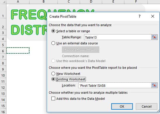
STEP 1: Let us insert a new Pivot Table. Select your data and Go to Insert > Tables > PivotTable
Select Existing Worksheet and pick an empty space to place your Pivot Table. Click OK.
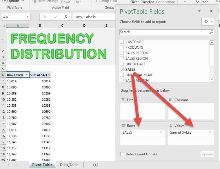
STEP 2: Drag SALES into VALUES and ROWS and you’ll see your Pivot Table get updated:
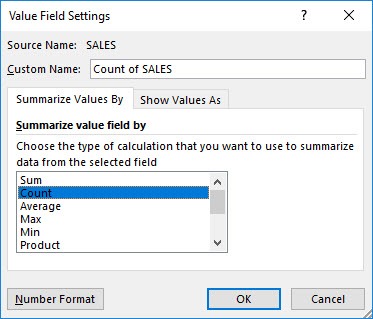
Click on Sum of SALES and select Value Field Settings.
Select Count and click OK.
STEP 3: We are almost there! Right click on your Pivot Table and select Group.
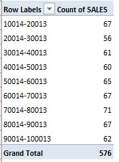
Accept the suggested values. It will group our values by ranges of 10,000. Click OK.
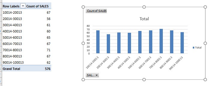
Now it’s grouped together!
STEP 4: Go to Analyze > Tools > PivotChart
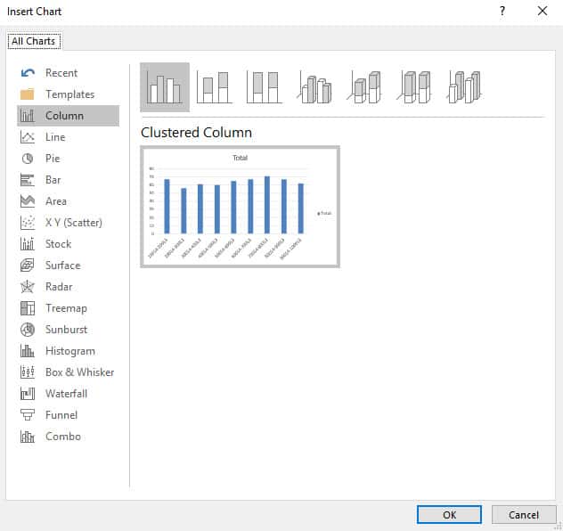
Ensure Clustered Column is selected. Click OK.
Your awesome Frequency Distribution is now ready!
Advanced Tips and Tricks for Frequency Distribution Mastery
Comparing Multiple Distributions for In-depth Analysis
When you’re dealing with various datasets, comparing frequency distributions side by side can unearth trends that might otherwise be overlooked. Excel lets you line up multiple distributions, providing a clearer picture of how different sets of data relate to each other. For example, you can compare monthly sales data across different years to detect seasonality or economic trends. By overlapping these distributions, you can easily spot which products perform consistently and which are subject to fluctuations.
Ensure that when comparing, you’re mindful of scale and intervals to maintain the integrity of your analysis. Visual aids like histograms or line charts can be useful here, as they offer a visual representation that’s straightforward to interpret. Remember to include [screenshots] or [charts] showcasing these comparisons for a more compelling story.
Automating Your Workflow: Dynamic Updates with Pivot Tables
Automating your workflow with dynamic updates in Pivot Tables means that your frequency distribution can refresh automatically as new data comes in. This is particularly useful when you’re tracking ongoing processes or results that regularly receive new input. For instance, sales figures that are updated daily or weekly.
To set this up, you’d leverage Excel’s table feature and the ‘Refresh’ option in Pivot Tables. By making your data range a defined table, the Pivot Table recognizes when new rows are added and incorporates them into the frequency distribution upon refresh. This automation saves you considerable time and ensures your data analyses are always up to date.
Here are a few steps for smoother automation:
- Convert your data range into a table by selecting the range and pressing
Ctrl+T. - Create a Pivot Table based on this table.
- Apply any design or calculation specifications needed for your frequency distribution.
- Remember to refresh the Pivot Table to reflect any new or changed data automatically.
Frequently Asked Questions:
How do I create a frequency distribution in Excel using Pivot Tables?
To create a frequency distribution, add your data to a Pivot Table, drag the numerical field into the Rows area, and then group the values by selecting the numeric field and choosing Group from the context menu. Specify the range interval, and add the same field to the Values area to count occurrences.
Can I customize the grouping intervals for frequency distributions in Pivot Tables?
Yes, you can customize the grouping intervals. Right-click on the numeric field in the Rows area, select Group, and specify the Starting At, Ending At, and By values to set your desired range intervals.
What type of data is suitable for frequency distribution in Pivot Tables?
Pivot Tables work best with numerical data for frequency distributions, such as sales amounts, ages, or scores. They can also group categorical data by counting occurrences, such as product categories or regions.
Can I visualize the frequency distribution created with a Pivot Table?
Yes, you can create a chart to visualize the frequency distribution. After creating the Pivot Table, select it and go to Insert > Column Chart or Histogram to represent the frequency distribution graphically.
Why are the grouping options greyed out when I try to group data in the Pivot Table?
The grouping option may be greyed out if your data contains blank cells or non-numeric values in the numeric field. Ensure all data in the field is numeric and free of empty cells before grouping.

Bryan
Bryan Hong is an IT Software Developer for more than 10 years and has the following certifications: Microsoft Certified Professional Developer (MCPD): Web Developer, Microsoft Certified Technology Specialist (MCTS): Windows Applications, Microsoft Certified Systems Engineer (MCSE) and Microsoft Certified Systems Administrator (MCSA).
He is also an Amazon #1 bestselling author of 4 Microsoft Excel books and a teacher of Microsoft Excel & Office at the MyExecelOnline Academy Online Course.


