Funnel charts visualize data as it narrows through stages, ideal for showcasing sequential steps with decreasing values. They are perfect for tracking processes like sales pipelines, highlighting where significant drop-offs occur. This guide will help you create and customize a funnel chart in Microsoft Excel efficiently.
Key Takeaways:
- Purpose of Funnel Charts: Funnel charts are used to display data that decreases across stages, like sales processes.
- Data Preparation: Structure your data sequentially, ensuring accuracy and consistency.
- Creating the Chart: Select your data, navigate to the ‘Insert’ tab, and choose the funnel chart option.
- Customization: Enhance your chart’s readability by adjusting colors, fonts, and data labels.
Table of Contents
Introduction to Funnel Charts
Understanding the Basics of a Funnel Chart
Funnel charts offer a dynamic way of visualizing data as it progresses through stages, much like how a physical funnel narrows down. This type of chart is ideal for presenting sequential steps where values decrease incrementally, making the stages easily comparable at a glance.
Imagine a funnel chart as the go-to tool when you want to track the journey of prospects becoming customers. You can quickly spot where the most significant drop-offs occur and which areas to focus on for improvement.
The Importance of Funnel Charts in Data Visualization
Funnel charts hold a special place in the realm of data visualization. They are indispensable for providing insights into processes where you expect a reduction in numbers over time, such as in sales pipelines or lead conversion scenarios.
By utilizing a funnel chart, you can eloquently communicate complex data in an intuitive and easily digestible format, allowing you to highlight key points of interest or concern. They are particularly effective in demonstrating the health and efficiency of a process, as they make it easier to spot and address potential bottlenecks that may be hindering your progress.
Preparing Your Data for a Funnel Chart
Structuring Your Data Effectively
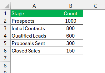
To ensure your funnel chart tells the right story, it’s crucial to structure your data effectively. Start by making a clear distinction between each phase of the process you’re analyzing. List these stages in the first column of your spreadsheet, ensuring they are ordered from the initial step at the top to the last step at the bottom.
Next to each stage, input the corresponding values or a number of items in the second column. It’s key that the data is organized sequentially and accurately reflects the flow of the process.
Tips for Data Accuracy and Consistency
For flawless funnel charts, ensuring data accuracy and consistency is a must. Here are a couple of pro tips:
- First, always verify the numbers you are entering match the actual figures from your records or reports. A single error can distort your entire analysis.
- Second, maintain consistency in measurement throughout your dataset. If you’re evaluating a sales process, for example, decide if you’re looking at the number of leads, the value of sales, or the percentage of conversion, and stick with that metric from top to bottom. This uniformity is crucial for the integrity of your funnel chart.
Step-by-Step Guide to Creating a Funnel Chart
Initiating the Funnel Chart Creation Process
Getting started with your funnel chart in Excel is a straightforward process.
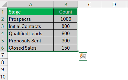
STEP 1: Begin by selecting the data that would be represented—this includes both the stages of your process and their corresponding values.
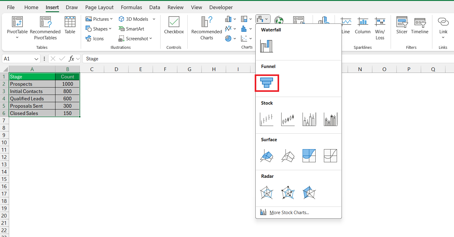
STEP 2: With the data highlighted, navigate to the ‘Insert’ tab and find the ‘Charts’ group.
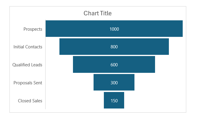
STEP 3: Click on the funnel chart icon to insert a default funnel chart.
Excel will automatically generate a chart that gives you a visual starting point.
Customizing the Appearance of Your Funnel Chart
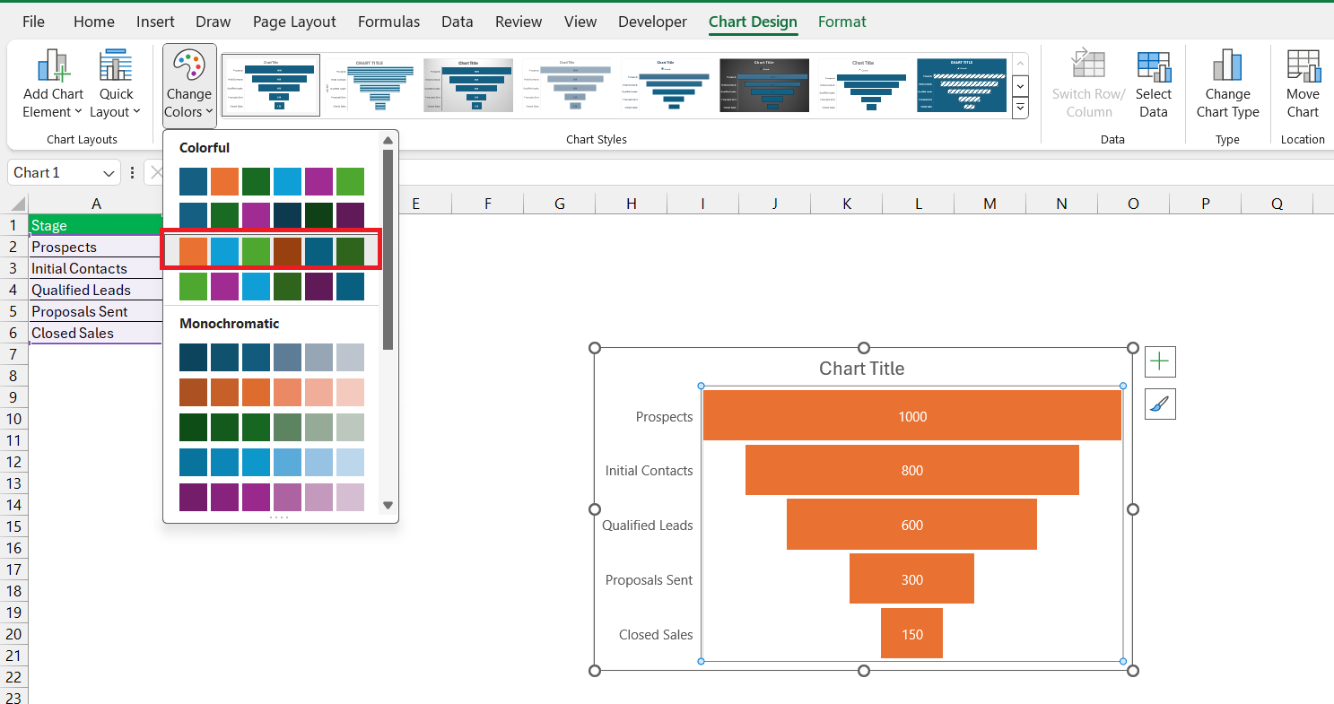
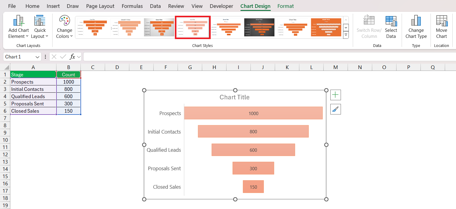
After creating your basic funnel chart, it’s time to make it pop with some customization. By right-clicking on the chart, or using options in the chart tools format and design tabs, you can change the color scheme.
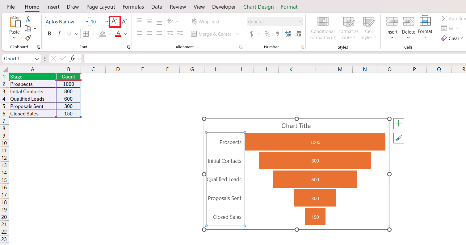
Adjusting the font size and color of your data labels will enhance readability.
If it suits your style, consider formatting each level with a gradient or pattern to add visual depth.
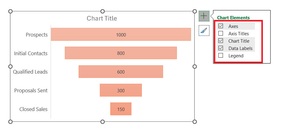
You can also add or remove elements like chart titles or legends to achieve a cleaner look that focuses on the data.
Common Uses for Funnel Charts in Excel
Sales Process Analysis with Funnel Charts
Funnel charts are tailor-made for dissecting your sales process. By mapping out each step, from initial contact to final sale, you can identify at which stages potential clients are lost and what might cause the drop-offs. This insight enables you to optimize the sales process effectively. Moreover, by comparing different time periods or sales strategies, funnel charts can help you understand the impact of changes made and point out best practices.
Identifying Bottlenecks and Improving Conversion Rates
Using funnel charts to pinpoint bottlenecks is where they truly shine. They visually expose gaps between stages, allowing you to focus your resources on the most critical areas. This not only streamlines the process but can significantly aid in enhancing conversion rates. For instance, if you notice a steep decline between the initial lead stage and the follow-up contact stage, you can strategize ways to improve communication. Improving these friction points can lead to a smoother transition down the funnel, turning more leads into conversions.
Troubleshooting Common Issues in Funnel Chart Creation
Solving Data Display Errors
If your funnel chart isn’t displaying correctly, don’t fret – solutions are often simple. Double-check your data range to ensure it includes all relevant cells, and confirm the data series are in the correct order. If numbers are misrepresented, ensure that they are formatted consistently as numbers without any stray text or characters. Another common issue may be incorrect chart type selection; make sure you’ve indeed chosen the funnel chart option. Remember, a well-prepared dataset is key to avoiding display errors from the get-go.
Adjustments for Aesthetic Appeal and Clarity
A visually compelling funnel chart is not just about the data – it’s also about clarity and aesthetics. To improve appeal, consider customizing the color palette to align with your branding or report theme. Use contrast effectively to ensure that text stands out against background colors. A clear and concise title along with intuitive labeling makes your chart immediately understandable. Also, avoid clutter by removing non-essential elements like gridlines or surplus chart elements that do not add value to the interpretation of data.
FAQs on Creating Funnel Charts in Excel
How do I create a funnel chart in Excel?
Creating a funnel chart in Excel is easy! Simply organize your data in descending order, select the range, go to the ‘Insert’ tab, and choose the ‘Funnel’ option from the charts group. Excel will craft the funnel chart for you, which you can then customize as needed.
What is a funnel chart used for?
A funnel chart is used to visualize the stages in a process where quantities decrease progressively, such as sales pipelines, website visitor trends, or order fulfillment processes. It’s especially helpful for identifying potential bottlenecks and illustrating conversion rates throughout different stages.
How Do I Customize the Colors in My Funnel Chart?
Customizing the colors in your funnel chart adds clarity and visual interest. Right-click on a section of the chart you wish to change and select ‘Format Data Point. From there, choose ‘Fill’ and pick the color you want. Repeat this for each section to create a vibrant and informative chart.
Can I Create a Funnel Chart in Older Versions of Excel?
Yes, even in older Excel versions prior to 2019, you can simulate a funnel chart by using a Stacked Bar chart and then applying some clever formatting. It’s a bit more hands-on, but it gets the job done and allows you to visualize your data effectively in a funnel-style representation.
How do I edit a funnel chart in Excel?
Editing a funnel chart in Excel is straightforward. Click on the chart to bring up the Chart Design and Format tabs. From there, you can adjust styles, and colors, add chart elements like data labels, and tweak the overall layout. Dragging edges will also resize the chart to better fit your space.
John Michaloudis is a former accountant and finance analyst at General Electric, a Microsoft MVP since 2020, an Amazon #1 bestselling author of 4 Microsoft Excel books and teacher of Microsoft Excel & Office over at his flagship MyExcelOnline Academy Online Course.

