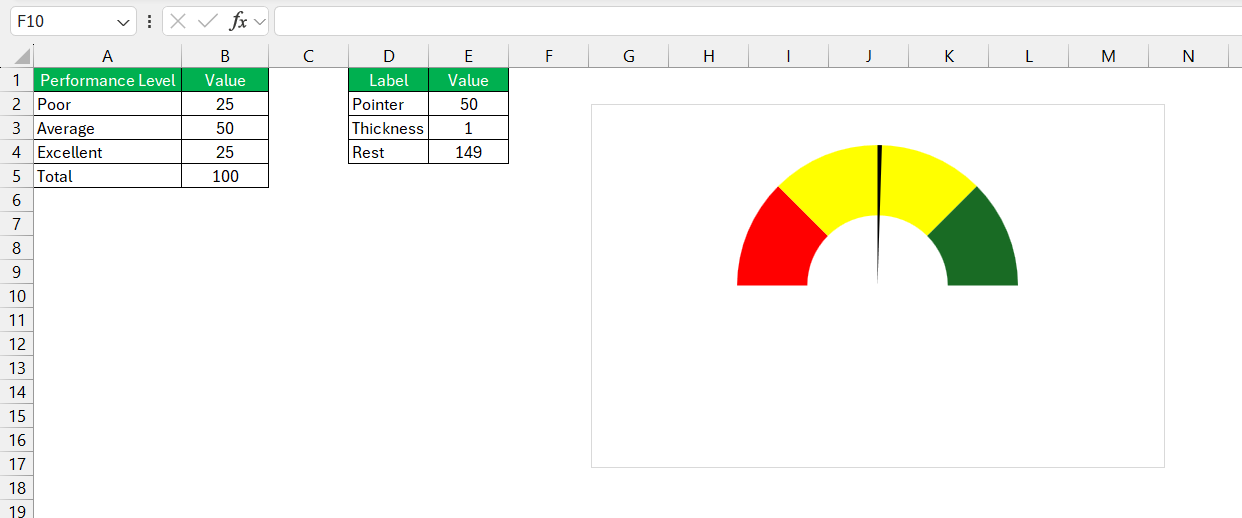
Gauge charts, also known as speedometer charts, are powerful tools in Microsoft Excel for showcasing single-value metrics succinctly. Much like a speedometer indicates a car’s speed against potential speeds on its dial, gauge charts provide an immediate snapshot of how a value compares to a specific target.
Key Takeaways:
- Gauge charts offer a quick and intuitive way to assess whether a metric is on track or in need of attention, akin to a traffic light signaling red, yellow, or green.
- In today’s fast-paced world, visual representation of data is essential for swift comprehension and decision-making. Gauge charts transform raw numbers into a story that’s easily understood and remembered.
- With the rising need for data accessibility across organizations, gauge charts serve as a bridge, allowing individuals from various backgrounds to interpret and act upon data without technical expertise.
- Color, simplicity, and professional customization are key elements in crafting impactful gauge charts. Strategic design choices enhance readability and guide viewers toward actionable insights.
Table of Contents
Introduction to Gauge Charts in Excel
Grasping the Fundamentals of a Gauge Chart
Gauge charts, sometimes known as speedometer charts, are visual tools used in Excel to display single-value metrics. They excel at illustrating the extent to which a value meets a particular target, akin to how a speedometer shows a car’s speed against the potential speeds on its dial.
Imagine being able to quickly discern whether your project’s progress is in the red zone or cruising comfortably in the green—it’s this instant snapshot gauge charts provide.
The Rapid Rise of Visual Data Representation
In today’s fast-paced world, the ability to quickly interpret complex data is indispensable. That’s where Excel charts come into play, taking the spotlight as a critical element in data analysis and decision-making.
Visuals like gauge charts transform raw data into a narrative that’s not only easily grasped but also retained in memory longer. Since our brains process visuals far faster than text, incorporating an effective gauge chart into your Excel spreadsheet can mean the difference between overlooked data and actionable insights.
With the growing need for data democratization across organizations, ensuring that information is accessible and understandable to non-experts is paramount. Gauge charts serve this need beautifully, allowing team members from various departments, even those with little to no technical expertise, to quickly assess and react to information. The visual language they create simplifies communication and facilitates more informed and timely decision-making.
Step-by-Step Guide to Craft Your Gauge Chart
Follow the steps below to create a gauge chart in Excel –
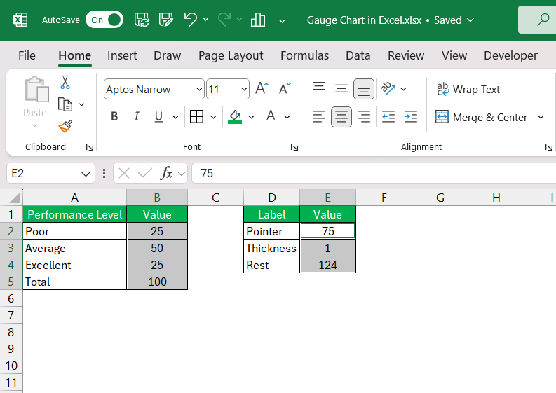
STEP 1: Select range B2:B5 and E2:E4.
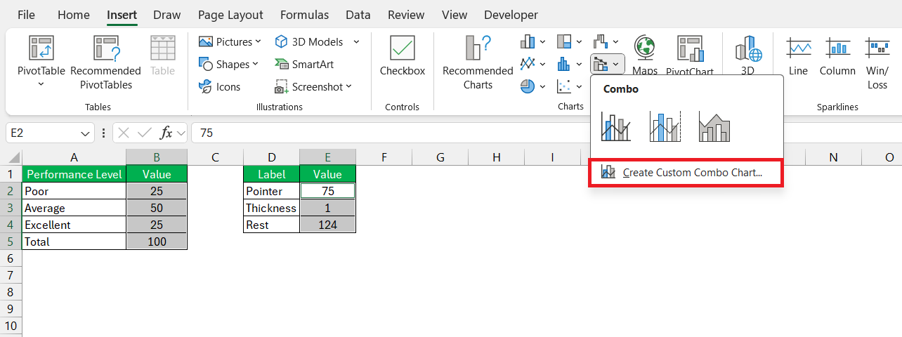
STEP 2: On the Insert tab, within the Charts group, click the Combo symbol.
STEP 3: Opt for “Create Custom Combo Chart” from the dropdown.
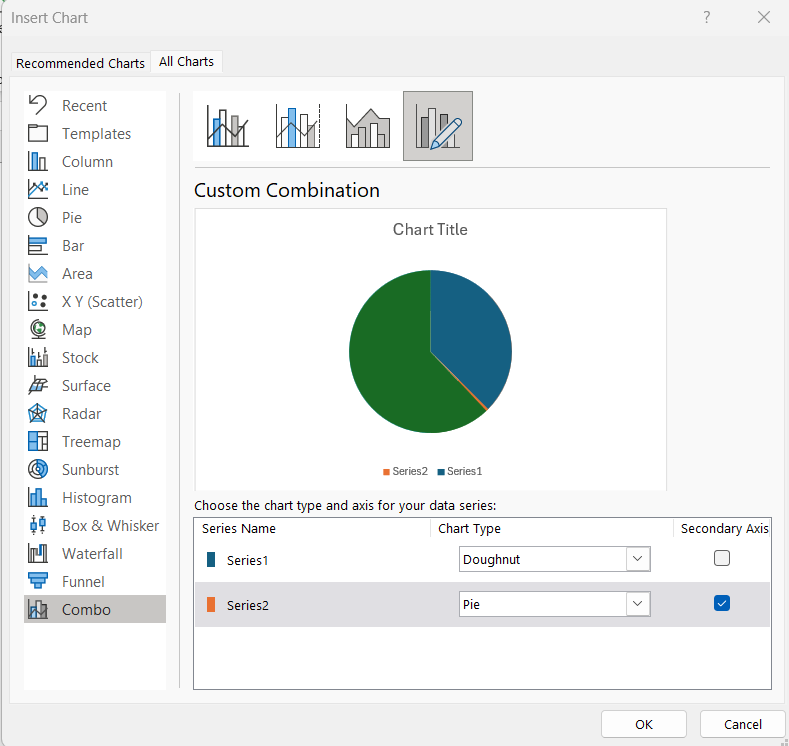
STEP 4: In the Insert Chart dialog box:
- Choose Doughnut (fourth option under Pie) as the chart type for the Donut series.
- Opt for Pie as the chart type for the Pie series.
- Chart the Pie series on the secondary axis.
- Click OK.
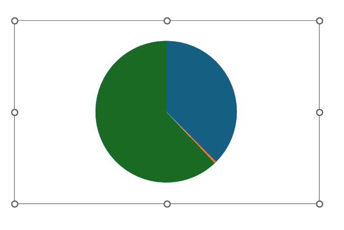
STEP 5: Remove the chart title and legend.
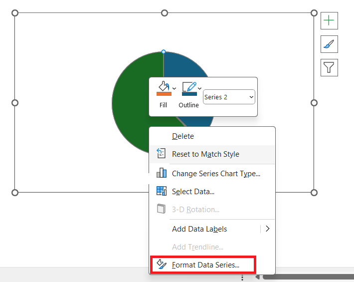
STEP 6: Right-click on the chart and select Format Data Series.
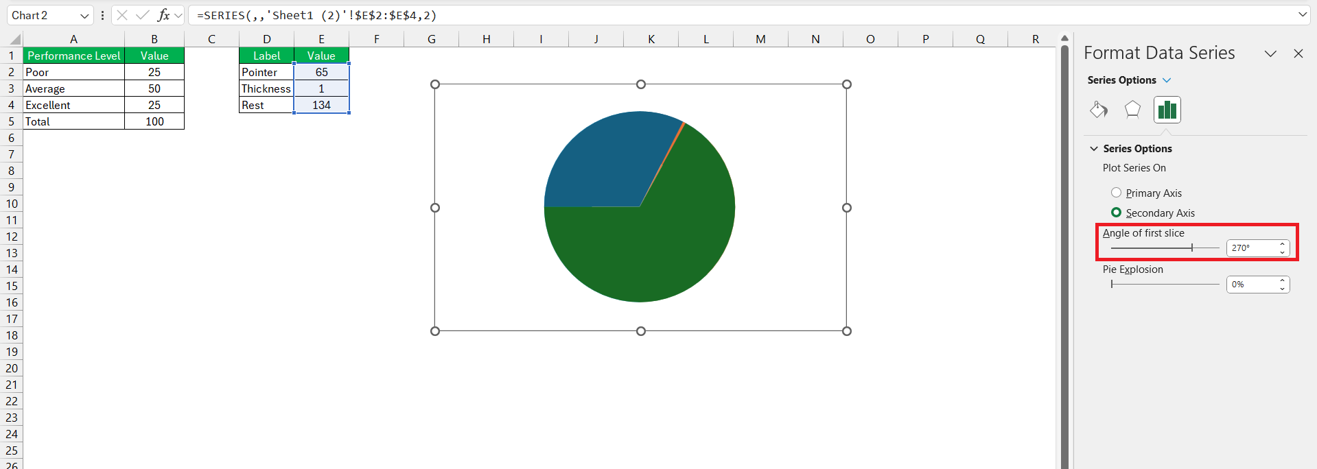
STEP 7: Rotate the first slice to 270 degrees.
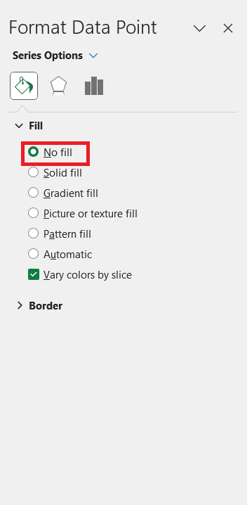
STEP 8: While holding down CTRL, use the ← and → keys to select individual data points. In the Format tab > Shape Styles group, alter the Shape Fill for each point:
- Point 1 = No Fill
- Point 2 = Black
- Point 3 = No Fill
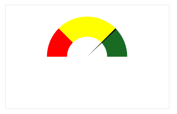
STEP 9: Repeat the same steps to change the shape fill for the donut chart.
- Point 1 = Red
- Point 2 = Yellow
- Point 3 = Green
- Point 4 = No Fill
STEP 10: Utilize the Spin Button to alter the value in cell E2 from 75 to 50.
Tips and Tricks for an Impactful Gauge Chart
Color and Design Considerations for Clarity
Designing a visually appealing and clear gauge chart means being strategic about your use of color and design elements:
- Use High-Contrast Colors: Opt for colors that stand out against each other. For instance, use dark colors against light ones so your data pops and is easier to read at a glance.
- Simplify: Keep the design simple and free of unnecessary clutter. Each element should serve a purpose and contribute to the overall understanding of the data.
- Color to Indicate Status: Choose intuitive color schemes, like green for good performance, yellow for satisfactory or cautious, and red for areas needing improvement, leveraging colors as a universal language of status.
- Match Branding: If it’s for a corporate setup, match your gauge’s colors with the company’s branding for a seamless visual experience.
Remember, the aesthetic choices should never compromise the chart’s readability. Consider how the colors and design elements work together to guide the viewer’s eye naturally to the most important data.
Advanced Customization for Professional Appeal
Taking your gauge chart from standard to standout requires delving into advanced customization options that give it professional appeal. Let’s talk about how to refine your chart:
- Utilize Chart Styles: Dive into Excel’s chart styles and templates for sophisticated visual themes that can be applied with just a click.
- Incorporate Data-Driven Conditional Formatting: Experiment with conditional formatting tied to the data your chart represents, such as dynamic color changes as performance fluctuates.
- Play with Fonts and Text Effects: Choose clear and professional fonts, and adjust size for readability. Consider subtle text effects for emphasis without distraction.
- Add Interactive Elements: If your chart will be viewed electronically, consider adding interactive elements such as hover-over effects that display more detailed data.
- Create a Dashboard Feel: Integrate your gauge chart into a dashboard layout with other charts and data visualizations for a comprehensive snapshot of related metrics.
As you refine your gauge chart, keep functionality at the forefront. Every customization should enhance understanding rather than complicate it, ensuring that the gauge remains a tool of clarity and insight.
Practical Applications for Gauge Charts in Excel
Monitoring Project Deadlines with Gauge Charts
Gauge charts are tailor-made for monitoring project deadlines, thanks to their intuitive display of progress against set goals. They can signify how close you are to the finish line and if you need to speed up.
- Use the gauge chart to represent the percentage completion of a project. As deadlines approach, the needle moves closer to 100%, offering a visual push for momentum.
- Configure the color sections to indicate urgency—green for on track, yellow for caution, and red for danger zones that signal potential delays.
This visual method simplifies stakeholder updates and keeps project teams aligned with current status and focused on the next milestone. Gauge charts in projects offer a clear and ongoing reminder of time frames and goals, fostering a better-paced work environment.
Measuring Performance Against Targets
Gauge charts shine when it comes to measuring performance against targets. They visually communicate whether targets are being met, surpassed, or require additional attention.
- In sales environments, use gauge charts to display individual or team performance, pertaining to sales targets. A quick glance can inform managers and team members alike about their current standing and how much further they need to go before the period ends.
- For manufacturing, gauge charts can indicate machinery performance or production quotas, showing how many units are produced against the target and signaling if adjustments in the process are necessary.
This visual representation of key metrics not only boosts transparency but also instills a sense of achievement and urgency, driving teams toward their goals.
FAQs: All You Need to Know About Gauge Charts in Excel
What is a gauge chart?
A gauge chart, also known as a speedometer chart, is a tool for visualizing data in a way that resembles a car’s dashboard gauge. It features a dial and a needle that indicates where a specific data point lies within a pre-set range, often color-coded. This chart type is excellent for displaying the progress of a single value against a goal or threshold and is commonly used in dashboards for an immediate understanding of performance.
What is the use of a gauge chart?
A gauge chart is used to display key performance indicators (KPIs), giving a quick visual reference to show how close a value is to a predefined goal or benchmark. It’s particularly helpful for translating singular data points into an understandable narrative about progress, success, or areas needing attention. This visual approach is impactful for real-time monitoring of objectives in various contexts.
What is the alternative to the gauge chart in Excel?
Alternatives to a gauge chart in Excel include bullet charts, which are great for comparing performance against a target, or thermometer charts, which visually display the percentage of a goal achieved. Both options consume less space and can be more effective in showing progress or reaching targets. They maintain simplicity while delivering a clear message about your data.
What Is the Advantage of Using a Gauge Chart over Other Chart Types?
The advantage of using a gauge chart over other chart types lies in its intuitive nature, providing a clear visual representation of a single value’s status within a range, making it easier for viewers to grasp quickly.
How Can I Make My Gauge Chart in Excel Look More Professional?
To make your gauge chart in Excel look more professional, consider refining its design by removing unnecessary elements, adjusting colors and formatting for clarity, ensuring the scale and ranges are clearly labeled, and providing context or additional data where necessary for better interpretation.
John Michaloudis is a former accountant and finance analyst at General Electric, a Microsoft MVP since 2020, an Amazon #1 bestselling author of 4 Microsoft Excel books and teacher of Microsoft Excel & Office over at his flagship MyExcelOnline Academy Online Course.

