The Ultimate Guide to Group Data in Excel
Introduction to Grouping Data in Excel.
When I delve into the world of Excel, I find that organizing my data can turn a chaotic spreadsheet into an oasis of understanding.The basics of grouping involve consolidating rows or columns that share a common characteristic.
Imagine I have a long list of transactions; instead of scrolling endlessly, I can group data by month, product, or region.
With the simple act of grouping, large chunks of data are bundled neatly, and I can collapse or expand these bundles with just a click.
Introduction to Grouping Data in Excel
When I delve into the world of Excel, I find that organizing my data can turn a chaotic spreadsheet into an oasis of understanding. The basics of grouping involve consolidating rows or columns that share a common characteristic. Imagine I have a long list of transactions; instead of scrolling endlessly, I can group data by month, product, or region. With the simple act of grouping, large chunks of data are bundled neatly, and I can collapse or expand these bundles with just a click.
Key Takeaways:
- Enhanced Organization: Grouping data in Excel helps me consolidate related rows or columns, turning complex spreadsheets into manageable sections.
- Improved Readability: By grouping, I can collapse and expand data to focus on the most relevant information, making it easier to navigate.
- Efficient Analysis: Grouping data, especially in PivotTables, allows for streamlined data analysis and quick insights.
- Custom Views: I can customize my data views by grouping dates, numerical ranges, or specific categories to better understand trends and patterns.
- Streamlined Management: Using expand and collapse functions, I can efficiently manage the visibility of my data, enhancing my workflow and productivity.
Step-by-Step Instructions to Group Data
Preparing My Excel Data for Grouping
Before I start grouping like a pro, I need to ensure my Excel data is primed for the task. I begin with structured worksheets that have clear column headings and no missing rows or columns—it’s like setting a strong foundation for a house. Each subset of rows that I plan to group should ideally have a summary row, like a subtotal, to maximize the feature’s effectiveness. Think of it as knowing where I want my folds to be before I start folding a piece of paper; it will result in a crisp, clean fold, every time.
Grouping Rows and Columns for Better Readability
Taking the plunge into grouping rows and columns is my ticket to a smarter and less cluttered sheet. For instance, let’s say each product in my long inventory list is hogging precious screen space, making it taxing to wade through the information. By grouping rows based on products, I turn a sprawling grid into a streamlined list where everything is just a click away—expand to see the details, collapse to hide them.
Columns can be managed similarly; perhaps I have monthly data that’s overwhelming at first glance. Grouping quarters or years brings methodical order, and suddenly, the sheet is no longer an endless sea of numbers but a navigable dashboard of information.
To group data in Excel, select the rows or columns you want to group, head to the Data tab, and click the ‘Group’ button.
The grouped data will look like this –
Optimizing Data Analysis with Pivot Tables
How to Create a Pivot Table for Grouped Data
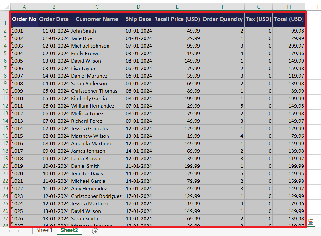
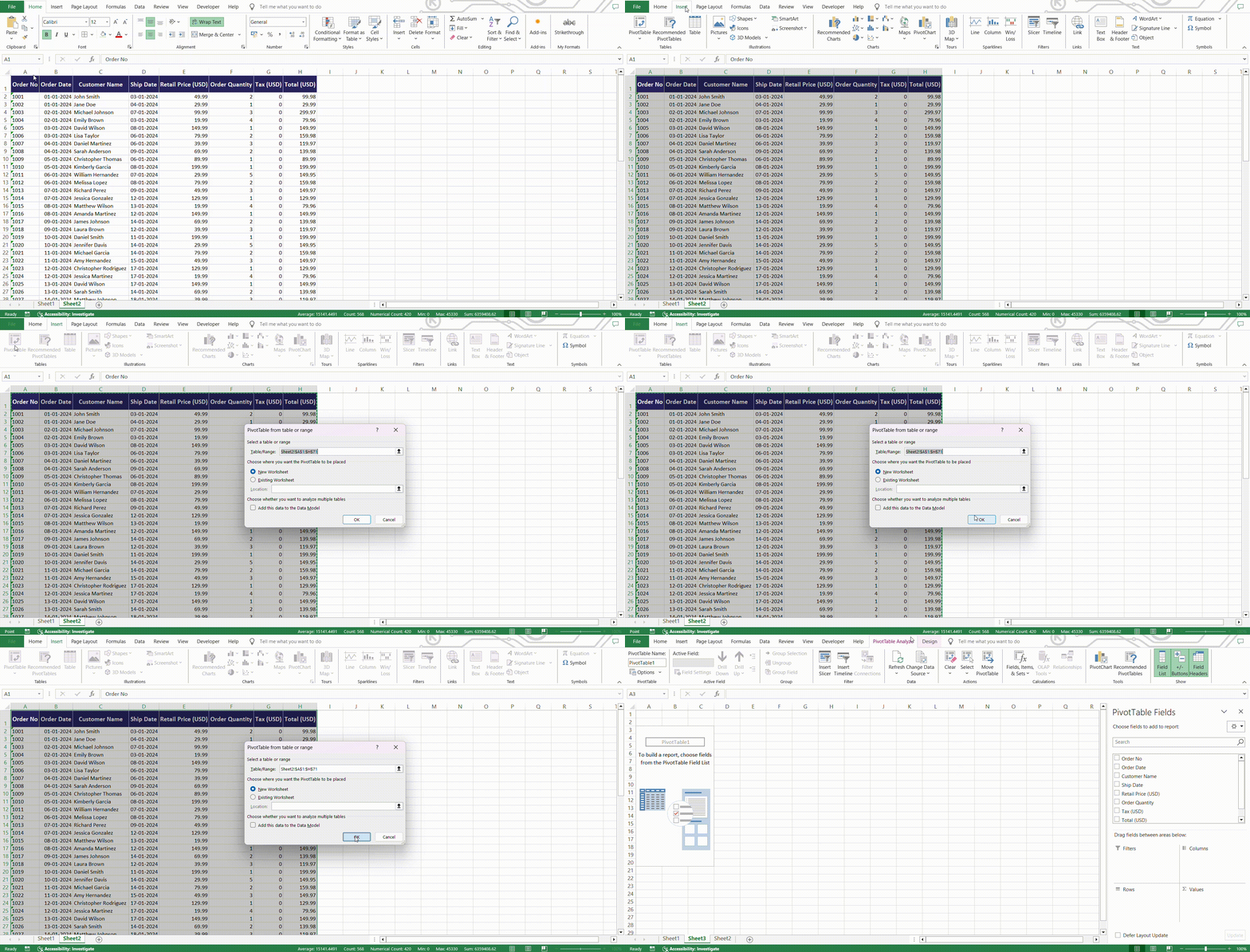
Creating a Pivot Table can feel like unlocking a superpower in Excel. It’s particularly handy when dealing with grouped data. I start by selecting my range of data—this could be my entire dataset or just the bits I’m keen to analyze. Then, I head over to the Insert tab and choose the PivotTable option.
Excel charms me with a dialog box asking where I want my Pivot Table to be placed. I select a location, and just like that, I’ve laid the groundwork for what’s going to be a beautiful scaffolding of sorted and summarized information, ripe for the picking.
Here’s a basic rundown for pivot prowess:
STEP 1: Select Data: Highlight the range or table I want to pivot.
STEP 2: Insert PivotTable: Find this option under the ‘Insert’ tab. Choose Location: Decide where I want my new analytical playground to live—same sheet or a new one.
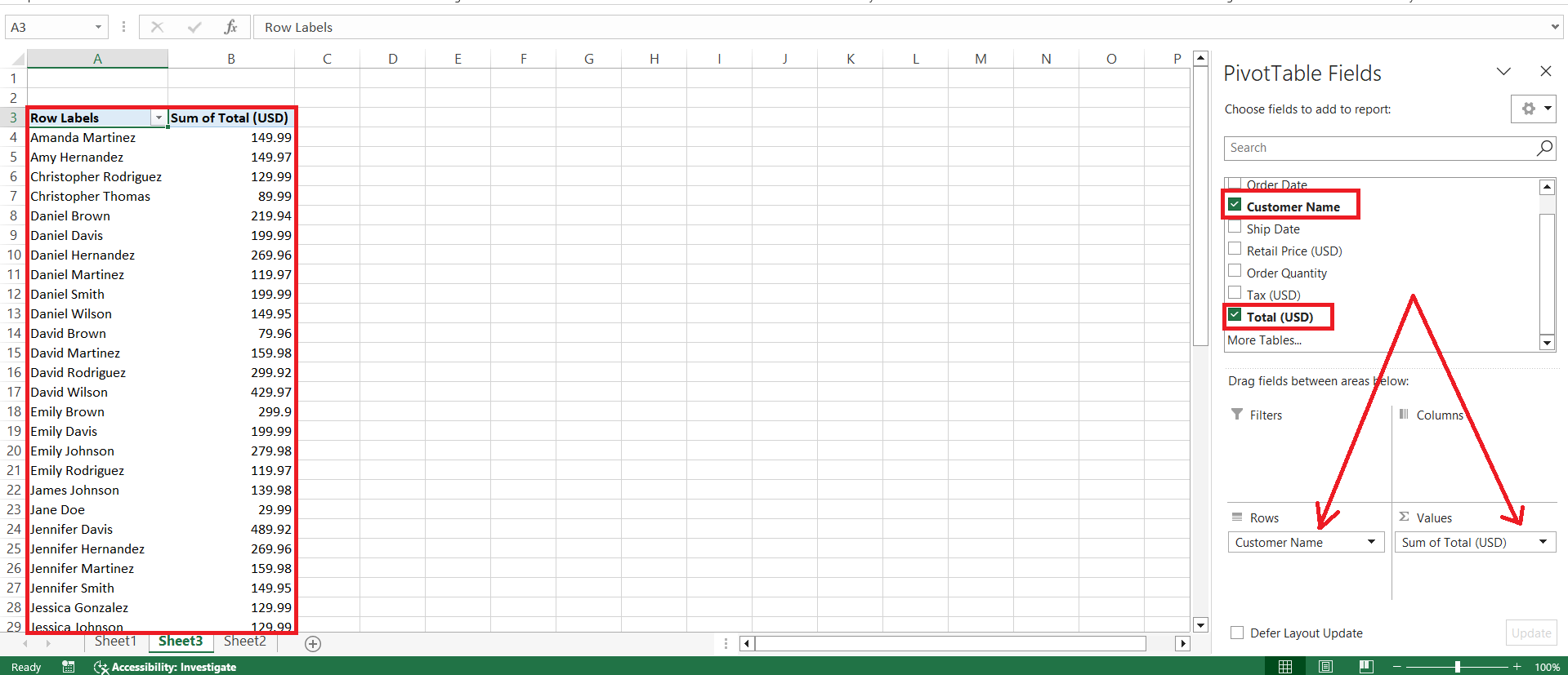
STEP 3: Drag and Drop: Use the Field List to tailor my table—grouping here becomes intuitive.
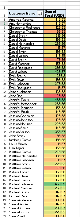
RESULT: Analyze: Admire my handy work and get ready to dive deep with filters, calculations, and more. I can either use conditional formatting or insert charts to deduce the analysis.
Customizing Data Views with Groupings in Pivot Tables
Customizing my data views with groupings in PivotTables feels like using a magic wand to tidy up the chaos. Want to examine my sales data by region and quarter? Grouping’s got me covered. With a few drags and drops, I can organize my data by date, numerical ranges, or custom-defined intervals.
PivotTables allow me to hide the nitty-gritty details and focus on the forest, not the trees. And when I’m ready, I can drill down to the specifics with just a double-click.
To elevate my PivotTable experience:
- Date Grouping: Consolidate my dates by months, quarters, or years to perceive trends over time.
- Number Grouping: Combine figures into custom ranges, like sales brackets or age groups.
- Item Banding: Create meaningful clusters to draw insights from diverse categories.
- Filter Flair: Apply filters to hone in on what’s truly relevant to my cause.
- Calculated Fields: Inject additional metrics for a tailored analytical narrative.
Managing Groups Effectively
Expanding and Collapsing Data Groups
Managing the visibility of my data with the expand and collapse functions in Excel brings me closer to a streamlined workflow. Think of it as an accordion, where sections of my spreadsheet can be compressed to just a summary line or expanded to showcase all the underlying details.
To expand the rows within a certain group, I engage the Show Detail button on the Data tab or click the plus sign next to the group’s summary row. Conversely, I click the minus sign to collapse the group, leaving me with a clean and concise summary.
For those who prefer keyboard shortcuts, here’s my game plan:
- Select All: Ctrl + A to grab everything on my sheet.
- Collapse: Press Alt + A + H to hide the nitty-gritty.
- Expand: Hit Alt + A + J to reveal the full story.
- Use Icons: Click the outline symbols (usually numbers like 1 or 2) at the side to toggle the entire group’s visibility.
FAQs
How do I group data in Excel?
To group data in Excel, select the rows or columns you want to group, head to the Data tab, and click the ‘Group’ button. This bundles your selected data together, allowing you to expand or collapse the group and simplify your worksheet’s view. It’s as straightforward as selecting and clicking.
Why would you group data in Excel?
Grouping data in Excel helps you manage large amounts of information by organizing it into expandable and collapsible outlines, making it easier to navigate and analyze your data. It’s especially beneficial for focusing on specific sections without getting overwhelmed by the entirety of your dataset.
How do you group data without using a pivot table?
Outside of a Pivot Table, you can group data by selecting rows or columns, right-clicking, and choosing the ‘Group’ option from the context menu. You’ll then see a new outline bar next to your data for expanding or collapsing the grouped items. It’s manual but effective for quick organization.
Can you create multiple levels of grouping in Excel?
Yes, Excel allows you to create multiple levels of grouping, which means you can have nested groups within your spreadsheet. To create these hierarchies, you group the innermost items first and then proceed to group the larger sections, enabling you to detail or summarize your data at different levels.
How do I delete unwanted data from a pivot table?
To delete unwanted data from a pivot table, you can uncheck the items you don’t want to display from the field’s filter list or directly remove the field from the PivotTable layout. For items generated automatically, such as blanks, you can filter them out or adjust the source data to eliminate them.
John Michaloudis is a former accountant and finance analyst at General Electric, a Microsoft MVP since 2020, an Amazon #1 bestselling author of 4 Microsoft Excel books and teacher of Microsoft Excel & Office over at his flagship MyExcelOnline Academy Online Course.


