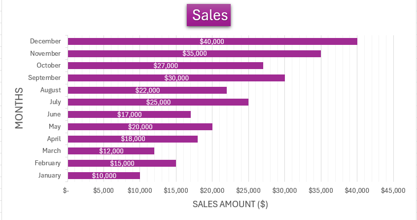
Grouped bar charts in Microsoft Excel are indispensable for data professionals seeking to visually compare multiple datasets within categories, offering a clear perspective on complex information. This guide explores the creation, customization, and application of grouped bar charts in Excel, transforming intricate data into actionable insights with ease.
Key Takeaways
- Grouped bar charts excel in visualizing data distribution, detailed comparisons, and temporal and multi-categorical analysis, facilitating insightful decision-making.
- Excel offers a straightforward process for creating grouped bar charts, from selecting data to customizing for visual clarity and impact.
- Customization options, such as adjusting bar width, choosing colors, and formatting labels and fonts, are crucial for readability and audience engagement.
- Overcoming common issues like managing overlapping labels and tackling axis scaling ensures a smooth creation process and accurate data representation.
- Effective presentation of grouped bar charts involves storytelling, clear design, and considering accessibility, elevating the chart from a mere visual to a compelling narrative.
Table of Contents
Unlocking the Power of Grouped Bar Charts
Defining the Grouped Bar Chart for Clear Analytics
Grouped bar charts are a mighty tool for those who work with data. They serve as a visual bridge between numbers and insights, providing an immediate understanding of complex information. The essence of a grouped bar chart is its ability to display multiple datasets side-by-side for quick comparisons. With vertical or horizontal bars representing different data points, one can easily observe trends and infer relationships.
Use Cases: Where Grouped Bar Charts Shine
Grouped bar charts have a knack for turning intricate data into compelling stories. When it comes to comparing diverse metrics within a category or analyzing sub-categories within a larger dataset, they make a perfect fit. Here are the use cases where grouped bar charts truly excel:
- Visualizing Data Distribution: Grouped bar charts graphically represent the distribution of data points, making it much easier to interpret complex datasets.
- Detailed Comparisons: By allowing the comparison of secondary level variables within each primary level variable, these charts enable data pros to delve deep into the subtleties of their data.
- Temporal Analysis: For datasets that span over time, grouped bar charts can compare values across different periods, revealing trends and changes effectively.
- Multi-Categorical Analysis: They extend beyond single-category analysis by illustrating numeric values for levels of two categorical variables, enhancing the depth of the examination.
- Facilitating Decision-Making: Whether it’s sales performance, survey results, or any other data-driven decision process, grouped bar charts provide the clarity needed to make informed choices.
For instance, a grouped bar chart could illustrate the sales performance of different products over several quarters, making it easy to pinpoint which products are performing well consistently and which are not. This strategic visual aid is invaluable in various fields, from marketing to finance, and health to education.
Step-by-Step Guide to Creating a Grouped Bar Chart
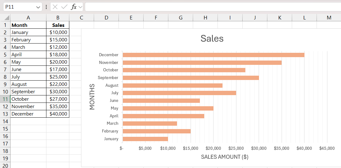
Creating a grouped bar chart in Excel is a delightful process — think of it as an artist who brings a blank canvas to life. Here’s a step-by-step guide to help you craft a vivid and persuasive chart:
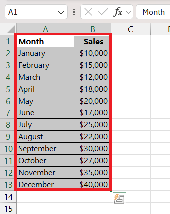
STEP 1: Select Your Data Range: Click and drag to highlight the cells that contain the data you want to appear in the chart. Don’t forget to include the row and column headers if they are essential for understanding your chart.
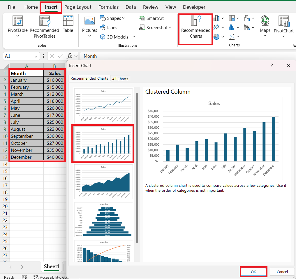
STEP 2: Insert Your Chart: With your data selected, locate the “Insert” tab on the Excel ribbon. Then, find the “Charts” group and click on the “Recommended Charts” option. From there, you can choose a “Clustered Column” chart.
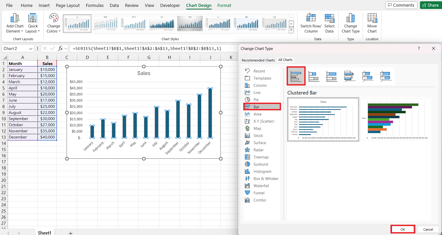
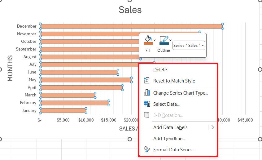
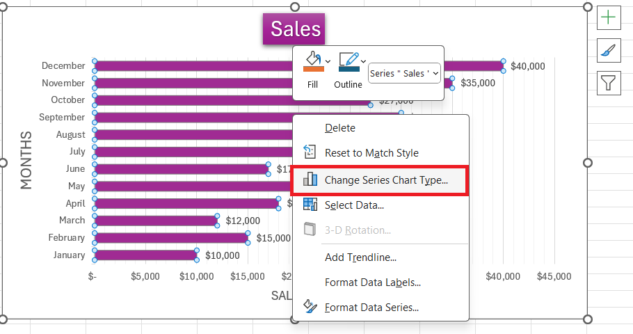
STEP 3: Customize Your Chart: After inserting the chart, you’ll see a bar for each column of your data. Right-click on the bars and select “Change Series Chart Type.” Now, change it to “Clustered Bar” to transform your columns into horizontal bars.
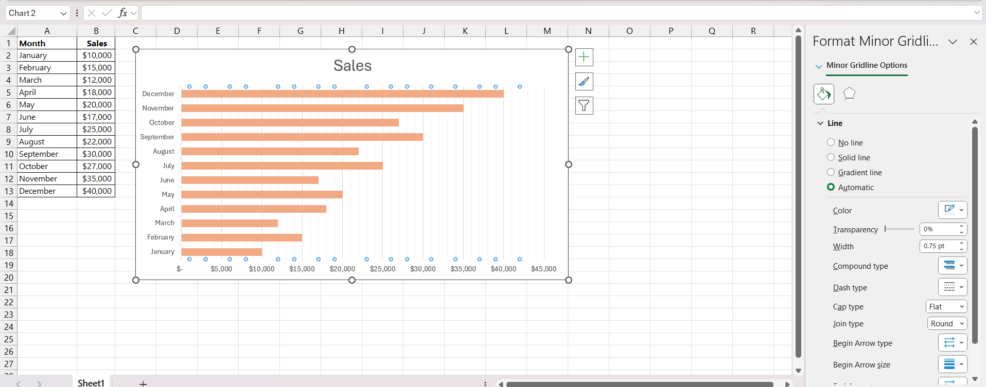
STEP 4: Adjust the Details: Primp your chart by adjusting the gap width for clarity, altering the series colors for visual variety, and playing with the axis titles to make everything crystal clear.
STEP 5: Add Titles and Labels: Insert clear titles for your chart and axes. Go to the ‘Chart Tools’ section to add element such as the chart title and axis labels.
Now you have a well-prepared grouped bar chart that not only conveys information accurately but also in a way that will catch the eye and hold attention.
Customizing for Clarity and Impact
Adjusting Bars for Readability
When you’ve crafted the skeletal structure of your grouped bar chart, it’s time for finessing the visuals. Adjusting the bar width and spacing is akin to fine-tuning an instrument; it enhances the tune of your data presentation. Excel makes this customization quite user-friendly:
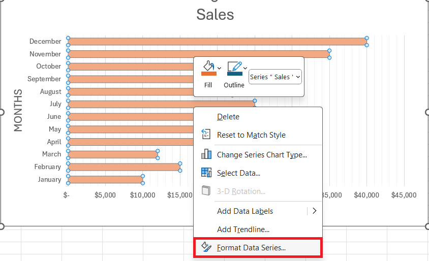
STEP 1: Right-click on any of the bars on your chart.
STEP 2: Select “Format Data Series” from the contextual menu that appears.
STEP 3: A panel titled “Format Data Series” will emerge on the right.
STEP 4: Navigate to “Series Options” within this pane. Here, you can adjust the “Gap Width” to your preference.
As you reduce the gap width, bars become thicker, and conversely, they become thinner as you increase the gap width. Striking the right balance depends on your particular dataset and the message you intend to convey:
- Large Dataset: Increase bar width to improve readability.
- Small Dataset: Decrease bar width to minimize clutter.
- Professional Presentation: Aim for sophistication with moderate widths and spacing.
- Casual Presentation: Prioritize ease of reading with clear separation and broader bars.
Adjusting the width and spacing can dramatically transform the look and feel of your chart, so take your time experimenting to find the most visually compelling configuration for your data.
Enhancing with Labels, Colors, and Fonts
Your grouped bar chart is slowly coming to life, and it’s time to infuse it with more personality and clarity. Like an artist choosing their palette, you have the power to make your chart stand out with the right choice of labels, colors, and fonts. Here’s how to enhance your chart:
Enhancing with Labels:
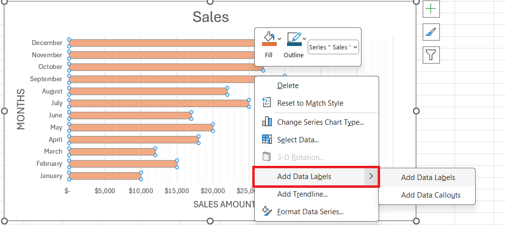
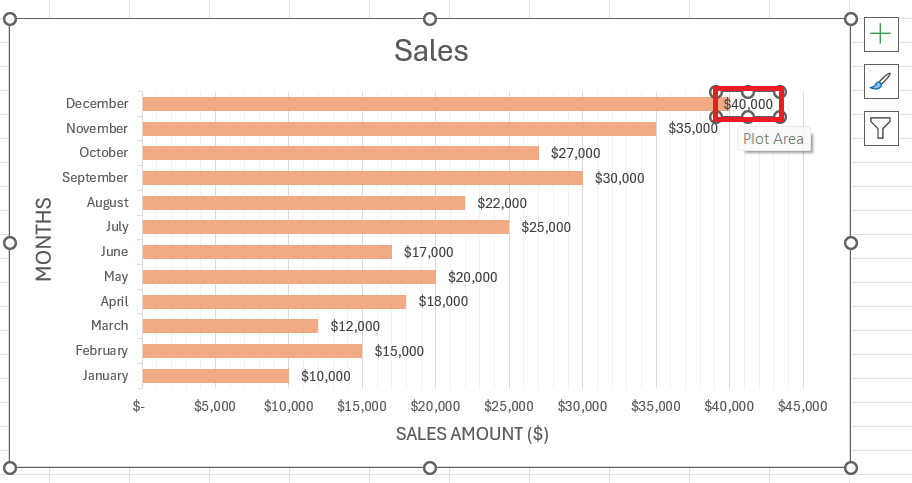
STEP 1: Right-click a bar and select “Add Data Labels” to display the numerical value each bar represents.
STEP 2: Customize label position for the best fit – perhaps inside the end of the bar, inside its base, or outside of it.
Colors for Clarity:
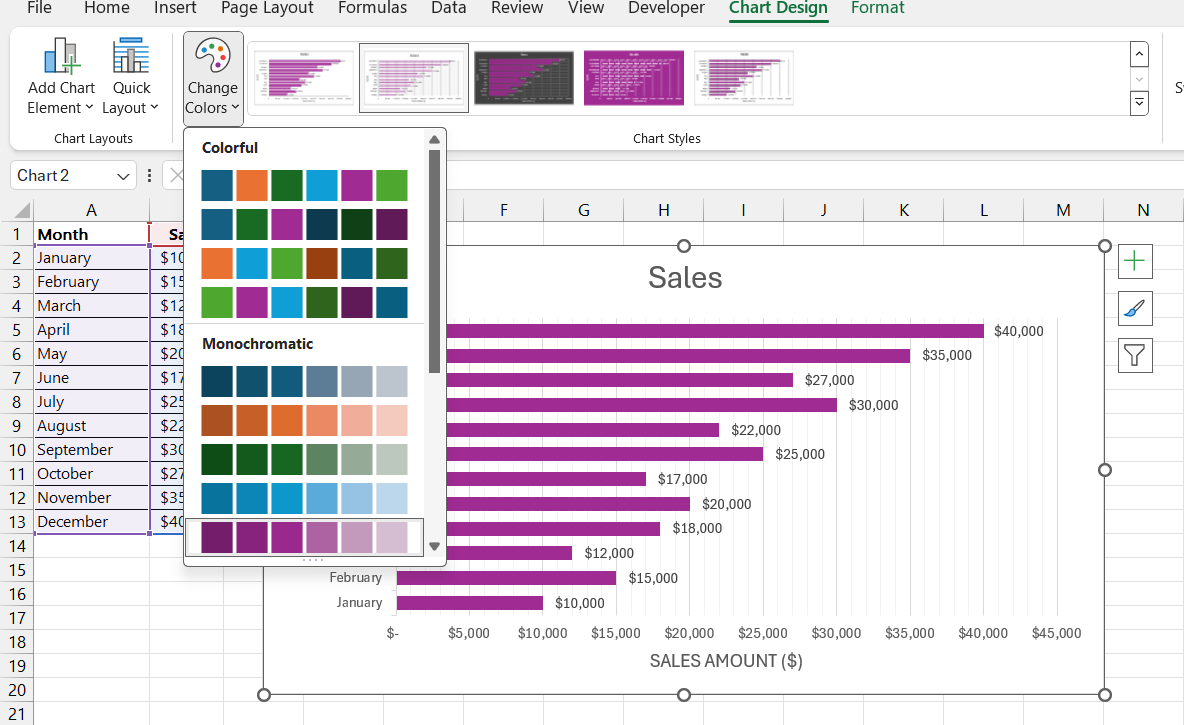
- Use the “Chart Design” options to alter bar colors and maintain aesthetic appeal and functional clarity.
- Ensure good contrast for easy differentiation between datasets.
- Opt for colors consistent with your brand or message; avoid using a scatter of hues that may confuse your audience.
Fonts for Focus:
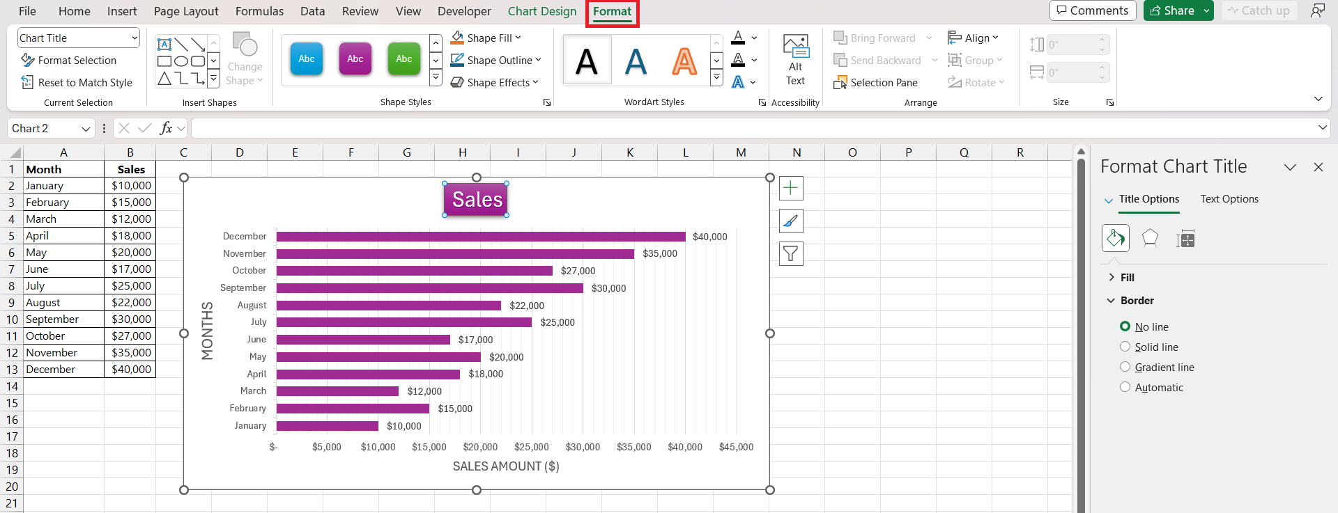
- Highlight crucial information through contrasting fonts by selecting the text and choosing the preferred style and size under the “Format” tab.
- Choose easily readable fonts for titles and data labels to communicate your data quickly and efficiently.
Remember, if part of your audience includes colorblind individuals, ensure you use color schemes that provide sufficient contrast between different sections of your chart. This thoughtful attention to detail will make your chart accessible and impactful to a wider audience.
Troubleshooting Common Hurdles
Overcoming Typical Issues During Creation
As you navigate the waters of creating grouped bar charts in Excel, you may encounter a few waves of common issues. Don’t let these small hiccups capsize your data visualization journey. Here is how to overcome typical issues during chart creation:
Managing Overlapping Labels:
- If labels start to overlap, increase the chart size or font size.
- Utilize the ‘Format Data Labels’ option to adjust the label position and rotation for better fit and readability.
Tackling Axis Scaling Issues:
- Right-click on the axis for which you need adjustments and select “Format Axis.”
- In the axis options, you can refine the scale by setting a more appropriate maximum, minimum, or specifying the interval between marks.
Handling Inconsistent Data Series:
- Access “Select Data” on your chart tools to reorder or adjust the series.
- Make sure your data is consistent and appropriately sequenced before generating your chart.
By addressing these common issues head-on with the plethora of Excel’s built-in tools, not only do you maintain the integrity of your data, but you also enhance the viewer’s experience by delivering a clear, error-free visual representation.
Ensuring Accurate Data Representation
Accuracy in data representation is the cornerstone of a credible chart. A minor error can mislead and have a ripple effect on decision-making processes. Here’s how to ensure that your grouped bar chart mirrors the true story of your dataset:
- Check Your Raw Data: Scrutinize the raw data for any inconsistencies or errors before you even start charting.
- Verify Data Import: If you’re importing data from an external source, double-check that all the values and labels have been accurately brought into Excel.
- Review Chart Settings: Dive into the chart settings to confirm that your data series are correctly assigned and axes are representing the intended values.
- Calculate Totals Manually: If your chart includes summarized information, it’s always a good practice to manually calculate totals or averages to ensure they match those represented in the chart.
- Solicit Peer Review: Fresh eyes can spot discrepancies you might have missed. Ask a colleague to review your chart before finalizing it.
By double-checking your work at each step, you ensure your grouped bar chart is not only visually appealing but also a true and trustworthy reflection of your data.
Sharing Insights Effectively
Best Practices in Presenting Your Charts
Now that your grouped bar chart is ready, the spotlight shifts to how you present it. Presentation makes all the difference—it can turn a good chart into a revelation or reduce it to a mere visual. To hit the sweet spot, follow these best practices:
- Context is Key: Begin with an explanation of what your chart illustrates. Providing background helps your audience understand the ‘why’ behind your data.
- Tell a Story: Your chart is a narrative. Highlight trends, anomalies, or key comparisons that emerge from the data. Guide your audience through the plot points of your visual story.
- Simplify for Clarity: Avoid clutter. Remove any elements that don’t contribute to the understanding of the chart. Aim for a balance between comprehensive data and a clean, engaging design.
- Use Descriptive Titles: An effective title and axis labels enable quick comprehension. They act as a frame for the picture of data you’re painting.
- Consider Accessibility: Use color choices and patterns that are legible for everyone, including those with color vision deficiencies.
- Practice Your Delivery: When presenting, make sure you are familiar with your chart’s every detail. Anticipate questions and rehearse explanations for data patterns and conclusions you’ve drawn.
Remember, your objective is to make your findings resonate with your audience, so use a combination of narrative flair and crisp visual design to make your grouped bar chart presentation memorable and impactful.
Transitioning from Basic to Stacked Grouped Bar Charts
Elevating your data visualizations from basic to stacked grouped bar charts can offer a more nuanced analysis of complex data sets. Here’s how to smoothly transition:
Understanding Stacked Grouped Bar Charts:
A stacked grouped bar chart layers data points atop one another within the same category, offering a cumulative insight.
Creating a Stacked Chart:
STEP 1: After following the initial steps for a basic grouped bar chart, right-click on the data series you want to stack, and select the “Change Series Chart Type” option.
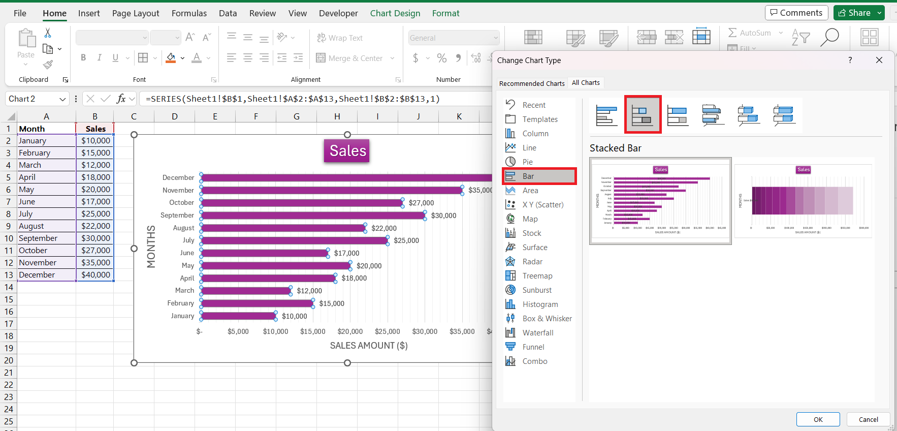
STEP 2: In the “Bar” option in the charts panel, choose the “Stacked Bar” chart type.
Differing Them from Basic:
- With a stacked bar chart, you’ll find different data series for a category represented as parts of a whole. This contrasts with a basic grouped chart where series are side by side.
The transition to a stacked grouped bar chart allows viewers to not only compare the individual contributions of each data point but also understand how they contribute to the total. It’s optimal for when you’re interested in both individual and collective data points within categories.
Frequently Asked Questions
What is a grouped bar chart?
A grouped bar chart, also known as a clustered bar chart, is a type of chart in Excel that allows you to compare multiple data series across different categories. Each category has its own set of bars, making it simple to see side-by-side comparisons within the same category. This kind of chart is great for when you have more than one data series and need to observe not just individual data points, but also their relationship to each other within groups.
How do I create a grouped bar graph in Excel?
To create a grouped bar graph in Excel, input your data into rows and columns, then select it. Go to the ‘Insert’ tab, click on ‘Bar Chart,’ and choose ‘Clustered Bar.’ Excel will generate the grouped bar graph for you, which you can then format and customize as needed for clarity and visual appeal.
How do you group data in a chart in Excel?
In Excel, to group data in a chart, first ensure your data is formatted as a table with categories in one column and values in contiguous columns. When creating the chart, Excel will naturally group the data based on the way you’ve organized your table. Assign different columns for each group you need to compare, and Excel’s charting tool will do the rest.
How Can I Create a Grouped Bar Chart with Multiple Variables in Excel?
To create a grouped bar chart with multiple variables in Excel, organize your variables as column headings and your observations or categories in the leftmost column. Highlight the entire data range, including headers. Go to “Insert” > “Bar Chart” > “Clustered Bar.” Excel will create a bar for each variable within each category, allowing you to compare multiple variables side by side.
What Are the Best Practices for Customizing Grouped Bar Charts for Presentation?
For customizing grouped bar charts in Excel for presentation, adopt a minimalist design, use brand-consistent colors, and select readable fonts. Ensure high color contrast for differentiation and to accommodate colorblind viewers. Finally, annotate with concise titles and labels for context and clarify your data’s narrative. Keep customization focused on enhancing comprehension and drawing attention to key insights.
John Michaloudis is a former accountant and finance analyst at General Electric, a Microsoft MVP since 2020, an Amazon #1 bestselling author of 4 Microsoft Excel books and teacher of Microsoft Excel & Office over at his flagship MyExcelOnline Academy Online Course.

