A histogram in Microsoft Excel is a powerful tool for visualizing the distribution of numerical data. It organizes data into bins or intervals, providing a graphical representation of the frequency of data points within each range. Creating histograms in Excel allows for easy identification of patterns, trends, and outliers in datasets, making it an essential feature for data analysis and statistical reporting. With Excel’s built-in functionalities, generating histograms is both straightforward and efficient, facilitating deeper insights into data sets.
Key Takeaways:
- The normal distribution, or bell curve, is crucial in statistics for illustrating how data points cluster around a mean, making it easier to analyze and interpret data sets.
- Histogram Normal Distribution serve as fundamental tools in data analysis, transforming numerical data into visual formats that reveal trends, outliers, and patterns that might not be apparent from raw numbers alone.
- Excel’s built-in histogram tool, part of the Analysis ToolPak, simplifies the creation of histograms by automatically calculating the frequency of data points within specified ranges or bins.
- Ensuring your data is clean and organized is essential for accurate histogram creation. Any erroneous entries can significantly impact the mean and standard deviation, skewing the normal distribution.
- Understanding and applying the bell curve is invaluable in various fields, from business and finance to healthcare, aiding in decision-making processes.
Table of Contents
Introduction to Bell Curve Graphs in Excel
Demystifying the Normal Distribution
When you delve into the world of statistics, you’re likely to encounter the concept of the normal distribution—a fascinating phenomenon often depicted by the iconic bell curve graph. This continuous probability distribution is integral to data analysis because it portrays data clustering around the mean or average.
Picture the symmetry and sleekness of a bell – this is what you’re visualizing when you talk about the normal distribution. It’s essential because it simplifies complex data sets, providing a clear visual representation of where most values lie concerning the average.
Importance of Histograms in Data Analysis
Histograms are the stepping stones on the path to understanding data distribution. They serve as powerful tools that give you a quick glance at the frequency of data points within certain ranges. This allows you to literally ‘see’ trends, outliers, and patterns that numbers alone might not reveal.
In essence, histograms organize large amounts of data into visually digestible and intellectually interpretable chunks, turning a sea of numbers into actionable insights. What’s more, they are the bedrock on which bell curve graphs are constructed, making them indispensable in areas such as process improvement, quality control, and financial analysis.
Getting Started with Excel for Bell Curve Graphs
Understanding Excel’s Histogram Tool
Excel’s histogram tool is a feature-rich resource that allows you to transform columns of data into a visual histogram. It’s part of Excel’s Analysis ToolPak, specifically designed to manage and analyze large sets of data. When you create a histogram, Excel does the heavy lifting by calculating the frequency of items in each bin.
A bin is a specified interval or range of values, and the histogram displays how many data points fall within each range. This tool is fantastic for establishing the foundation of a bell curve graph, providing a straightforward method to portray the frequency distribution of your data.
Preliminary Steps Before Creating Your Bell Curve
Make sure the Analysis ToolPak is enabled—it’s an add-on necessary for creating histograms, which can be activated from the Add-ins menu. To activate the Analysis ToolPak in Excel, follow these steps:
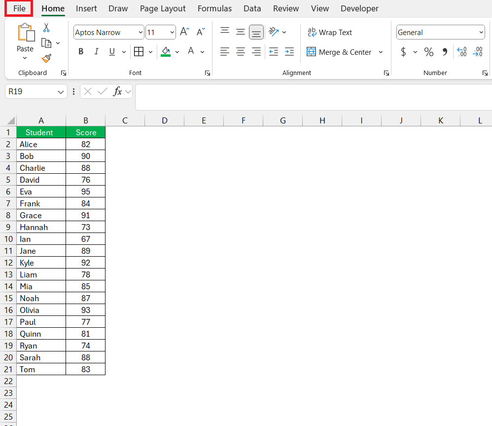
STEP 1: Click on the “File” tab.
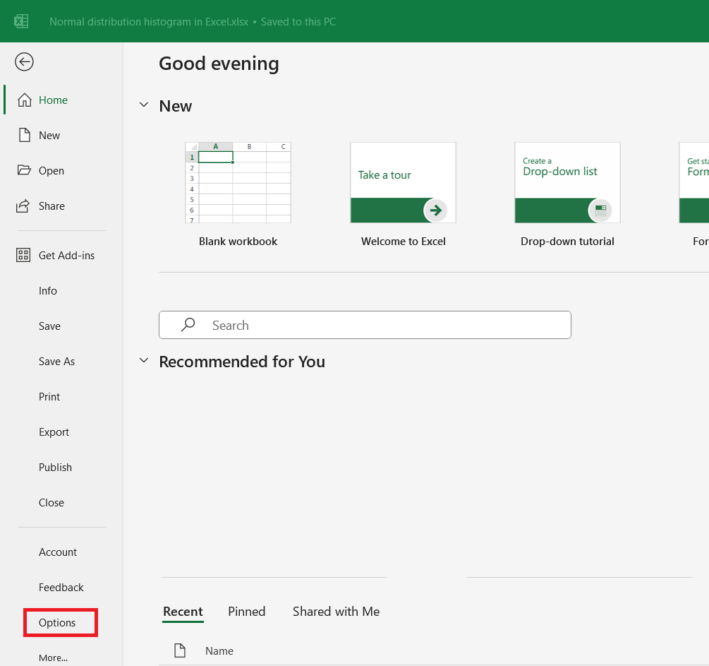
STEP 2: Select “Options” at the bottom of the left-hand menu.
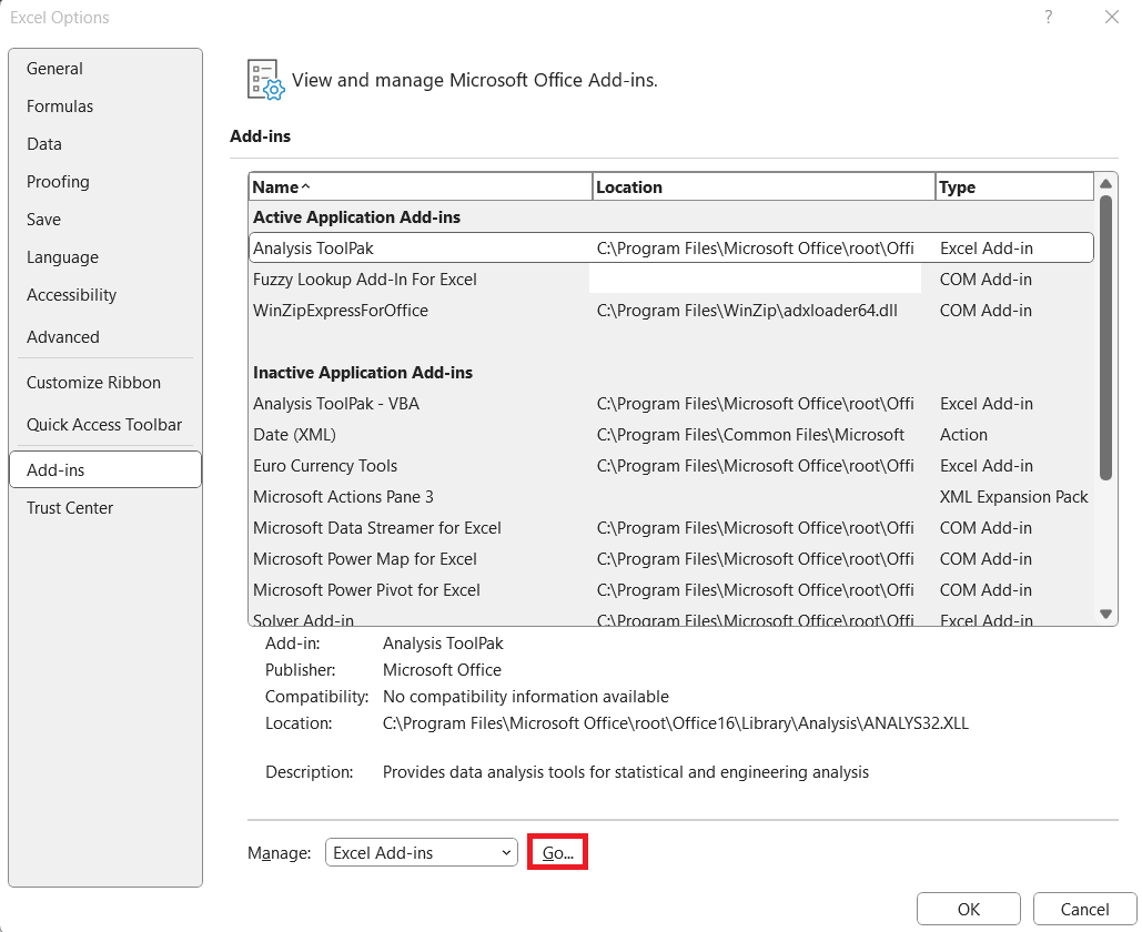
STEP 3: In the Excel Options dialog box, select “Add-Ins” from the list on the left. In the Manage box at the bottom, make sure “Excel Add-ins” is selected, then click “Go….
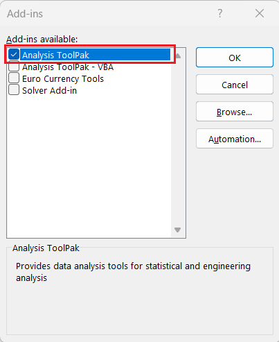
STEP 4: In the Add-Ins box, check the “Analysis ToolPak” box. Click “OK”.
Once the Analysis ToolPak is activated, you can find its tools under the “Data” tab in the “Analysis” group.
Step-by-Step Guide to Creating a Bell Curve
Setting Up Your Data for Histogram Normal Distribution
To pave the way for a great bell curve graph, your data setup is crucial. Start by listing your dataset in a single column, creating a clear, organized range. This prepares your data to be input into Excel’s histogram tool, which will later help to visualize the normal distribution. Ensure that your data has no erroneous entries, as they could dramatically impact the mean and standard deviation, the two keystrokes of normal distribution.
Utilizing Excel’s Built-In Features for Histogram Creation
Creating a histogram using the Data Analysis ToolPak in Excel involves several straightforward steps. Here is a detailed guide to help you through the process:
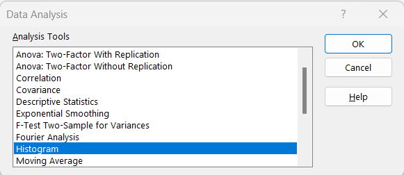
STEP 1: Go to the “Data” tab on the Ribbon. Click on “Data Analysis” in the Analysis group.
STEP 2: In the Data Analysis dialog box, select “Histogram” and click “OK”.
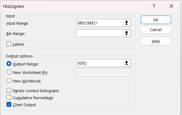
STEP 3: Enter the following –
- Input Range: Enter the range of your data (e.g., $B$2:$B$21).
- Bin Range: (Optional) Specify a range for bins if you have predefined bins. If not, Excel will create bins automatically.
- Output Range: Select where you want the histogram output to appear (e.g., $D$2).
- Check “Chart Output” to create a histogram chart. Click “OK”:
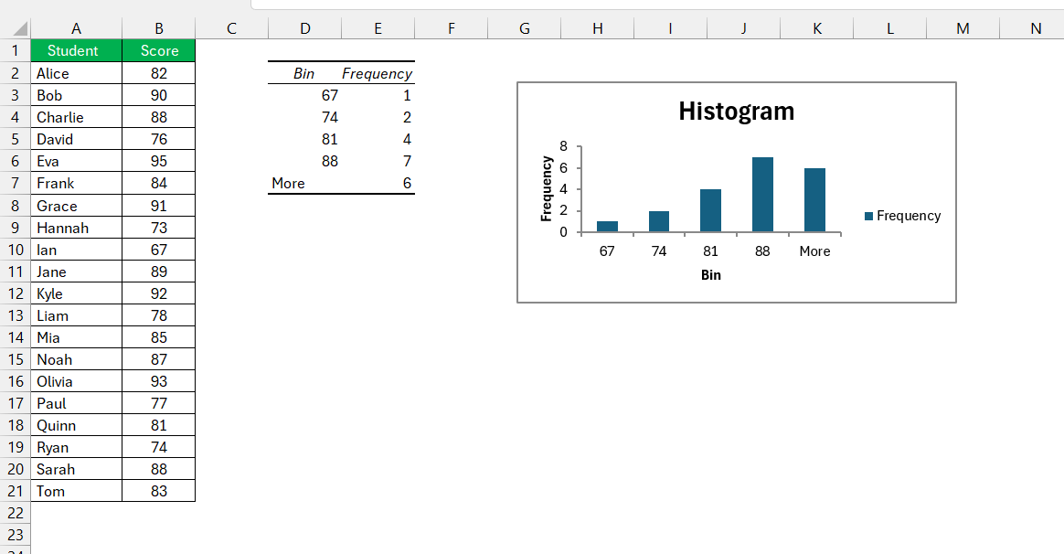
Excel will generate a frequency distribution table and a histogram chart based on your data.
Leveraging Your Bell Curve Graphs
Interpretation and Application of Normal Distribution in Real-Life Scenarios
Grasping the bell curve’s significance in real-life scenarios is like unlocking a new level of data literacy. In the business realm, normal distribution helps to predict sales trends and manage inventory. It’s also invaluable in human resources for understanding employee performance and compensation structures, where most of the workforce typically clusters around an average level of performance.
In finance, assessing investment risks often hinges on the normal distribution of returns, guiding strategy, and portfolio management. Health and medical fields apply the bell curve to analyze patient results like blood pressure readings, turning raw data into meaningful action plans for patient care.
Understanding the story your data tells through the bell curve prepares you to make sound decisions, from optimizing processes to making policy recommendations. Interpretation is key—you’re not just looking at a graph, but rather understanding the patterns and probabilities that govern real-world outcomes.
Frequently Asked Questions
What is the normal distribution of a histogram?
The normal distribution of a histogram is when the frequency of the data points creates a bell-shaped graph, with most values clustering around a central peak—the mean—and fewer occurring as they move further away, demonstrating lower or higher values. It reflects a symmetrical distribution of values where the mean, median, and mode are all equal.
How do you make a normal histogram in Excel?
To make a normal histogram in Excel, input your data in a single column, navigate to the ‘Insert’ tab, select ‘Histogram’ under the ‘Charts’ group, and then customize your bins and layout as needed for accurate representation of data frequency.
How do I ensure my bell curve represents my data accurately?
Ensure an accurate bell curve by verifying your data is clean, setting suitable bin ranges, and using correct mean and standard deviation values. Also, align the total area under the normal curve with your histogram for precision.
Can I automate the bell curve creation process for multiple datasets?
Yes, you can automate the bell curve creation process for multiple datasets in Excel by using macros with VBA or employing the Data Analysis ToolPak for repeating tasks efficiently across different data sets.
What is the difference between a normal probability density and a cumulative normal distribution function?
The normal probability density function shows likelihoods within a range, crafting the classic bell curve shape, while the cumulative normal distribution function adds up probabilities up to a certain value, illustrating the total probability accumulation along the distribution’s curve.
John Michaloudis is a former accountant and finance analyst at General Electric, a Microsoft MVP since 2020, an Amazon #1 bestselling author of 4 Microsoft Excel books and teacher of Microsoft Excel & Office over at his flagship MyExcelOnline Academy Online Course.

