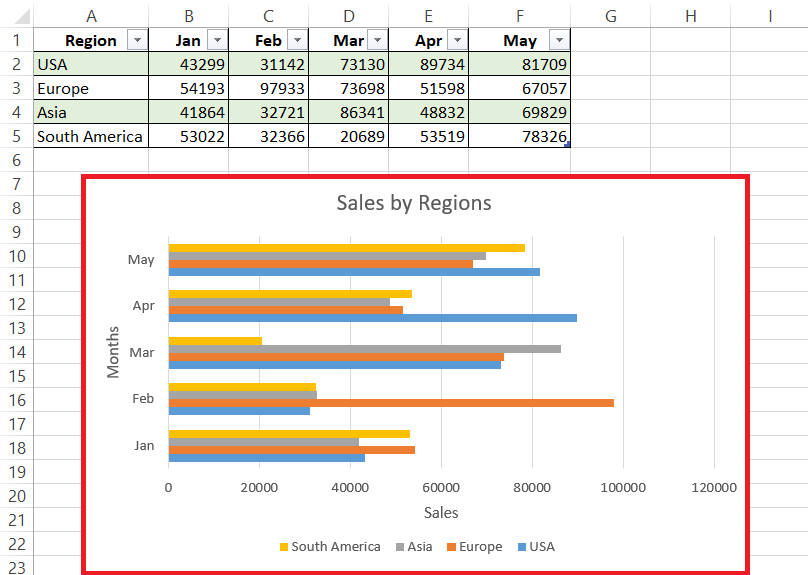
Horizontal bar charts are a standout in data visualization for their readability and straightforward layout. With data bars extending horizontally, these charts easily accommodate lengthy category labels and facilitate side-by-side comparisons between categories, providing a clear view of hierarchical relationships or variations within a dataset. In this guide, we will cover a detailed guide on horizontal bar chart in Microsoft Excel.
Key Takeaways:
- Perfect for Complex Labels: Horizontal bar charts handle long or intricate category labels well, preventing text overlap and ensuring readability.
- Ideal for Numerous Categories: They are optimal for presenting a large number of categories, allowing for clear and organized data representation.
- Effective with Negative Values: The horizontal orientation of these charts makes it easier to present and interpret negative values.
- Customizable for Clarity: Adjusting bar width, spacing, and colors, and adding data labels can enhance clarity and transform the chart into an insightful visual tool.
Table of Contents
Introduction to Horizontal Bar Charts in Excel
The Appeal of Horizontal Bar Charts
Horizontal bar charts shine in data visualization due to their superb readability and straightforward layout. With data bars stretching horizontally, these charts can accommodate lengthy category labels that might be a tight squeeze in their vertical counterparts. They also make side-by-side comparisons between categories a breeze, giving viewers an instant grasp of the hierarchical relationship or variation within the data set.
Situations Best Suited for Horizontal Bar Charts
Horizontal bar charts are handy when dealing with categorical data that has long or complex labels, ensuring that each is readable without the text overlapping. They are also the go-to choice when presenting a large number of categories, or when the data set includes negative values, as the horizontal orientation can make these clearer to the observer.
Moreover, they allow for an efficient comparison of data points across categories, making them ideal for benchmarking or tracking changes over time.
Step-by-Step Creation of a Horizontal Bar Chart
Selecting the Right Data Range for Your Chart
Choosing the correct data range is crucial for a meaningful chart. Click and drag to highlight the cells with the data you want to display. Be careful to include the category names and corresponding values but exclude any totals or averages that could distort the chart. A properly selected range ensures your horizontal bar chart will accurately represent the information you aim to visualize.
Create a Horizontal Bar Chart
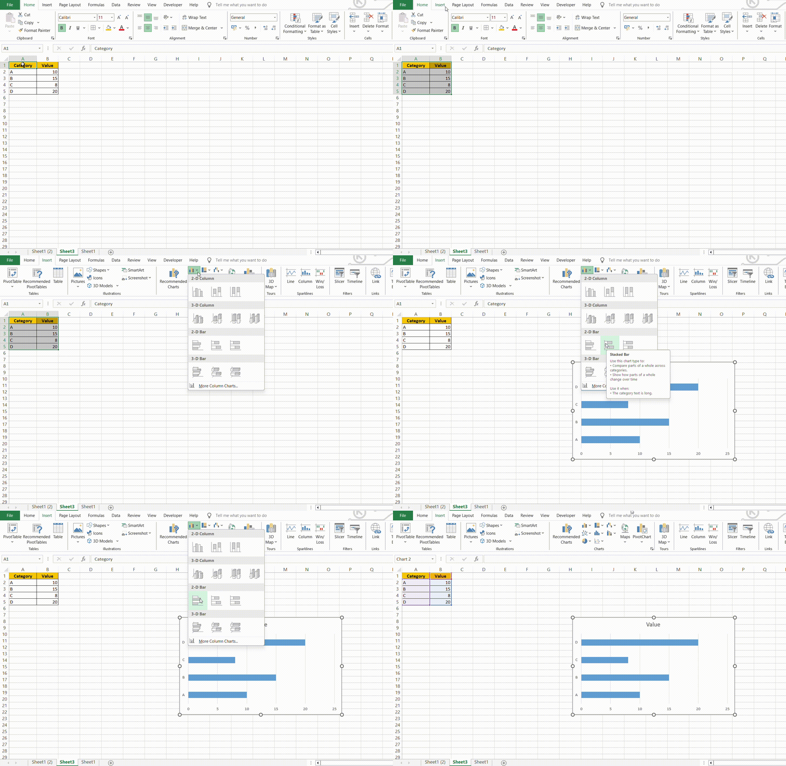
To create a horizontal bar chart in Excel, enter your data in columns, select the data range, go to the “Insert” tab, click on the “Bar Chart” icon, and choose a horizontal bar chart style.
Customizing Your Horizontal Bar Chart
Adjusting Bar Width and Spacing for Clarity
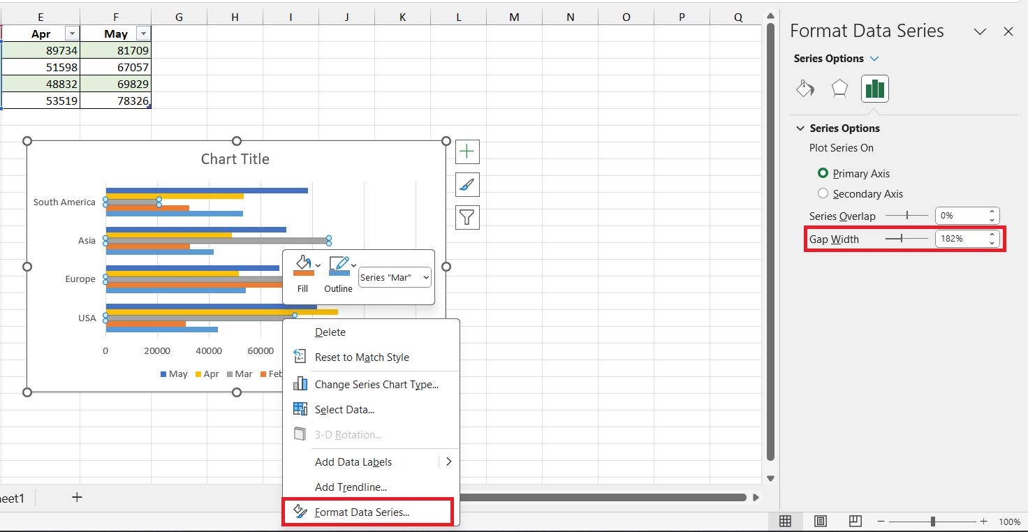
To adjust the bar width and spacing for clarity in your horizontal bar chart, right-click on any bar and select ‘Format Data Series.’ Here, you’ll find the ‘Series Options’ that allow you to alter the ‘Gap Width’— which influences the spacing between bars.
A smaller percentage leads to broader bars and reduced gaps, enhancing clarity. Play around with these settings to strike the perfect balance between a clear separation of data points and optimal use of space.
Changing Colors and Adding Data Labels for Better Understanding
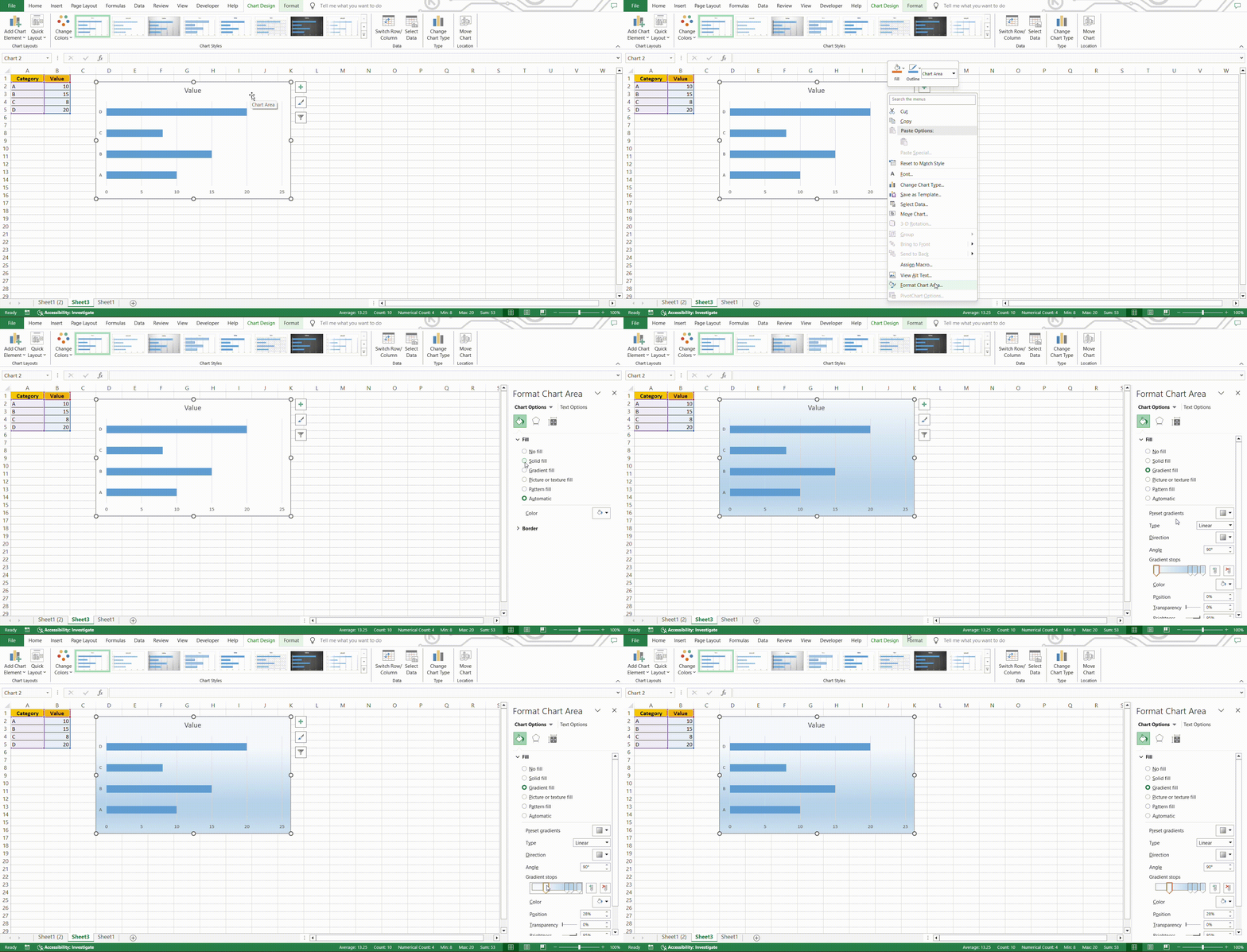
Adding a splash of color and inserting informative data labels can turn a bland bar chart into an insightful visual story. Take advantage of Excel’s vast color palette to differentiate between categories or highlight specific data points.
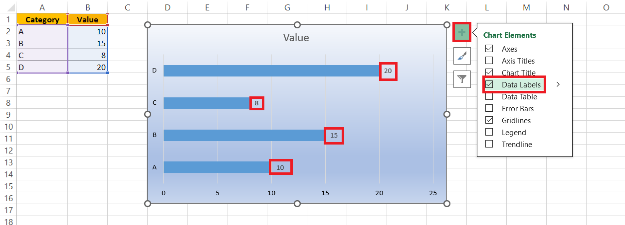
For added clarity, sprinkle your chart with data labels to display exact values. Right-click the bars and choose ‘Add Data Labels‘ or use the ‘Chart Elements’ button to access further customization options for position and format.
STEP 1: Select your data and insert a bar chart.
STEP 2: Right-click on the bars, select “Format Data Series,” and choose a color from the “Fill” options.
STEP 3: Right-click again, and choose “Add Data Labels” to display values on each bar.
NOTE: To further customize, click on any data label, then right-click to access options like “Format Data Labels” for font size and color adjustments.
Advanced Tips for Horizontal Bar Chart Mastery
Sorting Data Without Altering Source Information
If you need your bar chart to reflect a specific order but can’t shuffle your source data, no worries—Excel’s got you covered.
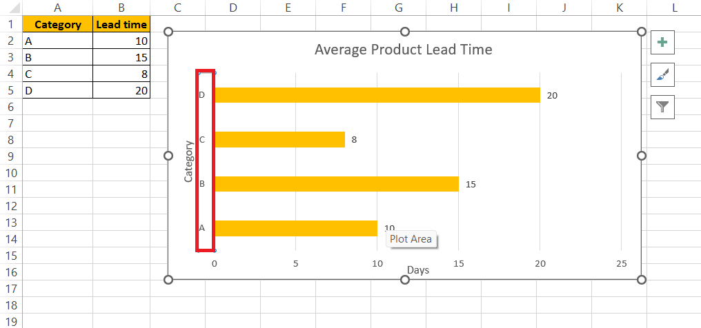
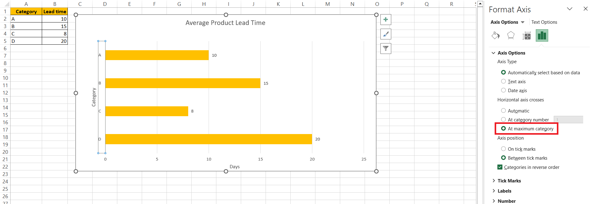
STEP 1: Click on the vertical axis of your bar chart to select it.
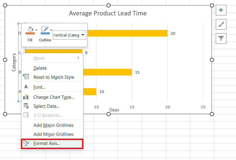
STEP 2: Right-click and choose “Format Axis.”
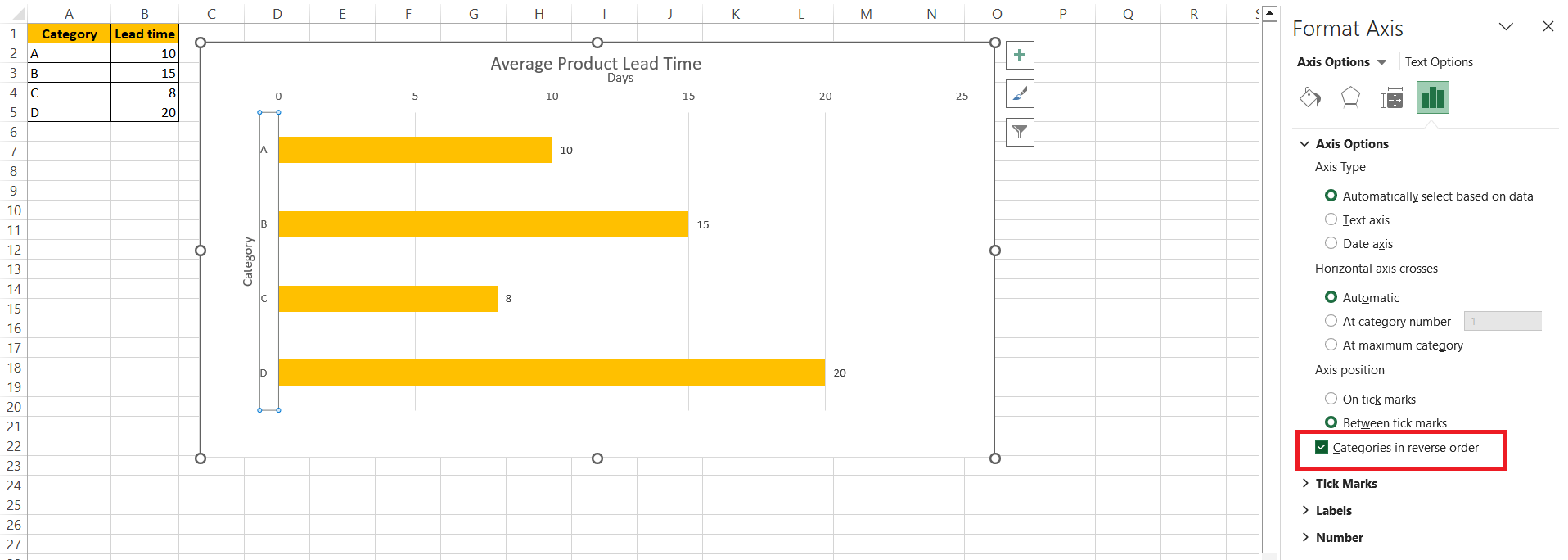
STEP 3: In the “Axis Options” pane, check “Categories in reverse order” to flip the sequence.
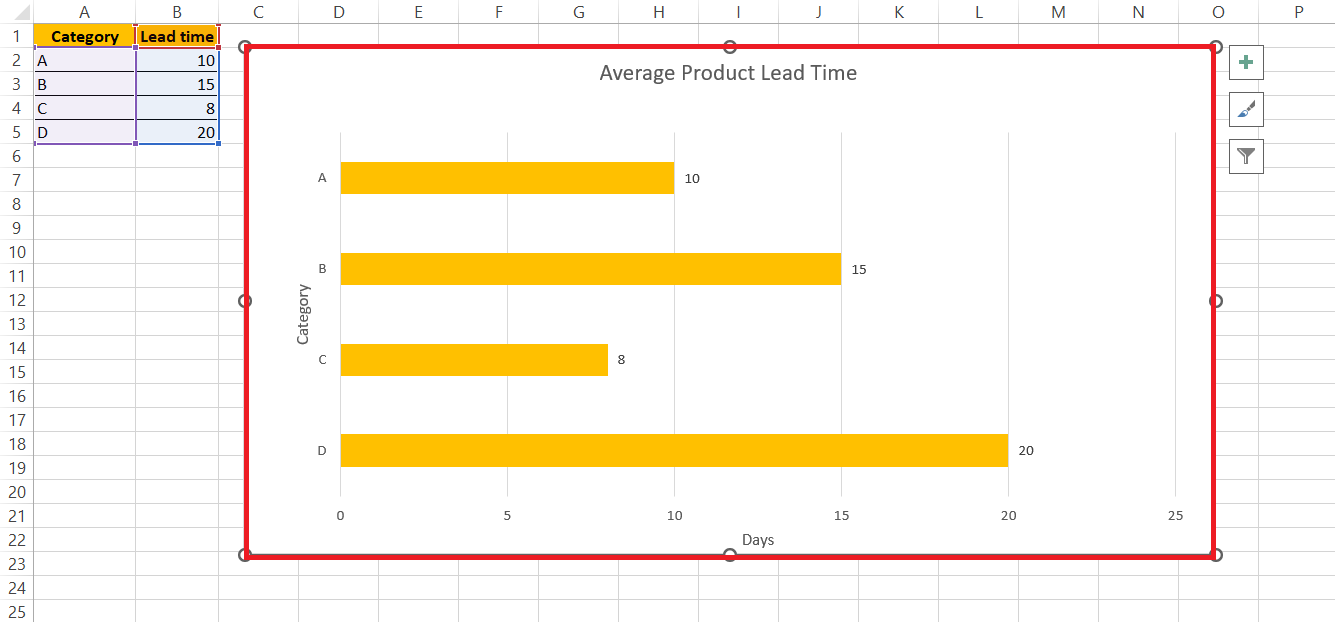
STEP 4: Optionally, adjust “Horizontal axis crosses” to “At maximum category” for precise alignment.
RESULT:
Common Pitfalls to Avoid When Making Bar Charts
Overcomplicating Data Presentation
Keep it clean, keep it simple. Introducing too many categories or data points can transform your horizontal bar chart from a clear visual representation into an overwhelming puzzle. The secret to a successful chart is finding the sweet spot where you convey your message without overtaxing your audience’s ability to process information.
Find ways to segment complex data into multiple charts if necessary, ensuring each chart maintains its clarity and focus.
Hence, simple charts maintain clarity. Overloading with categories can overwhelm, making charts confusing puzzles. Success lies in the balance—conveying messages without taxing understanding. Segment complex data into clear charts, ensuring each maintains focus for easy comprehension by your audience.
Misalignment of Data Points and Values
Accuracy is key in data visualization. Any mismatch between data points and their corresponding values can lead your audience astray. To prevent misalignment in Excel, double-check your data ranges and ensure that your category names and values are properly paired.
Also, take care to align axes and data labels correctly. In Excel, this can typically be adjusted under ‘Axis Options‘ where you can set the axis bounds and units precisely.
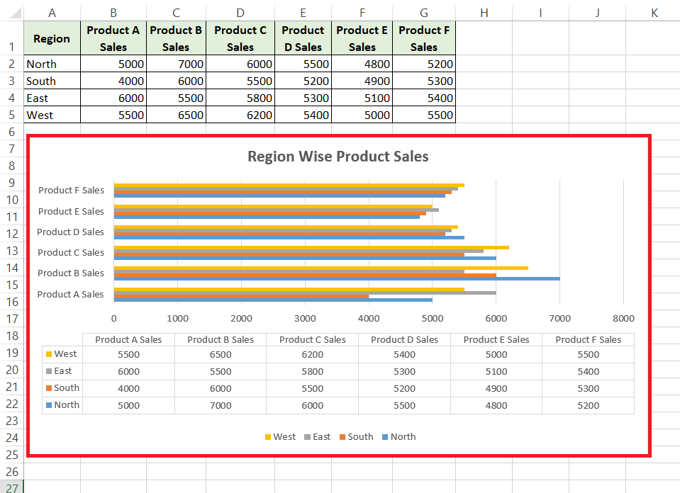
From the above example we can see the left-side graph has a misalignment of data points and the right- side is readable to a layman. Hence, ensuring accuracy in data visualization is paramount. Verify data and label alignment to avoid misinterpretation. Excel’s ‘Axis Options’ allow precise adjustments, enhancing clarity and reliability, ultimately guiding audiences accurately through your visual narrative.
Alternative Visualization Techniques
Exploring Other Bar Chart Types for Comparison
Excel offers an array of bar chart variations to suit different types of data storytelling. Besides the standard horizontal bar chart, you might explore the stacked bar chart for a cumulative perspective, or the 100% stacked bar chart to focus on the proportion each category contributes to the whole. There are specialized types too, like the waterfall chart which is excellent for visualizing a sequential change in data.
FAQs
Can I Create a Horizontal Bar Chart with Multiple Variables?
Yes, you can create a horizontal bar chart with multiple variables in Excel. Use a clustered or stacked horizontal bar chart to compare multiple variables across different categories. Ensure your data is arranged correctly, with each variable in its own column, for Excel to interpret it efficiently.
How Do I Change the Scale of the Horizontal Axis in Excel?
To change the scale of the horizontal axis in Excel, right-click on the axis you wish to modify and select ‘Format Axis’. Under the ‘Axis Options’ menu, adjust the minimum and maximum bounds, as well as the units of measurement, to scale the axis to your preference.
What Should I Do If My Data Labels Overlap in the Chart?
If data labels overlap in your chart, try reducing the font size, changing label position, or using the ‘Label Options’ to add a callout or leader lines for clarity. You can also stagger labels, use abbreviations, or simply show key data labels to prevent clutter.
Is It Possible to Convert a Vertical Bar Chart to a Horizontal One?
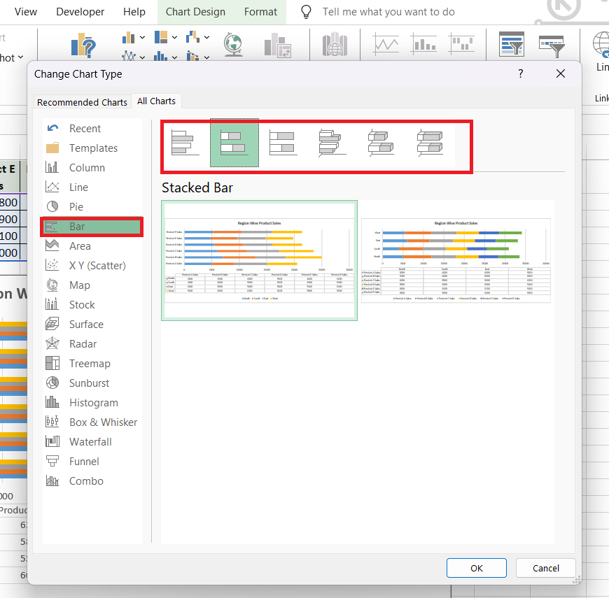
Absolutely! To convert a vertical bar chart to a horizontal one in Excel, right-click the chart and select ‘Change Chart Type.’ Then choose the horizontal bar chart option from the list of available chart types. Your chart will update automatically to the new orientation.
How do you change a bar chart from vertical to horizontal in Excel?
In Excel, to change a bar chart from vertical to horizontal, click on the chart, then select ‘Change Chart Type‘ from the design tab. Choose a horizontal bar chart from the options and click ‘OK’ to apply the changes.
John Michaloudis is a former accountant and finance analyst at General Electric, a Microsoft MVP since 2020, an Amazon #1 bestselling author of 4 Microsoft Excel books and teacher of Microsoft Excel & Office over at his flagship MyExcelOnline Academy Online Course.

