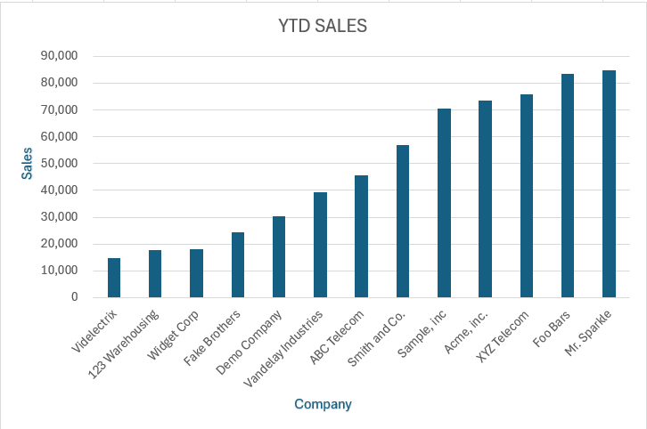
Axis labels are essential tools in data visualization, serving as guides in Microsoft Excel that make the data plotted along the X and Y axes comprehensible. Like a guide in a museum, axis labels provide necessary context, without which the data, however compelling, might be difficult to understand. This guide on How to add axis labels in Excel offers a straightforward approach to adding informative axis labels to your charts, enhancing both their readability and effectiveness.
Key Takeaways
- Select Your Chart: Start by selecting your existing chart or create a new one by choosing from various chart types under the ‘Insert’ tab.
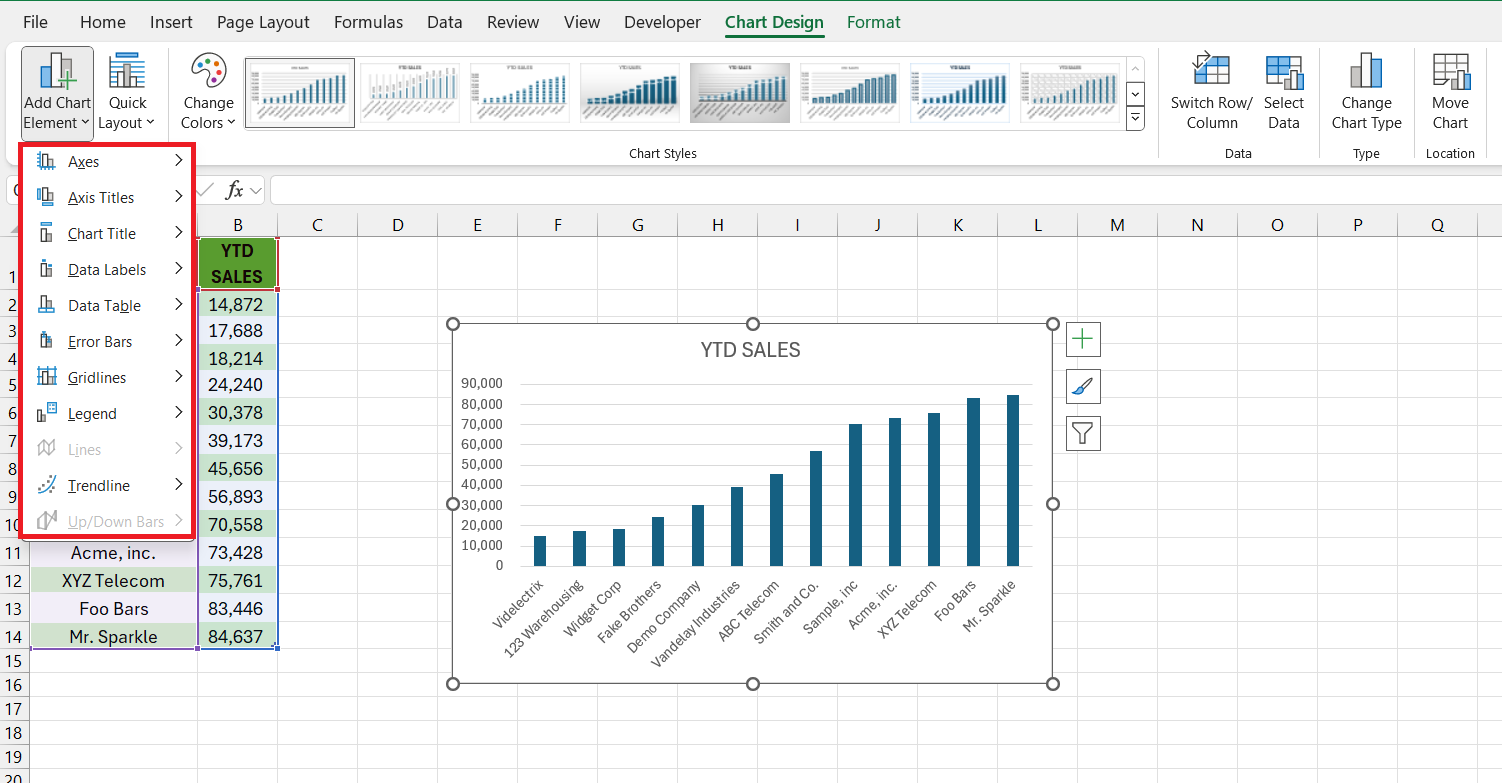
- Add Axis Titles: Use the ‘Chart Design’ tab to add primary horizontal and vertical axis titles through the ‘Add Chart Element’ dropdown.
- Edit Axis Titles: Directly edit the default axis title text boxes that appear on your chart to customize your labels.
- Format for Clarity: Utilize the ‘Format’ tab to adjust the font style, size, and color of your axis titles for better visibility and impact.
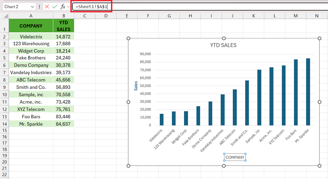
- Dynamic Titles: Link axis titles to worksheet cells to make them dynamically update when the cell content changes, keeping your chart always current.
Table of Contents
Introduction to Axis Labels in Excel Charts
Understanding the Importance of Axis Labels
Axis labels serve as critical signposts in the landscape of data visualization. They offer clarity, allowing anyone viewing your chart to quickly understand the data plotted along the X and Y axes. Think of them as the helpful guide at a museum, without whom the artwork—though compelling—might leave you lost in interpretation.
Overview of Steps to Add Axis Labels
Creating a Chart in Excel without axis labels is like a book without a title; it lacks the necessary context. But fret not, adding these descriptive elements is a breeze. Just follow a straightforward series of actions to insert labels for both the horizontal and vertical axes.
Trust this process, and you’ll elevate your Microsoft Excel chart with informative labels that make your data come alive.
Step-by-Step Guide to Adding Axis Labels
Select Your Chart and Access Chart Elements
Adding axis labels to a chart in Microsoft Excel can enhance the readability and effectiveness of your presentation. Here’s a step-by-step guide on how to add axis labels to your Excel chart:
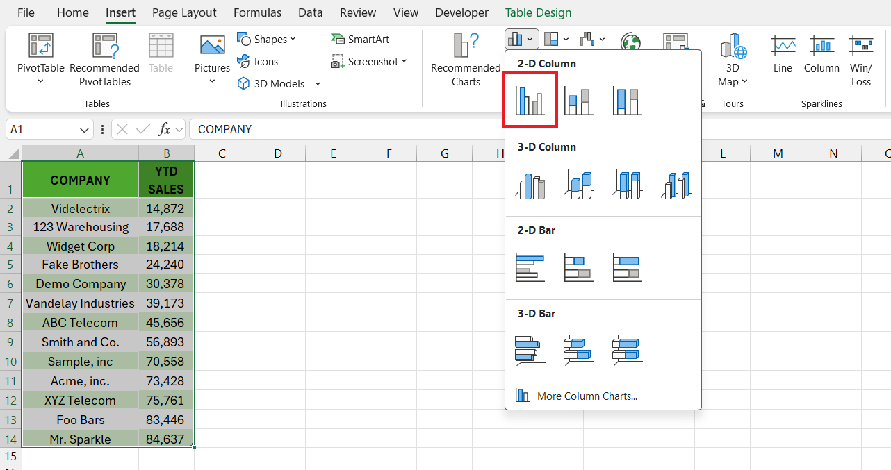
STEP 1: Create a chart by selecting your data and choosing a chart type from the ‘Insert’ tab, such as a line or bar chart.
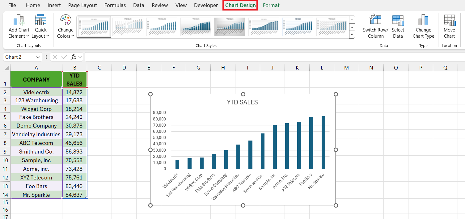
STEP 2: With your chart selected, ‘Chart Tools’ will appear in the Excel Ribbon. Click on the ‘Chart Design’ tab to modify your chart.
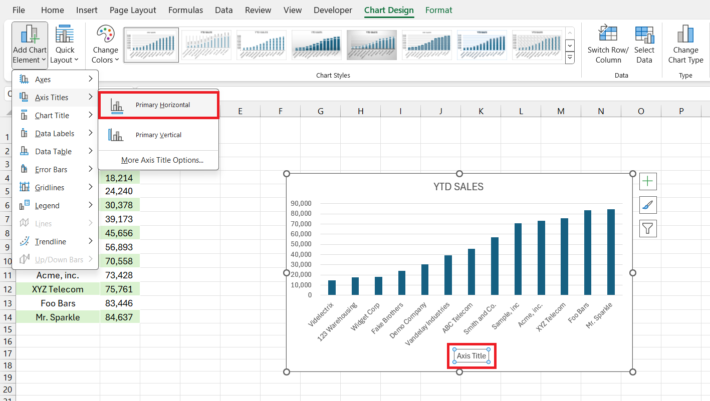
STEP 3: Click the ‘Add Chart Element’ button in the ‘Design’ tab, then select ‘Axis Titles’ from the drop-down menu. Choose ‘Primary Horizontal’ or ‘Primary Vertical’ to add titles.
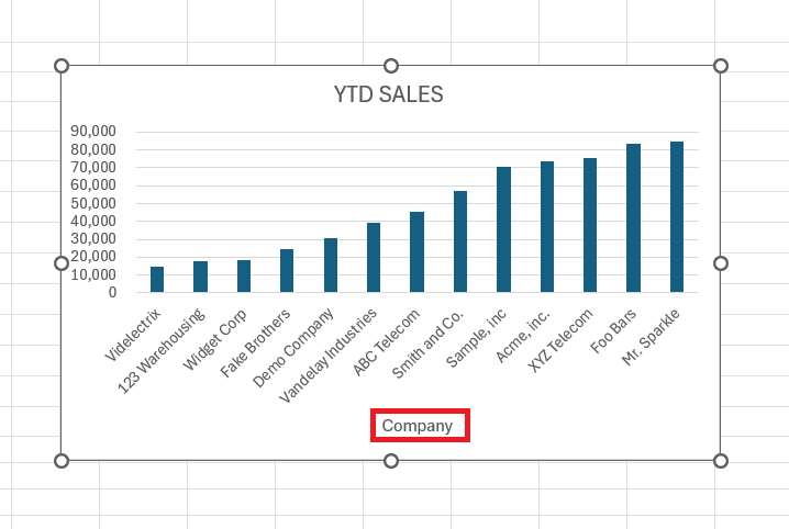
STEP 4: Edit the default “Axis Title” text box that appears on your chart to add your axis label.
STEP 5: Select the axis title text box and use the ‘Format’ tab to change font style, size, and color.
STEP 6: Check that the axis titles are clear and correctly positioned to enhance your chart’s readability.
By following these shortened steps, you can efficiently add and customize axis labels to your Excel charts.
Adding Axis Titles Using Multiple Methods
If versatility is your thing, Excel won’t disappoint when it comes to adding axis titles. You can select the chart and head over to the Chart Design tab for a traditional approach, where the Add Chart Element dropdown is your gateway to labeling nirvana.
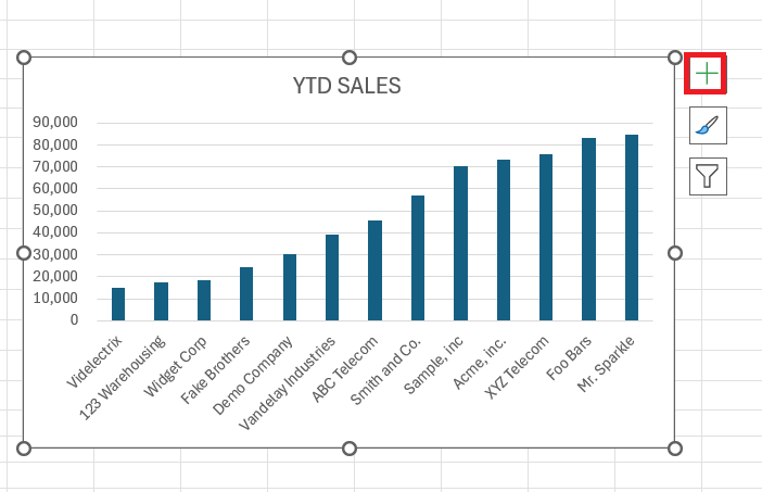
Or perhaps the direct route appeals to you, where selecting the chart springs forth the Chart Elements icon for immediate axis title action.
Whether you prefer a stroll through menu options or the straightforwardness of quick access icons, Excel has the method to suit your style.
Advanced Tips for Axis Labels
Dynamic Axis Titles Linked to Worksheet Cells
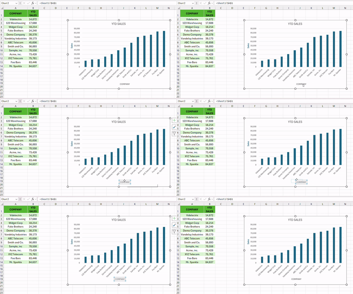
Take a leap into the dynamic realm where your axis titles are not just static text but live, breathing elements linked directly to your worksheet cells. Imagine your chart titles updating with the agility of a chameleon, mirroring every change you make in their linked cells. Here’s the magic spell: select the axis title, type an equals sign (=) in the formula bar, click the cell with your desired text, and press Enter.
Voilà! You’ve created a living link that ensures your axis titles are always in sync with your data.
Troubleshooting Common Axis Label Issues
Correcting Misplaced or Missing Axis Titles
When axis titles go walkabout or decide to play hide-and-seek, there’s no need to fret. Reclaiming your errant text or coaxing your shy labels out of hiding is easier than you might think. If they’ve gone missing, it’s time to revisit that trusty Chart Elements button or the Chart Design tab to recheck the Axis Titles option. Titles out of place? A simple drag-and-drop action will restore order.
Remember, you’re the puppet master; with a few clicks, you can ensure every element is perfectly positioned for the show.
Changing and Resetting Axis Label Formats
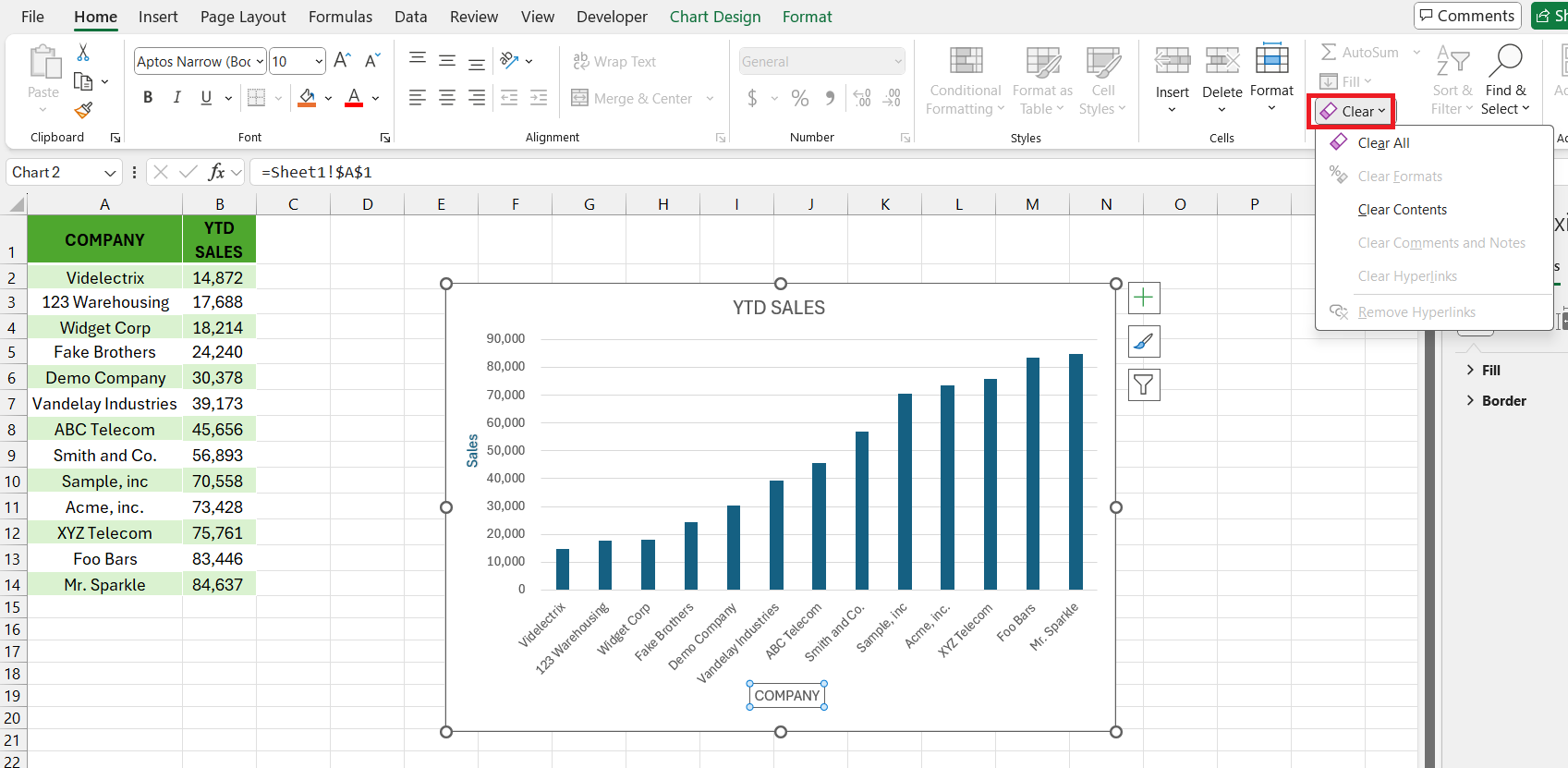
Tinkered a bit too much with the axis labels? If your Excel chart now looks like a wild art experiment gone awry, fear not! You can revert to the default styling with the simplicity of a seasoned pro. Click on the axis title, find your way back to the Home tab, and press the ‘Clear’ button to wipe the slate clean of all formatting.
Alternatively, the ‘Reset to Match Style’ option under the Format tab offers a one-click return to the original chart design.
Think of it as the “Ctrl+Z” for your creative explorations, keeping your axis labels crisp, clean, and coherent.
FAQs
What is an Axis Label?
An axis label is your chart’s guiding star; it tells you what’s plotted on each axis. Typically, it’s found along the horizontal or X-axis, and the vertical or Y-axis, describing data dimensions. These labels are essential for understanding, at a glance, what the numerical values or categories represent in your data set.
How Do I Add Axis Labels in Excel?
To add axis labels in Excel, click on your chart to activate the Chart Elements button. Choose ‘Axis Titles’ and select the desired axis (‘Primary Horizontal’ or ‘Primary Vertical’). Enter your text into the placeholder to set your axis labels and press Enter to apply them.
Can I Link Axis Titles to Cell Content in Excel?
Absolutely! You can link axis titles directly to cell content in Excel. Select the axis title, type ‘=’ in the formula bar, click the cell with the text you want, and press Enter. This keeps your titles updated with changes in the cell.
What Are Some Common Problems When Adding Axis Labels?
Adding axis labels might sometimes be met with issues like labels not appearing, incorrect positioning, or formatting woes. Often, it’s as simple as ensuring the Chart Elements option is correctly toggled or reselecting the misplaced labels and dragging them to the desired spot. If the formatting goes awry, the ‘Reset to Match Style’ feature becomes your best pal for quick fixes.
How do I change the axis label format in Excel?
Change your axis label format in Excel with a right-click on the axis title and select ‘Format Axis’. Use the pane that appears to explore a kaleidoscope of formatting options, from number and font styles to color and alignment. Your data can now not only inform but also impress with its aesthetic.
John Michaloudis is a former accountant and finance analyst at General Electric, a Microsoft MVP since 2020, an Amazon #1 bestselling author of 4 Microsoft Excel books and teacher of Microsoft Excel & Office over at his flagship MyExcelOnline Academy Online Course.

