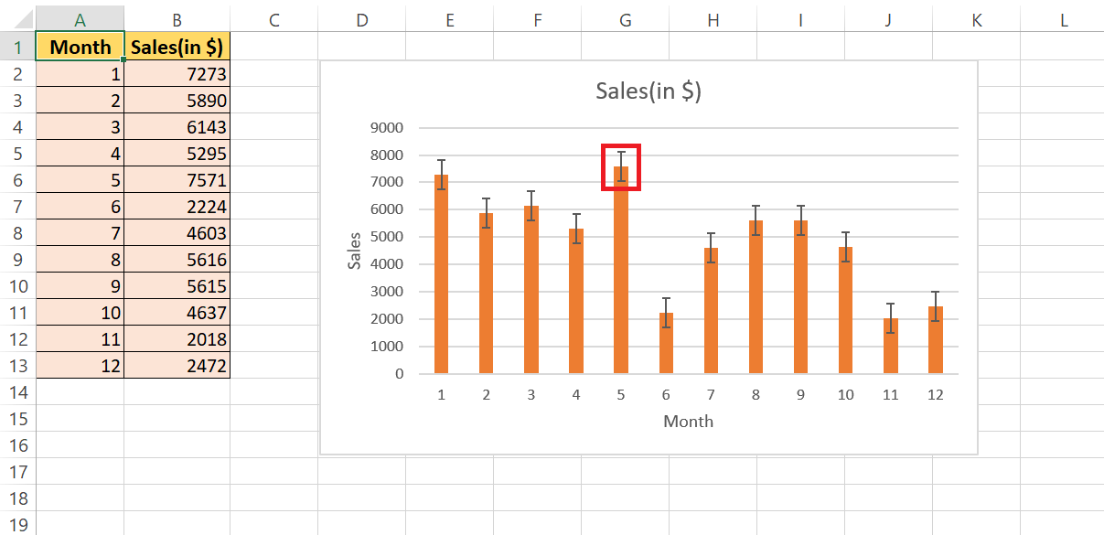
In the intricate world of data analysis, visual clarity reigns supreme, and Error Bars in Microsoft Excel play a pivotal role. These markers gauge the uncertainty of measurements, ensuring clarity and credibility in data representation. By incorporating error bars, you provide your audience with essential insights into the potential error margin, facilitating accurate data interpretation.
Key Takeaways:
- Error bars in Excel enhance data interpretation by representing potential variability, making distinctions between data points clearer.
- Understanding the concept of error bars is fundamental; they visually express uncertainty or variability in data, aiding in statistical significance assessment.
- Organizing data effectively in Excel lays the groundwork for seamless error bar integration, ensuring smooth and accurate representation.
- Adding error bars in Excel is straightforward; utilize basic options like standard error or percentage for clear visualization of data variance.
Table of Contents
Introduction to Precision in Data Representation
The Role of Error Bars in Excel
When diving into the intricate world of data analysis, visual clarity is essential, and that’s where Error Bars step in. They are your reliable markers in Excel that gauge the uncertainty of your measurements. By incorporating error bars, you ensure that anyone examining your chart grasps the potential error margin, making your data’s story clear and credible.
Ensuring Accurate Data Interpretation with Error Bars
With error bars added to your Excel charts, you arm your audience with the precision they need for accurate data interpretation. These visual cues represent potential variability, making the distinction between seemingly similar data points clearer.
It’s a precautionary tale, alerting viewers to consider the margin of error when making decisions based on the graphic representation of your dataset. This reduces the likelihood of misunderstandings stemming from overlooked data variability.
Laying the Groundwork for Error Bars
Understanding the Concept of Error Bars
Error bars are like the trusty sidekicks to your data points; they keep them honest. They visually express uncertainty or variability, providing quick insights into statistical significance—or the lack thereof. Whether you’re dealing with standard deviation, which tells you how spread out your data is, or standard error, which estimates the accuracy of your sample mean against the population mean, error bars have got it covered.
They basically put your data under a microscope, bringing the finer details into focus by showcasing just how much your numbers could potentially swing.
Gathering Your Data for Error Bar Integration
Getting your numbers in a row is the first step towards error bar excellence. Start with organizing your data set in Excel, where rows and columns are your best buds. It’s a good idea to label each clearly, streamlining the process when you later add those error bars.
Pop in an “Average” row at the bottom to calculate mean values easily, since these often serve as the anchor for your error bars. Think of it as laying down the red carpet before your data takes the stage – it’ll thank you for the smooth entrance once those error bars come into play.
Step-by-Step Guide to Adding Error Bars
Inserting Basic Error Bars
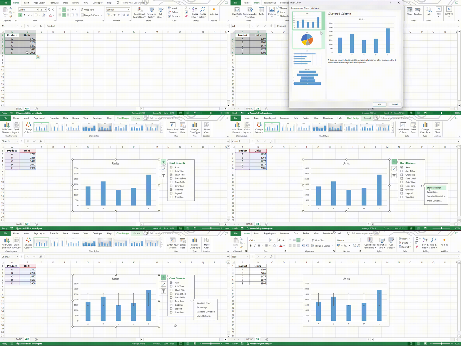
Alright, if you’re jumping into the fray of basic error bars, Excel’s got your back, making it a breeze. Here’s the lowdown: click your chart, and there, like a chart whisperer, is the Chart Elements button, ready to guide you. Zoom in on the ‘Error Bars’ and you’ve got a platter of options – standard error, percentage, or standard deviation.
Pick one and, kaboom, you’ve got error bars that—by default—speak to each data point in your graph. For those drawn to a simple aesthetic, the standard error is your go-to, giving your audience a straightforward glimpse of potential variance in your mean.
Enhancing Your Error Bars
Formatting and Styling Error Bars
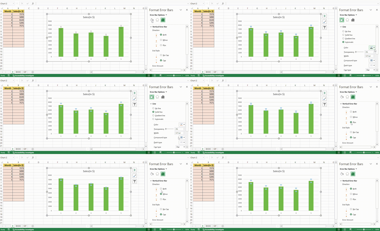
Time to dress those bars up! Click on them, and a magical “Format Error Bars” dialog box will appear, where your creative wishes are its command! Change their color to match the mood or theme, fiddle with the line style to suit the visual story you’re spinning, or sprinkle some dash styles for that extra bit of flair. Make them stand out or blend in; this is your canvas, and each tweak enhances how well your error bars communicate their intended message.
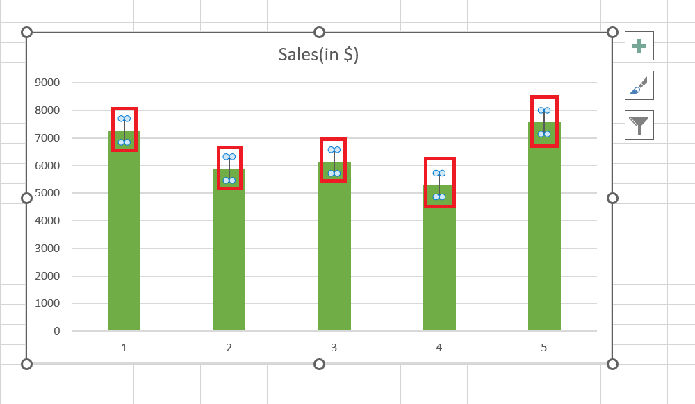
STEP 1: Click on any of the error bars in your Excel chart to select them.
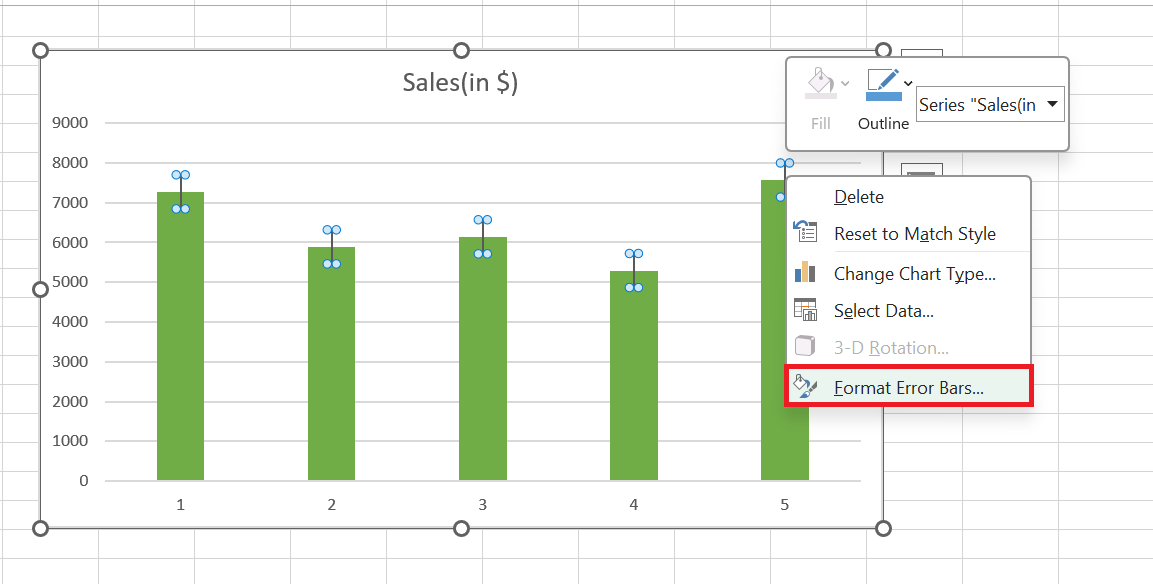
STEP 2: Right-click and choose “Format Error Bars” from the context menu.
STEP 3: In the Format Error Bars dialog box, explore options to adjust color, line style, and dash style to match your theme or preference, enhancing the visual communication of your data’s variability.
Advanced Techniques in Error Bar Modification
Working with Custom Value Error Bars
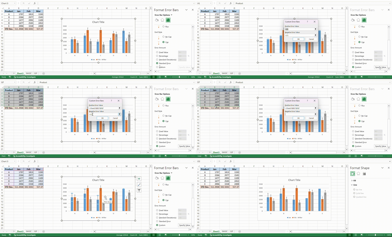
For data maestros craving even more control, custom value error bars are like wielding a conductor’s baton. They let you set unique high and low error levels for each data point, reflecting more than just the average sunshine or showers in your data’s weather report.
Dive into the “Format Error Bars” menu, select “Custom,” and tap “Specify Value” to compose your data’s precise error melody. Enter your chosen values and watch each bar stretch to the exact note of uncertainty you’ve composed—making each data point sing its truth loud and clear.
Employing Error Bars for Complex Data Series
As you orchestrate more complex data symphonies, error bars morph into nuanced instruments, allowing each series its unique tempo. Combo charts, with their mix of lines, bars, and other chart types, can turn into visual cacophonies if every data series shouts with error bars. Cue strategic placement—selecting only pivotal series for error bar emphasis. Such precision casting focuses the audience’s attention where it’s most needed, avoiding overplotting and ensuring that the chart remains an insightful, not overwhelming, ensemble.
Frequently Asked Questions (FAQs)
How do I add error bars in sheets?
To add error bars in sheets, simply click on your chart first. Then, look out for the Chart Element button—it will appear as three vertical dots or a plus sign. Click it, select “Series,” and seek out “Error bars.” Choose the type you want to add and customize them if needed. It’s that easy!
How to add error bars in Excel on Mac?
On your Excel for Mac, right-click the data series and pick “Format Data Series.” Hit “Error Bars,” then “More Options” to expand your choices. From here, select the type of error bars you need and customize accordingly. Mac’s Excel might seem like a different beast, but it’s just as capable!
How do I add standard deviation in Excel?
To add standard deviation in Excel, place your cursor where you’d like the result, and type the formula “=STDEV.S(range)” with your data range in place of “(range).” This calculates the standard deviation, which you can use for crafting error bars or other statistical analyses.
How Do I Add Error Bars for a Specific Data Series?
To add error bars for a specific data series, click to select your intended series within the chart. Then, access the Chart Elements button, choose ‘Error Bars,’ and finally select your preferred error type. It’s about pinpointing which data story you want to highlight.
Can Error Bars Represent Variability Beyond Standard Deviation?
Absolutely! Error bars aren’t just one-trick ponies limited to standard deviation. They can represent a variety or uncertainty measures like standard error, confidence intervals, or even a custom range you specify. Your chart, your rules—tailor those error bars to tell the most transparent story.
John Michaloudis is a former accountant and finance analyst at General Electric, a Microsoft MVP since 2020, an Amazon #1 bestselling author of 4 Microsoft Excel books and teacher of Microsoft Excel & Office over at his flagship MyExcelOnline Academy Online Course.

