Drawing a line in Microsoft Excel can enhance the visual appeal and clarity of your spreadsheets. Whether you want to underline text, create borders, or illustrate trends, Excel offers straightforward tools to insert lines. By using the Shapes tool under the Insert tab, you can easily add, format, and position lines to suit your needs. This guide will walk you through the process of how to draw a line in Excel.
Key Takeaways:
- Enhancing Visual Appeal: Drawing lines in Excel can significantly improve the clarity and attractiveness of your spreadsheets.
- Using Shapes Tool: The Shapes tool under the Insert tab allows easy insertion, formatting, and positioning of lines.
- Customization Options: Customizing line style and color enhances visual clarity and differentiates data sets effectively.
- Straight Line Placement: Holding the Shift key while drawing ensures straight lines, and manual adjustments in the Shape Format tab provide precision.
- Practical Steps: A step-by-step approach helps users efficiently draw and customize lines to create compelling data presentations.
Table of Contents
Introduction to Data Visualization in Excel
The Significance of Lines in Data Presentation
When we dive into the realms of data visualization in Excel, lines become one of our most powerful tools. They connect data points to display trends, comparisons, and changes over time, providing clear visual cues to tell a story with numbers.
Lines help viewers trace the path of data as it ascends, descends, or remains steady—vital for making informed decisions or understanding complex analyses.
Quick Primer on Excel’s Drawing Tools
Navigating the Drawing toolbar is the first step in utilizing Excel’s array of drawing tools effectively. With a few clicks, they let you create lines, shapes, and text boxes, which can be customized, moved, or copied to suit your project’s needs.
The ability to draw straight lines, arrows, rectangles, and circles, as well as more complex AutoShapes, adds versatility to your data presentation toolbox.
Crafting Your Visual Story with Lines
Step-by-Step Guide to Drawing a Line
Drawing lines in Excel is straightforward once you get the hang of it. Here’s a quick walkthrough to help you start:
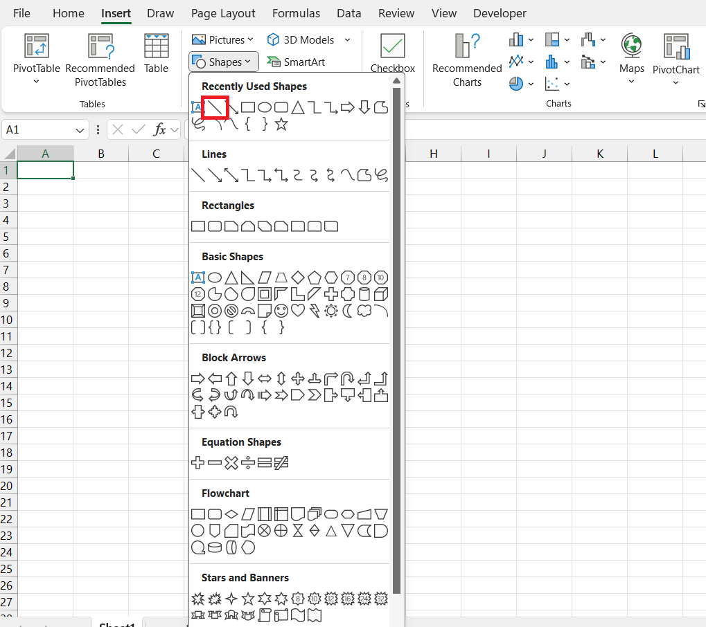
STEP 1: Select the “INSERT” tab in your Excel workbook. Click on “Shapes” found within the “Illustrations” group and choose the simple “Line” shape.
STEP 2: Upon selection, your cursor changes to a crosshair; now, click on your desired start point in the spreadsheet, hold and drag your cursor to where you want the line to end, and then release.
If you happen to release the cursor early or need to adjust the line, simply select it to see edit points at each end, allowing you to resize or realign as needed.
Remember to play around with these steps. Familiarity will make your workflow more efficient and your data presentations more compelling.
Customizing Line Style and Color for Clarity
To enhance the clarity and the visual appeal of line elements in Excel, customizing their style and color is essential. Here’s how to do so:
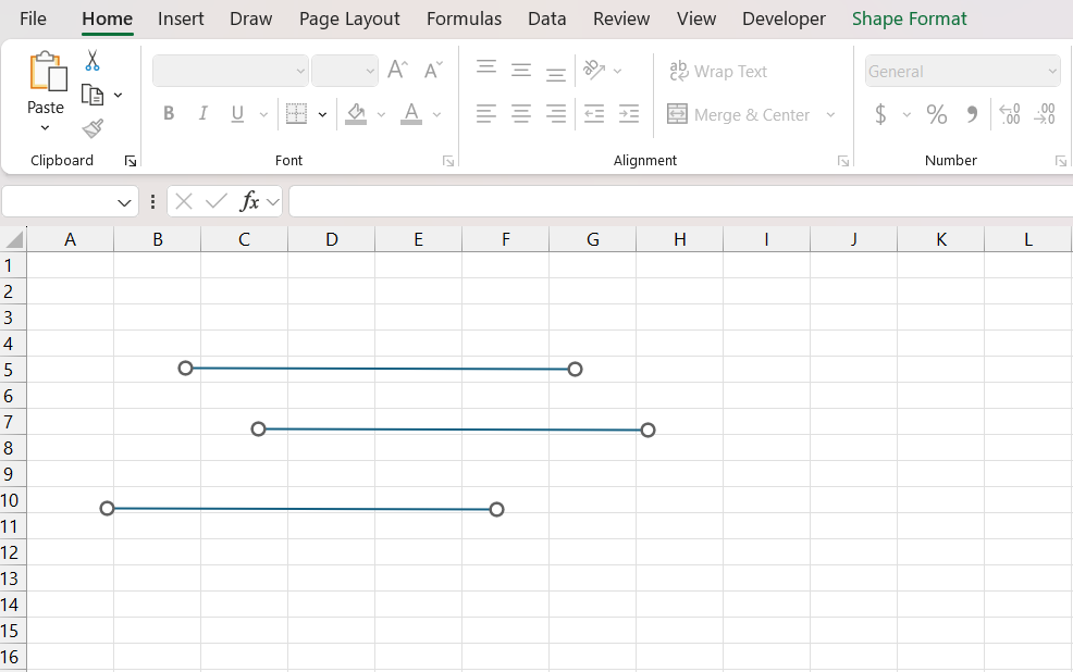
STEP 1: Click on the line you wish to customize. For multiple lines, hold down ‘Ctrl’ as you select each line.
STEP 2: Navigate to the “Shape Format” tab that appears.
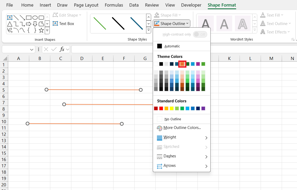
STEP 3: Here, you can select a Quick Style for preset options or manually change the line’s color, weight, and dash type under “Shape Outline.”
Alter line styles to distinguish between data sets easily. For example, primary data could be shown with a solid, heavier line, while secondary information might be dashed or lighter. Such customization ensures data is easy to follow and interpret.
Ensuring Straight Line Placement
Achieving perfectly straight line placement can be a bit tricky at times; however, Excel offers a nifty trick to make sure your lines don’t wobble.
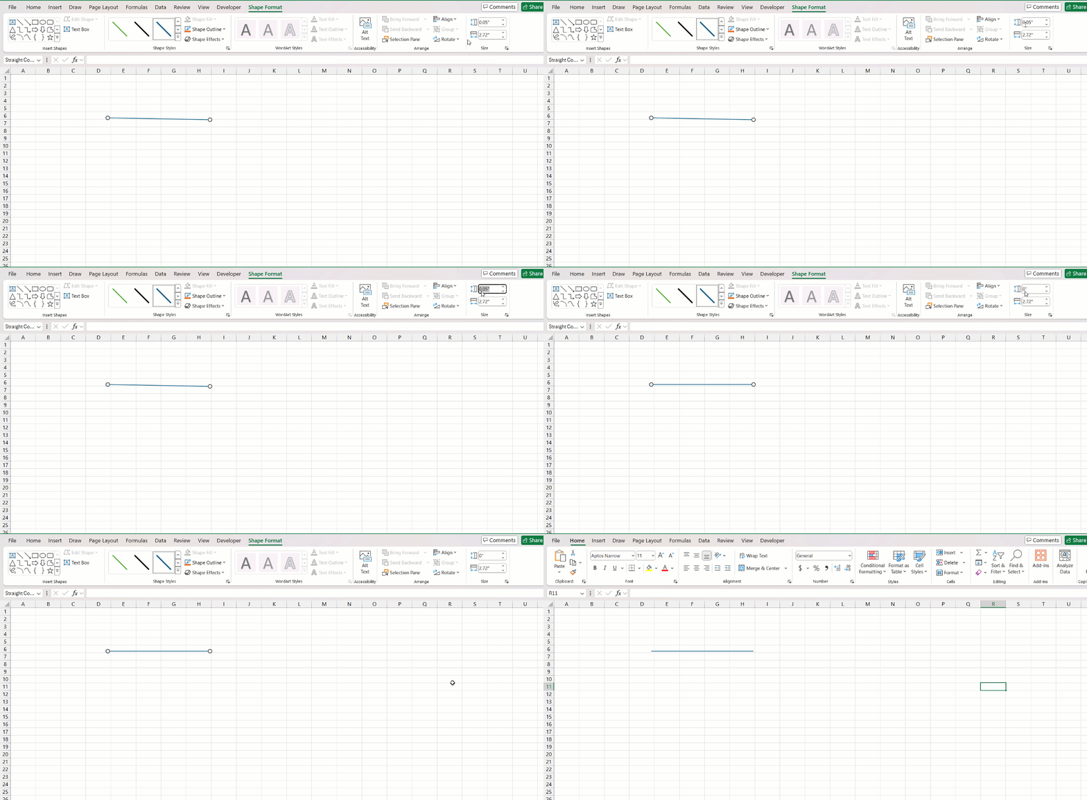
- After drawing a line, click to select it. You’ll notice that the “Shape Format” tab appears.
- In the “Shape Format” tab, you can set the exact Height of the line. For a perfectly horizontal line, set the Height to 0 cm.
- You can also hold the “Shift” key while drawing your line which will constrain it to a straight 0, 45, or 90 degrees.
Remember, if a diagonal line is what you need, simply increase the Height while keeping the Width constant, and utilize the up and down arrows for small adjustments.
FAQs: Mastering Lines in Excel for Better Data Visualization
How to draw a line in Excel?
To insert a line in Excel, go to the ‘Insert’ tab, click on ‘Shapes’, and then select your preferred line shape. Click and drag on the worksheet to draw the line. Once placed, you can customize it as needed.
How to draw a line in a cell in Excel?
To draw a line within a cell in Excel, choose ‘Shapes’ from the ‘Insert’ tab, select a line style, and then draw the line inside the cell. Adjust it by dragging the ends of the line so that it fits within the cell boundaries.
How do I add vertical lines in a word?
To add vertical lines in Microsoft Word, go to the ‘Insert’ tab, click on ‘Shapes’, and select the line shape. Click and drag upwards or downwards in your document to create a vertical line. Hold ‘Shift’ for a perfectly straight line.
How do I ensure my lines are perfectly straight in an Excel chart?
To ensure lines are perfectly straight in an Excel chart, hold down the ‘Shift’ key while you draw the line. If adjusting an existing line, click it, go to the ‘Format’ tab, and set the shape height or width to zero (0) depending on the orientation.
What should I consider when adding lines to visualize data in Excel?
When adding lines to visualize data in Excel, consider the line type and its relevance to the data, keep styles consistent for easy interpretation, and use colors and weights that enhance clarity without overwhelming the viewer. Ensure lines add value and do not clutter your visualization.
John Michaloudis is a former accountant and finance analyst at General Electric, a Microsoft MVP since 2020, an Amazon #1 bestselling author of 4 Microsoft Excel books and teacher of Microsoft Excel & Office over at his flagship MyExcelOnline Academy Online Course.


