When I work on visualizing data in Excel, adding a clear, descriptive title to my graphs is a crucial step. A good title not only helps me understand the purpose of the graph but also communicates its essence to anyone viewing it. If you’re like me and want to make your graphs stand out while being informative, let me walk you through how to title a graph in Excel.
Key Takeaways:
- A clear, concise title enhances the impact and clarity of your Excel charts.
- Linking chart titles to worksheet data makes them dynamic and updates automatically with changes.
- Formatting titles with appropriate font size, color, and style ensures readability and visual appeal.
- Positioning the title strategically avoids overshadowing key chart elements.
- Troubleshooting chart titles and axis labels ensures seamless data communication.
Table of Contents
Capturing Your Audience with Impactful Chart Titles
The Importance of a Well-Crafted Chart Title
In the realm of data visualization, first impressions matter immensely. A well-crafted chart title is not just a label—it’s a headline that encapsulates the narrative of the data. Think of it as the topic sentence to your data story; it offers context, directs attention, and sets the tone.
A title can make the difference between a chart that speaks volumes and one that goes unnoticed. To me, a great chart title is like a book cover; it entices the audience to delve deeper into the data.
Key Elements of an Effective Chart Title
When constructing a chart title, it’s the clarity and relevance that take the spotlight. The key elements of an effective chart title encompass brevity, precision, and insight. A succinct title that accurately reflects the content of the chart ensures a quick understanding.
Forego ambiguity or cleverness that might confuse the reader. It should highlight the main takeaway, like the rise or fall of a trend, without the need for further explanation. In addition, consider your audience; the technicality of your title should match their level of expertise.
Whether it’s a quarterly sales report or a scientific study, the title must bridge the data and the viewer, providing an immediate recognition of the chart’s significance.
How to Title a Graph in Excel
Starting Simple: Adding a Basic Chart Title
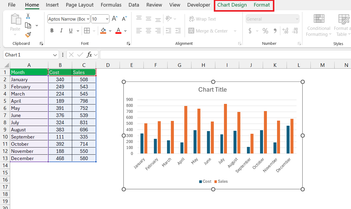
Adding a basic chart title in Excel is a breeze. Here’s a simple way to start: Once you’ve created your chart, click on it to bring up the Chart Design and Format tabs.
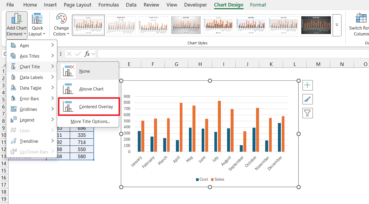
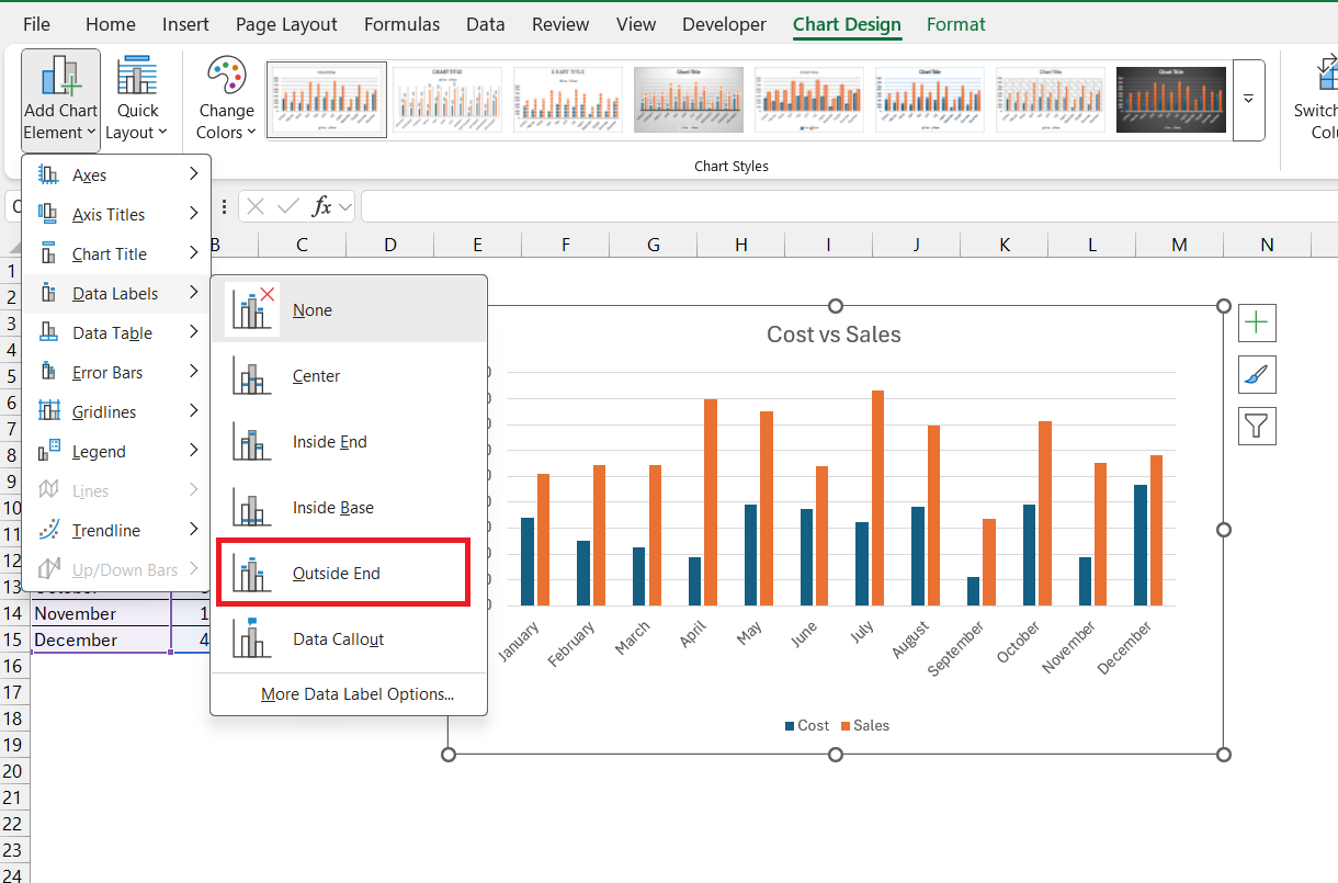
From there, navigate to the ‘Chart Design’ tab and find the ‘Add Chart Element’ dropdown menu in the toolbar. Select ‘Chart Title’ from the options and choose your preferred position for the title, such as ‘Centered Overlay.’
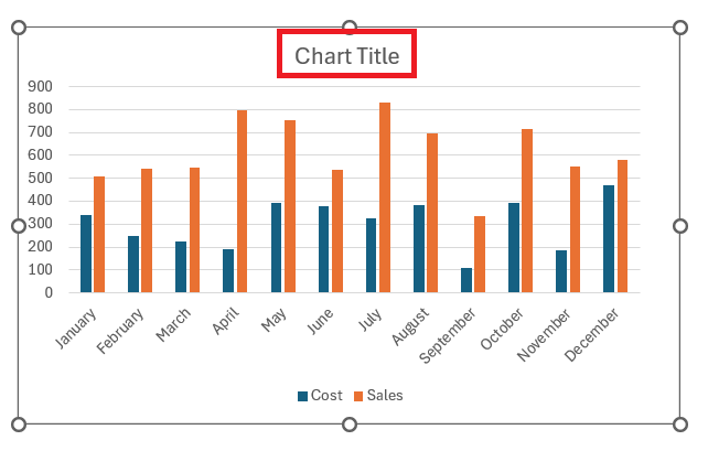
Excel will place a textbox with the placeholder text “Chart Title” on your chart.
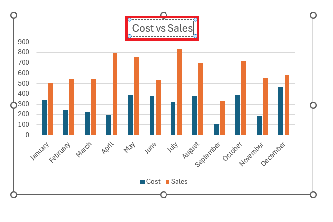
Click to select the text box, highlight the placeholder text, and type in your desired title.
It’s an elegant way to quickly bestow a name upon your data story, making it more accessible and informative for your audience.
Linking Your Chart Title to Worksheet Data for Dynamism
Harness Excel’s dynamism by linking your chart title directly to worksheet data. This nifty trick means that anytime the cell’s data is updated, your chart title reflects the changes instantly—ideal for reports or dashboards that need to stay updated with minimal manual intervention. Here’s how to set this up:
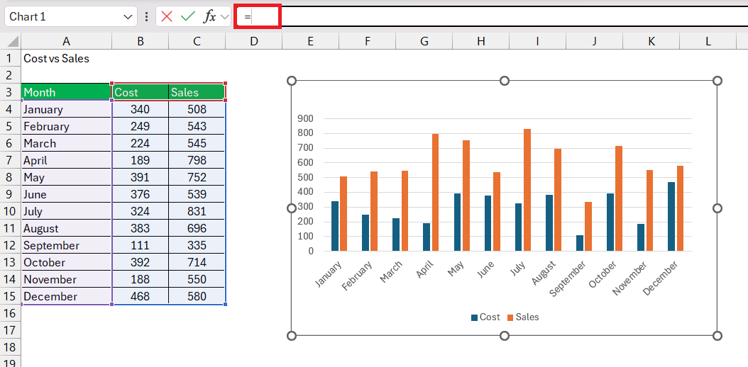
Click on the chart title you’ve just added. Then, in the Formula bar—not in the title box itself—type the equal sign =.
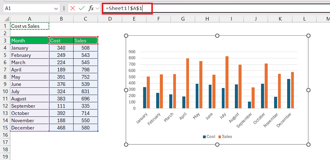
Next, click on the cell that holds the data or heading you want in your title.
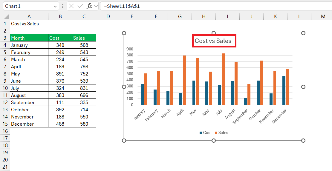
This cell could contain a simple entry or a more complex formula summing up your chart’s story. Once selected, hit Enter, and voila! Your chart title now dynamically updates to mirror the cell’s content.
Imagine the convenience during monthly reporting—update your data table, and your chart titles adjust automatically!
Customizing Your Excel Chart Title Like a Pro
Font, Size, and Color: Making Your Title Stand Out
To ensure your title captivates attention, play around with font, size, and color. Click on the chart title and select ‘Home’ tab to access customization options.
Here, you can bold or italicize the font for emphasis or pick a typeface that complements your presentation’s design. Increasing the size can make your title more commanding, but remember—balance is key.
It should be prominent without overwhelming the chart itself. As for color, pick a shade that contrasts well with the background for legibility but harmonizes with the overall palette of your document.
These simple tweaks can significantly amplify the impact of your data visualization.
Moving and Resizing: Positioning Your Title for Maximum Impact
For the title of your chart to make the maximum impact, you need to position it with care. This is where fine-tuning comes into play. To move it, click on the title to see the four-headed arrow cursor, then drag it to the preferred location.
Place it where it can be seen instantly without overshadowing any critical data. To resize the title box, click on it and drag the sizing handles. A larger title can enhance visibility, but ensure it doesn’t encroach on the chart itself. The goal is to achieve a visual hierarchy that guides the viewer’s eye smoothly from the title, through the legends, and down to the data points.
Troubleshooting Common Chart Titling Issues
Overcoming Obstacles with Axis Titles and Data Labels
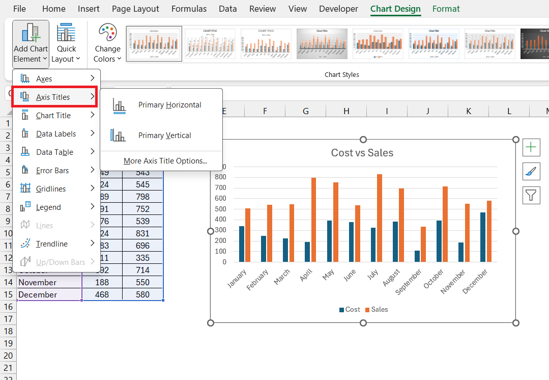
Axis titles and data labels are pivotal in clarifying chart data, but adding them or editing them might bring about some hiccups. To sidestep common issues, remember to select the chart and enable the Axis Titles feature through the ‘Add Chart Element’ in the Chart Tools.
If the axis titles or data labels don’t appear as they should, double-check the chart type; some, like pie charts, don’t use axes. For data labels overlapping or being too cramped, you can adjust their position to ‘Outside End’ for clearer visibility.
Troubleshooting these elements successfully can vastly improve the legibility and informative value of your charts.
FAQs: Mastering the Art of Excel Chart Titles
How do I add a title to my chart that updates automatically?
To add a chart title that updates automatically in Excel, link it to a worksheet cell. Click on the chart title, type an equal sign (=) in the Formula bar, click the cell with the data you want as your title, and press Enter. Now your title reflects any changes to that cell.
Can I link a chart title to a formula in Excel?
Yes, you can link a chart title to a cell that contains a formula in Excel. By entering =CellWithFormula in the Formula bar while your chart title is selected, the title will display the result of the formula, updating automatically as the formula’s input values change.
What are the best practices for formatting chart titles?
For formatting chart titles effectively, keep it clear and concise; use a font size and style that’s easy to read and matches the rest of your presentation. Employ colors that stand out against the background but aren’t jarring. Make sure the title is positioned where it doesn’t distract from the data. Also, consider dynamic linking if regular updates are necessary.
Why isn’t my chart title showing after I added it in Excel?
If your chart title isn’t showing after adding it in Excel, check if it’s hidden by selecting the chart and using the ‘Add Chart Element’ button to toggle the title on. If misplaced, use the chart formatting options to resize and reposition it visibly.
How do I automatically add a title to a chart in Excel?
To automatically add a title to a chart in Excel, create your chart, go to the ‘Design’ tab, click on ‘Add Chart Element’, select ‘Chart Title’, and choose a position. For dynamic titles, link it to a worksheet cell containing your desired title text.
John Michaloudis is a former accountant and finance analyst at General Electric, a Microsoft MVP since 2020, an Amazon #1 bestselling author of 4 Microsoft Excel books and teacher of Microsoft Excel & Office over at his flagship MyExcelOnline Academy Online Course.

