Excel PivotTables has transformed data analysis by offering intuitive insights from complex datasets. These tools not only simplify data management but also enhance it by integrating visuals, making information easier to digest and interpret. With the added ability to use image and data types in PivotTables, it has become a storytelling tool, where data is not just presented but narrated through engaging visual elements.
Key Takeaways:
- PivotTables can excel in turning extensive data into comprehensible insights, making them indispensable for analyzing, summarizing, or uncovering trends in data.
- Incorporating visuals into PivotTables elevates the data narrative, offering instant comprehension, and aesthetic appeal, and aiding in pattern recognition.
- The process involves preparing your data table, inserting images via the IMAGE function, creating your PivotTable, and finally adjusting design and formatting to display images properly.
- For optimal results, maintain consistent image sizes, use relevant and clear images, keep file sizes small, and ensure the PivotTable’s layout remains simple for ease of updates.
Table of Contents
Introduction to PivotTables with Visualization
Understanding the Power of PivotTables
PivotTables, a gem in Excel’s toolbox, have revolutionized the way you delve into data. They serve as your data whisperers, translating columns of information into understandable and actionable insights without sweat. If you’re looking to sort out complex data, want a clear summary, or wish to uncover hidden trends, PivotTables are your go-to resource.
The Impact of Visuals in Data Analysis
Visuals make a significant impact on data analysis, offering a quick, intuitive way to process information. When you incorporate images, you’re grabbing attention and delivering initial recognition at lightning speed. A pivot table decorated with visuals is not just table with numbers, but a narrative that stands out. It’s about making data tell a story, where images serve as the compelling chapter headings and graphs the plot twists.
Visual Benefits:
- Instant comprehension
- Aesthetic appeal
- Pattern recognition
- Increased memorability
Incorporating Images into Excel PivotTables
Step-by-Step Guide to Inserting Pictures
Inserting pictures into your PivotTables can help transform data into a visually engaging narrative. Here’s a simple guide to help you get started:
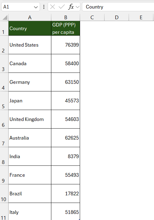
Step 1: Prepare Your Data Table Make sure your data table is set up correctly. Ensure there’s a column for the pictures you’re planning to include in your PivotTable.
Step 2: Place Pictures Into Cells Use the IMAGE function to add images directly into the cells of your data table. This feature ensures that pictures fit neatly within the Excel cell boundaries.
Step 3: Create Your PivotTable Select your data range and insert a PivotTable as you normally would, via ‘Insert > PivotTable’.
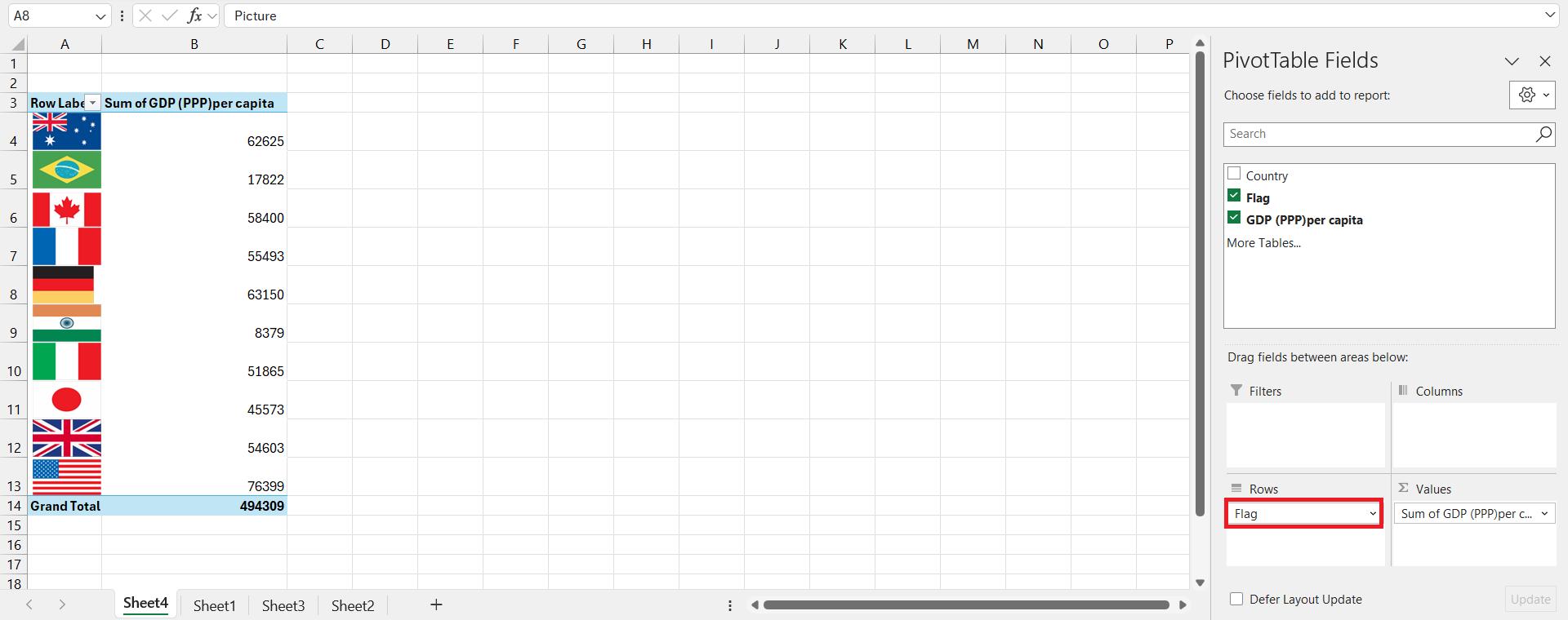
Step 4: Incorporate Images into the PivotTable Drag the column containing images to either the row or the column area in the PivotTable fields pane, depending on where you want the images to appear.
Step 5: Design and Format Your PivotTable Adjust the PivotTable design and format the cell sizes if necessary, so that the images are displayed correctly and to your liking.
Note: The ability to insert images into PivotTables may vary across different Excel versions.
Best Practices for Image Integration
Integrating images into Excel PivotTables adds dimension and appeal to your datasets, but it’s essential to do it right. Here are some best practices to follow for the best results:
- Maintain Consistent Image Size: Ensure all images are uniform in size before inserting them into cells. This creates a neat, organized look and prevents a cluttered or imbalanced PivotTable.
- Use Relevant and Clear Images: Select images that add value and context to your data. Avoid images that are too complex or detailed, which could distract from the data itself.
- Keep File Sizes Optimal: Use images with a small file size to avoid bloating your Excel file, which can lead to slower performance or difficulties in sharing.
- Opt for Simple Formatting: Simplify image integration by avoiding merging cells or complex layouts in the PivotTable, which could complicate updates or changes.
- Accessibility Considerations: Remember that screen readers can’t interpret images. Add descriptive text in adjacent cells or use Alt Text to describe the image for users with visual impairments.
Leveraging Data Types in PivotTables
Exploring Geography and Stock Data Types
Excel’s Geography and Stock data types are like having a research assistant within your spreadsheet, providing you with a plethora of linked information from an online source. Let’s explore:
Geography Data Type: By converting text in a cell to the Geography type, you access a wide range of attributes like population, economic indicators, or even gas prices. This is immensely helpful when you’re dealing with demographic, economic, or travel-related datasets.
Stock Data Type: For the financially astute, the Stock data type turns a company name or ticker symbol into a goldmine of financial data. From stock prices to market caps, you’re equipped to make informed decisions with up-to-date info.
Here’s how to use them:
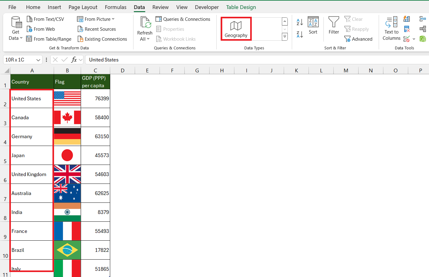
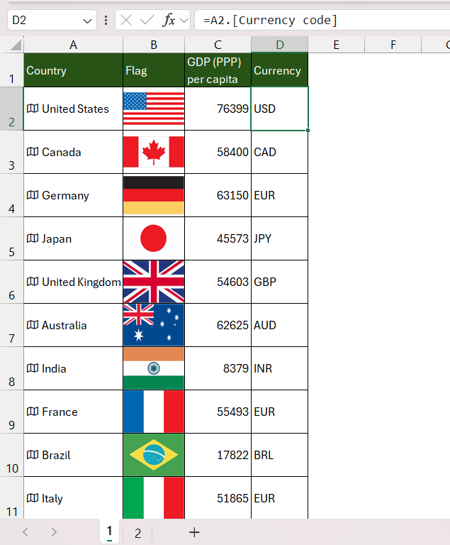
STEP 1: Simply type in a country or company name, and go to Data tab and select Geography.
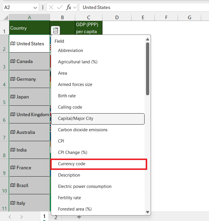
STEP 2: Once the data type is set, use the field list to extract specific information like currency for Geography or the PE Ratio for Stocks.
The currency column will be added using the data type card and you can format it to match the existing table format.
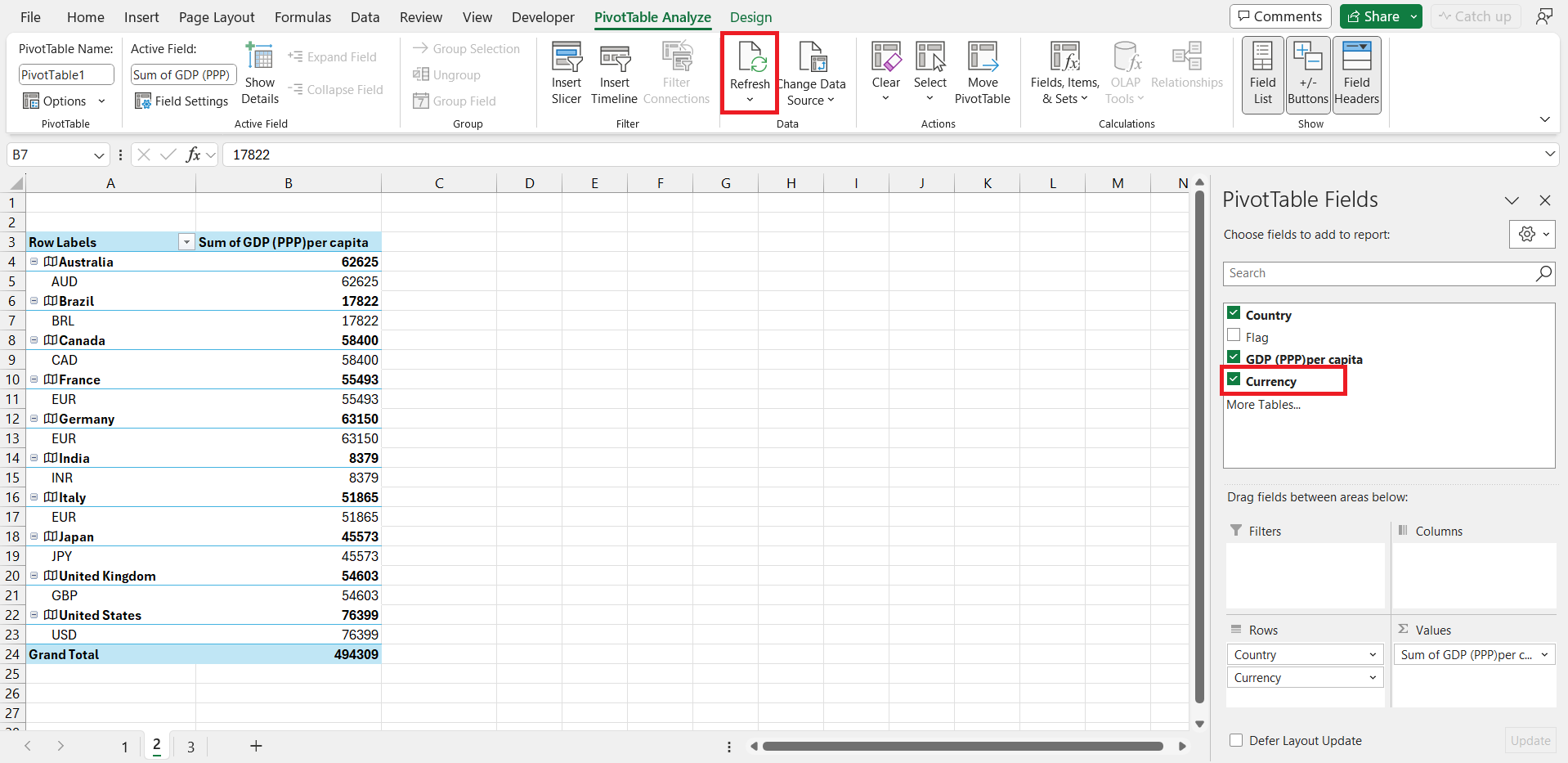
STEP 3: Go to the Pivot table and with a simple refresh, the data types’ figures update with the latest information from the web, keeping your analysis current.
Remember, these powerful tools are available to Microsoft 365 subscribers or those with a free Microsoft Account, with certain language preferences set in Office.
Advanced Tips for Powerful PivotTables
Dynamic Conditional Formatting with Data Types
Dynamic Conditional Formatting, in tandem with Excel’s Data Types, can transform your PivotTables into vibrant and intuitive displays. This feature lets you apply formatting rules based on cell values, making it easier to highlight trends and outliers at a glance. It’s like setting visual cues for your brain to catch important data points without reading every number.
Here’s how to apply it:
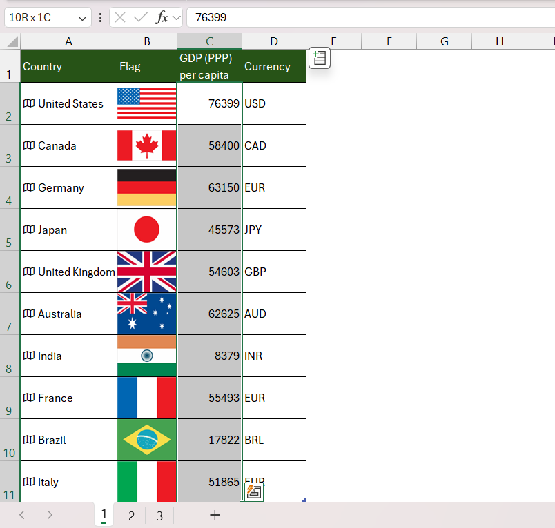
STEP 1: Select Your Data: Click on the cell or range within your PivotTable where you want the rules to apply.
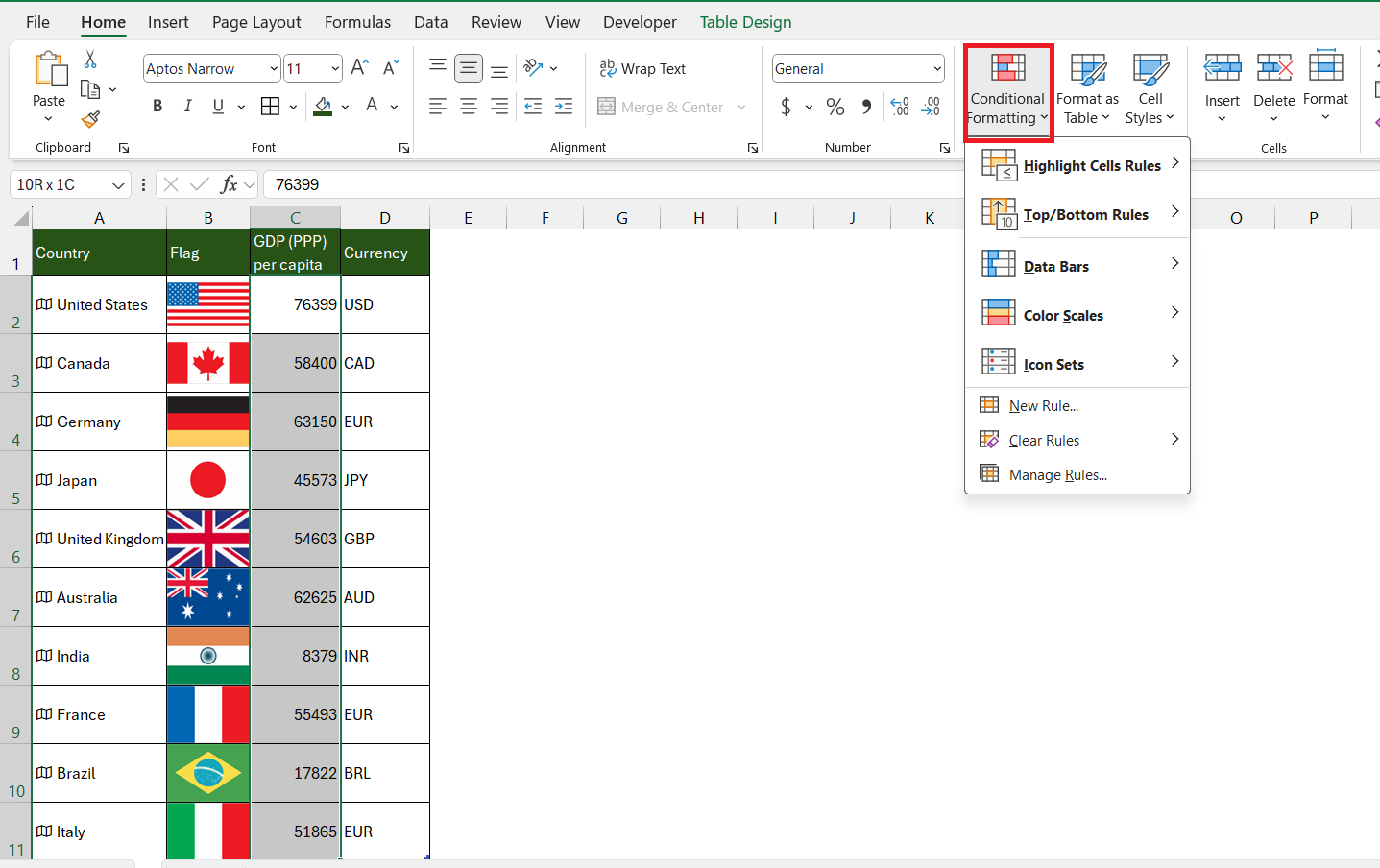
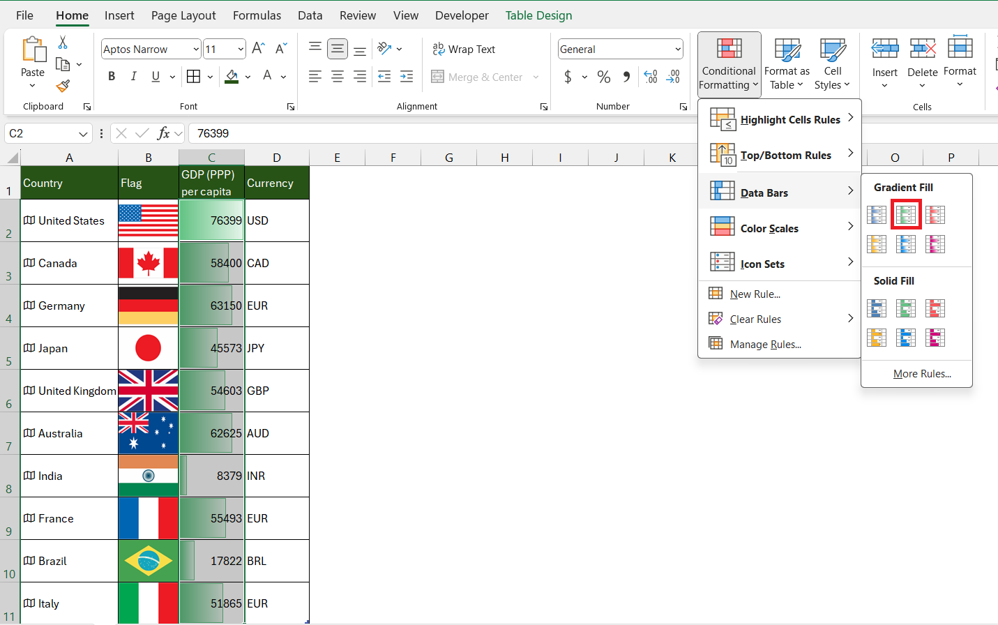
STEP 2: Access the Formatting Menu: Go to the ‘Home’ tab and click ‘Conditional Formatting’.
STEP 3: Set Your Rules: Choose from preset rules like ‘Color Scales’, ‘Data Bars’, or create your own with ‘New Rule’. These can be based on the data type’s properties, such as highlighting countries with populations above a certain threshold.
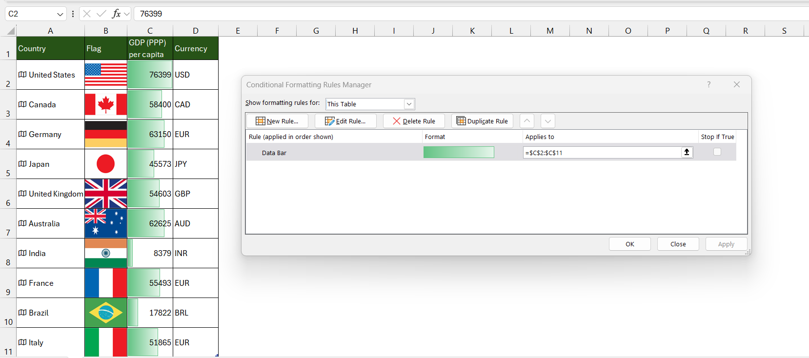
STEP 4: Refine and Manage: Adjust the formatting rules to suit your data needs and manage them through the Conditional Formatting ‘Manage Rules’ option.
The result? A PivotTable that not only speaks numbers but also shows a spectrum of significance, temperature, or performance through colors and icons, all updating dynamically as your data evolves.
Using External Data Sources Effectively
When it comes to elevating the utility of Excel PivotTables, tapping into external data sources is a game-changer. It broadens the horizon of your analysis, enabling you to pull in data from various databases, online services, or even other spreadsheets.
To use external data sources effectively:
- Integration with Ease: Utilize Excel’s ‘Get & Transform’ features (formerly known as Power Query) to connect your PivotTable to a multitude of data sources like SQL, Access, or web pages.
- Data Consolidation: Combine data from different sources to get a holistic view. You could merge sales data from an SQL database with marketing spend data from an Excel spreadsheet.
- Automated Updates: Set your PivotTables to refresh automatically or with a simple manual command, ensuring you’re always working with the most current data.
- Maintain Data Integrity: Always verify the reliability and accuracy of the external sources and maintain a consistent data structure to ensure seamless updates.
- Privacy and Security: Keep sensitive data secure by controlling the data source links and access permissions within your workbook.
By weaving external data sources into your PivotTables, you create not just tables but sophisticated data discovery platforms that can provide strategic insights.
Avoiding Common Pitfalls
Troubleshooting Data Refresh Issues
When working with PivotTables linked to external data sources or dynamic data types like Stocks or Geography, you might occasionally encounter issues where your data isn’t refreshing correctly. Here are some tips for troubleshooting refresh issues:
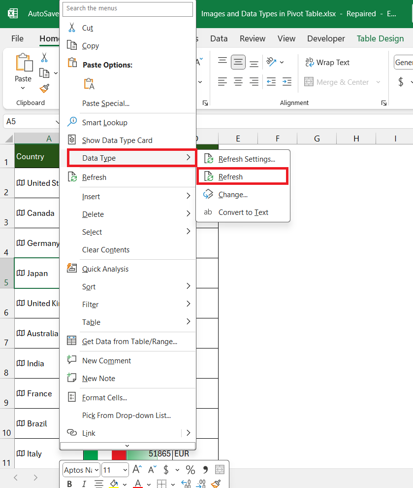
- Manual Refresh: Right-click inside your PivotTable, and choose ‘Refresh’ to update the data manually. For data types, right-click a cell with the linked data type and select ‘Data Type > Refresh.’
- Connection Check: Ensure that the workbook’s connections to external data sources are still valid and that the sources are accessible.
- Data Source Verification: Confirm that the external data source hasn’t been moved or altered and that the data structure matches what your PivotTable expects.
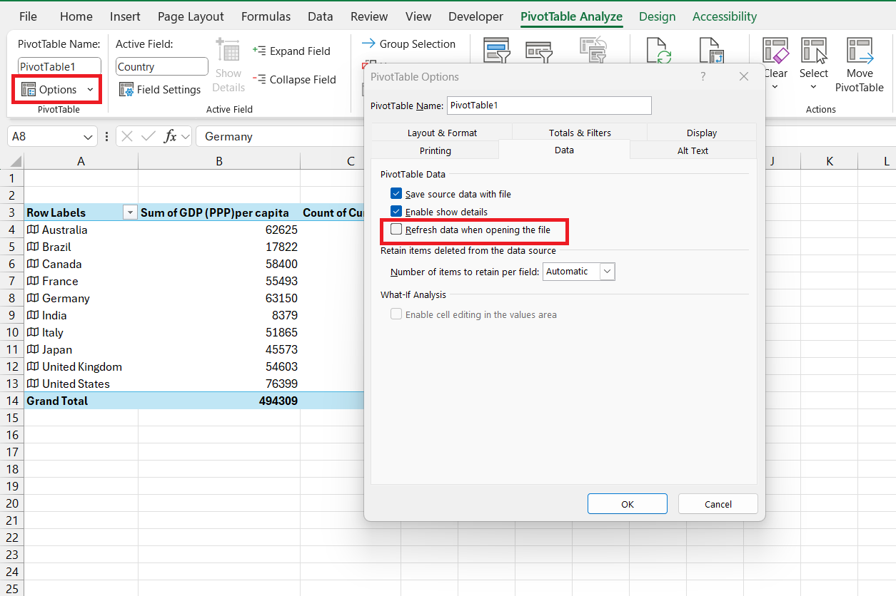
- PivotTable Options: Visit PivotTable Options > Data tab to verify that the refresh options are set correctly for your needs.
- Cache Clearing: Sometimes, the PivotTable cache can become corrupted. Clearing it can often resolve refresh issues. You can do this by re-creating the PivotTable or using VBA to clear the cache programmatically.
- Check for Errors: Inspect your data for errors that might prevent a refresh, such as non-standard date formats or missing values in key fields.
- Update Excel: Make sure you’re running the latest version of Excel with all current updates installed, as this can fix bugs related to data refreshing.
If all else fails, the problem could be more complex, such as issues with background services or authentication for certain data sources. In such cases, reaching out to an administrator or IT support might be necessary.
Frequently Asked Questions
How to Maintain Image Quality in PivotTables?
To maintain image quality in PivotTables:
- Use High-Resolution Images: Start with high-quality images to ensure they are clear when inserted.
- Avoid Resizing in Excel: Resize images using photo editing software before inserting, to avoid distortion.
Can You Use Multiple Data Types in a Single PivotTable?
Yes, you can use multiple data types in a single PivotTable by including each as separate columns in your source data and then adding them to your PivotTable fields as needed.
How do you include an image in a PivotTable?
To include an image in a PivotTable, insert the image into a cell in your source data using Insert > Pictures > Place in Cell’ and then add that column to the desired area in your PivotTable layout.
How do I change the datatype in a PivotTable in Excel?
Change the data type in a PivotTable by first changing it in the source data. Right-click the cell, select ‘Data Type’ and choose the new type. Then, refresh the PivotTable.
What can you use to visualize your data from a PivotTable?
To visualize data from a PivotTable, use PivotCharts, Excel’s charting feature, which dynamically reflects the PivotTable’s data, allowing for easy comparison and trend analysis.
John Michaloudis is a former accountant and finance analyst at General Electric, a Microsoft MVP since 2020, an Amazon #1 bestselling author of 4 Microsoft Excel books and teacher of Microsoft Excel & Office over at his flagship MyExcelOnline Academy Online Course.

