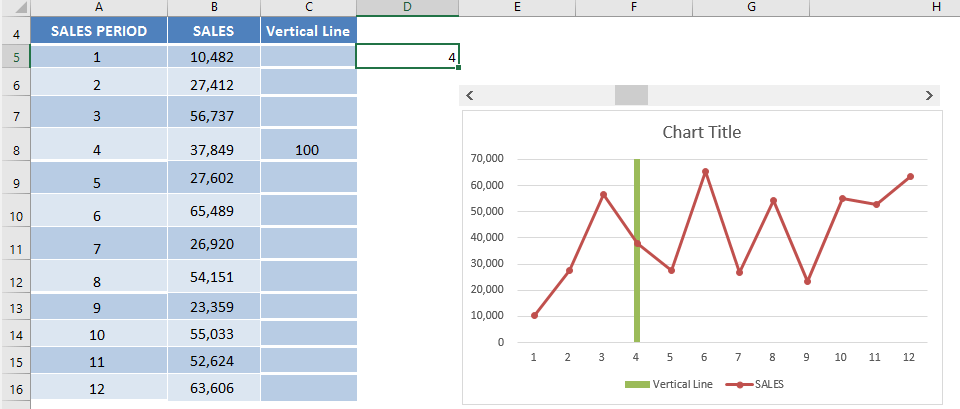
In Excel, it is very easy to add vertical date line Excel chart and make it interactive with a Scroll Bar! The reason why I do this is to use the vertical column to highlight a specific point in the Excel chart whilst I am presenting the data to my stakeholders. Mmmm Steak 🙂 In this example, I show you how easy it is to add vertical date line excel chart & sprinkled with a little magic using three different methods: Add Vertical Line using Shapes, Add Vertical Line using XY Scatter Plot, Add Vertical Line using Additional column series. Let’s look at each of these methods one-by-one!
Key Takeaways
- Enhances Chart Interactivity: Adding an interactive vertical column to a line chart allows users to highlight a specific data point dynamically, making the chart more engaging and easier to analyze.
- Uses Formulas for Automation: By combining helper columns and formulas (like
IFstatements), you can automatically generate the values for the vertical column based on user input or specific conditions. - Linked with Drop-Down Menus: You can integrate the interactive vertical column with a drop-down menu created using data validation. This lets users select a specific category or point to highlight in the chart.
- Dual Chart Types for Combination: To create this effect, you combine a line chart with a column chart. The column chart is used for the vertical bar, while the line chart displays the trend.
- Improves Data Analysis: This method is especially useful for presentations or dashboards where you want to focus on specific data points within a larger dataset, providing better insights for decision-making.
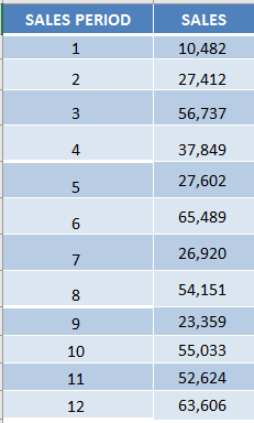
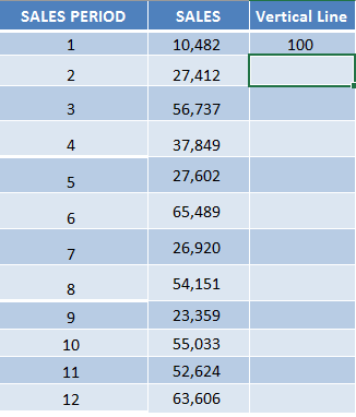
This is our data:
Table of Contents
Add Vertical Line using Shapes
The easiest way to add vertical line to Excel chart is to draw a line on top of the Excel Chart using shapes. Follow the steps on how to add a vertical line in Excel graph below:
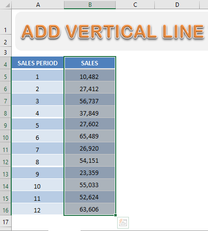
STEP 1: Select the data that will be used to create a chart.
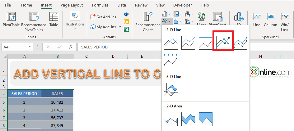
STEP 2: Go to Insert > Line Charts > Line with Markers.
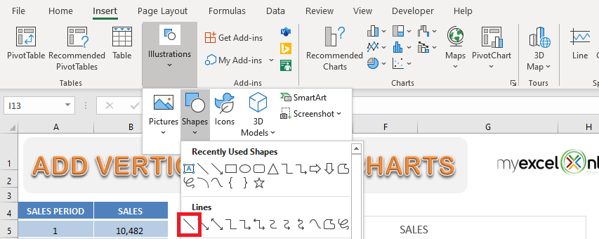
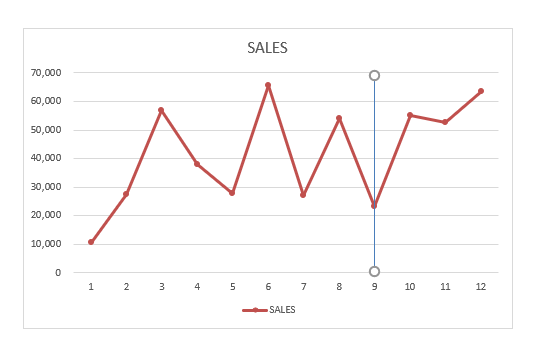
STEP 3: Go to Insert > Illustrations > Line.
STEP 4: Draw the line on top of the Chart.
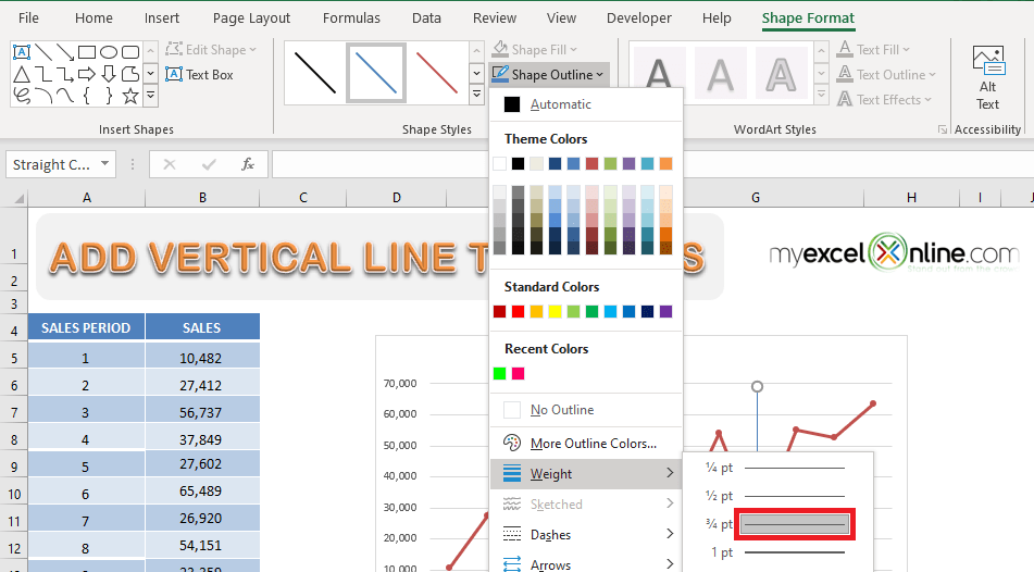
STEP 5: To increase the weight of the vertical line, Go to Shape Format > Shape Outline > Weight > 3/4 pt.
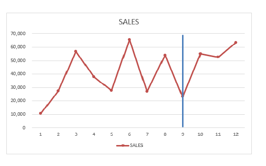
This will excel add vertical line to chart!
Even though this method is super easy, it comes with its own drawback.
This line is not linked to the data and hence will not change when you change the data. So, you will have to adjust this line as and when you update the data.
Add Vertical Line using XY Scatter Plot
To highlight a point in your chart, you can clearly define its position on the x-axis and create a vertical line for that plot.
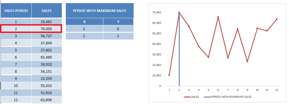
In this example, we will be using a scatter chart to highlight the period in the chart that has the maximum sales. Let’s see how it can be done:
STEP 1: Select the data that will be used to create a chart.
STEP 2: Go to Insert > Line Charts > Line with Markers.
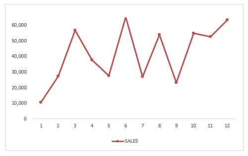
This is how your sales chart will look like:
Now, insert the data for your vertical line highlighting the period that achieved the maximum sales.
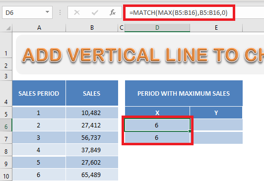
STEP 3: In cells D6 and D7, use the formula below to extract the sales period with the maximum sales amount.
=MATCH(MAX(B5:B16),B5:B16,0)
Here, the MAX Formula will return the largest sales amount in the array provided and the MATCH Formula will return the relative position of the maximum value in the array.
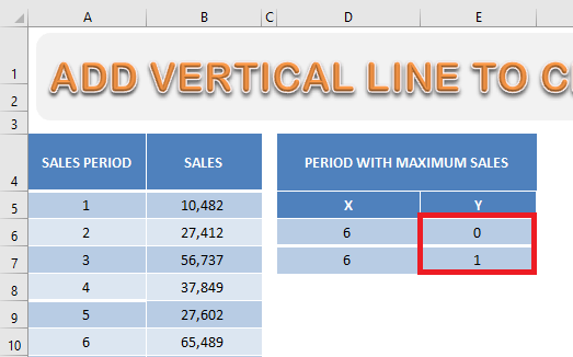
STEP 4: In cells E6 and E7, type the value 0 and 1 respectively.
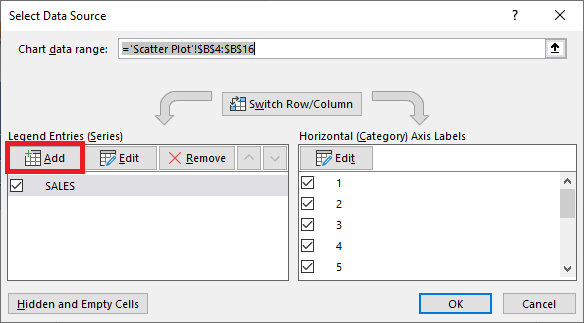
STEP 5: Click on the chart and then Go to Chart Design Tab > Select Data.
STEP 6: In the Select Data Source dialog box, click on the Add button.
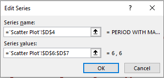
STEP 7: In the Edit Series dialog box, select cell D4 for the Series name box and cells D6:D7 for the Series Values box. Click OK.
STEP 8: Go to Chart Design > Change Chart Type.
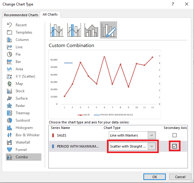
STEP 9: In the Change Chart Type dialog box, select Scatter with Straight Line and check the box for the secondary axis. Click OK.
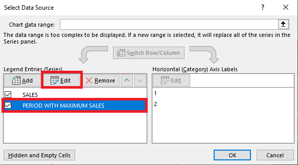
STEP 10: Again, Go to Chart Design> Select Data to open the Select Data dialog box. Select Period with Maximum Sales and then click on the Edit button.
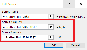
STEP 11: In the Edit Series dialog box, select cells D6 and D7 for X values and E6 and E7 for Y values. Click OK.
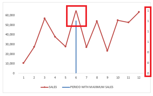
You will a vertical line for the sales period 6 has been created but it does not extend to the top of the chart. Let’s change that and remove the secondary axis label as well!
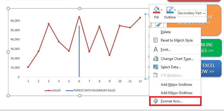
STEP 12: Right-click on the secondary axis and select Format Axis.
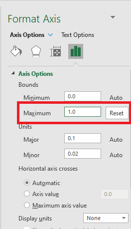
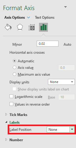
STEP 13: In the Format Axis dialog box, select the Maximum bound as 1 and the Label Position as None.
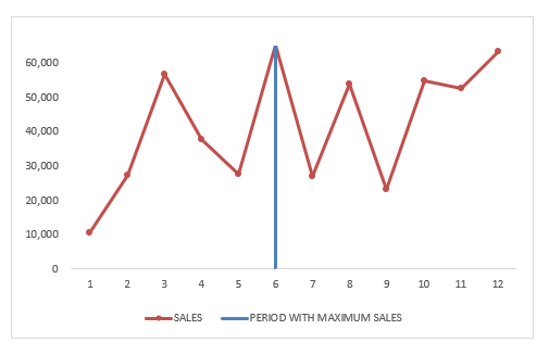
Your vertical column highlighting the maximum sales is now ready!
This line is dynamic as well. In this updated sales data, the highest sales are now achieved in the sales period 2. The Line chart, as well as the vertical column, gets updated based on the new data.
Add Vertical Line using Additional column series
The last method is to use an additional column for the vertical line. Let’s dive into a step-by-step tutorial on how to add vertical line in Excel graph:
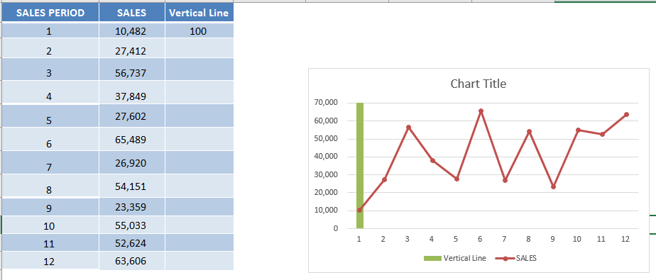
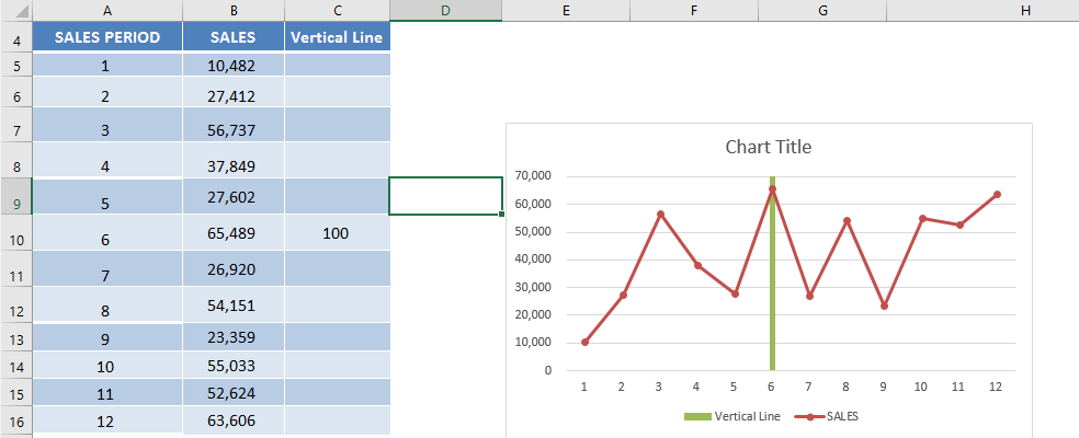
STEP 1: Add a new column Vertical Line, and place in the first value as 100.
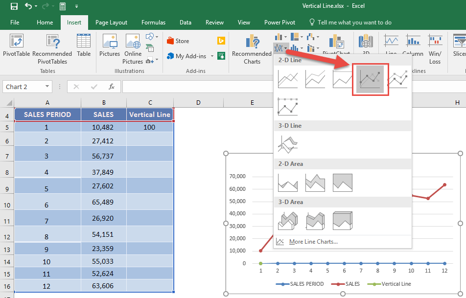
STEP 2: Select the entire table, go to Insert > Line Charts > Line with Markers
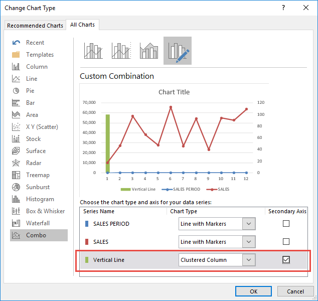
STEP 3: Select the chart and go to Design > Change Chart Type > Combo > Custom Combination
STEP 4: For the Vertical Line series, change the Chart Type to Clustered Column and check Secondary Axis. Press OK.
(This will transform the Vertical Line series into a vertical column in your chart.
Make sure the SALES PERIOD and SALES are Line with Markers Chart Types).
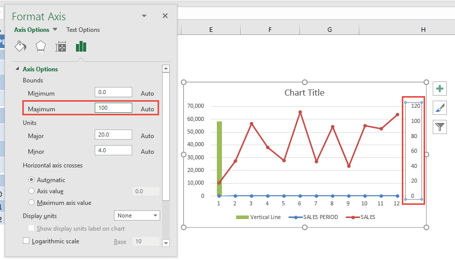
STEP 5: Double click your Secondary Axis to view the Format Axis Panel.
Set Maximum to 100, to ensure our Vertical Line extends all the way to the top since we placed in the value of 100.
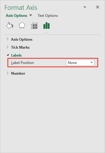
Click on Labels and change the Label Position to None.
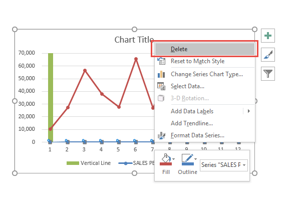
STEP 6: Just to clean up our chart, notice there is a Sales Period Series.
Right click on it and click Delete. We do not need this.
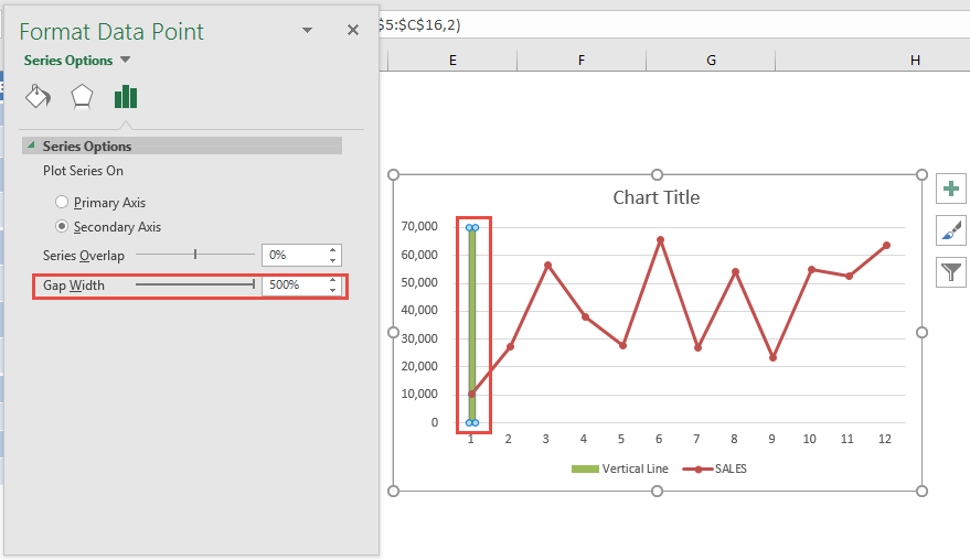
STEP 7: Double click on the vertical bar, so that we can make it slimmer.
In the Format Data Point pane, Set Gap Width to 500%.
STEP 8: Now it is time to try out our interactive chart!
Drag and drop the Vertical Line value of 100 into another Sales Period and see the column chart move!
STEP 9: There is a cooler trick and we can make the Vertical Bar become Dynamic! For this we need the Developer Tab.
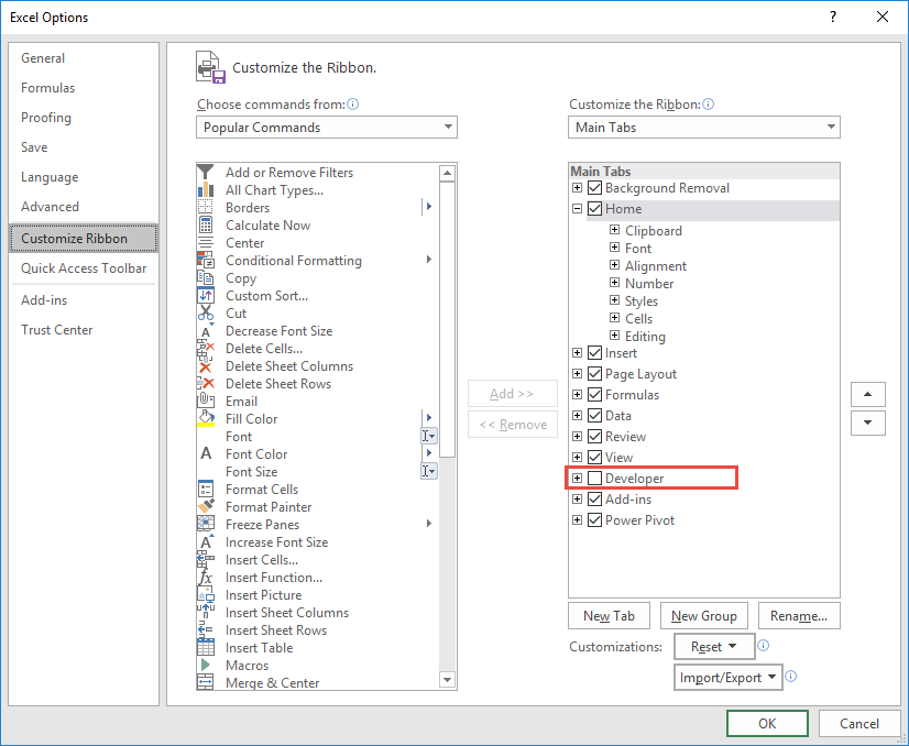
If you do not have the Developer Tab enabled yet, it is very easy to enable this first. Go to File > Options
Go to Customize Ribbon > Main Tabs > Developer. Check this and click OK.
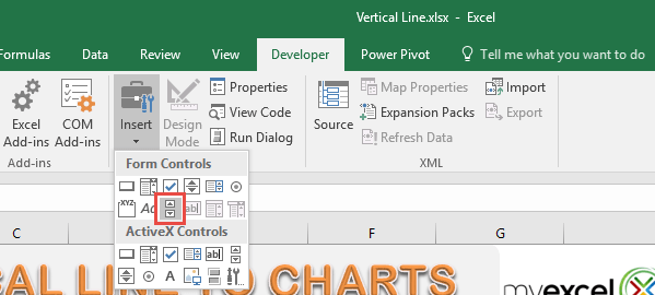
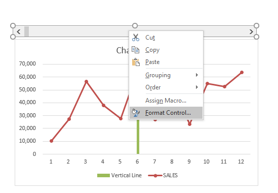
STEP 10: Go to Developer > Insert > Form Controls > Scroll Bar. Drag this horizontally on top of the graph.
STEP 11: Right click on the scroll bar and select Format Control.
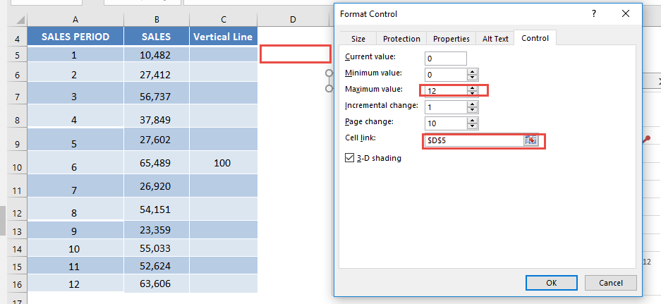
STEP 12: Set the Maximum Value to 12. This will depict our sales periods from 1 to 12.
For the Cell link, place in $D$5, this will show the value of the Scroll bar in this cell (i.e. which sales period it’s pointing to). Press OK.
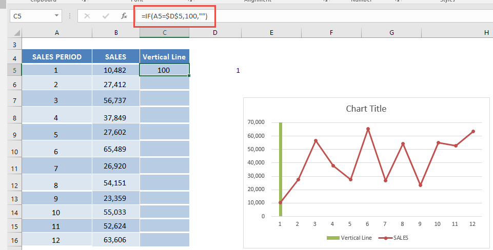
STEP 12: In the Vertical Line column, place in this formula: =IF(A5=$D$5,100,””)
What this will do, is simply check if the Sales Period matches the value of the Scroll bar ($D$5).
If YES, then set the value to 100.
Setting the value to 100 will then make our vertical line show up in that Sales Period!
Now the pieces are almost all in place!
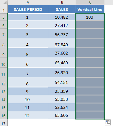
STEP 13: Double click the lower right corner of the formula cell, which will copy the same formula down the entire column.
Your interactive chart is now complete!!!
Try playing around with the scroll bar and see the Vertical Line move with it! Cool hey?
Frequently Asked Questions
How can I add an interactive vertical column to a line chart in Excel?
To add an interactive vertical column, create a helper column with a formula that returns values only for the specific data point you want to highlight. Then, insert a line chart and add the helper column as a new series. Change the chart type of the new series to a column chart to create the vertical column effect.
Can I use a drop-down menu to make the vertical column interactive?
Yes, you can use a drop-down menu created with data validation to select a specific data point. Combine the drop-down menu with formulas (like IF) in your helper column to adjust the position of the vertical column dynamically based on the user’s selection.
What is the purpose of the helper column in this method?
The helper column is used to isolate the value of the data point you want to highlight. It uses logic (e.g., IF formulas) to show the value for the selected point and 0 for all other points, enabling the creation of the vertical column.
How do I combine a line chart with a column chart in Excel?
After inserting your line chart, add the helper column as a new data series. Right-click the new series, select Change Chart Type, and choose Column Chart. This allows you to overlay the column chart on the line chart for the desired interactive effect.
Can I customize the appearance of the vertical column?
Yes, you can format the vertical column by selecting it in the chart and using the formatting options. You can adjust the color, width, transparency, and other properties to make it visually distinct and align with your chart design.

Bryan
Bryan Hong is an IT Software Developer for more than 10 years and has the following certifications: Microsoft Certified Professional Developer (MCPD): Web Developer, Microsoft Certified Technology Specialist (MCTS): Windows Applications, Microsoft Certified Systems Engineer (MCSE) and Microsoft Certified Systems Administrator (MCSA).
He is also an Amazon #1 bestselling author of 4 Microsoft Excel books and a teacher of Microsoft Excel & Office at the MyExecelOnline Academy Online Course.
