Creating a KPI dashboard in Excel is one of my go-to methods for tracking performance metrics in a visually engaging and easy-to-understand way. Excel is incredibly versatile, making it a fantastic choice for building dashboards that can keep you and your team focused on what matters most.
Let me walk you through the steps I take to create a well-structured KPI dashboard in Excel, so you can start monitoring your key metrics effectively.
Key Takeaways:
- KPI Dashboards offer a clear view of crucial metrics, helping to assess success and identify improvement areas.
- Its familiarity, flexibility, and easy integration make it a preferred tool for creating KPI dashboards.
- Selecting the right KPIs aligned with business goals ensures the dashboard is actionable.
- Structuring data in tables and using dynamic ranges in Excel helps maintain dashboard accuracy.
- Charts, conditional formatting, and clean layouts make dashboards easy to interpret and visually appealing.
Table of Contents
Introduction to Mastering KPI Dashboards in Excel
The Importance of KPI Dashboards in Performance Management
KPI dashboards hold an invaluable role in performance management, providing a visual representation of a company’s vital metrics at a glance. With these dashboards, we can both celebrate our successes and pinpoint areas in need of improvement.
By centralizing financial and operational data on a single page, we undercut the time spent toggling between various reports and enhance our decision-making process.
Why Excel Remains a Popular Choice for KPI Dashboards
Excel’s steadfast popularity for creating KPI dashboards stems from its widespread use and familiarity within the business community. We’re witnessing a world where data visualization tools abound, yet Excel remains the cornerstone for many due to its accessibility and integration into our daily workflows.
It simplifies our lives by allowing us to manage data, craft visualizations, and keep dashboards current within a single ecosystem. This familiarity often translates into efficiency, wherein stakeholders from various departments can easily interpret and collaborate on the insights derived from the Excel KPI dashboards.
Furthermore, Excel’s broad functionality means that I can customize dashboards to a high degree, meeting the nuanced needs of different businesses or departments. Bart Vittori, for instance, leverages Excel for both his sales team and executive reviews, ensuring transparent and effective communication of critical business metrics.
As Excel continues to be an indispensable tool in the business environment, its role in developing KPI dashboards becomes ever more important. Despite the sophisticated options available on the market, Excel’s simplicity and versatility hold strong, ensuring its position as a go-to choice for KPI tracking and reporting.
Step-by-Step Guide to Create KPI Dashboard in Excel
Define the Key Metrics
The first thing I do when building a KPI dashboard is to decide which metrics I need to track. KPIs are highly specific to each business, so I take the time to consider what matters most. Here are a few examples of common KPIs across different areas:
- Sales KPIs: Total Revenue, Sales Growth, Customer Acquisition Cost
- Marketing KPIs: Conversion Rate, Website Traffic, Return on Ad Spend
- Operational KPIs: Production Efficiency, Lead Time, Inventory Turnover
- Financial KPIs: Gross Profit Margin, Net Profit, Cash Flow
Once I have my list, I make sure each KPI aligns with my organization’s goals. This ensures that the data I include on the dashboard is meaningful and actionable.
Collect and Prepare the Data
With my KPIs defined, I gather the data for each metric. I usually use data from multiple sources like internal reports, databases, or external platforms. Once I have the data, I format it in a way that Excel can easily understand. Here’s what I do:
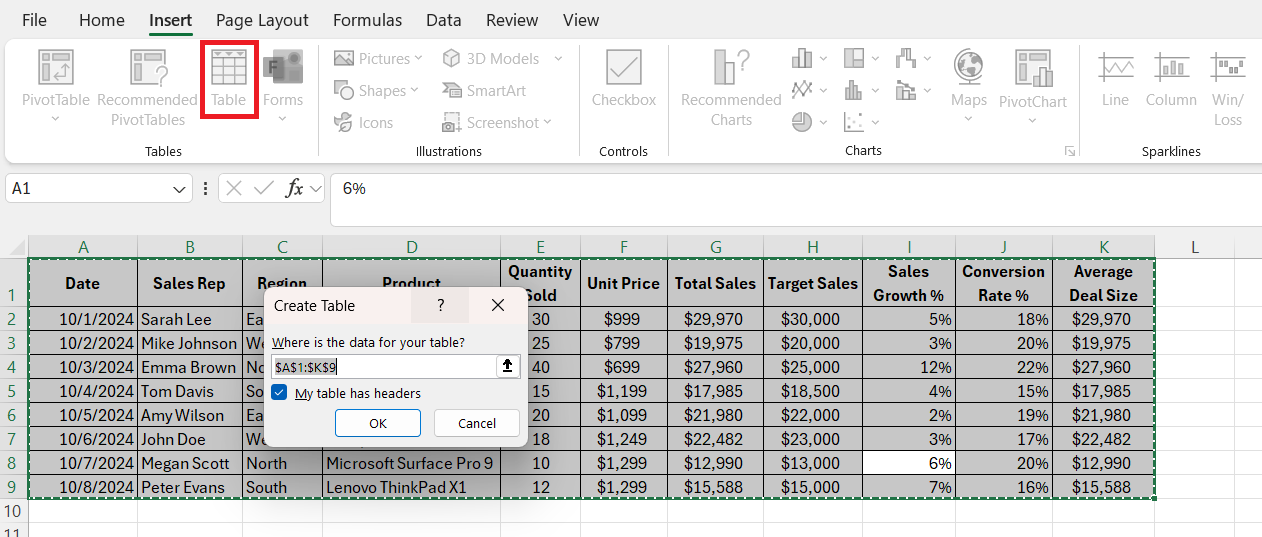
- Organize the data in tables: Excel tables are a powerful way to manage data, as they allow me to use named ranges and structured references.
- Use consistent formatting: I make sure my data uses consistent formatting for dates, currencies, and numbers.
- Set up dynamic ranges: By creating dynamic ranges using named ranges or structured references, I can ensure that the data updates automatically when I add new entries.
Build the Dashboard Layout
Now comes the fun part—designing the dashboard layout. I keep my layout simple and organized, as a cluttered dashboard can make it hard to extract insights quickly. Here’s the structure I typically use:
- Header: This includes the dashboard title, the report date, and any filters I want to add (such as date ranges or categories).
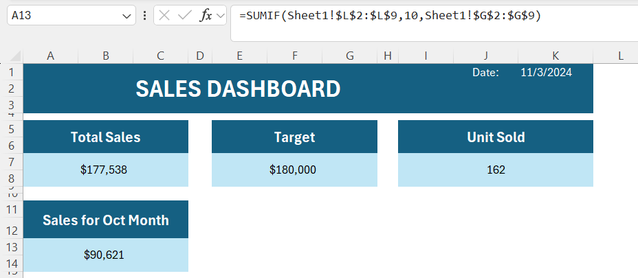
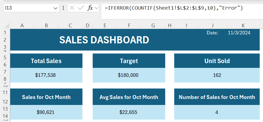
- KPI Summary: I like to show key metrics at the top of the dashboard in large, easy-to-read numbers. For example, I might display Total Revenue, Target Sales, Total units sold, etc.
Create Dynamic KPIs Using Formulas
One of Excel’s strengths is its powerful formulas. Here are a few formulas I rely on to make my KPI dashboard dynamic:
- SUMIF/SUMIFS: I use these functions to calculate totals based on specific criteria, such as revenue for a particular month.
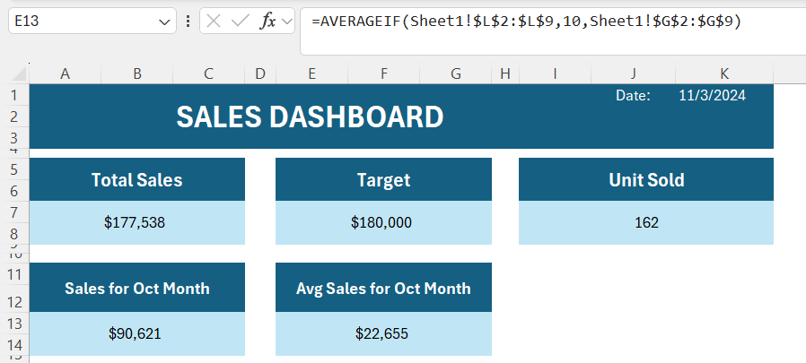
- AVERAGEIF/AVERAGEIFS: These are great for calculating average metrics, like average order value.
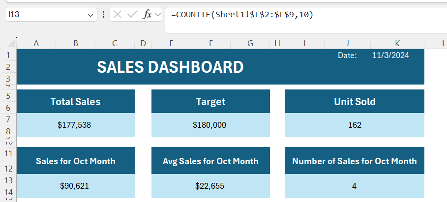
- COUNTIF/COUNTIFS: For metrics like the number of sales or customer count, COUNTIF and COUNTIFS are essential.
- IF and IFERROR: I use these functions to handle errors or conditional logic, which makes the dashboard look more polished.
Add Visualizations for Key Insights
To make my dashboard visually appealing and easy to interpret, I use a mix of Excel charts and conditional formatting. Here’s how I approach each type of visualization:
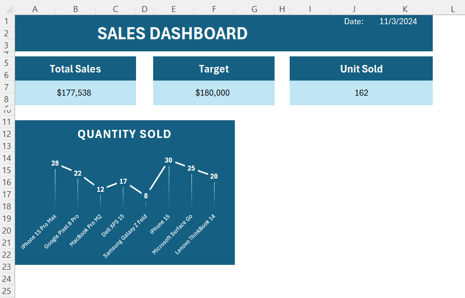
- Line Charts: For showing trends over time, line charts are invaluable. I use them to track metrics like Monthly Revenue or Customer Growth.
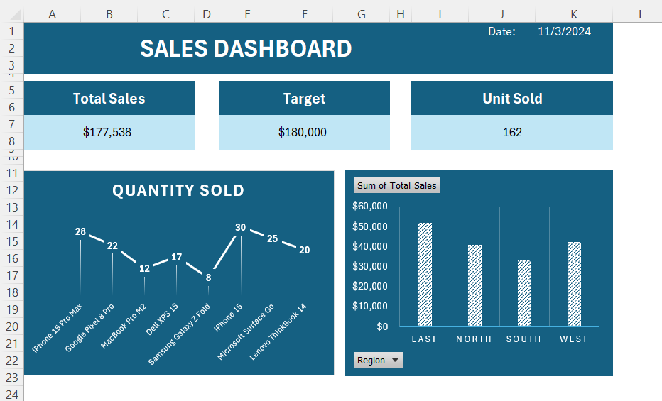
- Bar and Column Charts: These are perfect for comparing values across categories. For example, I might use a bar chart to compare sales by region.
- Gauge or Speedometer Charts: Gauge charts are especially helpful for showing progress toward a goal. I create a gauge to show how close I am to targets.
- Conditional Formatting: This is a quick way to highlight trends. For example, I might use conditional formatting to color-code cells based on performance, such as turning red for below-target values and green for those meeting or exceeding targets.
Final Touches and Formatting
To give my dashboard a polished, professional look, I follow these formatting best practices:
- Consistent Fonts and Colors: I use the same font style and color scheme throughout the dashboard.
- Borders and Spacing: Adding borders and ensuring even spacing between elements keeps everything organized.
- Highlighting Key Metrics: I use larger font sizes or bold formatting for the most critical KPIs so they stand out.
- Legend and Titles: Clear titles and legends help explain what each chart and metric represents.
Tips & Tricks
- Use Power Query: For more complex data, I often use Power Query to transform and load data directly into Excel. It saves me a lot of time by automating data updates.
- Leverage Power Pivot: If I need to create more advanced reports, I use Power Pivot to manage large datasets and build more sophisticated calculations.
- Save as a Template: Once I’ve created a dashboard I’m happy with, I save it as a template so I can reuse it with different data sets.
Building a KPI dashboard in Excel may seem complex, but following these steps helps me streamline the process and create a tool that delivers real insights.
FAQ: Navigating KPI Dashboards in Excel
What is a KPI?
A KPI, or Key Performance Indicator, is a quantifiable metric used to evaluate how effectively a company or an individual is achieving key business objectives. KPIs are used to gauge performance over time, providing targets for teams and individuals to aim for and metrics against which they can be evaluated.
They act as a guide to track progress and identify areas that require improvement or adjustment in strategy. They’re not just numbers; they’re informative signposts guiding the way to business success.
Why use KPI dashboards?
KPI dashboards are essential because they provide a centralized view of all key metrics, making it easier to monitor performance at a glance. They help managers and teams understand where the company stands in real time, making it easier to celebrate successes and identify problem areas. By focusing on actionable data, KPI dashboards support faster and more effective decision-making. This clarity is invaluable for aligning everyone toward the same goals.
What are some essential KPIs to track?
Common KPIs include Total Revenue, Sales Growth, Conversion Rate, and Gross Profit Margin, each of which provides insight into different aspects of business health. Sales KPIs, like Customer Acquisition Cost and Sales Growth, are critical for tracking customer-related metrics, while Operational KPIs like Production Efficiency and Inventory Turnover highlight internal processes.
Financial KPIs such as Net Profit and Cash Flow are fundamental to understanding profitability and liquidity. Selecting KPIs that align with specific business goals ensures the dashboard remains relevant and actionable.
Which Excel functions are useful for KPIs?
Excel offers a range of functions that make KPI tracking more dynamic and responsive, such as SUMIF/SUMIFS, which can sum data based on specific conditions, and COUNTIF/COUNTIFS for counting entries under certain criteria. AVERAGEIF/AVERAGEIFS functions help in calculating averages for selected conditions, making it easier to assess trends like average sales per period.
Conditional IF and IFERROR statements allow you to handle errors or apply conditional logic, which makes the dashboard cleaner and more reliable. These functions allow users to create highly customizable dashboards that adapt as data changes.
How Do I Customize an Excel KPI Dashboard Template to Fit My Needs?
To customize an Excel KPI dashboard template, start by identifying the KPIs that are most relevant to your business objectives. Replace the default data in the template with your own data sources. Adjust the charts, tables, and conditional formatting rules to reflect the new data and suit your reporting style. Personalize the design with your company’s branding, colors, and fonts for a consistent look and feel. Finally, incorporate interactive elements such as slicers, dropdown menus, or buttons to make your dashboard user-friendly and adaptable to various users’ needs.
John Michaloudis is a former accountant and finance analyst at General Electric, a Microsoft MVP since 2020, an Amazon #1 bestselling author of 4 Microsoft Excel books and teacher of Microsoft Excel & Office over at his flagship MyExcelOnline Academy Online Course.


