Visualizing data is essential when working with Excel, and one of the most effective ways to do this is by using a line graph. Line graphs help track trends over time and make it easier to analyze patterns. In this guide, I’ll walk you through the process of creating a line graph in Excel step by step.
Key Takeaways:
- Line graphs in Excel effectively visualize trends over time, making data analysis clearer.
- Selecting well-structured, continuous data ensures accurate and meaningful line chart representations.
- Customizing charts with colors, markers, and formatting improves readability and impact.
- Advanced features like trendlines and multiple data series enhance predictive insights and comparative analysis.
- Troubleshooting common issues like misrepresentation or cluttered visuals ensures clarity and effectiveness.
Table of Contents
Introduction to Line Graph Mastery in Excel
Unveiling the Power of Excel’s Line Graphs
Excel’s line graphs offer an unparalleled ability to visualize trends and changes over time. The beauty of line charts lies in their simplicity and clarity, allowing us to portray complex information in a way that’s easy to digest. I find that when I need to tell a story with numbers, a well-crafted line graph can be a compelling narrator.
Elevating Data Storytelling with Line Charts
Line charts serve as a critical tool in my data storytelling arsenal. By transforming numeric data into a visual narrative, I use them to highlight trends, pinpoint anomalies, and communicate insights in a way that resonates with any audience. Their ability to reveal the rise and fall of values over time enhances the impact of the stories told through data, providing a higher level of understanding that numbers alone cannot convey.
Selecting the Right Data for Your Line Graph
Criteria for Choosing Line-worthy Data
When selecting data for a line graph, I always aim to ensure it will effectively communicate the intended message. Suitable data types include time series to showcase trends, comparative figures for cross-category analysis, or scientific measurements for observing variable changes.
The criteria I use for line-worthy data involve continuity, comparability, and clear progression over time or categories, all of which are paramount to highlighting the story that lurks within the numbers.
Organizing Your Dataset for Precision and Clarity
In organizing datasets for precision and clarity, meticulous structure is key. I arrange data chronologically or by category, ensuring that each column represents a unique variable. Clear headers identify the variables or categories, providing at-a-glance understanding. This organization eliminates confusion and paves the way for accuracy and efficacy in the line graph. Adequate labeling and consistent measurement units across all series are non-negotiable practices for clarity.
Step-by-Step Creation of a Compelling Line Chart
Starting with the Basics: Inserting a Line Chart
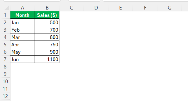
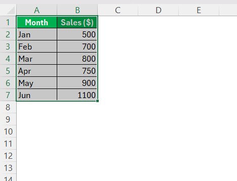
To insert a line chart, I begin by highlighting the dataset—including headers and data points.
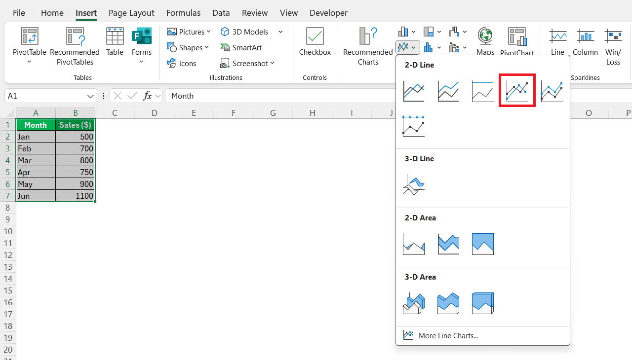
This step is crucial as it defines what will be plotted. Next, I navigate to the “Insert” tab and choose the “Line” chart type from the “Charts” group.
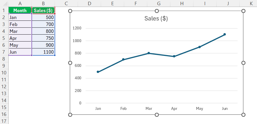
Here, I can select from various line chart styles, depending on the intended presentation of the data. The moment I click the preferred style, Excel magically transforms the selected data into a basic line chart, providing an immediate visual representation of the data.
Customizing the Look – A Guide to Chart Formatting
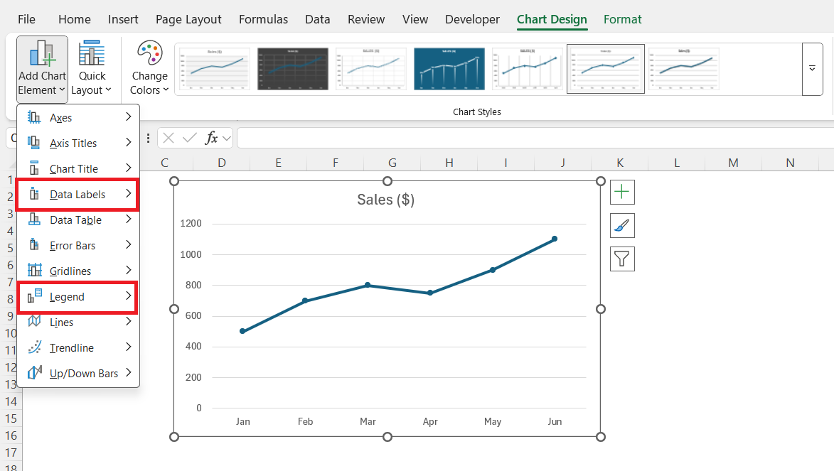
Chart formatting is where a good graph can become great. After inserting the basic chart, I explore the plethora of formatting options to enhance its visual appeal. This includes modifying line styles, colors, and markers for each data series to ensure differentiation and focusing on legibility by adjusting the overall chart and plot area.
I add elements like legends and data labels for context.
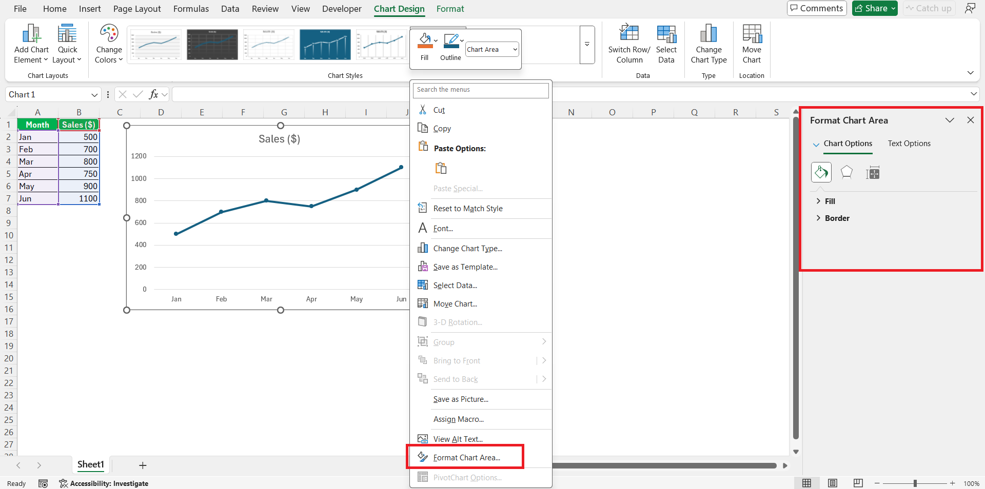
Lastly, to access all formatting options and apply finer customizations, I right-click the chart element or use the Chart Tools Format pane.
Advanced Visualization Techniques
Adding Depth to Your Graph with Multiple Lines
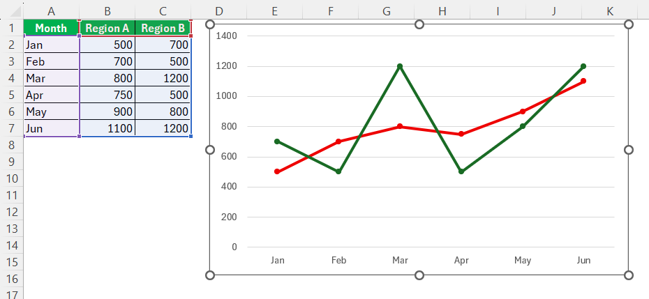
Adding multiple lines can turn a simple chart into a multidimensional analysis tool. To add depth to my graph, I incorporate more than one data series, making sure each represents a different aspect or subset of the same topic. This allows me to compare different elements directly within the same time frame or category.
To maintain clarity, I limit the number of lines and use different styles or colors—especially when dealing with complex datasets. It’s a delicate balance, though; too many lines can create confusion, known as a “spaghetti plot”. The key is to provide clear, scoped narratives within a single chart.
Tweaking Visual Elements for Maximum Impact
To make a line chart truly impactful, I adjust visual elements for readability and emphasis. I experiment with contrasting colors and add markers to distinguish between data series or highlight significant points. Using a strategic approach to gridlines—sometimes less is more—I create a cleaner look that directs attention to the data itself.
Additionally, I format the axes for clear delineation of scales and intervals. An engaging line graph is not just about the data it conveys, but also about its ability to guide an audience through the narrative with ease.
Analytical Enhancements for Your Line Chart
Utilizing Trendlines for Predictive Insights
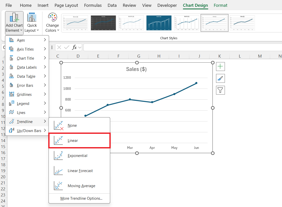
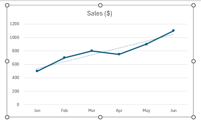
Trendlines are instrumental in revealing the underlying tendencies in datasets. To utilize them for predictive insights, I first ensure that my line chart accurately reflects the trends I want to analyze. Then, by adding a trendline—I usually opt for linear or moving average types—I can forecast beyond the dataset and estimate future values.
These trendlines offer a visual approximation of data movement, which can be incredibly enlightening.
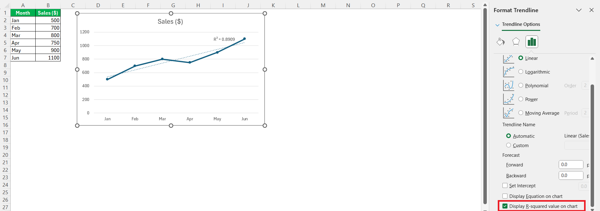
The trendline feature in Excel also allows me to display the R-squared value, which quantifies the trendline’s accuracy in representing the observed data.
Spotlighting Key Data Points with Markers and Color Changes
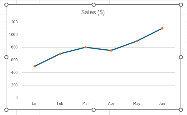
To spotlight key data points, I make strategic use of markers and color changes. Markers can signify important events or anomalies within the data, drawing the eye to where it’s most needed. Additionally, changing the color of a particular data point or segment can signal a deviation from the norm or highlight a period of interest.
For instance, a sudden spike in user engagement might be marked with a bright color.
This notelineates the segment or points of special interest within a larger dataset, making complex data more accessible.
Troubleshooting Common Line Chart Issues
Addressing Unexpected Data Representation Challenges
Unexpected data representation challenges often arise when there’s a disconnect between the chart and the data’s story. To address these, I scrutinize the axes scales, as they can unintentionally exaggerate or diminish trends. I adjust the scale to a more appropriate range, ensuring a fair representation of all data points. If overlapping labels occur, I either adjust their position or abbreviate text for readability. It’s important to carefully examine the chart for any misrepresentation and not to assume the default settings will always serve the data best.
Overcoming Limitations with Creative Solutions
Overcoming limitations in line graphs requires creative solutions that could involve using combination charts, where I might add a secondary axis to represent different data scales, or break up a complex dataset into multiple charts for clarity. Interactive controls like slicers can also help viewers filter what they see. In instances where Excel’s built-in features fall short, I might turn to add-ins or even external data visualization tools to achieve the desired objectives. It’s about being resourceful and open-minded to alternate methods of presenting data when conventional means hit their limits.
FAQ: Fine-Tuning Your Excel Line Graph Skills
How do I make a line graph in Excel?
To make a line graph in Excel, first enter your data into columns, including headers. Select the data range, then go to the ‘Insert’ tab, click on the ‘Line’ chart drop-down menu, and choose a line graph style. Excel will produce the line graph based on your selected data.
How do you personalize data markers in a line graph?
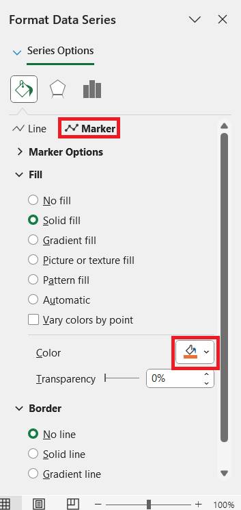
To personalize data markers in a line graph, right-click on the data series and select “Format Data Series.” Under the “Marker” options, choose the desired size, shape, and color. You can apply unique styles to different data points for emphasis.
What are the different types of line charts available in Excel?
Excel offers several line chart types: the classic 2-D Line, Stacked Line, 100% Stacked Line, Line with Markers, and 3-D Line. Each serves various data representation purposes, such as showing cumulative totals or part-to-whole contributions.
When is it better to use a scatter chart instead of a line graph?
Use a scatter chart instead of a line graph when you need to show the relationship between two numerical variables or to explore patterns and correlations in data points that are not connected by time or sequential order.
Can you create individual line graphs for each row of data?
Yes, individual line graphs for each row of data can be created by using Excel Sparklines. Located under the ‘Insert’ tab, Sparklines offers mini-chart representations to showcase trends directly in cells adjacent to the data.
John Michaloudis is a former accountant and finance analyst at General Electric, a Microsoft MVP since 2020, an Amazon #1 bestselling author of 4 Microsoft Excel books and teacher of Microsoft Excel & Office over at his flagship MyExcelOnline Academy Online Course.

