When creating my PowerPoint slide deck, I pay particular attention to line spacing. It’s crucial for making sure my content isn’t just legible but also visually enticing. I consider line spacing to be the breathing space between sentences—it’s that sweet spot where clarity and comfort coexist. By diligently adjusting the line spacing for PowerPoint slides, I can greatly improve my audience’s experience, ensuring they stay engaged and better comprehend my message.
Key Takeaways
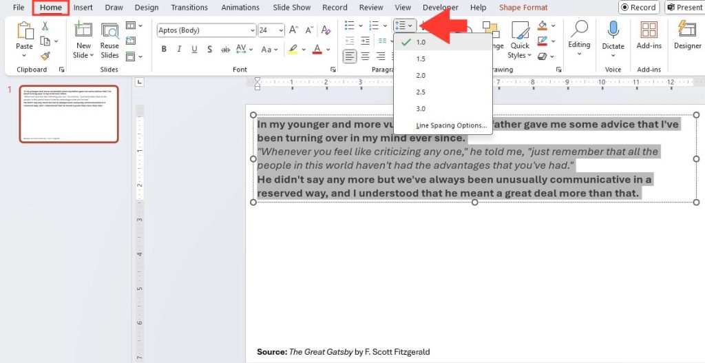
- Adjust line spacing in PowerPoint by selecting the desired text, going to the Home tab, and then choosing from preset line spacing options in the Paragraph menu, such as 1.0, 1.5, 2.0, 2.5, or 3.0.
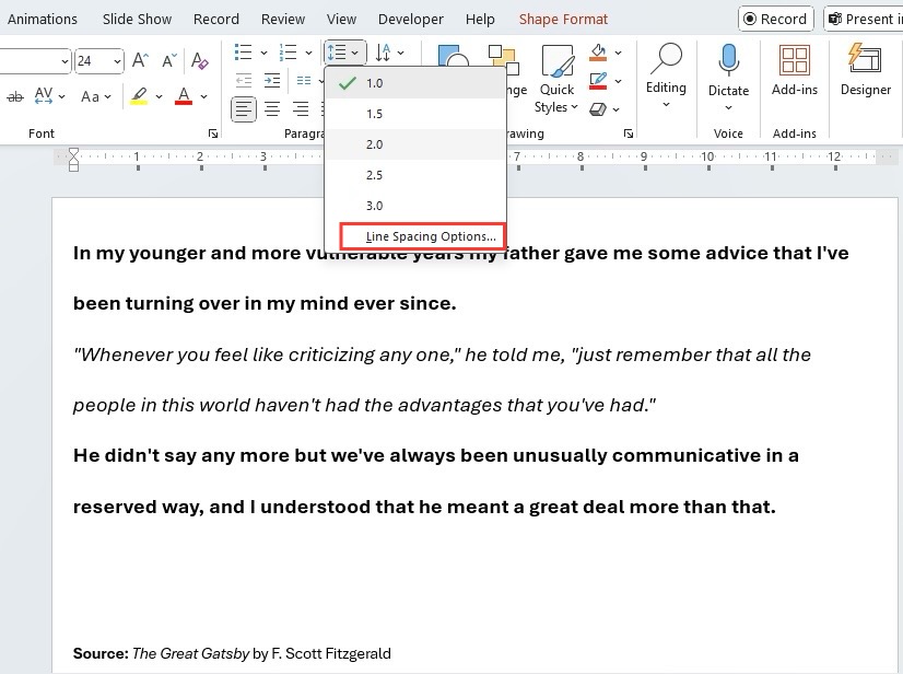
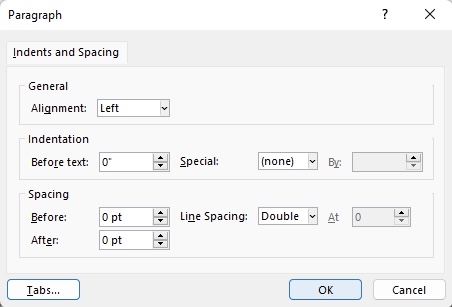
- For custom line spacing, select Home -> Line Spacing -> Line Spacing Options to access a dialog box where you can set specific spacing parameters, as well as adjust indent and text alignment.
- Line spacing can enhance legibility and slide aesthetics in PowerPoint; thus, it’s important to customize it appropriately to maintain text relevance and visual appeal within the slide’s content.
Overview of PowerPoint’s Text Formatting Options
I love that PowerPoint allows me to easily refine the look of my presentations with its robust text formatting capabilities. By tweaking line spacing and vertical alignment, I can give my text a polished appearance that enhances readability and impact. Whether I’m going for single or double spacing, aligning text to the top, middle, or bottom, or adjusting indentation and alignment to left, center, right, or justified, all the options are right there in the Home tab. The ease of access to these tools lets me quickly experiment and determine the most visually appealing layout for my slides.
Table of Contents
Step-by-Step Guide to Adjusting Line Spacing
Accessing the Line Spacing Features
To access the line spacing features in PowerPoint:
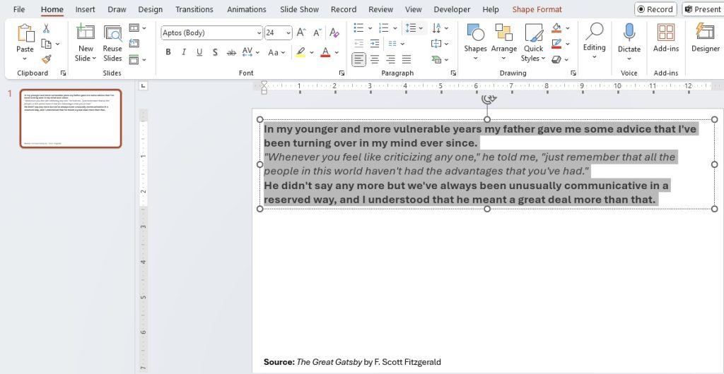
STEP 1: Select the text that requires adjustment.
STEP 2: Navigate to the Home tab which is prominently situated in the top menu bar > Line Spacing command within the Paragraph group of this tab. A simple click on this command reveals a dropdown menu, offering a selection of commonly used line spacing presets for your convenience. This is your first stop for making quick and efficient line spacing adjustments to give those words a little more room to breathe.
Customizing Your Slide’s Text Appearance
Once you’ve accessed the line spacing features, customizing your slide’s text appearance becomes a matter of a few strategic tweaks. To go beyond the presets, PowerPoint allows you to dive into the Line Spacing Options. Here you can fine-tune settings like the exact spacing measurements – expressed in points – and even set specific spacing before and after paragraphs for that extra control.
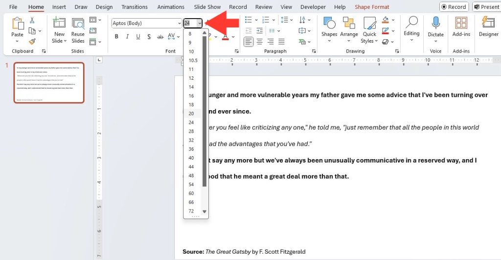
Increasing the font size is also a crucial part of customizing your text. This can be easily done by selecting your text box > clicking on the Home tab > then adjusting the font size to ensure optimum visibility.
Remember, the goal is to make your slide easy to read at a glance, so don’t shy away from scaling up those fonts to fill the space effectively.
Tips for Effective Line Spacing in Presentations
Balancing Readability with Aesthetics
Balancing readability with aesthetics is the key to presenting text that not only communicates effectively but also looks good. When you adjust line spacing, it’s important to consider the readability of your text, ensuring that it isn’t cramped and overwhelming, or too spaced out causing the reader’s focus to drift. But aesthetics play a role too – the spacing should match the tone and style of your presentation.
To find that sweet spot, preview your slides to see how they look from a distance, simulating an audience perspective. Experiment with different line spacings while paying attention to the overall look and feel of your slides. Aesthetic appeal and readability go hand-in-hand, and when they’re well-balanced, your presentation can capture and retain the audience’s attention with ease.
Choosing the Right Line Spacing for Different Contexts
Choosing the right line spacing can depend on various contexts such as the amount of text on a slide, the size of your audience, or even the content’s formality level. For example, tight line spacing can make a dense, informative slide appear even more overwhelming, while generous spacing can underpin key points by giving them the space to stand out. If your audience is seated far from the screen, wider line spacing can enhance legibility.
On the more formal side, a business or academic presentation might merit an assertive 1.5 line spacing to balance professionalism with clarity. In a less formal context, like an interactive workshop, playful multiple line spacing can add to an engaging atmosphere. Remember to preview the slides in slideshow mode to ensure your choices translate as intended when projected.
Troubleshooting Common Line Spacing Issues
Fixing Inconsistent Spacing Across Slides
Fixing inconsistent spacings across slides is essential for maintaining a cohesive look throughout your presentation. Inconsistency can be distracting and may sharply reduce the professional feel of your slides. To achieve uniformity, use the ‘Format Painter’ tool, which allows you to copy formatting from one block of text to another with ease.
First, select the text with the spacing you want to replicate. Click on the ‘Format Painter’ icon in the Home tab, then apply it to the text on other slides.
For multiple selections, double-click the ‘Format Painter’ icon. This handy tool ensures that your line spacing is consistently applied, keeping your audience focused on your message, rather than the formatting quirks.
Addressing Overcrowded or Sparse Text Fields
When you encounter overcrowded text fields, it suggests the need for increased line spacing or even a reduction of content for better legibility. Start by increasing the spacing to allow each line of text to stand out, or alternatively, edit down the text to the most essential points. Adding bullet points or subheadings can also break up large blocks of text, making the content more digestible.
Conversely, sparse text fields can create a disjointed look and distract the audience from your main points. In this case, consider decreasing the line spacing to create a more unified block of text or add relevant content to utilize the empty space effectively. Visual aids, such as graphs or images, can also fill the space and complement the text. Ensuring that every slide has a balanced and cohesive appearance can make a significant impact on the effectiveness of your presentation.
Enhancing Your Presentation’s Flow with Line Spacing
Using Line Spacing to Highlight Key Points
Using line spacing strategically can serve as a subtle yet powerful way to highlight key points in your PowerPoint presentation. By increasing the spacing before and after a critical piece of information, you can naturally draw the audience’s attention to it. This technique separates the important text from the surrounding content, much like how a frame emphasizes a picture.
In cases where you have a list of items and wish to emphasize one or two, adjusting the line spacing can make those points stand out. Remember, such formatting tips should be used sparingly to maintain impact; overuse can dilute their effectiveness and result in a cluttered presentation. Line spacing is a tool in your visual communication toolkit—use it wisely to underscore the most impactful information.
Integrating Line Spacing with Other Design Elements
Incorporating line spacing effectively means considering how it interacts with other design elements in your PowerPoint slides. Consistent line spacing can create harmony alongside fonts, colors, and imagery. For instance, if your design involves a lot of visual elements, tighter line spacing can help maintain a clean, uncluttered look. Conversely, if your slides are text-heavy, a generous line spacing can improve readability and provide a visual breather.
Matching the line spacing to the mood and rhythm of your presentation can also reinforce the content’s message. For slides meant to convey energy and movement, line spacing that mimics this dynamic can complement the feeling. On slides where the pace is meant to slow down, perhaps for reflection or emphasis, a wider line spacing can visually cue the audience to the shift. Aligning line spacing with design objectives helps to create a seamless viewer experience.
Frequently Asked Questions (FAQ)
How do I change line spacing for bullet points in PowerPoint?
To change line spacing for bullet points, select the text containing the bullets, then go to the Home tab, click the Line Spacing icon, and choose your desired spacing. For custom settings, select Line Spacing Options and tweak as needed. Just a few simple steps, and your bullet points will have the perfect breathing room!
Can I apply custom line spacing to specific sections of text?
Yes, you can apply custom line spacing to specific sections of text in PowerPoint. Simply highlight the text segment you want to modify, click on the Line Spacing option in the Home tab, and choose ‘Line Spacing Options’ from the dropdown to set your desired spacing values for that particular selection. This way, you can fine-tune different parts of your slide for visual impact.
What is the best line spacing setting for readability during a presentation?
The best line spacing setting for readability during a presentation typically falls between 1.5 to 2.0. This range provides clear separation between lines, making text easier to read, especially from a distance. But remember, the ideal setting can vary based on your presentation context and audience needs, so it’s always wise to test and adjust accordingly.
John Michaloudis is a former accountant and finance analyst at General Electric, a Microsoft MVP since 2020, an Amazon #1 bestselling author of 4 Microsoft Excel books and teacher of Microsoft Excel & Office over at his flagship MyExcelOnline Academy Online Course.

