Learn about Excel with our Free Microsoft Excel Online Course!
Key Takeaways
- Ensure the outline color contrasts with the background to enhance visibility; reserve outlining for key points or headings to avoid overuse.
- Opt for outlining larger text to improve readability while maintaining a balance to prevent the text from being too distracting.
- Experiment with different outline colors and thicknesses, and view your presentation from a distance to verify readability and visual appeal.
Table of Contents
Part 1: Getting Started With Text Outlines in PowerPoint
Insert Text Box: The First Step in Text Styling
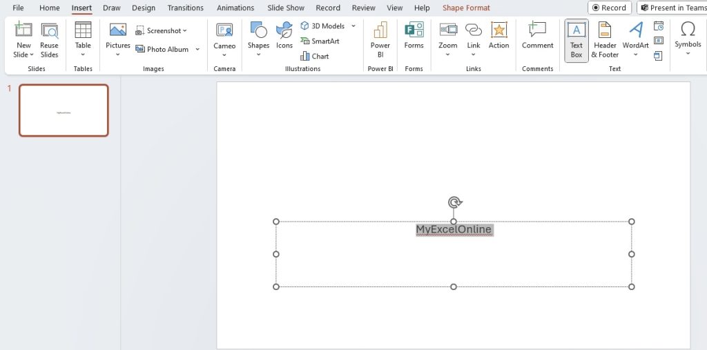
To begin outlining your text in PowerPoint, first, you need to lay the foundation. Inserting a text box is the essential first step to any text styling in your slides. Here’s how you can get started:
STEP 1: Launch PowerPoint and open your presentation or create a new slide.
STEP 2: Click on the “Insert” tab in the top menu.
STEP 3: Select “Text Box” to draw a new text box onto the slide.
STEP 4: With the text box in place, you can now type in your desired content.
Remember, the text box is more than just a container; it’s the canvas for your creativity. So, take the time to position it right where you want your outlined text to shine.
Selecting Your Text for Outlining
Once your text is comfortably sitting within its box, it’s time to give it that extra oomph with an outline. Before you can add any effects, you need to select the text you wish to outline:
STEP 1: Click on the text box that contains your desired text.
STEP 2: Drag your mouse across the text or double-click to select a single word.
STEP 3: If you want to select all the text within a text box, triple-click inside the box or press Ctrl + A (on Windows) or Cmd + A (on Mac). Adjust the size of the font based on your preference.
There you go! Your text is now highlighted, and that bounding box indicates you’re ready to proceed to the next step – giving it a compelling outline that separates it from the mundane.
Access Text Outline Options for Stunning Slide Design
Change the Color of Text Outline: A Dash of Creativity
Giving your text an outlined look is an excellent way to add a dash of creativity to your slides. Let’s walk through changing the color of your text’s outline:
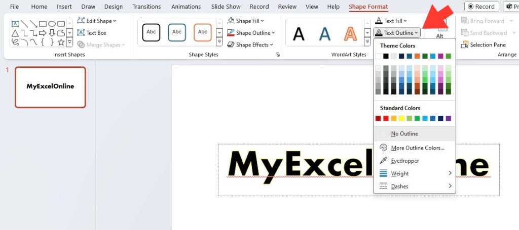
STEP 1: With your text selected, navigate to the ‘Format’ tab in the PowerPoint ribbon at the top of the window.
STEP 2: Look for the ‘Text Outline’ option. Click on it to reveal a dropdown menu, which will show you a palette of standard colors.
STEP 3: Select your desired hue by clicking on it. If you want more options, click “More Outline Colors” for an extended spectrum.
STEP 4: Once chosen, the outline color will instantly update around your selected text.
By altering the outline color, you can emphasize keywords, match your company branding, or simply add some visual consistency across your presentation.
Adjust Outline Thickness: Fine-Tuning for Clarity
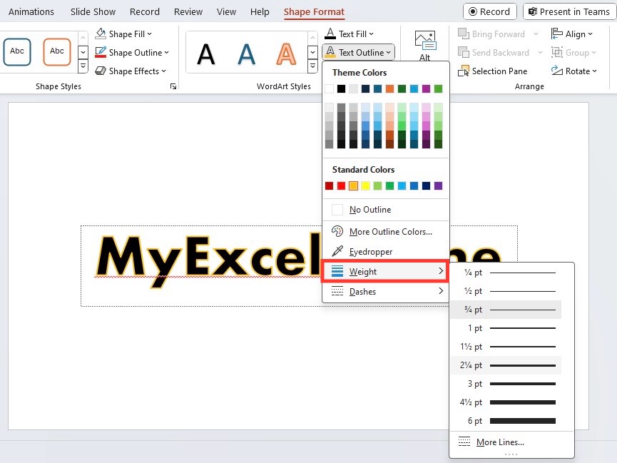
Adjusting the thickness of your text outline can significantly affect the clarity and visibility of your content. Thicker outlines can make text stand out more, especially against detailed backgrounds, while thinner ones might suit a minimalist style better. Let’s fine-tune the weight of your text outline:
STEP 1: With your text selected, click on the ‘Format’ tab in PowerPoint’s ribbon.
STEP 2: Click on ‘Text Outline’, and then hover over ‘Weight’ in the dropdown menu.
STEP 3: You’ll see options ranging from ‘Hairline’ to ‘Thick’. Selecting one will change the outline weight immediately.
Play around with different thickness levels to find the perfect balance that complements your slide design without overwhelming your audience.
Remember that striking the right contrast between the outline color and the background, and experimenting with the thickness, is key to making your text legible and visually appealing.
Advanced Text Outlining Techniques
How to Apply Dashes or Gradients for a Unique Look
Elevating your text’s appeal can be as simple as applying distinctive dashes or gradients to its outline. This advanced technique lends a unique touch to your slides. Let’s jump into the aesthetic world of text outlining:
For Dashes:
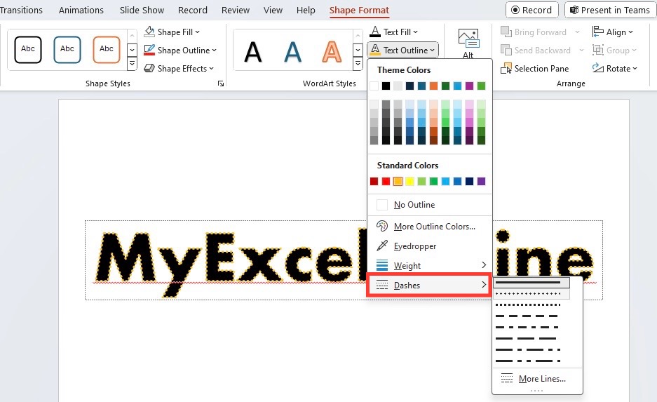
STEP 1: After selecting your outlined text, access the ‘Format’ tab.
STEP 2: Click ‘Text Outline’ and then choose ‘Dashes.’ A variety of dash styles will appear, from solid lines to dotted and dashed options.
STEP 3: Select a style, and it’ll be applied to your text, giving it a creative edge or a softer tone, depending on your choice.
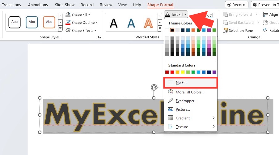
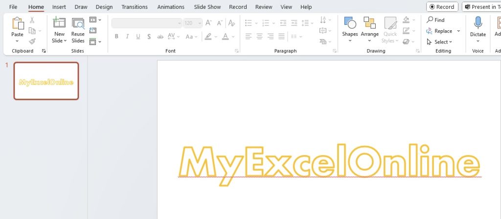
No Fill:
STEP 1: Again, with your text selected, go to the ‘Format’ tab.
STEP 2: Select ‘Text Fill,’ then click ‘No Fill.’ This option will eliminate the color within the outline entirely.
Keep in mind that these techniques are more effective on larger text with sufficient weight since intricate details might get lost on smaller fonts.
Experiment with these options to see how they align with your overall slide design and messaging. You might be surprised at how a simple dash or gradient can transform the look and feel of your text.
How to Create Text Masks and Half Circle Text Designs
For text masks and half circle text designs in PowerPoint, creativity meets versatility. These are powerful techniques to make your presentations stand out. Here’s how you can create these effects:
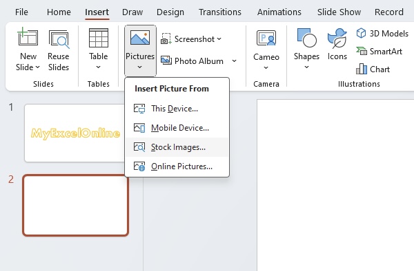
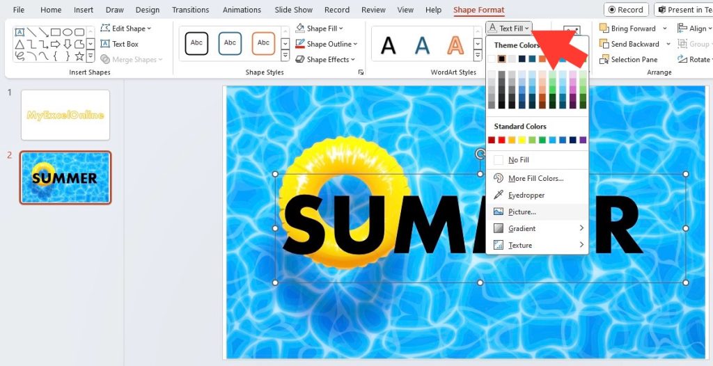
Text Masks:
STEP 1: Insert an image that you want to fill your text with.
STEP 2: Add your text over the image in a large, bold font for better visibility.
STEP 3: Select the text box, navigate to the ‘Format’ tab, and choose ‘Text Fill’.
STEP 4: Select ‘Picture’ and choose the same image you used as the background.
STEP 5: Select and delete the background image.
Common Problems and Solutions While Outlining Text
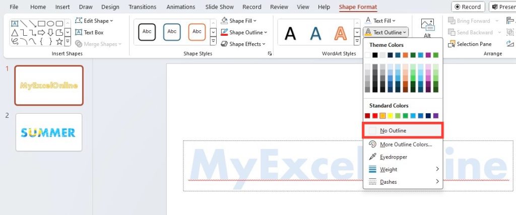
How to Remove Text Outline if Mistakes Happen
If your text outline isn’t exactly shaping up as you envisioned, don’t fret! Removing it is a quick and easy process:
STEP 1: Select the text with the outline you wish to remove.
STEP 2: Head over to the ‘Format’ tab on the PowerPoint ribbon.
STEP 3: Click on ‘Text Outline’ and then choose ‘No Outline’ from the dropdown menu.
STEP 4: Your text will now appear without an outline, and you can review the changes to ensure it matches your desired look.
Remember, if you’re working with multiple pieces of text, you can select all items where you want to remove the outline and follow the same steps. This will provide a uniform look across your slides. And for those working on master slides, remove the outline from your text on the Slide Master to apply changes throughout your presentation.
Whether it’s a slip of the mouse or a change in design direction, the ability to remove an outline allows you to iterate until your slide design is just right.
Tips for Compatibility Across Different PowerPoint Versions
Creating a universally compatible PowerPoint presentation can be a bit of a balancing act. If your presentation needs to be opened and edited across different versions of PowerPoint, here are a few tips to maintain compatibility:
- Stick to standard fonts: Use widely available fonts to ensure your text displays correctly on every version of PowerPoint.
- Avoid using the newest features: Some PowerPoint versions may not support the latest features. If you’re going to share your presentation with users who might have older versions, avoid using features introduced only in the newest PowerPoint versions.
- Test your presentation: Open and edit your presentation in different versions of PowerPoint to see how elements like text outlines behave. Make adjustments as necessary.
- Save your file appropriately: In some cases, saving your presentation as a
.pptfile instead of the newer.pptxformat can improve compatibility with older software. - Include instructions: If you used specific features for your text outlines, include a set of instructions or a “Read Me” slide explaining how to edit the text for those who might be using an older version.
Keep these tips in mind as you add complex elements like text outlines to your presentations. By doing so, you’ll ensure that your hard work looks as intended, no matter where or how it’s being viewed.
FAQs about Outlining Text in PowerPoint
How do you outline text effectively in PowerPoint?
To outline text effectively in PowerPoint, select the text box and then use the ‘Format’ tab to access ‘Text Outline. Customize the outline by choosing a color that contrasts with the background, and adjust the thickness to ensure readability. Opt for a style that complements the slide’s design for maximum impact.
How do you put a border around a letter in PowerPoint?
To put a border around a single letter in PowerPoint, insert a text box and type the letter. Then, go to the ‘Format’ tab, select ‘Text Outline’, choose a color, and adjust the border’s weight to your preference, which effectively places a border around the letter.
What are some creative ways to enhance text outlines in PowerPoint?
Enhance text outlines creatively in PowerPoint by experimenting with gradient fills, adding shadow or glow effects, using dashes or dots for a unique outline style, or even layering with multiple outlines of different colors and widths to create a standout visual effect.
John Michaloudis is a former accountant and finance analyst at General Electric, a Microsoft MVP since 2020, an Amazon #1 bestselling author of 4 Microsoft Excel books and teacher of Microsoft Excel & Office over at his flagship MyExcelOnline Academy Online Course.

