Pivot Charts are not just about “making data look pretty”—they’re about communicating insights in the clearest way possible. And the best way to do that is by mastering Pivot Chart Settings. So today, I’ll walk you through everything I know about Pivot Chart Settings in Excel. By the end of this article, you’ll feel confident enough to tweak, polish, and perfect your Pivot Charts like a pro.
Key Takeaways:
- Pivot Charts are powerful tools for communicating insights, not just for decoration.
- The Design Tab controls chart type, layout, and overall structure.
- The Format Tab fine-tunes details like shapes, text, alignment, and size.
- Smart use of chart elements and styles makes data easier to understand.
- Simplicity and consistency are key for professional-looking Pivot Charts.
Don’t forget to download the Exercise Workbook below and follow along with us!
Table of Contents
What are the Pivot Chart Settings?
When working with Pivot Charts, sometimes it gets overwhelming with the number of customizations it allows you to do. Right now I will walk you through the different options so that you can quickly maximize their usage to the fullest!
There are two buttons available for customizing and formatting the Pivot Charts in Excel:
- Design Tab – It can be used to change the chart type, chart style, select data, add chart elements, etc.
- Format Tab – It can be used to change chart size, insert shapes, change shape style, etc.
Once you click on the Pivot Chart, you will have these options. Let us go over the Design and Format settings.
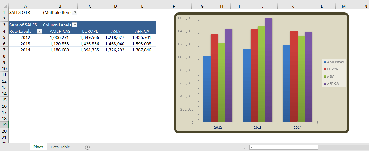
This is our current Pivot Chart that we will be using to try out the different Pivot Chart settings.
Tabs in Pivot Chart
Design Tab
The Design tab has the following settings:
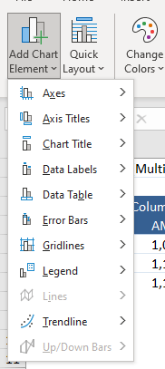
- Add Chart Element – If you want to add/remove additional elements like Axes, Data Labels, Gridlines, Legends, etc. to be displayed in your Pivot Chart, you have these settings:
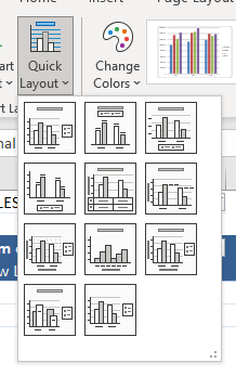
- Quick Layout – This is a handy way to have different types of presentation options. Go over them one by one to determine which will be the most appropriate way to visualize your data.
- Chart Styles – You can have fun here with the colors on how your chart will be displayed and match them with your company’s theme colors.
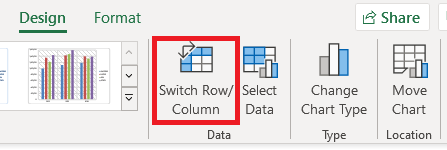
- Switch Row/Column – You can use this option to change the way data is plotted in PivotCharts. You can swap the data over the axis with this quickly and revert back when needed.
- Select Data – You can change the data source of your Pivot Chart using this option.
- Change Chart Type – There are a lot of different chart types that you can change quickly.
- Move Chart – If you need to place the Pivot Chart in a different location, you can easily use this option.
Format Tab
The Format tab has the following settings:
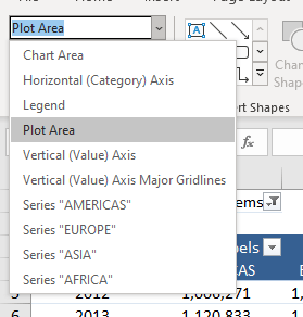
- Current Selection – You select the specific element of your Pivot Chart on the one you want to modify visually.
- Insert Shapes – You can add additional shapes that will help present your data better on top of your Pivot Chart such as arrows and boxes.
- Shape Styles – You can change the color fill, outline, or even add 3d effects to how it is displayed.
- WordArt Styles – You can change how text is formatted here with preset styles available.
- Arrange – You can change the display order, set alignment, or even rotate the selected element.
- Size – You can change the length and width here.
So, you can use the command buttons present in the Design and Format tab available for PivotCharts to easily customize and format your chart as per your requirement!
FAQs
1. What is the main difference between the Design Tab and the Format Tab in Pivot Charts?
The Design Tab focuses on the overall structure of the Pivot Chart. It lets you change chart types, apply layouts, switch row/column data, or adjust the chart’s source. This is where you shape how your data is represented and organized visually. The Format Tab, on the other hand, is where you add polish and personality. It handles specific styling like shapes, colors, text effects, and alignment. In short, Design is about functionality and structure, while Format is about style and presentation.
2. Can I use Pivot Chart Settings to update the chart automatically when my data changes?
Yes, but this depends on whether your Pivot Table is linked to a dynamic data source. If it is, then refreshing the Pivot Table will automatically update the Pivot Chart to reflect the changes. If your data range is static, however, you may need to manually redefine it through the “Select Data” option. A great way to avoid this hassle is to use Excel Tables or named ranges, since they expand automatically when new rows are added. By pairing dynamic sources with regular refreshes, your Pivot Charts will always display the latest insights without extra effort.
3. How do I choose the right chart type when using Pivot Chart Settings?
The right chart type depends entirely on the story you want your data to tell. For showing changes over time, line or area charts are usually the clearest. When comparing categories, I prefer column or bar charts because they make differences easy to spot at a glance. Pie or donut charts work well for proportions, but only when there are a few categories—otherwise, they get cluttered. Scatter plots are great for correlations, and combo charts can combine multiple perspectives in one. The golden rule: pick the chart type that highlights your message, not just what looks fancy.
4. What are some common mistakes to avoid when customizing Pivot Charts?
The most common mistake is overloading the chart with too much information—too many labels, gridlines, or elements make it hard to read. Another issue is using inconsistent or distracting colors, which can confuse viewers instead of clarifying data. A lot of people also forget to refresh their Pivot Table, which means their chart may be showing outdated numbers. Using the wrong chart type, like a pie chart with too many slices, is another pitfall that reduces clarity. Lastly, focusing too much on flashy formatting (like heavy 3D effects) often makes the chart harder to interpret. Keep it simple, accurate, and clean.
5. Can I save my Pivot Chart customizations for future use?
Yes! After customizing a Pivot Chart, you can save it as a Chart Template. This allows you to reuse the same style, layout, and formatting across different datasets without rebuilding from scratch. Templates are especially useful if you create recurring reports that require consistency in presentation.

Bryan
Bryan Hong is an IT Software Developer for more than 10 years and has the following certifications: Microsoft Certified Professional Developer (MCPD): Web Developer, Microsoft Certified Technology Specialist (MCTS): Windows Applications, Microsoft Certified Systems Engineer (MCSE) and Microsoft Certified Systems Administrator (MCSA).
He is also an Amazon #1 bestselling author of 4 Microsoft Excel books and a teacher of Microsoft Excel & Office at the MyExecelOnline Academy Online Course.

