Download our 141 Free Excel Templates and Spreadsheets!
Getting Started with PowerPoint Customization
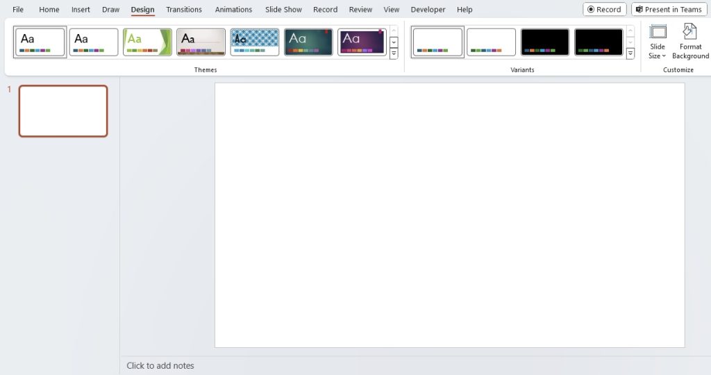
Diving into PowerPoint customization begins with a simple and intuitive process. Whether you’re looking to adapt your presentation for a specific projector, display, or print format, PowerPoint’s versatile design features are at your disposal. Starting is as easy as opening your presentation and clicking on the ‘Design’ tab. Here, a world of customization options, including slide size, background designs, themes, and more, is right at your fingertips. Remember, it’s worth spending a few moments to get these settings right to save time and ensure a seamless visual experience later.
Key Takeaways
- To customize PowerPoint print size, first set the slide size to match the desired paper dimensions by selecting “Custom Slide Size” in the Design tab. Ensure that the height and width you input are accurate for the printout you require.
- Design slides with your printer’s unprintable margins in mind, and use the “Preview” function in the Print dialog box to adjust the design without wasting paper. Ensure that the printer settings correspond to the paper and orientation you intend to use, and deselect “Scale to fit paper” before printing.
- For oversized printouts, like posters, match the PowerPoint slide size to the available printer page size without exceeding the maximum 56-inch slide limitation. If necessary, scale the slide proportionally for larger prints, choose the correct paper size, adjust scaling factors if “Scale to fit paper” is turned off, and print. Trim any excess paper if a larger page size was used.
Table of Contents
Understanding Standard Slide Sizes
The Classic 4:3 Ratio Explained
The 4:3 ratio is a time-honored classic that has served as the de facto standard for presentations for many years. Imagine the shape of traditional television sets or older computer monitors—that’s the 4:3 aspect ratio. Known for its suitability for print distribution, it’s a format that can adapt effortlessly to A4 or Letter paper sizes. Although it’s been largely replaced by wider formats in digital displays, the 4:3 ratio still has a place in many contexts, particularly for projectors and printed materials. It ensures that everyone in the room gets a clear view, with presentations appearing more ‘square’ and thus fitting comfortably onto projector screens designed with this aspect ratio in mind.
Embracing the Widescreen 16:9 Format
The widescreen 16:9 format has become the new normal for presentations, especially in the context of modern displays. It aligns perfectly with the screens of most laptops, desktop monitors, smartphones, and TVs. This means when you go for the 16:9 ratio, you’re choosing a size that’s optimized for the majority of digital viewing experiences today. They provide ample horizontal real estate, ideal for highly visual content like videos, wide tables, and panoramic images. Not only does this format make your slides look more contemporary, but it also translates well if your presentation is shared or viewed on different devices. And with most projectors now supporting widescreen, there’s rarely a need to squish or stretch your content to fit the screen.
Beyond the Basics: Custom Slide Dimensions
How to Choose Custom Dimensions for Various Purposes
Choosing custom dimensions for your PowerPoint slides should be guided by the purpose and medium of your presentation. For instance, if you’re presenting on a platform with specific video requirements, like YouTube or Instagram, you’ll want to tailor your slide dimensions to fit those specifications. If your focus is a professional printout for handouts, consider what paper size will be used—standard Letter, A4, or something else entirely?
Trade shows or specialized equipment might require unique sizes, and in these cases, custom dimensions can enhance visibility and impact. Contemplate the end-user experience: Will they view your presentation on a phone, through a web conference, or via a billboard? Each scenario demands different dimensions for optimal clarity and engagement. Tailor your slides to ensure content isn’t cropped awkwardly or displayed with unsightly borders, which can detract from your message and professionalism.
Step-by-Step Guide to Changing Your Slide Size
Adjusting your PowerPoint slide size is a piece of cake if you follow these steps:
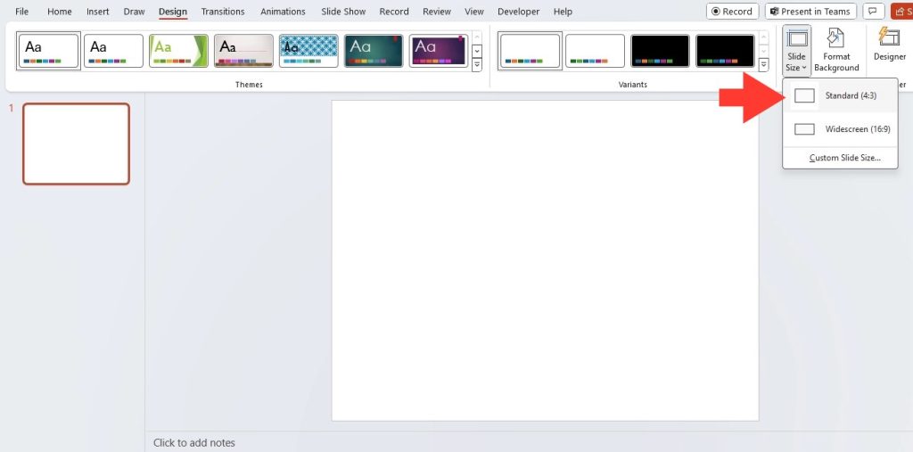
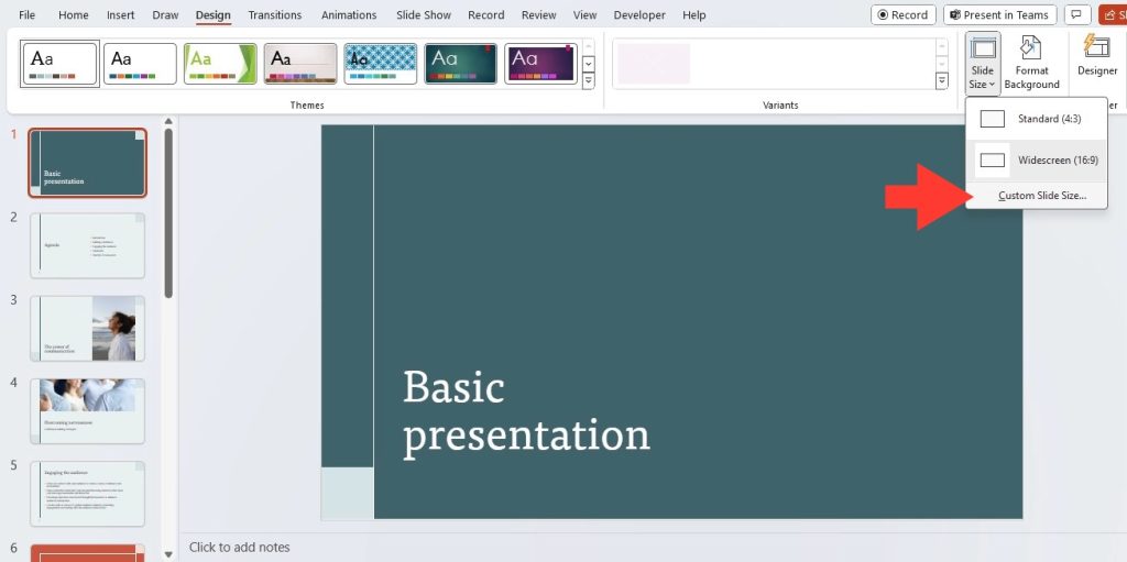
STEP 1: Begin by launching PowerPoint > ‘Design’ tab > Click on the ‘Slide Size’ option within the ‘Design’ tab. From the dropdown, select ‘Custom Slide Size’ to open the dialog box.
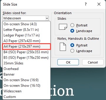
STEP 2: In the dialog box, input your desired width and height. You might do this in inches, centimeters, or pixels, depending on your preferences.
STEP 3: After feeding in the new sizes, hit ‘OK’ to apply your settings.
Make sure everything fits well and looks as intended. If needed, rejig text, images, and other elements accordingly.
It’s important to note that changing dimensions after adding content might alter the layout, so you might have to do some fine-tuning afterward to get everything to look just right.
Practical Tips for Perfect Printouts
Utilizing Print Preview to Avoid Mistakes
Before you commit your PowerPoint masterpiece to the printed page, it’s wise to utilize the Print Preview feature. This handy tool acts as your safety net, helping catch any unforeseen issues before they waste paper and ink. Here’s how to make the most of it:
- Access Print Preview: You can open Print Preview from the main menu by selecting ‘File’ > ‘Print’ and then ‘Preview,’ or directly from the Print dialog box by hitting the ‘Preview’ button.
- Inspect and Adjust: Use Print Preview to scrutinize slide nuances. Check alignments, margins, graphics, and overall layout. If something’s off, it’s infinitely easier to tweak it now than post-printing.
- Change Settings as Needed: If adjustments are required, Print Preview allows you to change settings without leaving the window. You can toggle printer settings and PowerPoint options, observing the effects in real-time.
Make sure all elements are rightly placed and appear exactly as planned. This moment of precaution can save you the headache of misprints or misaligned content, ensuring your final printouts are as flawless as they should be.
Paper Size and Orientation: Matching Your Slides to the Medium
When your presentation is polished and ready to see the world in print, remember to match its paper size and orientation with your chosen medium. This means if you’re printing on Letter paper, your slides should be designed with the same dimensions. Similarly, for A4-sized presentations, set your slide dimensions to 210mm by 297mm.
Orientation, whether portrait or landscape, should align with the nature of your content. Landscape orientation works wonders for most presentations due to its natural fit with screens and horizontal content flow. However, for documents like informational leaflets or certain reports, portrait may be more suitable.
Here’s how to match it all up:
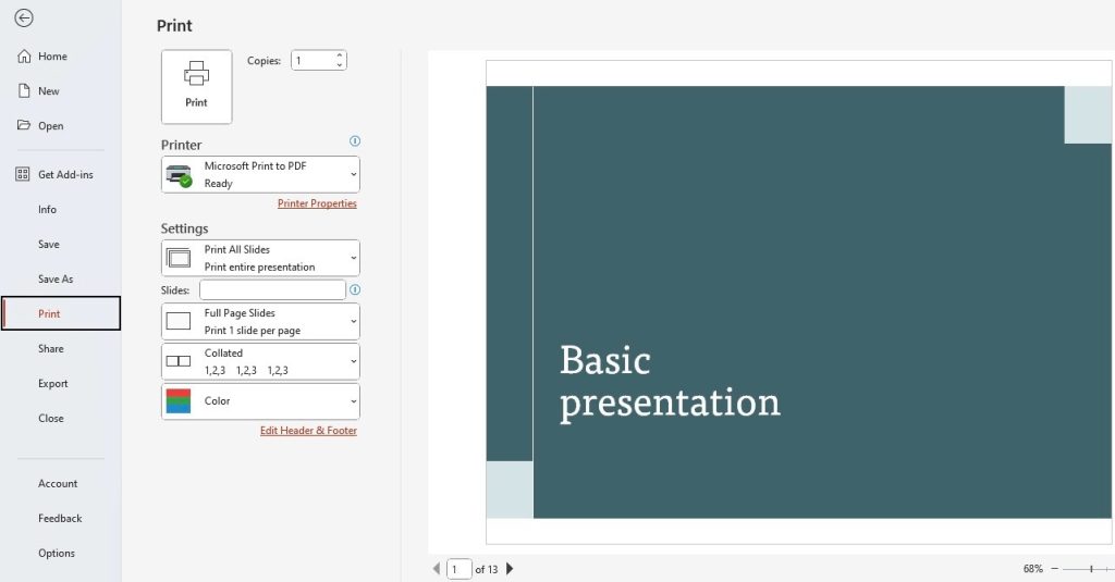
STEP 1: In PowerPoint, head to ‘File’ then ‘Print’.
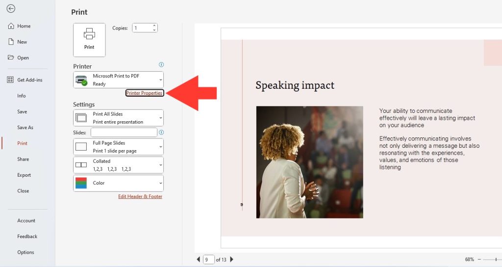
STEP 2: Select ‘Printer Properties’ to ensure the paper size and orientation match your PowerPoint settings.
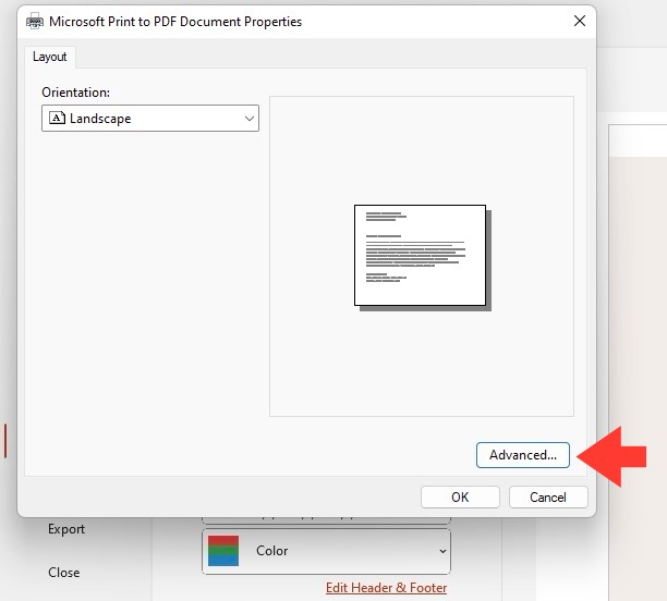
STEP 3: Click on Advanced, and choose the correct Paper Size in the Dropdown menu.
By perfectly syncing your paper size and orientation with your slides, your presentation will leap off the page just as impressively as it does on the screen.
Advanced Customization Techniques
Creating a Default Custom Size for Future Presentations
If your presentations regularly require a specific slide size that differs from PowerPoint’s default settings, it’s efficient to create a default custom size template. This simplifies the setup process and ensures consistency across multiple presentations. Here’s how to establish your custom dimensions for future use:
- Set the Custom Size: Start with the steps outlined previously to set up your desired slide size.
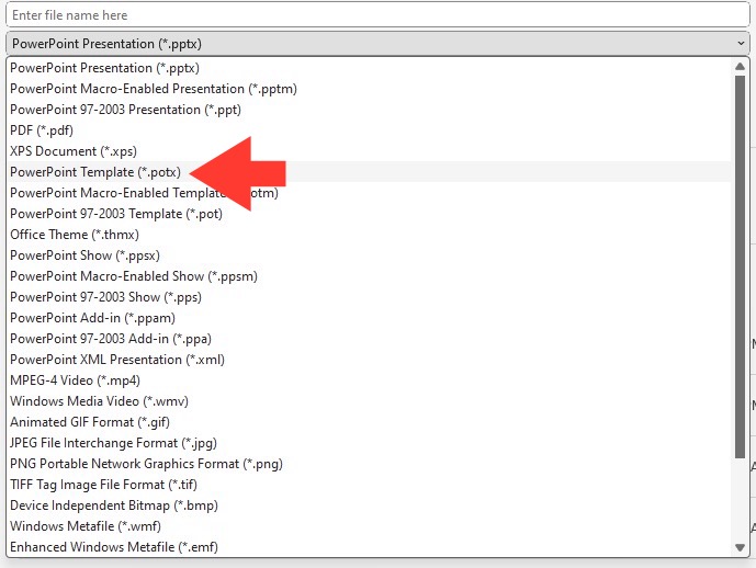
- Save as a Theme or Template: Once you’ve adjusted the dimensions and designed a slide to your liking, go to the ‘Design’ tab, and select ‘Save as Template.’ Save your file in the PowerPoint template format (.potx).
- Set as Default Theme: After saving your template, you can set it as the default for new presentations by clicking ‘Set as Default Theme.’
Next time you fire up PowerPoint to craft a new presentation, your customized slide size will be ready to go, saving you time and ensuring uniformity across all your presentations.
Special Considerations for Non-Standard Projects
When tackling non-standard projects, special considerations come into play. If you’re designing a presentation for a unique exhibition or a bespoke digital platform, sticking to conventional slide sizes won’t cut it. You’ll need to think outside the traditional box.
Consider the specific requirements of your project. For instance:
- Unusual Aspect Ratios: Perhaps you’re working with an ultra-wide monitor or a vertical screen setup. Create a custom size that makes the most of the space available.
- Interactive Displays: If your presentation involves touch screens or other interactive elements, design for ease of interaction.
- Large Format Printing: Preparing for a billboard or poster? You’ll want slides that scale up without losing image quality.
In each case, you’ve got to delve into detailed specifications and sometimes liaise with manufacturers or venue organizers for precise dimensions. Don’t forget to factor in any additional space for mounting or framing. Also, be sure to test your presentation on the intended platform, adjusting the design and layout based on feedback and observations to ensure it looks impeccable.
Maximizing Impact with Attention to Detail
Adjusting Resolution and Quality for Professional Results
For professional results that truly shine, it’s not just slide size you need to mind, but also resolution and image quality. If your visuals look pixelated or blurry, your presentation’s impact is instantly diminished. Striking the perfect balance between high-quality images and manageable file size is key.
Here’s the approach to take:
- Choose the Correct Resolution: When selecting your slides’ resolution, think about your presentation context. Higher resolutions like 1920×1080 pixels are superb for modern displays, but consider lower settings, such as 800×600, for faster loading without compromising too much on quality.
- Review Image Quality: Utilize high-resolution images when possible to avoid pixelation when projected on large screens. However, remember large images can bloat your file size, impacting sharing and loading times.
- Compress Images: PowerPoint offers built-in tools to reduce image file sizes while maintaining visual fidelity, which is ideal when working with many high-res photos.
- Test on Actual Hardware: Always preview your presentation on the hardware you’ll be using, adjusting the resolution and quality as needed for the best on-site experience.
In short, make your slides look their very best by batting for top-notch resolution and image quality—that’s what separates a run-of-the-mill presentation from a truly standout one.
The Role of Colors, Fonts, and Animations in Slide Design
Colors, fonts, and animations each play a conductor’s role in orchestrating a PowerPoint presentation that is both aesthetically pleasing and functionally effective.
Colors: They’re the visual emotions of your slides, setting the tone and mood. It’s crucial to choose a color palette that complements your brand and purpose, while ensuring clarity and readability. Remember, consistency in your color scheme across slides will give your presentation a cohesive, professional look.
Fonts: Select fonts that reflect your presentation’s character—be it professional, whimsical, or somewhere in between. Make sure they are legible, even from the back of the room. Using too many fonts can be distracting, so limit yourself to a consistent set that works well together.
Animations: When used judiciously, animations can enhance understanding and retention. They guide your audience’s focus and can illustrate complex ideas effectively. However, overusing them can be distracting, so use subtle, meaningful animations that support your message without stealing the show.
Integrating these elements with thoughtfulness and restraint not only maximizes impact but also contributes to the overall narrative of your presentation.
Common Missteps and How to Avoid Them
Frequently Overlooked Settings in Slide Preparation
In the hustle to get your presentation ready, it’s easy to glide past a couple of key settings that can greatly sway the final output. Keep an eye out for these:
- Slide Backgrounds: Sometimes, they’re neglected or too busy, which can mess with the readability of your content. Opt for simplicity and contrast.
- Transition Consistency: Inconsistent slide transitions can jar the flow of your presentation. Stick to one or two types that complement your content’s tone.
- Slide Masters: This powerful tool can save you loads of time, ensuring uniformity in fonts, colors, and logos across your slides. However, it’s occasionally overlooked by even seasoned PowerPoint users.
Check these settings before declaring your slide deck done. Doing so can refine your presentation’s look and feel, ensuring that nothing is amiss.
Proofreading and Final Previews: Your Checklist Before Hitting ‘Print’
Before sending your presentation to the printer, a meticulous proofread and final preview are vital steps that cannot be skipped. To ensure perfection, go through this checklist:
- Spellcheck Everything: Typos and spelling errors can undermine your credibility. Use PowerPoint’s built-in spellcheck and consider a peer review for a fresh pair of eyes.
- Review Font Sizes and Styles: Ensure your text is uniform and legible throughout. Small or overly decorative fonts might be hard to read in print.
- Check Alignment and Layout: All elements on your slides should align properly and follow a consistent layout. This keeps your presentation tidy and professional.
- Validate All Links and Multimedia: If you’re printing an interactive presentation, make sure all hyperlinks and multimedia elements work properly.
- Inspect Visuals: Confirm that all images, charts, and graphics are sharp and correctly positioned, without any awkward cropping or stretching.
- Print a Test Page: Finally, print a single test slide to verify it looks as expected on paper. Adjust color settings and layout as needed.
Armed with this checklist, take a moment to carefully inspect your presentation before printing the full set. Remember that this last run-through could catch errors that might otherwise detract from an otherwise stellar presentation.
FAQs About Customizing PowerPoint Slide Sizes
What’s the Difference Between ‘On-screen Show’ and ‘Widescreen’ Slide Sizes?
‘On-screen Show’ typically refers to the 4:3 aspect ratio, which was commonplace for older monitors and projectors. It offers a more square-like shape that fits traditional screen dimensions. On the other hand, ‘Widescreen’ is the term used for the 16:9 aspect ratio, which matches the dimensions of most current monitors, TVs, and projectors. It provides a broader, more rectangular viewing area that takes full advantage of modern display technology. When creating a PowerPoint, choose ‘Widescreen’ for contemporary displays and ‘On-screen Show’ for legacy or square screens.
Can I Convert Customized PowerPoint Slides for Digital Projection or Social Media Use?
Absolutely! Your customized PowerPoint slides can be converted for various digital uses, including projection and social media. For digital projection, tailor the slides to the projector’s resolution for clarity. For social media, adjust your slide dimensions to align with the specific platform’s requirements, such as square formats for Instagram posts or landscape formats for Twitter banners. Remember to save your slides in the correct file format, like JPEG or PNG, for easy sharing on digital platforms.
How Do I Make My Custom Slide Size the Default Setting in PowerPoint?
To make a custom slide size the default in PowerPoint, first create a slide with your preferred dimensions by going to the ‘Design’ tab, clicking on ‘Slide Size,’ and selecting ‘Custom Slide Size.’ After setting it up, click ‘Save As,’ choose ‘PowerPoint Template’ (*.potx), and save it in the default template location. When you create a new presentation, select your custom template from the ‘Personal’ tab to start with your preferred slide size.
John Michaloudis is a former accountant and finance analyst at General Electric, a Microsoft MVP since 2020, an Amazon #1 bestselling author of 4 Microsoft Excel books and teacher of Microsoft Excel & Office over at his flagship MyExcelOnline Academy Online Course.

